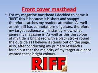
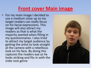
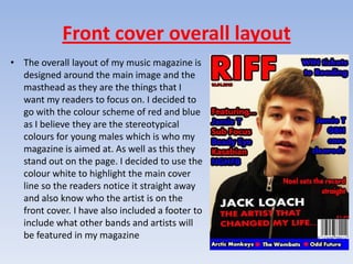
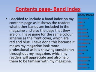
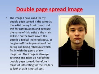
5. How did you attract/address
       your audience?

          By Will Dann
Front cover masthead
• For my magazine masthead I decided to name it
  ‘RIFF’ this is because it is short and snappy
  therefore catches my readers attention. As well
  as this, riff has connotations of guitars, therefore
  my target audience will instantly know what
  genre my magazine is. As well as this the colour
  of my title is bright red with a black stroke round
  the outside as I believe it stands out on the page.
  Also, after conducting my primary research I
  found out that the majority of my target audience
  wanted these bright colours.
Front cover Main image
• For my main image I decided to
  use a medium close up so my
  target readers can really focus
  on his facial expressions. This
  image will also attract my
  readers as that is what the
  majority wanted when filling in
  my questionnaires. I also tried
  to attract my target audience by
  getting the artist to look straight
  at the camera with a rebellious
  look on his face. By doing this
  captures the readers eye as he
  looks striking and fits in with the
  indie rock genre
Front cover overall layout
• The overall layout of my music magazine is
  designed around the main image and the
  masthead as they are the things that I
  want my readers to focus on. I decided to
  go with the colour scheme of red and blue
  as I believe they are the stereotypical
  colours for young males which is who my
  magazine is aimed at. As well as this they
  stand out on the page. I decided to use the
  colour white to highlight the main cover
  line so the readers notice it straight away
  and also know who the artist is on the
  front cover. I have also included a footer to
  include what other bands and artists will
  be featured in my magazine
Contents page- Band index
• I decided to include a band index on my
  contents page as it shows the readers
  what other bands are included in the
  magazine and also the page that they
  are on. I have gone for the same colour
  scheme as the front cover, which are
  red and blue. I have done this because it
  makes my magazine look more
  professional as it is showing consistency
  throughout my magazine, which my
  readers will appreciate and also help
  them to be familiar with my magazine.
Contents page title
• My contents title is very similar to my masthead. As you can
  see it is same colour and font, as well as the same stroke
  round the outside to make it stand out. I have done this so
  that my magazine looks consistent throughout and so that the
  readers can identify that it is my magazine quickly. You may
  also notice I have included my masthead on the contents
  page, I have done this because it makes the contents stand
  out more and also creates a brand recognition towards my
  readers
Double page spread title
• The double page spread title is again the same font
  and colour with also a stroke round the edge. This
  shows consistency though my magazine, the title
  itself will appeal to my target audience as it is left on
  a cliff-hanger which will encourage my readers to
  read the full article as they will want to find out.
Double page spread image
• The image I have used for my
  double page spread is the same as
  the artist on my front cover. I did
  this for continuation and because
  the name of this artist is the main
  sell line on the front cover. His
  pose is a typical indie rock pose, as
  he gives off the impression of not
  caring and being rebellious which
  fits in with the genre of my
  magazine. The image is also eye
  catching and takes up half of the
  double page spread, therefore it
  makes it interesting for the readers
  to look at as it is not all text.

Task 5

  • 1.
    5. How didyou attract/address your audience? By Will Dann
  • 2.
    Front cover masthead •For my magazine masthead I decided to name it ‘RIFF’ this is because it is short and snappy therefore catches my readers attention. As well as this, riff has connotations of guitars, therefore my target audience will instantly know what genre my magazine is. As well as this the colour of my title is bright red with a black stroke round the outside as I believe it stands out on the page. Also, after conducting my primary research I found out that the majority of my target audience wanted these bright colours.
  • 3.
    Front cover Mainimage • For my main image I decided to use a medium close up so my target readers can really focus on his facial expressions. This image will also attract my readers as that is what the majority wanted when filling in my questionnaires. I also tried to attract my target audience by getting the artist to look straight at the camera with a rebellious look on his face. By doing this captures the readers eye as he looks striking and fits in with the indie rock genre
  • 4.
    Front cover overalllayout • The overall layout of my music magazine is designed around the main image and the masthead as they are the things that I want my readers to focus on. I decided to go with the colour scheme of red and blue as I believe they are the stereotypical colours for young males which is who my magazine is aimed at. As well as this they stand out on the page. I decided to use the colour white to highlight the main cover line so the readers notice it straight away and also know who the artist is on the front cover. I have also included a footer to include what other bands and artists will be featured in my magazine
  • 5.
    Contents page- Bandindex • I decided to include a band index on my contents page as it shows the readers what other bands are included in the magazine and also the page that they are on. I have gone for the same colour scheme as the front cover, which are red and blue. I have done this because it makes my magazine look more professional as it is showing consistency throughout my magazine, which my readers will appreciate and also help them to be familiar with my magazine.
  • 6.
    Contents page title •My contents title is very similar to my masthead. As you can see it is same colour and font, as well as the same stroke round the outside to make it stand out. I have done this so that my magazine looks consistent throughout and so that the readers can identify that it is my magazine quickly. You may also notice I have included my masthead on the contents page, I have done this because it makes the contents stand out more and also creates a brand recognition towards my readers
  • 7.
    Double page spreadtitle • The double page spread title is again the same font and colour with also a stroke round the edge. This shows consistency though my magazine, the title itself will appeal to my target audience as it is left on a cliff-hanger which will encourage my readers to read the full article as they will want to find out.
  • 8.
    Double page spreadimage • The image I have used for my double page spread is the same as the artist on my front cover. I did this for continuation and because the name of this artist is the main sell line on the front cover. His pose is a typical indie rock pose, as he gives off the impression of not caring and being rebellious which fits in with the genre of my magazine. The image is also eye catching and takes up half of the double page spread, therefore it makes it interesting for the readers to look at as it is not all text.