Download to read offline
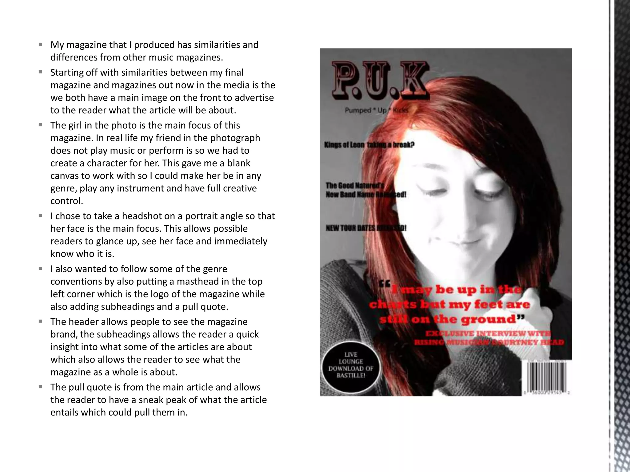
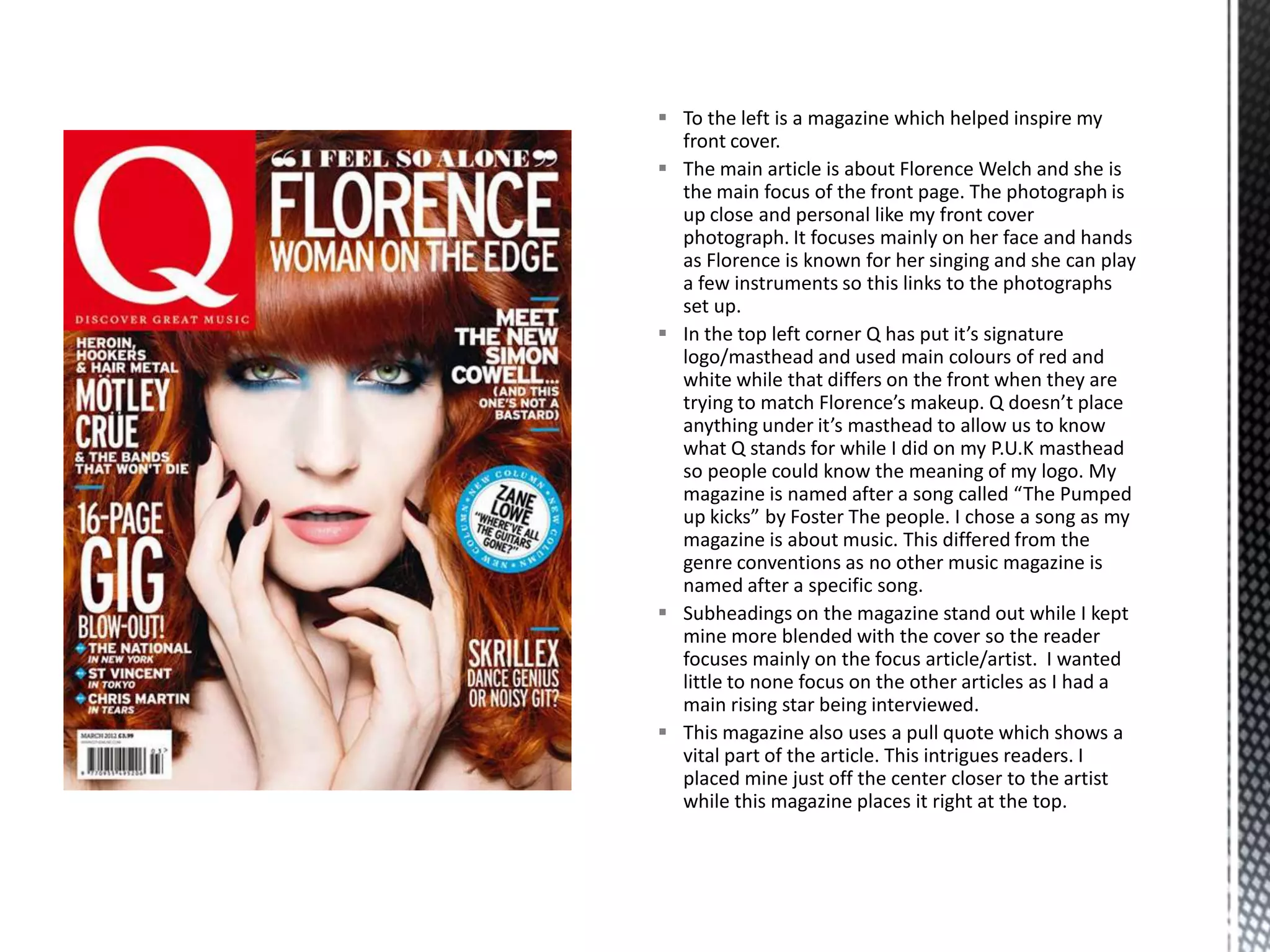
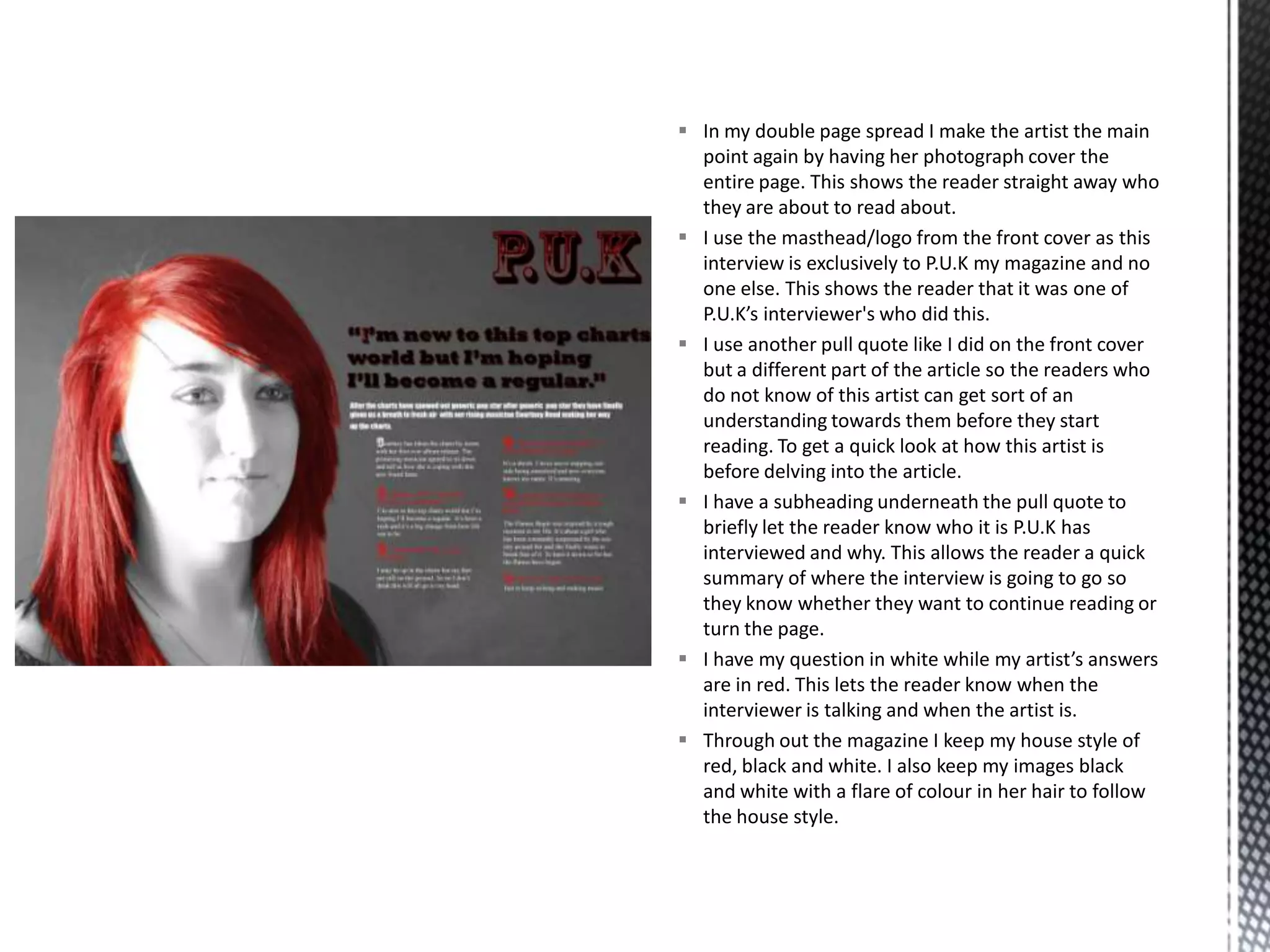
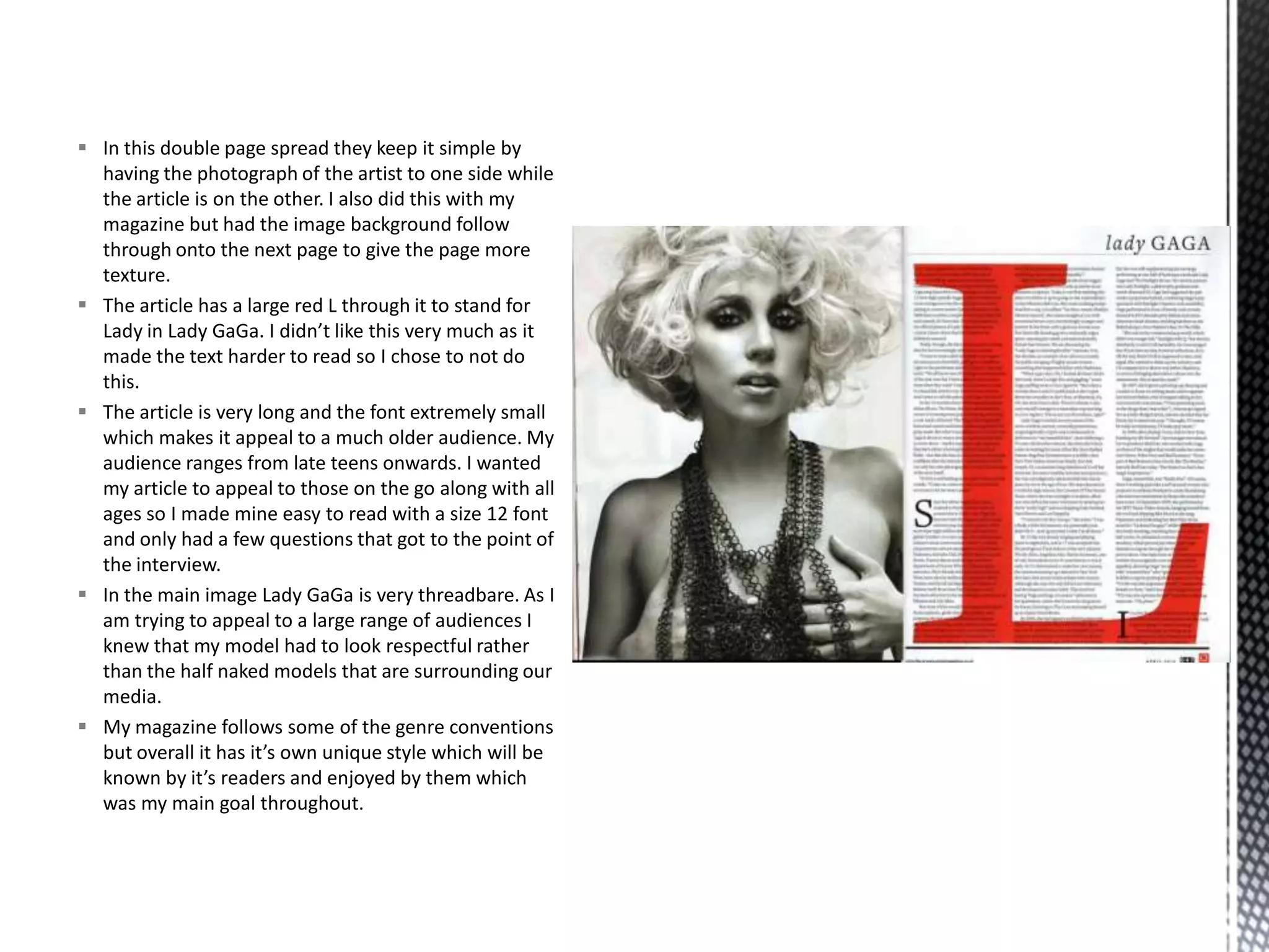

My magazine shares some similarities with other music magazines, such as featuring a main image on the front cover to advertise the main article. However, it also has unique elements, such as being named after a Foster the People song. The front cover features an up-close photo of a friend portrayed as a rising music star, with the magazine's logo in the top left corner. Inside, it maintains a consistent three-color house style of red, black and white. The double-page interview spread prominently features the subject's photo across both pages and keeps the questioning and answers visually distinct through font coloring.


