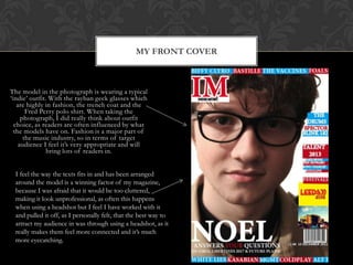
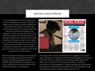
The document describes the design and content choices for a magazine targeting an indie/rock music audience. To attract this audience, the designer focused on simplicity while being eye-catching through the use of block colors, photos, and a consistent font. Both genders were considered by drawing inspiration from other popular music magazines. The front cover features the magazine name, taglines with band names, and a festival headline to entice readers. Inside, block colors highlight text and a variety of music and fashion topics aim to appeal to the target audience's interests.
Research/presentation for NCLCA National Conference- September 20, 2011- Title: Strategies for student achievement: Understanding the impact of a student success center
Research/Presentation- NCLCA National Conference- September 20, 2011. Title: Strategies for student achievement: Understanding the impact of a student success center
This is my first evaluation question for my media product. The question is, 'In what way does your media product use, develop or challenge forms and conventions of real media products?'
2. • When designing my magazine I needed to really focus and make sure that
it really met my target audiences‟ needs and interests. To make sure I did
this I kept checking and referring back to my research, to see which things
they wanted in there the most. Although not only did I need to interest
they through content, but the presentation of my magazine needed to
bring them in and excite them.
• The indie/rock genre is a new, cool, vintagey look and sound, so I had to
think carefully about content and layout, because I needed it to be
simplistic, but eye-catching-that‟s why I stuck to using the color scheme
and the block texts, accompanied by the photos that I used.
• Due to my target audience being mixed gender, I needed to make sure it
applied to both genders. For this reason, I was influenced by NME and Q!
magazine. It helped me a lot on layout and content as I got reassured that
using a quite outgoing colour scheme wasn‟t bad, and the main story I
produced was appropriate
DESIGNING MY MAGAZINE
3. MY FRONT COVER
The title of my front cover is large and
bold and in capital letters, as I thought the
name of the magazine was the most
important thing, it needed to be noticeable,
easily recognized and not too long, or it
could be shortened down into a smaller
version, that‟s why in a white stroke
underneath I put the full version. The font
looks like an „old‟ ish font, so I thought
this was appropriate for the indie genre,
but it also looks fresh and like no one
else‟s.
The tagline across the bottom and top really
help bring my audience in because of the
block colours, contrasting with the white.
Simply by using band names, they instantly
know which artists it focuses on and
includes, which makes them know it‟s an
indie genre magazine. As well as this,
keeping on with the colour scheme I did the
same down the side, to add some
information and colour to it, and also
adapted this into the “TALENT 2013” as if
I used different colours I feel it would give
it an unprofessional look. Again with it
being at the top and bottom, it brings your
eyes down to scan the whole of the
magazine, ensuring that the readers take in
all the the information. By putting them in,
it really gives the magazine a source of
symmetry and although it‟s very simple, it
adds just that extra bit of detail that could
convince/push a reader to buy it.
I included a FESTIVAL headline, because after my target audience research, this was the thing
that cropped up the most that people wanted me to feature, so putting this on the front of my
magazine will again entice the reader in, especially as I‟ve used the official photo/sign of 2013 and
a picture from the actual festival to make them trust me that I do have hot news and knowledge
on it, especially for those first time festivalers
The name Noel is in a larger, white font, to be eye-
catching and noticeable. The name of the celebrity
and the magazine name are in bold and the biggest
things on there as I felt these were the most
important things. At first I did use red for Noel,
but then it took away the attention from the IM
title, so changed it white so they were equally as
eye-catching, but the white also kept up the
consistency of the colour scheme. As well under
the Noel, I included an insight into what the
interview will be about, such as his former band
possibly making a new hit, which will entice the
reader in because they‟re such a well known and
loved band in the indie genre, it will immediately
bring people in. Another thing I did which I
thought was clever, was highlight the word YOUR
in red, as it really makes the reader feel involved in
the magazine, but then will also know that the
content won‟t be the same old boring questions as
magazines usually provide.
4. The model in the photograph is wearing a typical
„indie‟ outfit. With the rayban geek glasses which
are highly in fashion, the trench coat and the
Fred Perry polo shirt. When taking the
photograph, I did really think about outfit
choice, as readers are often influenced by what
the models have on. Fashion is a major part of
the music industry, so in terms of target
audience I feel it‟s very appropriate and will
bring lots of readers in.
MY FRONT COVER
I feel the way the texts fits in and has been arranged
around the model is a winning factor of my magazine,
because I was afraid that it would be too cluttered,
making it look unprofessional, as often this happens
when using a headshot but I feel I have worked with it
and pulled it off, as I personally felt, that the best way to
attract my audience in was through using a headshot, as it
really makes them feel more connected and it‟s much
more eyecatching.
5. DOUBLE PAGE SPREAD
In my double page spread I used big block
colours as backing on my texts. I did this to
brighten up the pages, and also highlight the
main bits of the article. I used the same
colour scheme again as it worked really well
and kept it consistent throughout the
magazine. I made sure that the colours fit in
with both gender and I feel that they do, by
making my magazine not gender bias, it really
maximizes the appeal and gets more readers
in. As well as this, because the artist is a boy I
didn‟t want just the girls to be attracted to
this page just because he‟s a „heart throb‟, so
again I took this into consideration and made
it applicable for both genders.
The font throughout the magazine was kept the
same, as I thought consistency was the key to
making it not looking unprofessional and
jumbled. I picked Cambria as I thought it was
not too girly and not too boyish and also fit in
with the indie genre of my magazine.
The images that I used are consistent with my magazine and contents
page. I thought it was important to have the main, big photo of the artist
on the left, with only a little bit of text, and the smaller image of the
album cover in the center of the interview, which is a common
convention of a music magazine. I wanted a picture with an instrument
here, because I‟ve already used a headshot here, and I thought by using
this image here it gives a much more personal look to it.
6. On this page I kept the block text consistent throughout, again
making sure that the colour scheme was the same throughout and
as headline things using block background colours. I felt although
this was the least important page to get my genre across, I still
had to make it a bit more obvious, because then I had something
to focus on as well.
CONTENTS AND OVERALL
MAGAZINE
One of the main things that was important to me, was the separation
of the stories/how things were labelled. I really focused on this
because I really wanted to keep it simplistic, but get as much
information in without overcrowding it. The block colour
backgrounds really helped me do this, because it made it eyecatching
and then allowed me to keep the rest of the text underneath black
e.g. the PLUS section.
The images I used showed my photography and editing skills, the
different poses to portay the type of music they played. Such as the
bottom left corner with the guitar portrays a very emotional, intense
acousitic sound, but the big fisheye photo suggests that their type of
music is much more upbeat and fun. Which because the indie genre
has such a wide field, I wanted to show that I was covering all types
of it.
7. In my magazine I included a wide range of different topics that I felt would appeal to my target audience. In
my article I felt that I needed to cover a lot of topics, so the reader felt like they‟d got their moneys worth, but
also make it funny, as to get the personality across to the readers.
Because there was such as strong reaction for festival, I featured in the article questions on festivals and his
opinions on them, such as where he‟s played, where was his favorite place to play, if he‟s doing any festivals
this year etc. By including personal factors, it makes the audience feel much more connected to him, making
them feel more involved.
For the music lovers who are also into fashion, I made sure to add a lot of current fashion and stylings,
portrayed through my photographs. I didn‟t think it was necessary to add in a fashion clothes article, as this is
a music magazine. Although, one thing I could have done was each week do an artists latest fashion loves,
which I think would have been a good factor to include for next time.
The titles on my contents page, although are slightly bizarre, are there to draw the reader in and wonder what
the stories are about. The titles do include some information on the topic, such as „I‟ve never heard of One
Direction in my life‟ which I thought was a particularly clever title to include as this famous boy band are so
„pop‟ and mainstream, the readers will find it funny and want to read more.
Finally, I feel that my magazine meets my target audience requirements and is something they can read with
ease and it doesn‟t need their full attention like for example a book would. I feel that I‟ve included all the main
artists, upcoming ones and featured old ones that will all bring them in. I feel that with the language and
stories that I‟ve included it makes them feel as part of the team and that they‟re getting special information
that often other magazines wouldn‟t provide them with.
LANGUAGE AND CONTENT USED