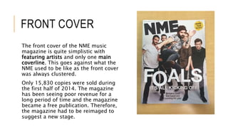
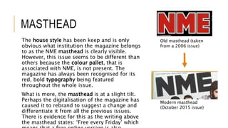
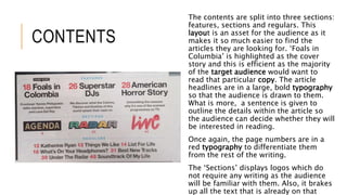
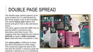
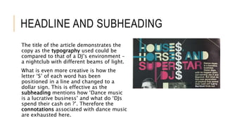
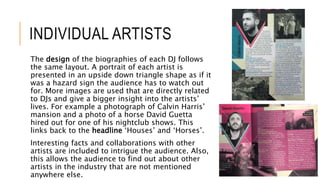
This is a powerpoint analysis of the front cover, contents page and double page spread of the XXL music magazine. However, these pages do not come from the same issue.
What Makes Candle Making The Ultimate Bachelorette CelebrationWick & Pour
The above-discussed factors are the reason behind an increasing number of millennials opting for candle making events to celebrate their bachelorette. If you are in search of any theme for your bachelorette then do opt for a candle making session to make your celebration memorable for everyone involved.
Johnny Depp Long Hair: A Signature Look Through the Yearsgreendigital
Johnny Depp, synonymous with eclectic roles and unparalleled acting prowess. has also been a significant figure in fashion and style. Johnny Depp long hair is a distinctive trademark among the various elements that define his unique persona. This article delves into the evolution, impact. and cultural significance of Johnny Depp long hair. exploring how it has contributed to his iconic status.
Follow us on: Pinterest
Introduction
Johnny Depp is an actor known for his chameleon-like ability to transform into a wide range of characters. from the eccentric Captain Jack Sparrow in "Pirates of the Caribbean" to the introspective Edward Scissorhands. His long hair is one constant throughout his evolving roles and public appearances. Johnny Depp long hair is not a style choice but a significant aspect of his identity. contributing to his allure and mystique. This article explores the journey and significance of Johnny Depp long hair. highlighting how it has become integral to his brand.
The Early Years: A Budding Star with Signature Locks
1980s: The Rise of a Young Heartthrob
Johnny Depp's journey in Hollywood began in the 1980s. with his breakout role in the television series "21 Jump Street." During this time, his hair was short, but it was already clear that Depp had a penchant for unique and edgy styles. By the decade's end, Depp started experimenting with longer hair. setting the stage for a lifelong signature.
1990s: From Heartthrob to Icon
The 1990s were transformative for Johnny Depp his career and personal style. Films like "Edward Scissorhands" (1990) and "Benny & Joon" (1993) saw Depp sporting various hair lengths and styles. But, his long, unkempt hair in "What's Eating Gilbert Grape" (1993) began to draw significant attention. This period marked the beginning of Johnny Depp long hair. which became a defining feature of his image.
The Iconic Roles: Hair as a Character Element
Edward Scissorhands (1990)
In "Edward Scissorhands," Johnny Depp's character had a wild and mane that complemented his ethereal and misunderstood persona. This role showcased how long hair Johnny Depp could enhance a character's depth and mystery.
Captain Jack Sparrow: The Pirate with Flowing Locks
One of Johnny Depp's iconic roles is Captain Jack Sparrow from the "Pirates of the Caribbean" series. Sparrow's long, dreadlocked hair symbolised his rebellious and unpredictable nature. The character's look, complete with beads and trinkets woven into his hair. was a collaboration between Depp and the film's costume designers. This style became iconic and influenced fashion trends and Halloween costumes worldwide.
Other Memorable Characters
Depp's long hair has also been featured in other roles, such as Ichabod Crane in "Sleepy Hollow" (1999). and Roux in "Chocolat" (2000). In these films, his hair added a layer of authenticity and depth to his characters. proving that Johnny Depp with long hair is more than a style—it's a storytelling tool.
Off-Screen Influenc
Is your favorite ring slipping and sliding on your finger? You're not alone. Must Read this Guide on What To Do If Your Ring Is Too Big as shared by the experts of Andrews Jewelers.
La transidentité, un sujet qui fractionne les FrançaisIpsos France
Ipsos, l’une des principales sociétés mondiales d’études de marché dévoile les résultats de son étude Ipsos Global Advisor “Pride 2024”. De ses débuts aux Etats-Unis et désormais dans de très nombreux pays, le mois de juin est traditionnellement consacré aux « Marches des Fiertés » et à des événements festifs autour du concept de Pride. A cette occasion, Ipsos a réalisé une enquête dans vingt-six pays dressant plusieurs constats. Les clivages des opinions entre générations s’accentuent tandis que le soutien à des mesures sociétales et d’inclusion en faveur des LGBT+ notamment transgenres continue de s’effriter.
From Stress to Success How Oakland's Corporate Wellness Programs are Cultivat...Kitchen on Fire
Discover how Oakland's innovative corporate wellness initiatives are transforming workplace culture, nurturing the well-being of employees, and fostering a thriving environment. From comprehensive mental health support to flexible work arrangements and holistic wellness workshops, these programs are empowering individuals to navigate stress effectively, leading to increased productivity, satisfaction, and overall success.
2. FRONT COVER
The front cover of the NME music
magazine is quite simplistic with
featuring artists and only one main
coverline. This goes against what the
NME used to be like as the front cover
was always clustered.
Only 15,830 copies were sold during
the first half of 2014. The magazine
has been seeing poor revenue for a
long period of time and the magazine
became a free publication. Therefore,
the magazine had to be reimaged to
suggest a new stage.
3. MASTHEAD
The house style has been keep and is only
obvious what institution the magazine belongs
to as the NME masthead is clearly visible.
However, this issue seems to be different than
others because the colour pallet, that is
associated with NME, is not present. The
magazine has always been recognised for its
red, bold typography being featured
throughout the whole issue.
What is more, the masthead is at a slight tilt.
Perhaps the digitalisation of the magazine has
caused it to rebrand to suggest a change and
differentiate it from all the previous issues.
There is evidence for this as the writing above
the masthead states: ‘Free every Friday’ which
Old masthead (taken
from a 2006 issue)
Modern masthead
(October 2015 issue)
4. COVERLINE AND MAIN SUBJECTS
The coverline has been adapted so that it seems as if one
of the artists has knocked the letter ‘O’. This is a clever
pun as it is also visual. The subject is kicking and the
coverline says: ‘It’s all kicking off’. This suggests that the
audience has to be looking out for the band as they are
starting something exciting that is worth their attention.
The main subjects are making a direct mode of address
with the target audience. This is because they are looking
face on at the camera. This is effective as the audience
feels like the magazine is more personal to them and they
can relate to the band ‘Foals’.
A sub-coverline has been used to give some detail about
who the subjects are. The tag ‘best’ suggests that the
band are ultimate and no one else is as good as them at
live shows. The direct address of ‘you’ connects with the
5. PUG
A pug is ‘the ear of the magazine’ which
means that it is related to something that has
took place and there is an article of it inside
the magazine. The pug has been situated in
the top-right corner where someone would
expect to find it.
What is creative about it is that the artist’s
hand is directly pointing at the pug. This is
effective as the audience’s attention is drawn
to it which means that they will not miss it.
6. CONTENTS PAGE
The contents page is slightly similar to the front
cover in the way that is uses the same house style
and a monotone colour pallet. However the bright,
red page numbers are in contract to the rest of the
typography on the page. This makes it easier to
find the articles.
The NME logo is still present so that the audience
has no doubt that it in fact is an NME magazine if
they opened the issue on that page.
A main subject is presented in the top-right corner
that is Lady Gaga and it is the biggest image which
suggests it is one of the main articles. A small
description and a page number has been located
alongside her so that the audience can find the
7. FURTHER DETAILS
The ‘Hello’ welcomes the audience to read the
magazine and they are provided with a short
biography of ‘Foals’ – the main subjects on the front
cover. This is effective as it is one of the first articles
the audience is drawn to on the contents page and if
it was not for the page number the audience could
feel disoriented on where they could read about it
more. However, the audience are encouraged to skim
read as the page number is not so obvious as it is
hidden within the text.
The editors name is highlighted in a red typography
to suggest that he is an important key player in the
magazine.
8. CONTENTS
The contents are split into three sections:
features, sections and regulars. This
layout is an asset for the audience as it
makes it so much easier to find the
articles they are looking for. ‘Foals in
Columbia’ is highlighted as the cover
story and this is efficient as the majority
of the target audience would want to
read that particular copy. The article
headlines are in a large, bold typography
so that the audience is drawn to them.
What is more, a sentence is given to
outline the details within the article so
the audience can decide whether they will
be interested in reading.
Once again, the page numbers are in a
red typography to differentiate them
from the rest of the writing.
The ‘Sections’ displays logos which do
not require any writing as the audience
will be familiar with them. Also, it brakes
up all the text that is already on that
9. DOUBLE PAGE SPREAD
The double page spread appears to be
quite modern as it is represented by
the sharp shapes such as the triangles.
The overall house style reflects the
theme and genre that is DJs and dance
music.
This goes against what the NME tries to
portray which is primarily rock,
alternative and indie music. This
suggests that the magazine has tried to
diversify to reach a wider consumer
base especially when circulation is low.
The colour pallet is different to what
has been illustrated on other pages.
This could once again be due to the
fact that the article is trying to grab the
audience’s attention as it is something
10. HEADLINE AND SUBHEADING
The title of the article demonstrates the
copy as the typography used could be
compared to that of a DJ’s environment –
a nightclub with different beams of light.
What is even more creative is how the
letter ‘S’ of each word has been
positioned in a line and changed to a
dollar sign. This is effective as the
subheading mentions how ‘Dance music
is a lucrative business’ and what do ‘DJs
spend their cash on ?’. Therefore the
connotations associated with dance music
are exhausted here.
11. INDIVIDUAL ARTISTS
The design of the biographies of each DJ follows
the same layout. A portrait of each artist is
presented in an upside down triangle shape as if it
was a hazard sign the audience has to watch out
for. More images are used that are directly related
to DJs and give a bigger insight into the artists’
lives. For example a photograph of Calvin Harris’
mansion and a photo of a horse David Guetta
hired out for one of his nightclub shows. This
links back to the headline ‘Houses’ and ‘Horses’.
Interesting facts and collaborations with other
artists are included to intrigue the audience. Also,
this allows the audience to find out about other
artists in the industry that are not mentioned
anywhere else.