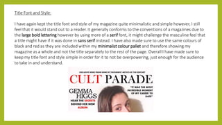
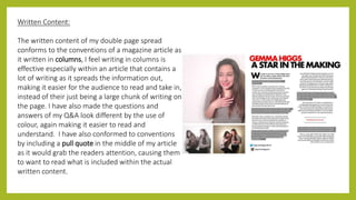
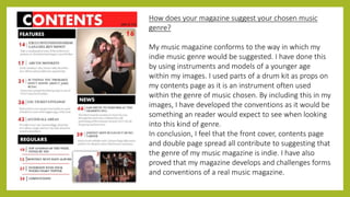
Instructions for Submissions thorugh G- Classroom.pptx
Evaluation 1
1. IN WHATWAYS DOESYOUR MEDIA
PRODUCT USE, DEVELOP OR CHALLENGE
FORMS AND CONVENTIONS OF REAL
MEDIA PRODUCTS?
By Hannah Clark –Year 12 AS Media Studies
2. Title of my magazine:
I feel my masthead conforms to the audience’s
expectations of a music magazine as it’s font and style
links to what I feel a person would expect of an indie
magazine. It is positioned at the top of the page,
meaning it can be seen clearly, it also means that when
it has been distributed onto shelves, the title can be
spotted easily.
In terms of the name of my magazine, I thought of a
name that sounded original and different in comparison
to other music magazines, due to it being of an indie
genre. I feel having a different kind of name would
conform to the generic codes and conventions of a real
magazine, by having such a short and simple name, that
would stand out to a reader.
3. Mise en scene of images:
Firstly, by looking at my magazine’s main, front cover
image we can see that I have kept it very minimalistic
and simple, causing the model to stand out at a first
glance. I have also made sure that the image is bright,
further enhancing the presence and professionalism of
the model. I feel my image challenges the general forms
and conventions of a woman on the front of a magazine.
The reason for this is due to the amount of clothing my
model is wearing as often in music magazines women
are seen as being an object and seen only for the beauty
and bodies. I felt this was important as readers
(especially women) would feel better about the
company focusing less on their bodies and more on
their facial expressions and the magazine’s actual
content.
4. Costume and Props:
For costume and props I am going to be focusing on the larger image
on the top, right hang side of my contents page. The first aspect
noticed about this image is the simplicity of the consumes used on
the models, I have made sure to keep with the same minimalistic
black and while colour scheme that was also on my front cover
image. This was a deliberate choice as it makes the costume look a
lot more modern and up to date, which would be stereotypical of
the music genre of the magazine. By keeping such simple costumes
on my models, I feel my readers would be able to focus more on the
people and content, instead of going crazy on colours and
accessories. This definitely would challenge the general forms and
conventions of a real music magazine as often images of artists focus
too much on what the models are wearing and not enough on actual
content. As far as props in this image go, my models are holding
drumsticks and a cymbal, both being objects that link very well to
music. I have done this to show the readers that although these
models are focused partly on style and costume, music is always
something in which they enjoy and have in common.
5. People:
All of the people I have used in my contents image
appear to be of a younger age, I have done this
deliberately in order to show the reader that this
magazine can appeal to a younger audience, and
therefore my targeted audience. Another concept to
consider when looking at this part of my magazine is
mostly the female dominance in two of the three
images on the page. I feel this challenges the codes and
conventions of a real indie music magazine as
companies tend to include a lot more males when
thinking about this certain genre. I believe that the use
of more females develops the conventions of the
magazine as it means they are playing an equal role with
men, attracting both more male and female readers.
6. Representations of Gender:
When looking at the company of NME’s indie magazines on google images, I found that the dominating gender on
the front covers of a lot of their magazines were male. As soon as I saw this I felt I wanted to challenge these
conventions of the dominant male gender on front covers by having a woman as my model. By equalising both
genders from the very beginning on my product, I feel I could attract a wider audience as readers would appreciate
that women as well as men are involved within the indie music industry.
7. Title Font and Style:
I have again kept the title font and style of my magazine quite minimalistic and simple however, I still
feel that it would stand out to a reader. It generally conforms to the conventions of a magazines due to
the large bold lettering however by using more of a serif font, it might challenge the masculine feel that
a title might have if it was done in sans serif instead. I have also made sure to use the same colours of
black and red as they are included within my minimalist colour pallet and therefore showing my
magazine as a whole and not the title separately to the rest of the page. Overall I have made sure to
keep my title font and style simple in order for it to not be overpowering, just enough for the audience
to take in and understand.
8. Written Content:
The written content of my double page spread
conforms to the conventions of a magazine article as
it written in columns, I feel writing in columns is
effective especially within an article that contains a
lot of writing as it spreads the information out,
making it easier for the audience to read and take in,
instead of their just being a large chunk of writing on
the page. I have also made the questions and
answers of my Q&A look different by the use of
colour, again making it easier to read and
understand. I have also conformed to conventions
by including a pull quote in the middle of my article
as it would grab the readers attention, causing them
to want to read what is included within the actual
written content.
9. How does your magazine suggest your chosen music
genre?
My music magazine conforms to the way in which my
indie music genre would be suggested. I have done this
by using instruments and models of a younger age
within my images. I used parts of a drum kit as props on
my contents page as it is an instrument often used
within the genre of music chosen. By including this in my
images, I have developed the conventions as it would be
something an reader would expect to see when looking
into this kind of genre.
In conclusion, I feel that the front cover, contents page
and double page spread all contribute to suggesting that
the genre of my music magazine is indie. I have also
proved that my magazine develops and challenges forms
and conventions of a real music magazine.