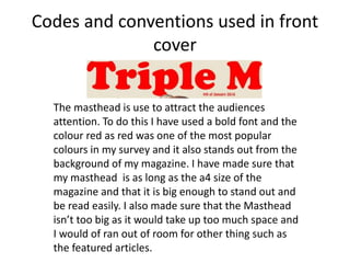
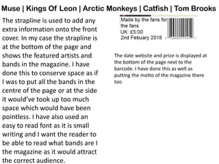
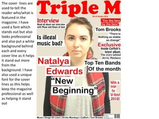
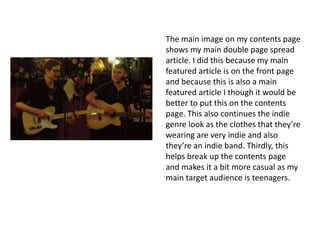
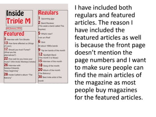
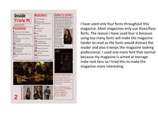
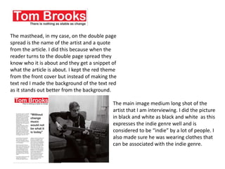
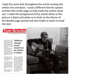
The document discusses codes and conventions used in magazine design. It describes the use of a bold red masthead on the front cover to attract attention, and a strapline at the bottom listing featured artists. On the contents page, the masthead is smaller and a different color/font scheme is used. Featured articles are highlighted to help readers find them. Throughout the magazine, a limited number of fonts are used to keep the design professional and readable while still interesting for the target audience. Images and layouts tie into the indie music genre.