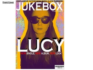
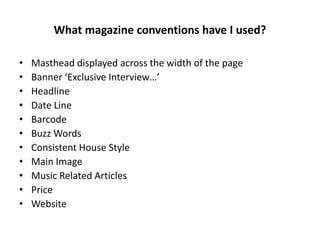
The document summarizes how the author's magazine product represents and conforms to conventions of real music magazines while also trying to challenge some conventions. The summary uses conventions like mastheads, covers, layouts, and content from magazines like NME and Kerrang as references. It also discusses representing various social groups like gender and ages to appeal to different audiences. Overall, the author aims to create a magazine that feels unique but is still recognizable to their target audience of 16-21 year olds interested in indie music.
The document discusses how the media product, a music magazine, represents and conforms to conventions of real music magazines while also trying to be unique.
The summary discusses using conventions like mastheads, house styles, prices, and layouts similarly to magazines like NME and Kerrang. Photos and articles also conform to expectations but try to challenge stereotypes. Representation of various social groups is discussed through inclusion of male and female interviews and photos from music festivals. Overall, the magazine aims to be familiar yet independent for its target 16-21 year old audience.
1. I gained valuable experience with design software like Photoshop, InDesign, and Premiere which allowed me to create a more polished and professional product.
2. Researching real magazines helped me understand conventions and better address my target audience. My preliminary task lacked knowledge of conventions.
3. Receiving feedback improved my skills at representing social groups and addressing gender, age, and other aspects of my target audience more effectively.
The document discusses conventions used in magazine design based on research of other music magazines. It summarizes the key conventions used in the layout and design of magazine covers, contents pages, and double page spreads. These include using a large, bold masthead; dominant central image; sidebar information; consistent layouts and fonts. The document also discusses targeting the audience, distributing the magazine, and using technology like design software to create the magazine pages.
This document describes a music magazine project created by the author using Photoshop and InDesign. It includes details on the magazine's masthead "Spotlight", target audience of teens and young adults interested in pop and R&B music, and contents like an interview with an up-and-coming young artist. The author discusses design elements like fonts, colors, and images used to make the magazine appealing. They also reflect on what they learned from preliminary tasks and audience research to help construct their music magazine.
This document provides an analysis of how the student's media product conforms to and develops conventions of real pop genre magazines. It summarizes how various elements like the masthead, naming, images, costumes, people, title/font style, written content, music suggestions, layout, and contents page follow expectations of the genre through techniques like bright colors and styles, airbrushed models, and column formatting while also challenging some conventions through a less organized interview layout and expanded contents page elements. The analysis considers how stereotypes, target audiences, and readability are addressed across the different sections.
This document analyzes various elements of a magazine created by the author for a school project. It examines how each element, including the masthead, images, costumes, models, title/font, written content, layout, and contents page, conforms to conventions of real pop genre magazines for a young female audience. Minor ways elements were developed include using the title "Inside this mag..." instead of "Contents" and including additional pictures on the contents page. Overall, the magazine closely follows conventions to appeal to its target readership.
The document discusses how the media product uses and challenges conventions of real magazines. It includes a masthead on the left like Kerrang and Q magazines. Images and limited fonts are used to attract audiences and show brand identity. Social media was used to advertise and gather audience feedback. The product represents a younger rock audience through images, articles, and price point. Distribution by Bauer Media Group was chosen for their experience with similar magazines.
The document provides an overview of a pop magazine aimed at teenage girls aged 14-17. It discusses the key elements included on the front cover such as the masthead, cover lines, images, and language used. The front cover is designed to attract the target audience and look professional like real magazines found in stores. Conventions from mainstream music magazines such as bar codes and issue numbers are included.
The document discusses how the media product, a magazine, uses and develops conventions of real pop magazines. It examines the magazine's masthead, front cover image, model, audience, fonts and styles, written content, representation of the pop genre, layout, and contents page. The magazine aims to attract a young female audience by following conventions like using a female cover model and bold, colorful design while also innovating in some ways like having a Halloween theme.
The document discusses the student's media magazine project and how it uses and develops conventions of real music magazines.
The student used conventions like consistent colors, fonts, and model photos to create continuity. Features included a masthead, puffs, cover lines, thumbnails on the contents page, and social media links.
The double page spread continues conventions with a pull quote, column layout for an interview, and drop cap. Comparisons are made to real magazines to show how conventions were developed, such as an exclusive story box and letter from the editor.
The document provides details on the design and layout choices for various elements of an indie music magazine created by the author. Key influences included magazines like Loud and Quiet, Fader, and Dazed. Simplistic fonts and a black and white color scheme were used to conform to indie magazine conventions. Photographs were composed and lit to draw attention to the featured artist. Unconventional elements like tilted frames and layered text were included to make the magazine unique. Overall, the design aims to represent the indie genre through a clean, minimal aesthetic while adding some distinguishing characteristics.
The document discusses various design elements of a magazine front cover and contents page for a pop music magazine, analyzing how they conform to stereotypical conventions of the pop genre. These include using bright colors, catchy titles, airbrushed celebrity images, and columns of easy-to-read text with pull quotes. The target audience is described as young females, so the designs aim to attract this demographic with extravagant fonts, fashionable costumes, and an emphasis on female idols.
The magazine represents teenage girls aged 14-17 who enjoy music. It features interviews and stories that teenage girls can relate to, such as struggles with relationships, to portray a positive image rather than negative stereotypes. The magazine focuses on music, celebrities, festivals, and gossip to align with the interests of its target demographic. Images of female musicians and stories of success from humble beginnings aim to inspire readers.
This document discusses how the author's music magazine uses conventions of real magazines to appeal to its target audience of teenagers and young adults. Some conventions it uses include large central images, catchy headlines and taglines, freebies and competitions to attract readers. The magazine also employs a consistent color scheme and fonts throughout to establish its house style and make it feel more professional. Images of young, relatable bands are featured to represent and engage the target social group.
This document discusses how the media product uses and develops conventions of real music magazines. It describes using conventions like a large central image of a recognizable artist and eye contact to connect with audiences. Color schemes and artists were chosen to suit the target genre and demographic. Some conventions like consistent branding were challenged to add variety and appeal to more readers. Overall, the product develops conventions by researching successful magazines but also challenges some to broaden appeal and entertainment.
This document discusses how the media product uses and develops conventions of real music magazines. It describes using conventions like a large central image of a recognizable artist and eye contact to connect with audiences. Color schemes and artists were chosen to suit the target genre and demographic. Some conventions like consistent branding were challenged to make the magazine more entertaining. Overall, the product develops conventions by tailoring aspects to audiences while also challenging things like house style to prevent things from being too bland.
The document discusses how the media product uses and develops conventions of real music magazines. It summarizes how the cover, layout, images, and content draw from conventions of magazines like Billboard and Q, such as large central images of recognizable artists and bold mastheads. However, it also challenges some conventions, such as using varied color schemes throughout instead of a single house style. The goal is to make the magazine entertaining while still appealing to its target audience within the chart music genre. In conclusion, the media product follows many major music magazine conventions but also innovates in some areas to broaden its appeal and entertainment value.
The media product is a magazine called "Pop'ular" that targets teenage girls aged 9-15. The magazine challenges some conventions by using a slanted font for the title and only featuring female models, but otherwise follows conventions. It uses bright images, interviews pop artists, and discusses fashion to attract its target audience. The layout and content sections like interviews and pull quotes mimic a real music magazine. Overall the magazine develops conventions through its focus on pop music genre and young female audience.
The document describes how the media product, a music magazine called "Pop'ular", uses and develops conventions of real music magazines for its target audience of 9-15 year old females. Some conventions it follows include using bright images, bold colors and fonts, and interviews and articles about pop artists. However, it also challenges some conventions by having a slanted title font, limited photos on the cover, and only featuring female models. The layout, contents page, and focus on the pop genre also aim to develop realistic conventions for this target audience.
The document describes the conventions used in the student's media magazine project. It discusses using a contrasting masterhead with capital and lowercase letters. It includes a pull quote about a TV show. Images on the contents page include page numbers and the front cover. Columns are used to break up text. Double page spreads include a large poster image and columns for text. The target audience is represented as teenage girls through stereotypical images and references to social media and TV. Egmont publishing would be a good fit as they currently only have one teen music magazine. The audience is attracted through pink and purple color scheme, elegant yet readable fonts, and flattering images of girls with natural looks and outfits. The student learned new skills
The document provides details about the design and content of a hip-hop magazine called "BEAT" created by the author for a media evaluation assignment. It summarizes the ways in which the magazine's design and conventions follow or challenge those of real hip-hop magazines. Key aspects discussed include the magazine cover, contents page, double-page spread layout and the representation of the target hip-hop audience aged 16-19. Distribution and potential publisher Bauer Media are also discussed.
Print Project – Music Magazine (Evaluation)Blackburn
The document summarizes the key elements and design choices in a music magazine print project created by the author. The magazine, titled "Beat Zone", targets teenage and young adult audiences interested in dance music. Key elements included a colorful cover featuring the main artist, a simple contents page organized into categories, and a main interview article titled "In the Zone with..." The author made choices to represent the target audience and main artist, such as informal language and images showing the artist's personality, to attract and engage readers.
Print project – music magazine (evaluation)Blackburn
The document describes a print project for a music magazine created by the author. It discusses the conventions used in real music magazines that were followed and challenged in the creation of the magazine. Key conventions included a masthead, prominent images, and a color scheme. The author aimed to portray a new dance artist in a way that represented today's teenagers positively without stereotypes. Through choices of images, layout, language, and content, the author worked to attract their target audience of 16-25 year olds interested in dance music.
The document compares the author's draft and actual front covers for their R&B magazine called "Desire". For the actual cover, the author zoomed in more on the model's face to make her the center of attention. Colors were changed to red, black, and white to appeal to the target audience. More text was added for more information. A barcode and issue number were included to make it seem more like a real magazine. The name "Desire" was chosen to create an association between the magazine and readers.
Media music magazine evalutaion question 1jess_hopee
The document discusses how the media product, a rock magazine called Paranoia, uses and develops conventions of real magazines. [1] It includes conventional elements such as a barcode with price and issue details, a bold title, interviews, color scheme, contents page with images and page numbers, use of models as artists and advertisements, layout of the front cover similar to Uncut magazine, inclusion of extras like an album cover, and advertising of free posters to encourage sales. [2] The document examines how each of these real magazine elements were included and their purpose, such as making the magazine look authentic, stand out, be visually appealing and draw in the target audience. [3]
The document discusses how the media product uses and develops conventions of real magazines. It summarizes how the magazine includes conventional elements such as a bar code with price and issue details, a bold title, interviews, a color scheme, contents page with images and page numbers, photos of people, a professional layout including masthead and images on the cover, extras like an album cover, and advertisements for free posters to encourage purchases. These elements make the magazine look authentic and help engage the target rock music audience.
Media music magazine evalutaion question 1jess_hopee
The document discusses how the media product uses and develops conventions of real magazines. It summarizes how the magazine includes conventional elements such as a bar code with price and issue details, a bold title, interviews, a color scheme, contents page with images and page numbers, photos of people, a professional layout including masthead and images on the cover, extras like an album cover, and advertisements for free posters to encourage purchases. These elements make the magazine look authentic and help engage the target rock music audience.
Evaluation of my own music magazine productionAshleigh Foy
The document provides an evaluation of the student's own music magazine production. It discusses various ways the magazine uses and develops conventions of real music magazines. This includes using a longer word for the masthead to fit the indie genre, positioning the cover model to turn pages, and including typical magazine elements like barcodes and prices. Formats like the contents page and double-page articles are analyzed against magazines like NME. The target audience is identified as women aged 16-23 interested in indie music and style. The student concludes that IPC Media, which distributes NME, would be a suitable institution to publish the magazine due to the similar audience demographics and conventions used.
Evaluation of my music magazine productionAshleigh Foy
This document provides an analysis of the student's music magazine project. It discusses several ways the magazine uses and develops conventions of real music magazines. It describes using "Eclectic" for the masthead to represent different indie music styles. Photos and layout follow conventions like large cover images and placing essential details in the bottom right. Color schemes and fonts were inspired by magazines like NME and Q. Inside pages imitate NME's layout with images, columns, and pull quotes. A double page spread uses a title at the top and 3 column layout like NME. The magazine aims to represent young female musicians and portray the main artist as having interests in photography, art, and fashion to inspire its target audience of women aged 16
Evaluation of my own music magazine productionAshleigh Foy
The document provides an evaluation of the author's own music magazine production. It summarizes the key ways the magazine uses and develops conventions of real music magazines. This includes using a longer masthead word, full page cover images, eye contact directing to the right, medium close-up shots, and color schemes inspired by other magazines. It also discusses representing a target audience of women aged 16-23 by featuring a female artist and portraying her style and interests. Finally, it suggests IPC Media as a potential distributor since they distribute a key inspiration magazine, NME, and have a large female audience.
Evaluation of my own music magazine productionAshleigh Foy
The document provides an evaluation of the author's own music magazine production. It summarizes the key ways the magazine uses and develops conventions of real music magazines. This includes using a longer masthead word, full page cover images, eye contact directing to the right, medium close up shots, and color schemes inspired by other magazines. It also discusses representing a target audience of women aged 16-23 by featuring a female artist and portraying her style and interests. Finally, it suggests IPC Media as a potential distributor since they distribute a magazine that inspired the design conventions, and they engage the target demographic.
Evaluation of my music magazine productionAshleigh Foy
The document provides an evaluation of the author's own music magazine production. It summarizes the key ways the magazine uses and develops conventions of real music magazines. This includes using a longer masthead word, full page cover images, eye contact directing to the right, medium close-up shots, and color schemes inspired by other magazines. It also discusses representing a target audience of women aged 16-23 by featuring a female artist and portraying her style and interests. Finally, it suggests IPC Media as a potential distributor since they distribute a key inspiration magazine, NME, and have a large female audience.
The document discusses how the student's media product uses and challenges conventions of real music magazines. They used continuity of color scheme and branding across the front cover, contents page, and double page spread. Fonts and placements of elements like the masthead and images follow conventions. The student was inspired by magazines like Vibe and XXL, challenging conventions by personalizing elements like the barcode while maintaining similarities. Key conventions like columns, features lists, drop caps, and logos were included to look professional and familiar to audiences.
The document is an evaluation of a music magazine product created by the author. It discusses various design elements of the magazine including the masthead, cover layout, contents page, double page spread, color palette, and target audience. The author aimed to challenge conventions by using multiple small images on the double page spread and descriptive paragraphs in an article. The target audience is teenage girls aged 14-19. The author learned skills in Photoshop and the importance of taking quality source images during the production process.
The document describes a music magazine product created by the author for evaluation. Key details include:
- The masthead and cover design conventions used to attract readers and represent the genre of music magazine.
- Layout of contents page and use of images, boxes, and questions to entice readers.
- Representation of the target audience of teenage girls through cover images and topics.
- Selection of IPC Media as the ideal distributor due to their existing music magazine portfolio.
The document describes a music magazine product created by the author for evaluation. Key details include using a recognizable masthead positioned at the top of the page, including pricing and issue information in the top right corner, and using a dominant cover image similar to other music magazines. The contents page follows a traditional symmetrical layout with article descriptions. The double page spread uses many small collaged images rather than a single large one for variation. The intended audience is teenage girls aged 14-19 interested in various music genres. IPC Media would be a suitable distributor due to their existing music magazine portfolio.
The document discusses how the media product uses and develops conventions of real music magazines. It summarizes how the cover, layout, images, and content draw from conventions of magazines like Billboard and Q, such as large central images of recognizable artists and bold mastheads. However, it also challenges some conventions, such as using varied color schemes throughout instead of a single house style. The goal is to make the magazine entertaining while still appealing to its target audience within the chart music genre. In conclusion, the media product follows many major music magazine conventions but also innovates in some areas to broaden its appeal and entertainment value.
This document analyzes how the author's media product represents various social groups. Regarding gender, the magazine features both women and men in the rock music genre, using female models since only women were available. This appeals to both genders of the target audience. In terms of age, the magazine features teenagers to match the target audience, though the genre typically features older adults; clothing choices aim to make models appear older. As for class, the document does not indicate any specific class representation in the magazine.
My magazine uses many conventional techniques of real magazines, such as including a bar code, title, interview, contents page, color scheme, images of people, layout, extras, and posters. The bar code, title, and color scheme were designed to attract my target audience of rock music fans and make the magazine look authentic. Features like the interview, contents page, and use of models help tell the story of the artists and engage readers. Including extras and free posters with the magazine encourages people to buy it. Overall, the magazine represents my progression from the initial school magazine assignment by applying what I have learned about magazine design conventions to create a more polished and professional final product.
The document discusses ways in which the student's media product uses and challenges conventions of real music magazines. For the masthead, a bold tattoo font is used to make it stand out. The layout follows conventions like columns but the chatty tone challenges conventions. A variety of genres and social groups are represented with diverse images of the artist. The product would likely be distributed by magazine companies like ICP Media, Bauer Media Group or Development Hell Ltd due to its genre mix appealing to their audiences.
- The document evaluates the author's magazine project and how it represents and is targeted towards young females aged 15-21.
- The magazine uses conventions from existing music magazines in its layout, fonts, and images but also challenges conventions in some ways.
- It represents its target audience, young females, through featuring a young female artist who has overcome drug and alcohol addiction, and uses bright, female-oriented colors in its design.
- A company like Conde Nast that publishes magazines for young women, such as Teen Vogue, might distribute the magazine online and in print to reach its target audience.
- The document evaluates the author's magazine project and how it uses and develops conventions of real media products.
- The author aims their magazine at young females aged 15-21 and represents this group through featuring a young female artist who overcame drug addiction as a role model.
- The magazine would be distributed by a company like Conde Nast who publishes magazines targeting young women, and the audience would specifically be females aged 16-21 interested in fashion and popular music.
- The document evaluates the author's magazine project and how it represents and is targeted towards young females aged 15-21.
- The magazine uses conventional layouts, fonts, and imagery found in other music magazines in order to look professional while representing its target audience.
- Images in the magazine aim to portray artists as fun yet serious role models for overcoming issues like drug addiction that young people face.
- The magazine would be well-suited for distribution by Condé Nast Publications, which publishes magazines for similar audiences, both online and in print.
This document analyzes the trailers for several historical and contemporary horror films using various film theories. It summarizes the plots of The Shining and Orphan from 1980 and 2009. It then analyzes the trailers for these films using Todorov's narrative theory and Propp's character theory. The document also summarizes the plots of Carrie, Black Swan, and The Woman in Black and indicates they will be analyzed but does not provide the actual analyses. It concludes with a brief section on the "female gaze".
The document provides information on trailers for several historical and contemporary horror films, including The Shining, Orphan, Carrie, Black Swan, and The Woman in Black. It also analyzes how the trailer for The Shining follows Todorov's narrative theory of equilibrium, disequilibrium, and new equilibrium. Additionally, it examines how the characters in the trailer for Orphan align with Propp's character theory, identifying the mother as the protagonist, a nun as the helper, and Esther as the villain.
The document provides information about the codes and conventions used in magazine front covers. It analyzes a magazine cover featuring the band Arctic Monkeys. Key points include:
- The masthead is located in the top left corner following convention. Red is used to make it stand out against the white background.
- Buzz words like "Exclusive" are used in red to attract attention and target fans of Arctic Monkeys.
- The barcode takes up little space in the bottom right corner, implying the price should not deter readers.
- The main image is of the band in a vintage style looking directly at the camera.
The document provides justifications for why several images were not chosen for the front page of a magazine. It states that images were not included because they lacked clarity, had inappropriate backgrounds where details could not be seen properly, had too much going on and drew attention away from the model, had extreme close-ups that did not suit the magazine's style, and had blurry or unflattering effects. Additional reasons given were that images still showed unwanted details like hair and had a model with her eyes closed, which would not engage the audience.
This document summarizes the codes and conventions used in magazine front covers. It discusses elements like the masthead, main image, date, barcode, buzz words, and color scheme. The masthead is typically in the top left corner. The main image dominates the center of the page. Dates and barcodes provide identifying information. Buzz words are used to attract attention. Color schemes follow conventions to make the magazines eye-catching. The document also provides examples of how different magazines apply these typical design elements.
The document summarizes the codes and conventions used in magazine design. It discusses elements like the masthead, main image, splash, barcode, lure, and date that typically appear on magazine covers and how they follow standard conventions. The color scheme and placement of these elements also adhere to customary magazine formats. Overall, the document outlines the typical structural components of magazines and how they are arranged consistently across publications.
The document summarizes the codes and conventions used in magazine design. It discusses the typical placement of elements like the masthead, date, barcode, and lure and how they follow magazine conventions. Color schemes and buzz words are also discussed as conventions to attract audiences. The main image usually depicts the cover story but in this case shows a non-conventional long shot of Lana Del Rey.
The magazine follows several conventions in its layout and design. The masthead is placed in the top left corner, and uses bright colors like red to attract attention. Buzz words, the main image, splash text and articles, barcode, and "lure" text at the bottom all provide key information about the contents in conventional ways. The date helps readers identify the issue. The color scheme of red, white, and black is eye-catching and conventional for magazines.
The document describes the process of creating a front page for a magazine. It outlines including elements like the masthead, headline, date line, main image in the center, and lure. Photos were taken to have a variety to choose from for the cover. Feedback was received on a first draft. The final version incorporates changes to make it look better, such as using a photo of a worried student and the headline "Worried About Exams?" in the school's blue colors with bright yellow text.
How to Build a Module in Odoo 17 Using the Scaffold MethodCeline George
Odoo provides an option for creating a module by using a single line command. By using this command the user can make a whole structure of a module. It is very easy for a beginner to make a module. There is no need to make each file manually. This slide will show how to create a module using the scaffold method.
it describes the bony anatomy including the femoral head , acetabulum, labrum . also discusses the capsule , ligaments . muscle that act on the hip joint and the range of motion are outlined. factors affecting hip joint stability and weight transmission through the joint are summarized.
This presentation was provided by Steph Pollock of The American Psychological Association’s Journals Program, and Damita Snow, of The American Society of Civil Engineers (ASCE), for the initial session of NISO's 2024 Training Series "DEIA in the Scholarly Landscape." Session One: 'Setting Expectations: a DEIA Primer,' was held June 6, 2024.
বাংলাদেশের অর্থনৈতিক সমীক্ষা ২০২৪ [Bangladesh Economic Review 2024 Bangla.pdf] কম্পিউটার , ট্যাব ও স্মার্ট ফোন ভার্সন সহ সম্পূর্ণ বাংলা ই-বুক বা pdf বই " সুচিপত্র ...বুকমার্ক মেনু 🔖 ও হাইপার লিংক মেনু 📝👆 যুক্ত ..
আমাদের সবার জন্য খুব খুব গুরুত্বপূর্ণ একটি বই ..বিসিএস, ব্যাংক, ইউনিভার্সিটি ভর্তি ও যে কোন প্রতিযোগিতা মূলক পরীক্ষার জন্য এর খুব ইম্পরট্যান্ট একটি বিষয় ...তাছাড়া বাংলাদেশের সাম্প্রতিক যে কোন ডাটা বা তথ্য এই বইতে পাবেন ...
তাই একজন নাগরিক হিসাবে এই তথ্য গুলো আপনার জানা প্রয়োজন ...।
বিসিএস ও ব্যাংক এর লিখিত পরীক্ষা ...+এছাড়া মাধ্যমিক ও উচ্চমাধ্যমিকের স্টুডেন্টদের জন্য অনেক কাজে আসবে ...
The simplified electron and muon model, Oscillating Spacetime: The Foundation...RitikBhardwaj56
Discover the Simplified Electron and Muon Model: A New Wave-Based Approach to Understanding Particles delves into a groundbreaking theory that presents electrons and muons as rotating soliton waves within oscillating spacetime. Geared towards students, researchers, and science buffs, this book breaks down complex ideas into simple explanations. It covers topics such as electron waves, temporal dynamics, and the implications of this model on particle physics. With clear illustrations and easy-to-follow explanations, readers will gain a new outlook on the universe's fundamental nature.
4. In what product ways
does your
media, develop or
challenge forms and
conventions of real
media products?
5. In order to reach my target audience I understand that certain aspects of my
publication need to be of a similar format to other successful magazines reaching
this section of public yet trying to make it both unique and stand out from its rivals. I
am aware that using these already established elements are popular with this
audience. For comparison, I looked at the front cover of NME issues looking at the
style and format these magazines followed. I wanted to follow these conventions so
that my magazine looked as trendy, appealing and professional but I also wanted to
challenge the forms by making the magazine feel more
inviting, personal, standalone and independent Furthermore, I wanted to promote
new bands in the my magazine rather than focusing on the well-known artists.
6. What magazine conventions have I used?
• Masthead displayed across the width of the page
• Banner ‘Exclusive Interview…’
• Headline
• Date Line
• Barcode
• Buzz Words
• Consistent House Style
• Main Image
• Music Related Articles
• Price
• Website
7. Conventions I used from real media products
Masthead
Without doubt the masthead of the front cover needed to be both unique and prominent therefore, I employed
a combination of the font ‘Copperplate Gothic Bold’ with a mixture of black and white I did this to catch the eye
and this fitted the minimalist layout I was looking for. I felt this simplified text was straightforward without being
predictable. In addition to this, I manipulated the writing so that the ‘magazine’ font is stretched out over the
width of the page and the black writing outlines the white writing behind. I used this same style on the contents
page as well as it makes the masthead stand out more as it outlines the text. The masthead conforms to the
audience’s expectations as it is positioned at the top of the page and by doing this it is able to be seen clearly.
This is a crucial effect especially for a new magazine. The masthead also dominates a large amount of the page
which again allows for identification.
Front Cover
Contents Page
Double Page Spread
8. When creating my masthead I researched other magazine companies like NME and Kerrang! I found that normally the
masthead was written in black or white so that it was eye catching. I also noticed that they used capital letters to
catch the readers attention and to make it more memorable.
For my magazine, I decided that using bold capital letters was a good technique, so chose to include this in my
magazine.
House Style
House Style for Kerrang! – Black, White and Yellow
House Style for NME – Black, White and Red
The colours I decided to use for my magazine was black, red and white which are similar to NME’s. I tried to keep this
consistent throughout the magazine. From my feedback “Red and Black text in article-nice touch-reminiscent of work
done on front cover” I could see that by including the colours on the pages it made it look more professional.
9. Price
The price of my magazine is £3.50 as although it is
higher than its competitors, the majority of responses
to my questionnaire stated that they believed this to
be a reasonable price for the type of magazine I am
producing. Also, by charging a higher price it will
create a profit so that I can interview and attract
more well known indie celebrities to appear in the
magazine.
The price for NME is £2.30
The price for Kerrang is £2.20
This conforms against typical magazine prices as you
can see from the data but I think that this will enable
me to be able to market my magazine and make a
bigger profit.
10. Font/Styles
Front Cover:
I noticed that existing music magazines
front covers were bold, distinct and
always had bright eye catching colours
used for their titles. This makes the
magazine more memorable and seen as
a brand therefore; I decided to use this
convention in my own magazine.
When researching different poses, I
came across using a different
background colours for different
images so that it made them stand out
more and appear unique.
The titles were written in white to
highlight them and catch the reader’s
attention. This conforms to what a lot
of other magazines do and so makes
the magazines authentic.
Double Page Spread:
As a unique selling point I decided to use a photo booth style which
I think challenges forms of a magazine as most of them only have
one large photo on the page rather than 16 different little ones. I
acquired my inspiration from looking at Andy Warhol’s ideas which I
researched when looking at different poses.
The title font and style of my magazine is uncomplicated and clear cut. There is no predictable fashionable and curved text often
associated with mainstream music magazines. Yet it still conforms to the conventions of a magazine due to the bold, capital letters used
in the font ‘Copperplate Gothic Bold’. I think that it is important that the magazine does this because it creates a straightforward and
comfortable aurora.
Contents Page: On my contents page, I have used an “ombre” style colour which I think worked really well. I
think that this conforms against usual magazine contents pages and is unique in that I have never seen it done
before.
I outlined the white text at the top of the page with a shadow effect to catch the reader’s attention. The titles
were written in white to highlight them and catch the reader’s attention and this conforms to what a lot of
other magazines do and I feel will appeal to my target audience
11. Mise-en-scene
Throughout my magazine I have tried to use complete contrasts between
the images I have used. The mise-en-scene of the images is simple but
effective. I decided that the picture looked better zoomed in so that it
was a medium close up which is similar to roles which other magazines
have adopted. Looking at my front cover, the lighting used is positioned
directly on the models face which makes it appear that the focus should
be on her solely. I have spoken about why I chose to use a different
colour background here. However, to challenge the rule often followed
by music magazines the model is not pouting or posing provocatively
which is often the case with female artists. In complete contrast the
model is displaying a neutral face and I feel this shows that the model
is proving that her music is important rather than her beauty being the
selling point. I further believe this definitely confronts the usual
conventions.
Again, I am looking at the mise-en-scene of the images of my double page
spread and am keeping it simple using black and white images taken in a
natural light. The model is looking completely normal and individual,
her poses show she is having fun and not afraid to be herself, again this
challenges to the normal conventions of music magazines where
models are mostly photo shopped.
When looking at an NME front cover I saw that they used different colours
to make the main image stand out i.e.. The Rhianna front cover. I
realised that by doing this it makes the magazine still look consistent
and it is still recognisable. This is why I decided to use a different colour
background on my image because I knew that my magazine would still
be recognisable yet it would make the image stand out more.
12. Costumes and Props
All the costumes and props used throughout the magazine are conventional. Both are an important feature because they
explain the images more clearly. Looking at the contents page I have used simple photos that represent what people
would wear and show images of people enjoying their music rather than studio shots. I have done this deliberately so
that my audience can connect with the individuals. My audience will be able to relate to this because it is something
they would enjoy doing. The main image I used was of a featured artist wearing plain black clothes so that she would
stand out and appear more obscure. For her make up, I used a gothic purple lipstick and gave her props like a hat and
dark sunglasses which gives off a cool message associated with this type of music. I thought that it was important to
include this image because this followed the genre used in similar publications and indicate immediately who and
what this publication is for. I wanted the feel to be “a do it yourself” approach often connected with this style of music
and audience. Although not intended females seem to be the highly dominate my publication however, I believe this
is a positive as it is normally male acts that are the main focus of these magazines and so this will not only attract a
greater female audience but will encourage a wide range of people see this as something new and interesting.
At the top of the front page I mentions a male artist interview. This allows the target audience to feel this publication is
relevant to them. However, to conform against stereotype I have used a model of a young girl. This follows the
standard used with most other magazines aimed at this genre.
I gave my model props like a hat and dark sunglasses
which gives off a cool message associated with this
genre of music. I also recognised that other well
known indie celebrities wore these so I tried to look
at their fashion and include it in my magazine.
Harry Styles
Liam Gallagher Nina Nesbitt
Pixie Geldof
YouTuber Zoella
wearing the
same top as the
model
13. Layout
I have used a conventional layout for this magazine; it is simple and easy to read. The layout is organised and relevant
for this type of publication. Similar to the music produced independently I wanted my publication to appear not
to be owned by a large mainstream publisher. Obviously it is a necessity to make this magazine profitable yet at
the same time I wanted to make it feel independent. Therefore, I needed to use different elements, so I have
arranged the conventions by placing the masthead at the top of each page and using headlines and sub headlines.
My subheadings tell the audience what to expect in the magazine without having to flick through the magazine.
This will help increase the audience range because I included information that would appeal to more people. This
conforms to the conventions of other similar magazines. Pages are numbered on the contents page so that the
reader can quickly go to the section that interests them. The appropriate image of a feature in the article used
corresponds well with the headlines and sub headlines. The barcode is placed conventionally at the bottom of the
front page. The magazine is also dated so that the reader knows what edition they are reading. The layout of the
magazine is an important feature because this is what first attracts the reader. The magazine needed to have a
good eye-flow so that it is interesting and attracting for the audience to read.
I think I have made my magazine unique by including Polaroid photo’s on it to make it look more relevant thus
letting the reader feel that this is not a high budget marketing tactic . Also, on the dps, a exclusive aspect is the use
of the photo booth as I believe this is a distinctive idea.
I have conformed to the conventions on the contents page by splitting the page into three columns, making the centre
column enlarged so it emphasises the picture. I think that by setting it out this way it makes the it more clear and
organised and highlights the most important feature of the magazine. I believe this will draw the audience to want
to read further.
This is NME
contents
page; I
adapted the
same
technique
they used
with the
different
subheadings.
The masthead is positioned across the width of
the page like Kerang! Following its conventions.
Contents page layout
14. I researched media conventions using my mood board which contained a mixture of images of artists and eye
catching headlines which made use of different buzz words.
Written Content
The written content in my magazine is essentially conforming to an article in magazines as it uses standard
writing techniques to create a piece of text to sound professional by using columns and an interview. I thought that
by incorporating an interview into the article this would attract audiences who wanted to know more about the
artist. By using columns which are a standard technique in magazines this would allow the audience to be able to
read the article easily. I used a font size of 11 in the same font (copperplate gothic bold) to show contingency
throughout the whole magazine.
15. Music Genre and How Your Magazine Suggests it?
My music magazine conforms to the way in which the music genre is suggested, this is done by
featuring well know indie artists as well as those who are not so well established. Featuring both
appeal to this type of audience. It is about underground and non mainstream music. The suggestion
of the genre of music is also offered by the mention of music festivals and the style of clothes worn in
the photographs. As with the music this trend follows its own individual style. I have looked at other
successful independent magazines such as The NME and Q Magazine.
NME talking about music festivals
I think through props and costumes I have
tried to show the different music genres.
Liam Gallagher, part an
indie band Oasis, seen
wearing a hat like my
models. The hats are well
known for being indie.
16. I’m using the two images above for comparison. First, let’s consider the posture of the two images within the photographs, as you can see they are both
similar. They are both medium close ups and postured standing upright with their body positioned towards the camera to address the audience.
However, the NME page is slightly closer up so it is more in an eye-line shot.
In both pictures both models have similar facial expressions displaying a serious expression to reflect their serious tones.
In the NME image, the artist is doing a gesture with her hands up whereas, in the picture I have taken the model is not doing a gesture. I wanted to do this
because I thought that if she was doing this pose it would take away the focus from her face.
The lighting is similar in the photos as they are both taken against a white screen and they have lighting displayed on their face which highlights it. It
suggests that these photos are intended to attract the audience to focus directly on the face.
The costumes in the images are quite different as in my image the model is more covered up with sunglasses and a hat whereas in the NME image the
model has a low cut top on displaying her tattoos. The hair looks very different on each model as the image on the left is shown to be quite messy and it is
in a ‘beehive’ style which could show that she is not high maintenance. In my image, the hair is left textured and given a messy side covered by a hat.
Common Stereotypes
•Rap music is for urban younger people
•Rock music is for rebellious and violent people
•Metal music is for Satan Worshippers
•Pop music is for teenage girls
•Country music is for hillbillies
•Classical is for upper class middle aged people
•Alternative music is for moody untidy teenagers who want to stay away from mainstream
My magazine tries to conform against stereotypes as I think that stereotypes are unfair judgements of characters and people’s views should not follow
them.
A real front cover VS. my front cover
17. 2. How does your media product represent particular social groups?
In order to represent a wide variety of my target audience I tried to make my magazine represent
different social backgrounds, abilities, race and age groups. In order to maintain this target audience the
publication needs to speak to everyone equally who like the genre of music as this way more people
would be interested in reading the magazine.
Equality
Although it is not intentional, females dominate my magazine which could in turn attract a greater
female readership. While I tried to balance up the ratio of male and female (by advertising a male
interviewee on the front page), I don't foresee this gender gap being a problem as people associated with
this subculture are known to tend to be fairly liberal in their views. I thought that this would be effective
as it would help the reader form a better opinion and more people would be interested to hear the views
from a variety of people.
Price
I incorporated the price on the barcode so that it is easy for people to see and it is a conventional feature
of a magazine. I have decided to price my product at £3.50 as the majority of responses to my
questionnaire stated that they believed that to be a reasonable price for the type of magazine I am
producing. My magazine is reasonably priced which makes the magazine inclusive and will attract more
people to read it.
I think that my magazine represents similar social groups to magazines like NME as the content is fairly
similar for example on the contents page it has different subheadings like ‘News’, ‘Reviews’, ‘Live!’ and
‘New Acts’.
18. Models Clothing
The model is dressed all in black to make it appear like
she is not in a costume. I feel by doing this it relates to
the target audience because she looks down to earth
and casual.
Ray ban Sunglasses – worn by younger celebrities
reflecting a young social group.
Younger celebrities at Festivals
Using pictures from festivals shows
that I am targeting a younger audience
because this normally attracts a
younger group.
19. The social groups that are represented in my media product are people aged between 16-
21 year old. This target audience is normally well known for being ‘heavy spenders’ e.g.
Buying the latest technology on the market and high branded clothes. This generation is
also well known for being online (1 in 4 people have facebook) so this is why I thought it
would effective to display a website on the contents page.
Music is a massive part of most young peoples lives, as often the songs recount situations
they have been in and so it would appeal to them to read more about the artists because it
something they can relate too. The people who are interested in the type of music that the
magazine deals in tend to be very passionate about it, and willing to spend a lot of money
on it.
I tried to use a variety of images that this target audience would be able to communicate
with. My magazine tries to appeal to all ethnicities and genders as I didn’t want to limit my
target market.
20. 3. What kind of media institution might distribute your media
product and why?
The major publishing company that I would be interested in my magazine would be IPC media because they
print magazines like NME.
IPC Media “With more than 60 iconic media brands, IPC creates content for multiple platforms, across
print, online, mobile, tablets and events. We engage with 26 million UK adults - almost two thirds of UK
women and over 40% of UK men. Our award winning portfolio of websites reaches over 25 million global
users every month.”
IPC media has partnerships with leading supermarkets which could widen my target audience and make the
magazine more accessible for my target audience. I feel that this would be a great platform for my magazine
as the company is already well known for its popularity amongst iconic media brands. It engages with 26
million people and its website reached over 25 million global users every month which would be a great
starting place.
My magazine can bring originality and uniqueness to the publishing company because there is not a
magazine like mine already on the market. My magazine is similar to NME whom IPC Media already publish
but as unlike NME, my magazine will look at new artists as well as the well-known artists which I believe is
the unique selling point.
21. 4) Who would be the audience for
your media product?
My target audience is 16-21 year old males and females who are passionate about indie and
alternative music. My research showed me that many people of this age, who enjoy this music also
follow indie fashion, enjoy watching the bands live, attend festivals and usually can play an
instrument. Although it is not intentional, females dominate my magazine which could attract more
females as they pay a bigger role in the magazine.
The type of people who would buy my magazine would be in E NRS Social Grade because the
majority of people aged 16-21 are unemployed students or casual workers. This suggests that
the magazine may be bought for them. The majority of people aged 16-21 are students or do
not have other commitments (families to support, mortgages,etc) and so have more disposable
income to spend on (on products such as my magazine)
My target audience would probably fall into both the explorer and the aspirer category in the
psychographics labels. This is because the target readership tend to research music beyond
that which they're immediately presented with by mainstream radio stations, and often aspire
to present this music to others as a superior alternative. It is also highly likely that the people
reading my magazine enjoy exploring music that they may not otherwise have heard of.
22. 5. How did you attract/address your audience?
To attract my audience, I first tried to understand what they would like in the magazine. I did this by taking a
survey which enabled me to get a clearer idea on their views. When I analysed these results, it allowed me to
cater to my audiences needs more. For example, when asking my audience 'How much would you be willing to
pay for a magazine?' The majority were willing to pay £3.00-£4.99 this allowed me to decide an appropriate
price for my magazine. The survey also helped me to decide what content to put inside the magazine. I asked
'What were people's favourite things to see in magazines?'. The result from this question was interviews, then
new bands followed by event information (gigs), and freebies and exclusives which again gave me a clear
insight and helped me understand the audiences needs. The link to this page is here.
Another way to try to attract my audience was by getting feedback from family and friends at every stage of
the creation process. I asked for positive and negative feedback so that I could make improvements to suit the
audience. I thought this would be effective because at every stage of the process it is consistently trying to suit
the target audience.
Positive
Looks professional-tag line of the magazine draws people in (especially the red ‘New’)
Right to make the actual picture darker-greater contrast makes it more eye-catching
White and red writing easy to read. The black less so.
Negative
Could perhaps have more on it? More of what else is in the magazine to draw people in “Exclusive interview
with Alex Turner” bit seems just randomly placed-need more there Maybe some effect on the singers name to
make it stand out?
23. Front Cover
When making my front cover, I tried to keep the writing to a minimum because I
wanted it to appear catchy and I thought by doing this it would grab the readers
attention as it would make it easier to read. I kept the text simple by making it
outlined and bold to contrast it against the brightly coloured background. I then
used buzz words to try to address the audience and to draw them in.
Contents Page
On my contents page, I have tried to include articles that would appeal to my
audience like including exclusive interviews with well liked artists like Jake Bugg
and Arctic Monkeys. Another way I tried to attract my audience was by using
different subheadings similar to NME as I thought this was a good technique to
use.
DPS
The double page spread tries to attract the audience by using a variety of pictures
to make it more eye-catching. I have included an image of the writer with the
artist to make the article seem more personal and keep up that DIY vibe that I'm
striving for
24. 6. What have you learnt about technologies from the
process of constructing this product?
• Throughout the process of constructing the product I learnt a great deal about the technology and
how vastly they have helped the media institutions. I have learnt many different things like
·Using a Nikon l810 I learnt how to take photos correctly by looking at different camera angles and
considering how the setting and lighting would affect the picture.
Computer Programmers' I used
• Adobe Photoshop: I have acquired new skills throughout the process of Photoshop and I now feel
much more confident with using the programme. Before doing this task I didn’t understand how to
use Photoshop but by watching online tutorials I knew how to move different pictures around the
screen, overlapping different pictures, making backgrounds, retouching pictures, getting rid of red-
eye and how to organise the different layers efficiently. I also learnt about how to use different
lighting and colour saturation to make the picture look different.
• Scanner to scan in paper drafts
• Microsoft PowerPoint and Word to record down or present my ideas
• Internet Explorer - allowed me to access online sites (Blogger and Slide share)
• Creating a blogger account to record the different steps that was involved in creating my magazine
e.g. first draft, mood board
• I used slide share to display my presentation on my blog
25. Looking back at your preliminary task, what do you
feel you have learnt in the progression from it to full
product?Preliminary Task
Final Task
26. When comparing my preliminary task and final task I feel the full product now looks
more professional both visually and within the content; you can clearly see a vast
improvement between the two. This learning process has helped me develop a deeper
understanding of what is required to achieve a better and more popular publication.
These new skills include what is required to attract my specific target audience. This
new knowledge has shown me that different social groups have different interests and
so magazines aimed at one target audience will not necessarily appeal to another. It
has shown me how important it is to reach the market you are trying to attract. I
further understand why and how to attract the audience for my music magazine in
order to reach its maximum potential. In the case of my Music Magazine I needed to
show the reader that this magazine was speaking to them and understood there desire
to stay away from mainstream music. The importance of my Market Research was
paramount to the success of this publication. By listening to feedback taken from my
questionnaire I learnt what was important to my audience e.g. many wanted to see
pictures of their favourite artists playing live and read live reviews. I have forged ahead
with my completed media product with a better understanding of programs such as
photoshop. I have a clear understanding of how to update my blog on a regular basis
and how to upload versions to slide share.