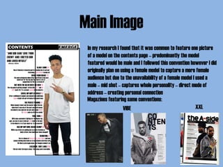
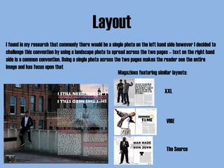
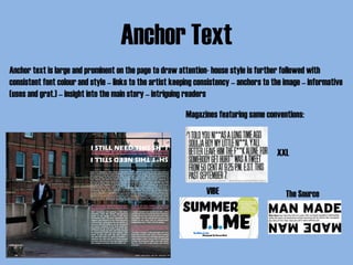
In what ways does your media
production use, develop or challenge
forms and conventions of real media
products?
Evaluation – Question 1
Front Cover
Header
Cover Line
Masthead
FeaturesMain Image
Main Cover Line
Anchor Text
Cover Line
Header
‘Freshest’ & ‘hottest’ – influential text to entice audience –
features current and big artist – sticks to younger target
audience which is more likely to be more up-to-date
Magazines featuring same conventions:
VIBE
XXL
Masthead
Large text which is a simple font and in bold as well as in upper
case – featured in the top quarter of the page with a contrasting
colour to the background – makes it stand out and draw in
readers by catching their eye – prominent display of the brand
Magazines featuring same conventions:
Features
Insight to magazine’s contents – informative (uses and grat.) –
stands out against background with the pink being a key factor
in attracting a female audience – both sides of the page
Magazines featuring same conventions:
VIBE
XXL
Cover Line
Creates questions and in this case creates interaction with
audience – leaves them wanting to find out more
Magazines featuring same conventions:
VIBE
Main Cover Line
No common convention in the magazines I researched for a main
cover line – mine is placed with the anchor text to further create
connection – central to the page – stands out – box shadow –
informs audience (uses and grat.) – attracts audience to see
what the artists is about – ‘hope’ in different colour draws eyes
to the cover line
Magazines featuring similar conventions:
VIBE
Main Image
I used a medium close up and a single person shot – common
conventions – model links to the story – direct mode of address
and eye line shots – connects artist and readers – personal
relationship (uses and grat.) – set behind the masthead – challenges
common conventions – contrasts to the light background to stand
out – white background follows conventions of a neutral colour –
targets both male and females – subject isn’t aggressive or
intimidating – challenges conventions – further targeting both
genders
Magazines with same/similar conventions:
Anchor Text
Features Artist’s name enticing fans/audience – anchors text to
image creating the connection between the model, magazine and
main story – bold upper case text in a contrasting colour to
background box which has shadows – stands out on the page and
also creates a 3 dimensional aspect
Magazines featuring same conventions:
XXL
VIBE
Contents Page
Masthead
Quote
Features & Page Numbers
Issue & Page Number
Main Image
Masthead
Bold and contrasting with the same font as front cover to keep
consistency – simple and easy to read – standing out on a black
background to make it prominent on the page
Magazines featuring same conventions:
VIBE
XXL
Quote
Quote from a recognised artist – female artist to further capture
and conform to female audience – not a convention I found
frequently in my research however I feel it adds character to the
page and is important in further capturing the female audience –
bold and contrasting font to draw attention to it – first thing under
the masthead and eyes are drawn to it
Magazines featuring same conventions:
XXL
Features and Page Numbers
I found that wrapping text around the main image was a common
convention in the magazines which I researched and so complied to
this convention – features are in bold to draw in attention –
big/celebrity names are in italics and pink font – draws attention to
recognisable names and creates consistency with the colour scheme
– both feature titles and page numbers in bold to further draw
attention - questions are integrated into the features to leave
readers wondering and curious to find out more
Magazines featuring same conventions:
VIBE XXL
Issue and Page Number
Recent information – informative (uses and grat.) – allows reader
to keep track of magazine – contrasting colour at bottom of page
to be seen – follows up from placement on front cover – not a very
common convention in all magazines that | researched – challenged
common conventions to bring a more specific and unique feel to the
magazine
Magazines featuring same conventions:
XXL
Main Image
In my research I found that it was common to feature one picture
of a model on the contents page – predominantly the model
featured would be male and I followed this convention however I did
originally plan on using a female model to capture a more female
audience but due to the unavailability of a female model I used a
male – mid shot – captures whole personality – direct mode of
address – creating personal connection
Magazines featuring same conventions:
VIBE XXL
Double Page Spread
Anchor Text
Image
Text
Columns
Issue and Page
Number
Album Promo
Layout
I found in my research that commonly there would be a single photo on the left hand side however I decided to
challenge this convention by using a landscape photo to spread across the two pages – text on the right hand
side is a common convention. Using a single photo across the two pages makes the reader see the entire
image and has focus upon that
Magazines featuring similar layouts:
XXL
VIBE
The Source
Anchor Text
Anchor text is large and prominent on the page to draw attention- house style is further followed with
consistent font colour and style – links to the artist keeping consistency – anchors to the image – informative
(uses and grat.) – insight into the main story – intriguing readers
Magazines featuring same conventions:
VIBE The Source
XXL
Image
The image I used completely goes against common conventions that I have researched. The purpose behind this
is the image itself shows the artist to be very individual and alone which is directly tied into the main story of
the magazine and the background behind the artist himself. I feel this was the best way to create a connection
between the image and actual story. Furthermore, direct mode of address isn’t incorporated in this image to
emphasise the individual nature of the artist and show his lack of connection and to show his only connection
is with music, which is intangible and eye contact cannot be made with it
Text
Text used is consistent with the font type and colour scheme used throughout – continues the house style –
font style is all the same height and a sans serif font is used to make it easier for readers to follow the text
along the line and allow quicker reading with more ease
Magazines featuring same conventions:
VIBE The Source
Columns
I found that there was no typical layout to magazines I researched, it was common to find the text broken up
into different bodies but there was no common consistency with the style. I stuck with breaking the text up
into different bodies – the top text box features a background to the artist – as he is new and ‘up-and-coming’
it provides readers with details about the new artist and makes the feel more connected as they know more
– the rest is broken into two columns of questions with a personal interview with the artist – creating an
exclusive feel to the magazine Magazines featuring similar conventions:
VIBE
XXL
Issue and Page Number
Page numbers – informative – layout and placement is consistent throughout magazine
Magazines featuring same conventions:
XXL
VIBE
Album Promo
This isn’t a common feature in magazine’s I researched and I used this as my final photo for my production –
promoting the album as well as stating it’s availability on iTunes ties in with my target audience as it is
promoted on digital media as opposed to a physical CD to buy in store as my target audience is more likely to
use digital forms of media

Evaluation - Question 1

  • 1.
    In what waysdoes your media production use, develop or challenge forms and conventions of real media products? Evaluation – Question 1
  • 2.
    Front Cover Header Cover Line Masthead FeaturesMainImage Main Cover Line Anchor Text Cover Line
  • 3.
    Header ‘Freshest’ & ‘hottest’– influential text to entice audience – features current and big artist – sticks to younger target audience which is more likely to be more up-to-date Magazines featuring same conventions: VIBE XXL
  • 4.
    Masthead Large text whichis a simple font and in bold as well as in upper case – featured in the top quarter of the page with a contrasting colour to the background – makes it stand out and draw in readers by catching their eye – prominent display of the brand Magazines featuring same conventions:
  • 5.
    Features Insight to magazine’scontents – informative (uses and grat.) – stands out against background with the pink being a key factor in attracting a female audience – both sides of the page Magazines featuring same conventions: VIBE XXL
  • 6.
    Cover Line Creates questionsand in this case creates interaction with audience – leaves them wanting to find out more Magazines featuring same conventions: VIBE
  • 7.
    Main Cover Line Nocommon convention in the magazines I researched for a main cover line – mine is placed with the anchor text to further create connection – central to the page – stands out – box shadow – informs audience (uses and grat.) – attracts audience to see what the artists is about – ‘hope’ in different colour draws eyes to the cover line Magazines featuring similar conventions: VIBE
  • 8.
    Main Image I useda medium close up and a single person shot – common conventions – model links to the story – direct mode of address and eye line shots – connects artist and readers – personal relationship (uses and grat.) – set behind the masthead – challenges common conventions – contrasts to the light background to stand out – white background follows conventions of a neutral colour – targets both male and females – subject isn’t aggressive or intimidating – challenges conventions – further targeting both genders Magazines with same/similar conventions:
  • 9.
    Anchor Text Features Artist’sname enticing fans/audience – anchors text to image creating the connection between the model, magazine and main story – bold upper case text in a contrasting colour to background box which has shadows – stands out on the page and also creates a 3 dimensional aspect Magazines featuring same conventions: XXL VIBE
  • 10.
    Contents Page Masthead Quote Features &Page Numbers Issue & Page Number Main Image
  • 11.
    Masthead Bold and contrastingwith the same font as front cover to keep consistency – simple and easy to read – standing out on a black background to make it prominent on the page Magazines featuring same conventions: VIBE XXL
  • 12.
    Quote Quote from arecognised artist – female artist to further capture and conform to female audience – not a convention I found frequently in my research however I feel it adds character to the page and is important in further capturing the female audience – bold and contrasting font to draw attention to it – first thing under the masthead and eyes are drawn to it Magazines featuring same conventions: XXL
  • 13.
    Features and PageNumbers I found that wrapping text around the main image was a common convention in the magazines which I researched and so complied to this convention – features are in bold to draw in attention – big/celebrity names are in italics and pink font – draws attention to recognisable names and creates consistency with the colour scheme – both feature titles and page numbers in bold to further draw attention - questions are integrated into the features to leave readers wondering and curious to find out more Magazines featuring same conventions: VIBE XXL
  • 14.
    Issue and PageNumber Recent information – informative (uses and grat.) – allows reader to keep track of magazine – contrasting colour at bottom of page to be seen – follows up from placement on front cover – not a very common convention in all magazines that | researched – challenged common conventions to bring a more specific and unique feel to the magazine Magazines featuring same conventions: XXL
  • 15.
    Main Image In myresearch I found that it was common to feature one picture of a model on the contents page – predominantly the model featured would be male and I followed this convention however I did originally plan on using a female model to capture a more female audience but due to the unavailability of a female model I used a male – mid shot – captures whole personality – direct mode of address – creating personal connection Magazines featuring same conventions: VIBE XXL
  • 16.
    Double Page Spread AnchorText Image Text Columns Issue and Page Number Album Promo
  • 17.
    Layout I found inmy research that commonly there would be a single photo on the left hand side however I decided to challenge this convention by using a landscape photo to spread across the two pages – text on the right hand side is a common convention. Using a single photo across the two pages makes the reader see the entire image and has focus upon that Magazines featuring similar layouts: XXL VIBE The Source
  • 18.
    Anchor Text Anchor textis large and prominent on the page to draw attention- house style is further followed with consistent font colour and style – links to the artist keeping consistency – anchors to the image – informative (uses and grat.) – insight into the main story – intriguing readers Magazines featuring same conventions: VIBE The Source XXL
  • 19.
    Image The image Iused completely goes against common conventions that I have researched. The purpose behind this is the image itself shows the artist to be very individual and alone which is directly tied into the main story of the magazine and the background behind the artist himself. I feel this was the best way to create a connection between the image and actual story. Furthermore, direct mode of address isn’t incorporated in this image to emphasise the individual nature of the artist and show his lack of connection and to show his only connection is with music, which is intangible and eye contact cannot be made with it
  • 20.
    Text Text used isconsistent with the font type and colour scheme used throughout – continues the house style – font style is all the same height and a sans serif font is used to make it easier for readers to follow the text along the line and allow quicker reading with more ease Magazines featuring same conventions: VIBE The Source
  • 21.
    Columns I found thatthere was no typical layout to magazines I researched, it was common to find the text broken up into different bodies but there was no common consistency with the style. I stuck with breaking the text up into different bodies – the top text box features a background to the artist – as he is new and ‘up-and-coming’ it provides readers with details about the new artist and makes the feel more connected as they know more – the rest is broken into two columns of questions with a personal interview with the artist – creating an exclusive feel to the magazine Magazines featuring similar conventions: VIBE XXL
  • 22.
    Issue and PageNumber Page numbers – informative – layout and placement is consistent throughout magazine Magazines featuring same conventions: XXL VIBE
  • 23.
    Album Promo This isn’ta common feature in magazine’s I researched and I used this as my final photo for my production – promoting the album as well as stating it’s availability on iTunes ties in with my target audience as it is promoted on digital media as opposed to a physical CD to buy in store as my target audience is more likely to use digital forms of media