Download as PDF, PPTX


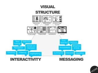


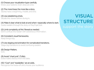


The document provides guidance on principles of visual storytelling with data through informative analysis, personalization, social sharing, and storytelling. It discusses choosing appropriate visualization types, using establishing shots to situate viewers, highlighting important parts of graphics, restricting interactivity, and weaving text and graphics together to tell a story. The principles are aimed at guiding readers through a narrative and engaging them with interactive data visualizations.