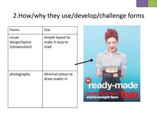
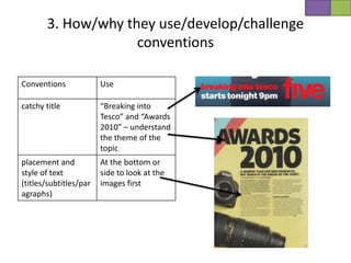
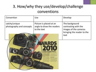
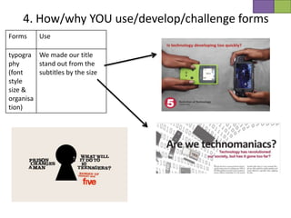
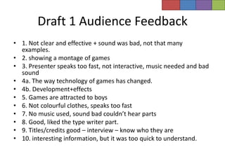
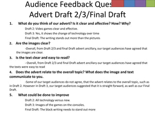
1. In what ways does your media product use,
 develop or challenge forms and conventions
           of real media products?
Newspaper adverts
Double page spreads
2.How/why they use/develop/challenge forms

Forms                                         Use

typography (font style size & organisation)   One or three colours
                                              Different size font to show
                                              priority
2.How/why they use/develop/challenge forms
Forms           Use
visual          Simple layout to
design/layout   make it easy to
(composition)   read


photography     Minimal colour to
                draw reader in
3. How/why they use/develop/challenge
                    conventions

Conventions             Use

catchy title            “Breaking into
                        Tesco” and “Awards
                        2010” – understand
                        the theme of the
                        topic
placement and           At the bottom or
style of text           side to look at the
(titles/subtitles/par   images first
agraphs)
3. How/why they use/develop/challenge
                   conventions
Convention                 Use                         Develop

catchy/unique              Picture is placed at an     The background
photography and concepts   angle to draw the readers   contrasting with the
                           to the text                 images of the cameras
                                                       bringing the reader to the
                                                       text
4. How/why YOU use/develop/challenge forms
Forms     Use

typogra We made our title
phy      stand out from the
(font    subtitles by the size
style
size &
organisa
tion)
Forms           Develop
visual          Layout of images
design/layout   communicate the
(composition)   theme of evolution


photography     Bold colours to
                draw reader in
5.How/why YOU use/develop/challenge
                  conventions
Conventions    Use                                   Develop

catchy title    Used a simple title for the advert   We developed the titles in
               that reveals the topic                the double page spread by
                                                     creating a word which
                                                     relates to the subject of
                                                     technology
5.How/why YOU use/develop/challenge conventions


Conventions       Develop

catchy/unique     • Developed
photography and     photography by
concepts            placing the
                    images so that
                    they
                    communicate an
                    evolution of
                    technology
                  • Developed the
                    advert by having
                    the images
                    coming out from
                    the sides rather
                    than the middle
Conventions                     Develop

placement and style of text     • We used the channel 5 font in both the advert
(titles/subtitles/paragraphs)     and double page spread to be consistent
                                • In both the double page spread and advert we
                                  also used red which is the colour of the channel
                                  5 logo
4. How/why YOU use/develop/challenge forms
Forms                  Use              Challenge          Develop

visual design/layout                                       Challenged channel
(composition)                                              5 adverts by having
                                                           a caption

photography


typography (font
style size &
organisation)


a. COMPARE SIMILARITIES & DIFFERENCES (of forms) TO REAL DOUBLE PAGE
SPREADS/ADVERTS
5.How/why YOU use/develop/challenge
                   conventions
Forms                   Use            Challenge           Develop

catchy title


catchy/unique
photography and
concepts

placement and
style of text
(titles/subtitles/par
agraphs)


A. COMPARE SIMILARITIES & DIFFERENCES (of conventions) TO REAL DOUBLE PAGE
SPREADS/ADVERTS
Draft 1 Audience Feedback
• 1. Not clear and effective + sound was bad, not that many
  examples.
• 2. showing a montage of games
• 3. Presenter speaks too fast, not interactive, music needed and bad
  sound
• 4a. The way technology of games has changed.
• 4b. Development+effects
• 5. Games are attracted to boys
• 6. Not colourful clothes, speaks too fast
• 7. No music used, sound bad couldn’t hear parts
• 8. Good, liked the type writer part.
• 9. Titles/credits good – interview – know who they are
• 10. interesting information, but it was too quick to understand.
Audience Feedback Questions
             Advert Draft 2/3/Final Draft
1.    What do you think of our advert? Is it clear and affective? How? Why?
            Draft 2: Video games clear and effective.
            Draft 3: Yes, it shows the change of technology over time
            Final Draft: The writing stands out more than the pictures
2.   Are the images clear?
           -Overall, from Draft 2/3 and final Draft advert ancillary, our target audiences have agreed that
     the images are clear.
3.   Is the text clear and easy to read?
            - Overall, from Draft 2/3 and final Draft advert ancillary our target audiences have agreed that
the texts were easy to read
4. Does the advert relate to the overall topic? What does the image and text
communicate to you.
             -Some of our target audiences do not agree, that the advert relates to the overall topic, such as
in Draft 2. However in Draft 3, our target audiences suggested that it is straight forward, as well as our Final
Draft.
5.    What could be done to improve
            Draft 2: All technology versus new.
            Draft 3: Images of the games on the consoles.
            Final Draft: The black writing needs to stand out more
Audience Feedback Questions
     Double Page Spread -Draft 2/3/Final Draft
1.    What do you think of our double page spread. How and why is it effective?
          Draft 2: Not really
          Draft 3: Good range of old and new technology, it is creative and rhetorical
          Final Draft: Effective images, relate to topic, stands out.
2.    Is the layout of the images and text clear?
           Overall, from Draft 2/3 and final Draft double page spread ancillary, our target
     audiences have agreed that the images and text were clear.
3.    Are the sizes of the images and text appropriate.
           Our target audiences have agreed that they were appropriate sizes.
4.    Is the text easy to read?
           Our target audiences have agreed that they were easy to read.
5.    Does the double page spread relate to the overall topic of technology. How?
          Our target audiences have agreed that our double page spread relates to our topic,
          through the use of images, such as the binary codes and the difference types of
          technology platforms that we have shown as examples.
6.    What could be done to improve.
          Draft 2: Better images to communicate evolution
          Draft 3: Font change to communicate technology
          Final Draft: Nothing, it was good.

Ancillaries inspirations

  • 1.
    1. In whatways does your media product use, develop or challenge forms and conventions of real media products?
  • 2.
  • 3.
  • 4.
    2.How/why they use/develop/challengeforms Forms Use typography (font style size & organisation) One or three colours Different size font to show priority
  • 5.
    2.How/why they use/develop/challengeforms Forms Use visual Simple layout to design/layout make it easy to (composition) read photography Minimal colour to draw reader in
  • 6.
    3. How/why theyuse/develop/challenge conventions Conventions Use catchy title “Breaking into Tesco” and “Awards 2010” – understand the theme of the topic placement and At the bottom or style of text side to look at the (titles/subtitles/par images first agraphs)
  • 7.
    3. How/why theyuse/develop/challenge conventions Convention Use Develop catchy/unique Picture is placed at an The background photography and concepts angle to draw the readers contrasting with the to the text images of the cameras bringing the reader to the text
  • 8.
    4. How/why YOUuse/develop/challenge forms Forms Use typogra We made our title phy stand out from the (font subtitles by the size style size & organisa tion)
  • 9.
    Forms Develop visual Layout of images design/layout communicate the (composition) theme of evolution photography Bold colours to draw reader in
  • 10.
    5.How/why YOU use/develop/challenge conventions Conventions Use Develop catchy title Used a simple title for the advert We developed the titles in that reveals the topic the double page spread by creating a word which relates to the subject of technology
  • 11.
    5.How/why YOU use/develop/challengeconventions Conventions Develop catchy/unique • Developed photography and photography by concepts placing the images so that they communicate an evolution of technology • Developed the advert by having the images coming out from the sides rather than the middle
  • 12.
    Conventions Develop placement and style of text • We used the channel 5 font in both the advert (titles/subtitles/paragraphs) and double page spread to be consistent • In both the double page spread and advert we also used red which is the colour of the channel 5 logo
  • 13.
    4. How/why YOUuse/develop/challenge forms Forms Use Challenge Develop visual design/layout Challenged channel (composition) 5 adverts by having a caption photography typography (font style size & organisation) a. COMPARE SIMILARITIES & DIFFERENCES (of forms) TO REAL DOUBLE PAGE SPREADS/ADVERTS
  • 14.
    5.How/why YOU use/develop/challenge conventions Forms Use Challenge Develop catchy title catchy/unique photography and concepts placement and style of text (titles/subtitles/par agraphs) A. COMPARE SIMILARITIES & DIFFERENCES (of conventions) TO REAL DOUBLE PAGE SPREADS/ADVERTS
  • 15.
    Draft 1 AudienceFeedback • 1. Not clear and effective + sound was bad, not that many examples. • 2. showing a montage of games • 3. Presenter speaks too fast, not interactive, music needed and bad sound • 4a. The way technology of games has changed. • 4b. Development+effects • 5. Games are attracted to boys • 6. Not colourful clothes, speaks too fast • 7. No music used, sound bad couldn’t hear parts • 8. Good, liked the type writer part. • 9. Titles/credits good – interview – know who they are • 10. interesting information, but it was too quick to understand.
  • 16.
    Audience Feedback Questions Advert Draft 2/3/Final Draft 1. What do you think of our advert? Is it clear and affective? How? Why? Draft 2: Video games clear and effective. Draft 3: Yes, it shows the change of technology over time Final Draft: The writing stands out more than the pictures 2. Are the images clear? -Overall, from Draft 2/3 and final Draft advert ancillary, our target audiences have agreed that the images are clear. 3. Is the text clear and easy to read? - Overall, from Draft 2/3 and final Draft advert ancillary our target audiences have agreed that the texts were easy to read 4. Does the advert relate to the overall topic? What does the image and text communicate to you. -Some of our target audiences do not agree, that the advert relates to the overall topic, such as in Draft 2. However in Draft 3, our target audiences suggested that it is straight forward, as well as our Final Draft. 5. What could be done to improve Draft 2: All technology versus new. Draft 3: Images of the games on the consoles. Final Draft: The black writing needs to stand out more
  • 17.
    Audience Feedback Questions Double Page Spread -Draft 2/3/Final Draft 1. What do you think of our double page spread. How and why is it effective? Draft 2: Not really Draft 3: Good range of old and new technology, it is creative and rhetorical Final Draft: Effective images, relate to topic, stands out. 2. Is the layout of the images and text clear? Overall, from Draft 2/3 and final Draft double page spread ancillary, our target audiences have agreed that the images and text were clear. 3. Are the sizes of the images and text appropriate. Our target audiences have agreed that they were appropriate sizes. 4. Is the text easy to read? Our target audiences have agreed that they were easy to read. 5. Does the double page spread relate to the overall topic of technology. How? Our target audiences have agreed that our double page spread relates to our topic, through the use of images, such as the binary codes and the difference types of technology platforms that we have shown as examples. 6. What could be done to improve. Draft 2: Better images to communicate evolution Draft 3: Font change to communicate technology Final Draft: Nothing, it was good.