16. 16
12/21/2012 Inspiration
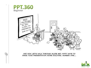
img
title
Sample Footer Text Here
text
text
img img img img
img img
img img img img
text
text
text
img img img
text
text
text
26. 26
Step 2:
Your color palette
2
DESIGN TOOL BOX
27. 27
Step 3:
italics = motion
bold = important
caps = SHOUTING!
underline = foundation
curly fonts = delicate
small size = timid
big size = power
2
DESIGN TOOL BOX
28. 28
Do I Need to fill up the
whole space with a lot of
words and stuff so I get all
the information on the page
and then people will
understand everything I am
trying to tell them…?
3
WHITE SPACE
55. 55 Finally,
Thank you for coming.
WORKING TO GET YOU WHAT YOU WANT.
More to come…
56. 56
12/21/2012 Free Images:
Morguefiles.com
Sample Footer Text Here
Flickr.com/CreativeCommons
Imageafter.com
Sxc.hu
Everystockphoto.com
Editor's Notes
So much out there, we are just giving you a tasteWe are always here for consultancy, as a resource to youMore training is on its way, we plan on doing a new topic once/qtr (repeats depending on demand)
New Horizons gave you the ‘How’, now we’ll give you the ‘Why’You now know how to use PPT, lets use it for our benefit nowEvery choice, whether it be size, shape, font, etc means somethingUse your gut, its better than you think We all have it, u don’t need to be an artist or anything to do so, born with it
So, basic question – what is design?How does design impact your powerpointWhy are design principles important in ppt Easier on the eyes – simpler to understand, easier to sell Imparts value More appealing Consideration - - value your audience
A way to organizing and communicating informationNOT, icing on the cake.You don’t just add the finishing touches at the endIts part of the process from the beginningA way for you to control the absorption of knowledgeThe in take of information is lead by the way you use design in your slidesIn design, there are many solutions. It’s always subjective to what you are trying to communicateEvery time u use the same slide, it maybe trying to communicate something different, so you should adjust when possible
Each has a 30 min demo followed by 15 mins to try and 15 mins to ask questionsAsk questions throughoutIf you get stuck with the how – ask NH repIf you get stuck with the why – ask bl!kWe are here for you, USE us!
Method of story telling3 things
Method of story telling
You should have your own version of 5 slides you will be creating
This may seem intimidating, but all it takes is some upfront thinking to get you here faster. Let’s dive into some techniques on how to go from the givens to the final communication
Its just the way you arrange the information on the slideInformation is everything from your text, to your images, charts…Whatever is going on the slide countsJust like anything else…you have to set it up before you play…
We are gonna go thru a few things in this sectionHow to draft basic layout – how do I place text, images or other elements on a slide the best wayWhat it means to build a true themeSetting up that layout within PPT
Napkins, paper, postits, whiteboards, leaves, desks, sand, your arm..ALL acceptable. But GET AWAY from the comHere is an easy tip. Open up ppt, make 3 empty slides, print – notes, 3 per slideGive you a place to sketch and write copy – trust me, this helps.puter
What do you want your audience to get in…3 seconds - If they just take a glance – or CEO level3 minutes - If they stop to read the impt parts – what do you want them to understand? – for your general client3 hours - If they need the details or come to revisit the information
Demo live a few ways to move around text, etc on the same slide for different effectMagazine pages – the way its laid out
A thematic structure can help you create an easy flow for your audience to followIt can also be used for dramatic effect. If you change the structure, extra emphasis becomes placed on itThemes offer you and your audience – 2 things – Ease and Control
Channel your inner six year old – we get to play with blocks! Use them as place holdersThis will help you stay focused on text size, length and types of images/placementIt will dictate what is read firstRemember, this is all within your control!
View > Grid linesU can pull it up or make your ownUse consistent alignment, good practiceCtrl for small shifts
Make sure you ask questions, don’t be shyLike everything else in life…a little practice goes a long way. You need to do it a few times so your mind adjusts to seeing information in a new waySoon you’ll be able to do it quickly on the fly, spend the time now.
You have to pick and choose what will be at the forefront of your communication and use visual cues to help your audience get the point quickly
So what is in your design tool box?Size, color, shape, space, font, reflections, shadows, etcIts important that you know ‘why’ you are using it and what it meansThis is part of your communication strategy, don’t use what doesn’t fit
The rule of 3 applies here as well. Think about what will be communicated at each time frame
Why go to grey?If you start with neutrals it will help you identify what is truly necessary to communicateUsing neutrals will help you kill the bias around what looks pretty vs. what is necessaryI usually go to the slide master and grey everything out, so I can pick and choose
A simple palette is grey, accent color, black and light colorIf you do NOTHING else..this alone is a good first step to make sure it is easier to read your pptsNow, choose the key works to deliver your message and highlightDemo a few examples – what is key and what is not
Now that you have the first 2 simple steps, lets use the rest of our arsenalEach thing has a communication that it expresses show a few examples
Common misperception - - my dad always said, if you are given a full page to write, you should fill it up. I disagreeEspecially in the case of PPT. People stop before they even give u a chance
Common misperception - - my dad always said, if you are given a full page to write, you should fill it up. I disagreeEspecially in the case of PPT. People stop before they even give u a chance
Imagine that 1 powerpoint slide is worth 100 pointsThe more items you put on this powerpoint slide, more spread the points are
They share the points
Use space and your tool box to your advantageAlways trying to emphasis, so the main shouldn’t be equal to the restScript has already laid out the main pointIts the same thing that we see in the world of media and market place clutterThe more that you have out there competing for the lime light, the more diluted your message becomesIs your key communication getting its fair share of voice?Better to keep it to less, so the communication comes out clean
Aight, give it a shot and ask some questionsTry multiple versionExpand the possibilitiesThere are many right answersWhat works for your core communicationWhat works for your presentation style?Here are my examples
Special effects definitely garner buzz and excitement by the audience, but can also evoke a feeling of excess and gimmickIts important that you understand WHY you are using itAnd make sure it communicates something important
Demonstrate a feeling when using transitions3 types of basic transitions3 uses for animation when demoing process
Shows ease, blend, transition
Shows ease, blend, transition
Shows movement, traveling, panning, advancement
Shows movement, traveling, panning, advancement
Shows change, something new, morphing
Shows change, something new, morphing
3D, shadow, reflection, bevel, gradients, quick fxAgain use it to help draw the eye to it. Make sure it has a purpose.Helps to give a feeling of depth
When u have multiple levels, u can show depth and perspectiveShow priority/importance (reflection, shadowsCall attention (gradients, shadows)
Try out animation stylesYou don’t have to do them now in ppt, but think conceptuallyWhat COULD you do?Check your visual flow, step back and see if it really communicates what you wantHere are my examples
So we’ve gone over 3 fundamental areas in the Visual story that can immediately improve your PPT skillsBasic Layout – to help your audience follow you and find your key communication quicklyEmphasis – Techniques to call out your key communication pointsSpecial Effects – To help add some emotion and dynamic elements to help illustrate your key communication
30 mins to mess around with the three areas we discussed. Take the few slides that you have and build a deck with your own personal flair, making sure you stay true to your objectives and key communications. We are here to walk around and help you out if you have problems. If you can’t find a button – NHIf you can’t figure out design – bl!k
We ask that you take what you have and upload it to our Slideshare channel. www.slideshare.netUsername: blikPassword: mindshareblikWe are going to use this as a central place to share good ppts. This is our first step to take advantage of all the talent we have here.
Finally, we are working hard to get you guys what you want. We really believe in what we are doing and can only succeed with you help. So, thank you for coming, we hope it was helpful. Fill out the feedback forms, this class was born from reading those forms…And lastly…tell your friends, spread the word. Bl!k is da bomb!Thanks!!