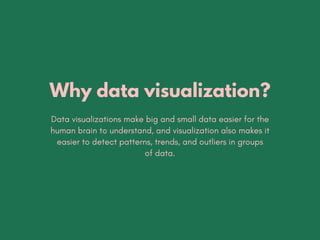
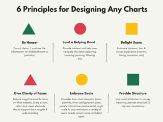
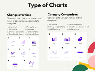
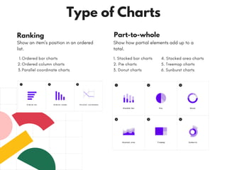
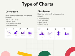
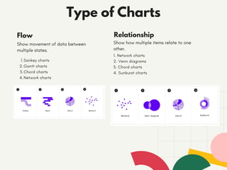
2. Why data visualization?
Data visualizations make big and small data easier for the
human brain to understand, and visualization also makes it
easier to detect patterns, trends, and outliers in groups
of data.
3. Embrace Scale
Consider how chart elements (color
palettes, filter configuration, axes,
panels, interactive mechanisms) might
scale to accommodate a variety of
users’ needs, screen sizes, and data
types.
Provide Structure
Use visual attributes to convey
hierarchy, provide structure, &
improve consistency
Give Clarity of Focus
Reduce cognitive load & focus
on what matters. Every action,
color, and visual elements
should support data insights &
understanding.
6 Principles for Designing Any Charts
Lend a Helping Hand
Provide context and help user
navigate the data (selecting,
zooming, panning, filtering,
etc)
Delight Users
Embrace dynamic, fast &
clever experience (motion,
timing, transition, etc)
Be Honest
Do not distort / confuse the
information for embellishment or
partiality
4. Line charts
Bar charts
Stacked bar charts
Candlestick charts
1.
2.
3.
4.
Change over time
Show data over a period of time such as
trends or comparisons across multiple
categories
Type of Charts
Category Comparison
Compare data between multiple distinct
categories.
5.Area charts
6.Timelines
7.Horizon charts
8.Waterfall charts
1. Bar charts
2. Grouped bar charts
3. Bubble charts
4. Multi-line charts
5. Parallel coordinate charts
6. Bullet charts
5. Ordered bar charts
Ordered column charts
Parallel coordinate charts
1.
2.
3.
Ranking
Show an item’s position in an ordered
list.
Type of Charts
Part-to-whole
Show how partial elements add up to a
total.
1. Stacked bar charts
2. Pie charts
3. Donut charts
4. Stacked area charts
5. Treemap charts
6. Sunburst charts
6. Scatterplot charts
Bubble charts
Column and line charts
Heatmap charts
1.
2.
3.
4.
Correlation
Show correlation between two or more
variables.
Type of Charts
Distribution
Show how often each values occur in a
dataset.
1. Histogram charts
2. Box plot charts
3. Violin charts
4. Density charts
7. Sankey charts
Gantt charts
Chord charts
Network charts
1.
2.
3.
4.
Flow
Show movement of data between
multiple states.
Type of Charts
Relationship
Show how multiple items relate to one
other.
1. Network charts
2. Venn diagrams
3. Chord charts
4. Sunburst charts
8. Gestalt Principles of
Visual Perception
When it comes to identifying which elements in our visuals are signal (the
information we want to communicate) and which might be noise (clutter),
consider using this principles.
9. We tend to think of objects that are physically close
together as belonging to part of a group
Proximity
Objects that are of similar color, shape, size, or
orientation are perceived as related or belonging to part
of a group
Similarity
We think of objects that are physically enclosed together
as belonging to part of a group.
Enclosure
People like things to be simple and to fit in the
constructs that already in their head. People tend to
perceive a set of individual elements as a single,
recognizable shape when they can-when parts of a
whole are missing, our eyes fill in the gap.
Closure