Downloaded 1,001 times
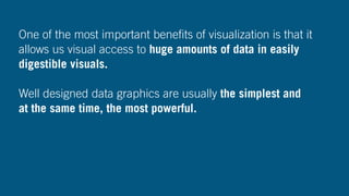


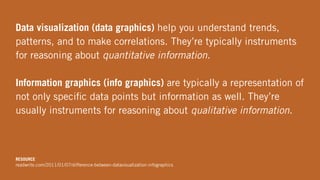


Data visualization is crucial for understanding and analyzing vast amounts of data generated by the increasing complexity of big data. It enables users to easily digest and interpret data through well-designed visuals, differentiating between data visualization and information graphics, each serving unique purposes. Moreover, it plays a significant role in professional contexts, aiding in trend identification and fostering a data-driven culture.


![제 23회 보아즈(BOAZ) 빅데이터 컨퍼런스 - [MBOAX] : ABSA를 활용한 소비자 반응 분석 기반 운영 효율화 대시보드 설계](https://cdn.slidesharecdn.com/ss_thumbnails/3-1boaz23rdconferencemboax-260203102709-9d519923-thumbnail.jpg?width=640&height=640&fit=bounds)


