Download as PDF, PPTX


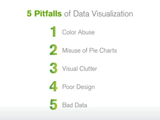


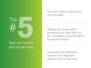


The document outlines five common pitfalls in data visualization: color abuse, misuse of pie charts, visual clutter, poor design, and bad data. It provides tips for avoiding these pitfalls, such as carefully choosing colors, using pie charts for limited data sets, limiting KPIs, collaborating with professional designers, and ensuring data quality. Ultimately, effective visualizations enhance understanding and insight from complex data.