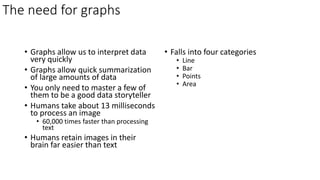
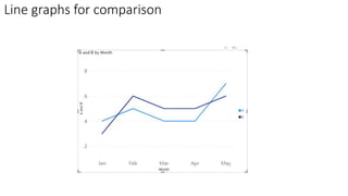
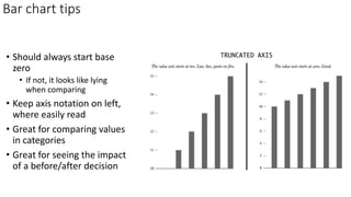
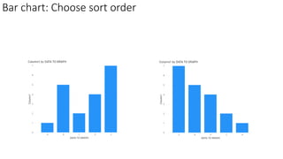
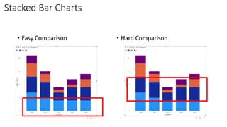
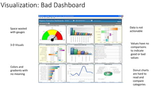
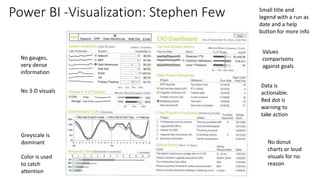
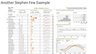
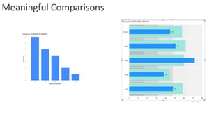
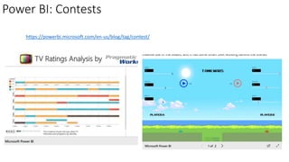
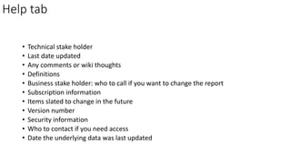
Storytelling with Data with
Power BI
How to create compelling Power BI reports
By Ike Ellis, MVP
• /ikeellis
• @ike_ellis
• www.ikeellis.com
• youtube.com/IkeEllisOnTheMic
• Founder of San Diego Power BI
UserGroup
• Founder of the San Diego Software
Architecture Group
• Co-chair of San Diego Data
Engineering Meetup
• MVP since 2011
• Author of Developing Azure
Solutions, Power BI MVP Book
• Speaker at PASS Summit, SQLBits,
DevIntersections, TechEd, Craft,
Microsoft Data & AI Conference
Ike Ellis
General Manager
Data & AI Practice Solliance
Agenda
• Before you begin
• The importance of context
• Identifying your audience
• Choosing a tone
• Choosing the correct visual
• Text
• Tables
• Heatmaps
• Line graphs
• Vertical bar chart
• Vertical Stacked Bar Chart
• Waterfall charts
• Visuals to avoid
• Design the report
• The appropriate use of color
• Organizing data
• Avoiding clutter
• Prompting the next steps
• Use bookmarks
• Help tab
• Final thoughts and recommendations
Target audience
• Anyone who uses data to prompt action for
themselves or others
• Including:
• Analysts
• Decision-makers
• Students
• If you are asked to “show data”, this
presentation is for you
The difference in exploratory vs explanatory work
Exploratory Analysis
• You are understanding the data
• Looking for interesting data that
might prove or disprove assumptions
• Hunting for a diamond in the rough
• May create many visuals and data
artifacts that are of negligible value
• Should not be shared for public
consumption
Explanatory work
• Should be brief
• Resist the urge to share everything
you’ve learned
• Focus on what your audience needs
to know
Before you begin
• What is your relationship with
the audience?
• Do they already trust you?
• Is this presentation meant to
show how smart you are?
• How receptive with you
audience be?
• The presentation is not about
you
• Facts might not need trust
• Reports should focus on
teaching, warning, or action
• After consuming your content,
audiences should be asked to
make a decision about what to
do next or what they learned
Before you begin
• Define success
• Think about the delivery
mechanism
• Live meeting
• Email report
• Ad hoc
• Scheduled report
• Think about consistency
How to choose the correct visual
Simple text
• Sometimes it’s better to be clear on the report about the
message you want to send
• Sometimes simple numbers and text tell a clear story
Tables
• Human readable
• Start at the top, read left to right
• Filled with text
• Can contain visual queues to help the viewer
• Try not to overload them
• Avoid being comprehensive
• Avoid in live presentations, too dense
• People will argue about every little number and miss the main
message
Table Tips
• Keep it to a few columns and rows
• Avoid heavy borders
• Most recent data or largest values on top
• This is typically what people care about the most
Heatmap
• Right-click on the amount
value and choose
Conditional formatting
• Choose a color for lowest,
medium, and highest
amounts
• Allows you to easily pick
out the highest and lowest
values
The need for graphs
• Graphs allow us to interpret data
very quickly
• Graphs allow quick summarization
of large amounts of data
• You only need to master a few of
them to be a good data storyteller
• Humans take about 13 milliseconds
to process an image
• 60,000 times faster than processing
text
• Humans retain images in their
brain far easier than text
• Falls into four categories
• Line
• Bar
• Points
• Area
Scatterplot
• Good for showing the
relationship between two values
Adding a trend line
• Change from scatter
chart to line chart
• Set stroke width to
0 on the line (to
make the line
disappear)
• Turn on Show
Markers and then
chose a marker
shape of a dot
• Trend line is in the
analysis section
Line graphs: This time with lines
• Used to plot continuous data
• Points are physically connected
via the line
• Continuous data is often days,
months, etc
Line graphs for comparison
Bars
• Very useful and should be relied
upon
• Most viewers know how to view
them
• Easy to read
Bar chart tips
• Should always start base
zero
• If not, it looks like lying
when comparing
• Keep axis notation on left,
where easily read
• Great for comparing values
in categories
• Great for seeing the impact
of a before/after decision
Bar chart: Choose sort order
Stacked Bar Charts
• Easy Comparison • Hard Comparison
Horizontal vs Vertical?
Choose which one is easier to read
Waterfall
• Used to pull apart things that
have happened
• Show a starting point along with
the increases or decreases
• Here is a breakdown of a
massive hiring effort
• Of course, waterfalls can go
down, too. This chart is a good
method for representing this
Area graphs
• Humans have trouble reading
them without training
• A lot of effort for not a lot of
value
Ribbon Chart
• Needs some training to use
• Quickly discover which data
category has the highest rank
(largest value).
• Effective at showing rank
change
• The highest value always
displayed on top
Bullet Graph instead of Gauges
Bullet graphs are denser. They allow a categorization of data. Couple them
with sparklines and the tell a fuller story
Spark lines can be very powerful
• https://learn.microsoft.com/en-us/power-bi/create-reports/power-bi-
sparklines-tables
• Tiny lines that add context to values in a table or matrix
• Can be very powerful when combined with bullet graphs
Visuals to be avoided
• Pie
• 3-D
• Donut Chart
• Secondary Y-axis
• Too many bars in a bar chart
Storytelling vs Monitoring
• Storytelling is convincing
someone of an idea, decision,
problem, solution, or to gain
agreement on any topic
• Monitoring is insuring the health
of a process, organization, team,
product, assembly line, or any
other topic
Now we will talk about generic report and
dashboard design that will help with monitoring
Visualization: Bad Dashboard
Space wasted
with gauges
3-D Visuals
Colors and
gradients with
no meaning
Values have no
comparisons
to indicate
good or bad
values
Donut charts
are hard to
read and
compare
categories
Data is not
actionable
Stephen Few Design Ideas
• “The main problem with dashboards today is they don’t say enough,
and what they do say, they don’t say very well.” – Stephen Few
• A good dashboard must:
• Offer meaningful comparisons
• Display data that is timely and reliable
• Express data in a manner that assesses performance
• Displays all pertinent information in a single screen
• Offers the next action
Power BI -Visualization: Stephen Few
No gauges,
very dense
information
No 3-D visuals
Greyscale is
dominant
Color is used
to catch
attention
Values
comparisons
against goals
No donut
charts or loud
visuals for no
reason
Data is
actionable.
Red dot is
warning to
take action
Small title and
legend with a run as
date and a help
button for more info
Another Stephen Few Example
Meaningful Comparisons
Display data that is timely and reliable
• Usually daily is enough
• Inter-day data often is incomplete
• Not showing shipping until the end of the day
• Cancellations and ordering mistakes
• People rush to put in their order before FedEx or UPS pick up inventory
• People do their banking after hours
• Data should be in a data platform where data pipelines can be tested,
monitored, and more easily changed
Express data in a manner that assesses performance
• Spark lines that mark improvement or degrading performance
• Vs Prior period (usually month is enough unless seasonality requires a
13 rolling month comparison)
• Vs Goal
Displays all pertinent information in a single screen
• Dense
• No horizontal scrolling
• Few multiple tabs
• Avoid comprehensiveness
• Give enough information to inspire action
• Reporting is not intended to be data exploration. We have better ad
hoc tools for that
• Answering questions is overrated. Inspiring action is where its at!
Offers the next action
• Hyperlinks
• Bookmarks
• Drillthroughs and drilldowns
• Embedded in a wider application
• Phone numbers and email address links
• Alerting
Nature walk in San Diego and Seattle
Power BI - Visualization: Use color sparingly.
In nature, colors do two things:
1) Entice
2) Warn
So let’s use them sparingly..
WARNING: POISON FROG!
Power BI - Visualization: Cynthia Brewer
No need for a large report title on the top
• Logos change
• Logos waste space
• Everyone already knows what company
they work for
• Company colors are tiring
• And they change too
No need for a background image
• Again, boring is more usable and less tiring
• Good for infographics, not good for daily usage
• Users will focus on the choices of color and not on the data
Power BI: Tips for Visualization
• Make the most important information the biggest
• Put it in the upper-left corner
Power BI: Use bookmarks to clear filters
Power BI: Use bookmarks to create a portal
• https://www.blue-granite.com/blog/create-an-app-like-experience-
in-power-bi-with-bookmarks
Power BI: Use bookmarks for pagination
• https://community.powerbi.com/t5/Data-Stories-Gallery/Pagination-
in-Power-BI-Reports-utilizing-Bookmarking/td-p/325702
Power BI: Contests
https://powerbi.microsoft.com/en-us/blog/tag/contest/
Help tab
• Technical stake holder
• Last date updated
• Any comments or wiki thoughts
• Definitions
• Business stake holder: who to call if you want to change the report
• Subscription information
• Items slated to change in the future
• Version number
• Security information
• Who to contact if you need access
• Date the underlying data was last updated
Recommended books
• /ikeellis
• @ike_ellis
• www.ikeellis.com
• youtube.com/IkeEllisOnTheMic
• Founder of San Diego Power BI
UserGroup
• Founder of the San Diego Software
Architecture Group
• Co-chair of San Diego Data
Engineering Meetup
• MVP since 2011
• Author of Developing Azure
Solutions, Power BI MVP Book
• Speaker at PASS Summit, SQLBits,
DevIntersections, TechEd, Craft,
Microsoft Data & AI Conference
Ike Ellis
General Manager
Data & AI Practice Solliance

Storytelling with Data with Power BI

  • 1.
    Storytelling with Datawith Power BI How to create compelling Power BI reports By Ike Ellis, MVP
  • 2.
    • /ikeellis • @ike_ellis •www.ikeellis.com • youtube.com/IkeEllisOnTheMic • Founder of San Diego Power BI UserGroup • Founder of the San Diego Software Architecture Group • Co-chair of San Diego Data Engineering Meetup • MVP since 2011 • Author of Developing Azure Solutions, Power BI MVP Book • Speaker at PASS Summit, SQLBits, DevIntersections, TechEd, Craft, Microsoft Data & AI Conference Ike Ellis General Manager Data & AI Practice Solliance
  • 3.
    Agenda • Before youbegin • The importance of context • Identifying your audience • Choosing a tone • Choosing the correct visual • Text • Tables • Heatmaps • Line graphs • Vertical bar chart • Vertical Stacked Bar Chart • Waterfall charts • Visuals to avoid • Design the report • The appropriate use of color • Organizing data • Avoiding clutter • Prompting the next steps • Use bookmarks • Help tab • Final thoughts and recommendations Target audience • Anyone who uses data to prompt action for themselves or others • Including: • Analysts • Decision-makers • Students • If you are asked to “show data”, this presentation is for you
  • 4.
    The difference inexploratory vs explanatory work Exploratory Analysis • You are understanding the data • Looking for interesting data that might prove or disprove assumptions • Hunting for a diamond in the rough • May create many visuals and data artifacts that are of negligible value • Should not be shared for public consumption Explanatory work • Should be brief • Resist the urge to share everything you’ve learned • Focus on what your audience needs to know
  • 5.
    Before you begin •What is your relationship with the audience? • Do they already trust you? • Is this presentation meant to show how smart you are? • How receptive with you audience be? • The presentation is not about you • Facts might not need trust • Reports should focus on teaching, warning, or action • After consuming your content, audiences should be asked to make a decision about what to do next or what they learned
  • 6.
    Before you begin •Define success • Think about the delivery mechanism • Live meeting • Email report • Ad hoc • Scheduled report • Think about consistency
  • 7.
    How to choosethe correct visual
  • 8.
    Simple text • Sometimesit’s better to be clear on the report about the message you want to send • Sometimes simple numbers and text tell a clear story
  • 9.
    Tables • Human readable •Start at the top, read left to right • Filled with text • Can contain visual queues to help the viewer • Try not to overload them • Avoid being comprehensive • Avoid in live presentations, too dense • People will argue about every little number and miss the main message
  • 10.
    Table Tips • Keepit to a few columns and rows • Avoid heavy borders • Most recent data or largest values on top • This is typically what people care about the most
  • 11.
    Heatmap • Right-click onthe amount value and choose Conditional formatting • Choose a color for lowest, medium, and highest amounts • Allows you to easily pick out the highest and lowest values
  • 12.
    The need forgraphs • Graphs allow us to interpret data very quickly • Graphs allow quick summarization of large amounts of data • You only need to master a few of them to be a good data storyteller • Humans take about 13 milliseconds to process an image • 60,000 times faster than processing text • Humans retain images in their brain far easier than text • Falls into four categories • Line • Bar • Points • Area
  • 13.
    Scatterplot • Good forshowing the relationship between two values
  • 14.
    Adding a trendline • Change from scatter chart to line chart • Set stroke width to 0 on the line (to make the line disappear) • Turn on Show Markers and then chose a marker shape of a dot • Trend line is in the analysis section
  • 15.
    Line graphs: Thistime with lines • Used to plot continuous data • Points are physically connected via the line • Continuous data is often days, months, etc
  • 16.
    Line graphs forcomparison
  • 17.
    Bars • Very usefuland should be relied upon • Most viewers know how to view them • Easy to read
  • 18.
    Bar chart tips •Should always start base zero • If not, it looks like lying when comparing • Keep axis notation on left, where easily read • Great for comparing values in categories • Great for seeing the impact of a before/after decision
  • 19.
  • 20.
    Stacked Bar Charts •Easy Comparison • Hard Comparison
  • 21.
    Horizontal vs Vertical? Choosewhich one is easier to read
  • 22.
    Waterfall • Used topull apart things that have happened • Show a starting point along with the increases or decreases • Here is a breakdown of a massive hiring effort • Of course, waterfalls can go down, too. This chart is a good method for representing this
  • 23.
    Area graphs • Humanshave trouble reading them without training • A lot of effort for not a lot of value
  • 24.
    Ribbon Chart • Needssome training to use • Quickly discover which data category has the highest rank (largest value). • Effective at showing rank change • The highest value always displayed on top
  • 25.
    Bullet Graph insteadof Gauges Bullet graphs are denser. They allow a categorization of data. Couple them with sparklines and the tell a fuller story
  • 26.
    Spark lines canbe very powerful • https://learn.microsoft.com/en-us/power-bi/create-reports/power-bi- sparklines-tables • Tiny lines that add context to values in a table or matrix • Can be very powerful when combined with bullet graphs
  • 27.
    Visuals to beavoided • Pie • 3-D • Donut Chart • Secondary Y-axis • Too many bars in a bar chart
  • 28.
    Storytelling vs Monitoring •Storytelling is convincing someone of an idea, decision, problem, solution, or to gain agreement on any topic • Monitoring is insuring the health of a process, organization, team, product, assembly line, or any other topic Now we will talk about generic report and dashboard design that will help with monitoring
  • 29.
    Visualization: Bad Dashboard Spacewasted with gauges 3-D Visuals Colors and gradients with no meaning Values have no comparisons to indicate good or bad values Donut charts are hard to read and compare categories Data is not actionable
  • 30.
    Stephen Few DesignIdeas • “The main problem with dashboards today is they don’t say enough, and what they do say, they don’t say very well.” – Stephen Few • A good dashboard must: • Offer meaningful comparisons • Display data that is timely and reliable • Express data in a manner that assesses performance • Displays all pertinent information in a single screen • Offers the next action
  • 31.
    Power BI -Visualization:Stephen Few No gauges, very dense information No 3-D visuals Greyscale is dominant Color is used to catch attention Values comparisons against goals No donut charts or loud visuals for no reason Data is actionable. Red dot is warning to take action Small title and legend with a run as date and a help button for more info
  • 32.
  • 33.
  • 34.
    Display data thatis timely and reliable • Usually daily is enough • Inter-day data often is incomplete • Not showing shipping until the end of the day • Cancellations and ordering mistakes • People rush to put in their order before FedEx or UPS pick up inventory • People do their banking after hours • Data should be in a data platform where data pipelines can be tested, monitored, and more easily changed
  • 35.
    Express data ina manner that assesses performance • Spark lines that mark improvement or degrading performance • Vs Prior period (usually month is enough unless seasonality requires a 13 rolling month comparison) • Vs Goal
  • 36.
    Displays all pertinentinformation in a single screen • Dense • No horizontal scrolling • Few multiple tabs • Avoid comprehensiveness • Give enough information to inspire action • Reporting is not intended to be data exploration. We have better ad hoc tools for that • Answering questions is overrated. Inspiring action is where its at!
  • 37.
    Offers the nextaction • Hyperlinks • Bookmarks • Drillthroughs and drilldowns • Embedded in a wider application • Phone numbers and email address links • Alerting
  • 38.
    Nature walk inSan Diego and Seattle
  • 39.
    Power BI -Visualization: Use color sparingly. In nature, colors do two things: 1) Entice 2) Warn So let’s use them sparingly.. WARNING: POISON FROG!
  • 40.
    Power BI -Visualization: Cynthia Brewer
  • 41.
    No need fora large report title on the top • Logos change • Logos waste space • Everyone already knows what company they work for • Company colors are tiring • And they change too
  • 42.
    No need fora background image • Again, boring is more usable and less tiring • Good for infographics, not good for daily usage • Users will focus on the choices of color and not on the data
  • 43.
    Power BI: Tipsfor Visualization • Make the most important information the biggest • Put it in the upper-left corner
  • 44.
    Power BI: Usebookmarks to clear filters
  • 45.
    Power BI: Usebookmarks to create a portal • https://www.blue-granite.com/blog/create-an-app-like-experience- in-power-bi-with-bookmarks
  • 46.
    Power BI: Usebookmarks for pagination • https://community.powerbi.com/t5/Data-Stories-Gallery/Pagination- in-Power-BI-Reports-utilizing-Bookmarking/td-p/325702
  • 47.
  • 48.
    Help tab • Technicalstake holder • Last date updated • Any comments or wiki thoughts • Definitions • Business stake holder: who to call if you want to change the report • Subscription information • Items slated to change in the future • Version number • Security information • Who to contact if you need access • Date the underlying data was last updated
  • 49.
  • 50.
    • /ikeellis • @ike_ellis •www.ikeellis.com • youtube.com/IkeEllisOnTheMic • Founder of San Diego Power BI UserGroup • Founder of the San Diego Software Architecture Group • Co-chair of San Diego Data Engineering Meetup • MVP since 2011 • Author of Developing Azure Solutions, Power BI MVP Book • Speaker at PASS Summit, SQLBits, DevIntersections, TechEd, Craft, Microsoft Data & AI Conference Ike Ellis General Manager Data & AI Practice Solliance