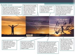
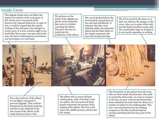
Existing Digipak Analysis 
You Me At Six – Cavalier Youth
Outside Cover 
The barcode is placed 
strategically on the back to 
avoid ruining the aesthetics 
of the front. However, it is 
large enough to be found 
easily when being 
purchased. 
The title of the bands name is at the 
top of the album so it is obvious to 
what the product is at a quick glance. 
The font is also the band’s typical 
choice. They do this so it is more 
recognisable and is part of their 
house style and brand. 
The design of this digipak 
is very aesthetically 
pleasing. The whole of the 
outside cover is one 
panoramic photo. 
The spine of this digipak has the band’s 
name on it in their typical typography 
making it easily recognisable, similar to 
the Final Night of Sin I previously 
analysed. The album name is also on the 
spine. This is a popular convention for all 
music genres. It is practical for when the 
albums are stacked on a shelf, the owner 
can easily identify which album it is. 
This is also the bands logo. As it is small 
it appears in various places in the 
band’s products including music videos 
and posters. It is the number six in 
roman numerals. This represents a lot 
of power as the romans ruled fiercely. 
The main picture of this 
album cover is the young 
boy wielding a sword. This 
is a direct interpretation of 
the album title. It is also a 
juxtaposition, as the 
band’s previous albums 
were released when they 
were a lot younger. 
This track list is very simple 
and it is not even numbered. 
This is a stark contrast to 
their other albums where 
their lists have been more 
creative. This could be 
evidence of how they have 
matured as a band. 
The band’s record label 
BMG has their logo present 
on the back of the album. It 
has nothing surrounding it 
so it stands out against the 
digipak’s design.
Inside Cover 
The pictures on the 
inside of the digipak are 
photos of the band that 
they took in LA whist 
recording the album. 
This gives the fans an 
inside into the 
production of the album. 
The drumsticks in the picture have the song 
titles on them which the drummer, Dan used 
to record the cited songs. As a way to connect 
to the fans, he gave away twenty drumsticks, 
these included and some from live shows to a 
number of orders for his clothing label. This 
was a way of promotion for his clothing 
company as the fans would feel special 
owning something that has been part of the 
album. 
The colour scheme of this album 
is a lot lighter compared to 
previous digipaks. This could be 
interpreted as the band maturing 
and this is also reflected in the 
new sound of the album as the 
songs being less heavy rock. 
The album title is across all three 
inside panels, with a font that is just 
an outline. The font across all three 
panels represents the process of the 
making of the album. The first is the 
input, the middle process, and the last 
the output. 
The CD is stored in the sleeve so it 
does not obstruct the images on the 
cover. Also, as it is plain white with 
just the band and album name with 
the record label’s logo on in black it 
is not exactly appealing or striking. 
This digipak design does not follow the 
typical conventions of the rock genre as 
the colours aren’t necessarily dark, 
however the exposed tattoos do. In spite of 
this, it could be argued that the typical 
clothing of the rock genre has changed in 
recent years. It is now common sight to see 
bands like this to wear vest tops and in this 
case, the band is following the conventions 
and stereotypes of a rock band. 
The can of alcohol follows the 
stereotypical connotations of 
the rock and roll lifestyle. It 
indicates that they were 
drinking whilst recording this 
album and the filter effect on 
the images represents the 
haze that alcohol provides.

Media Studies: Cavalier Youth Digipak Analysis

  • 1.
    Existing Digipak Analysis You Me At Six – Cavalier Youth
  • 2.
    Outside Cover Thebarcode is placed strategically on the back to avoid ruining the aesthetics of the front. However, it is large enough to be found easily when being purchased. The title of the bands name is at the top of the album so it is obvious to what the product is at a quick glance. The font is also the band’s typical choice. They do this so it is more recognisable and is part of their house style and brand. The design of this digipak is very aesthetically pleasing. The whole of the outside cover is one panoramic photo. The spine of this digipak has the band’s name on it in their typical typography making it easily recognisable, similar to the Final Night of Sin I previously analysed. The album name is also on the spine. This is a popular convention for all music genres. It is practical for when the albums are stacked on a shelf, the owner can easily identify which album it is. This is also the bands logo. As it is small it appears in various places in the band’s products including music videos and posters. It is the number six in roman numerals. This represents a lot of power as the romans ruled fiercely. The main picture of this album cover is the young boy wielding a sword. This is a direct interpretation of the album title. It is also a juxtaposition, as the band’s previous albums were released when they were a lot younger. This track list is very simple and it is not even numbered. This is a stark contrast to their other albums where their lists have been more creative. This could be evidence of how they have matured as a band. The band’s record label BMG has their logo present on the back of the album. It has nothing surrounding it so it stands out against the digipak’s design.
  • 3.
    Inside Cover Thepictures on the inside of the digipak are photos of the band that they took in LA whist recording the album. This gives the fans an inside into the production of the album. The drumsticks in the picture have the song titles on them which the drummer, Dan used to record the cited songs. As a way to connect to the fans, he gave away twenty drumsticks, these included and some from live shows to a number of orders for his clothing label. This was a way of promotion for his clothing company as the fans would feel special owning something that has been part of the album. The colour scheme of this album is a lot lighter compared to previous digipaks. This could be interpreted as the band maturing and this is also reflected in the new sound of the album as the songs being less heavy rock. The album title is across all three inside panels, with a font that is just an outline. The font across all three panels represents the process of the making of the album. The first is the input, the middle process, and the last the output. The CD is stored in the sleeve so it does not obstruct the images on the cover. Also, as it is plain white with just the band and album name with the record label’s logo on in black it is not exactly appealing or striking. This digipak design does not follow the typical conventions of the rock genre as the colours aren’t necessarily dark, however the exposed tattoos do. In spite of this, it could be argued that the typical clothing of the rock genre has changed in recent years. It is now common sight to see bands like this to wear vest tops and in this case, the band is following the conventions and stereotypes of a rock band. The can of alcohol follows the stereotypical connotations of the rock and roll lifestyle. It indicates that they were drinking whilst recording this album and the filter effect on the images represents the haze that alcohol provides.