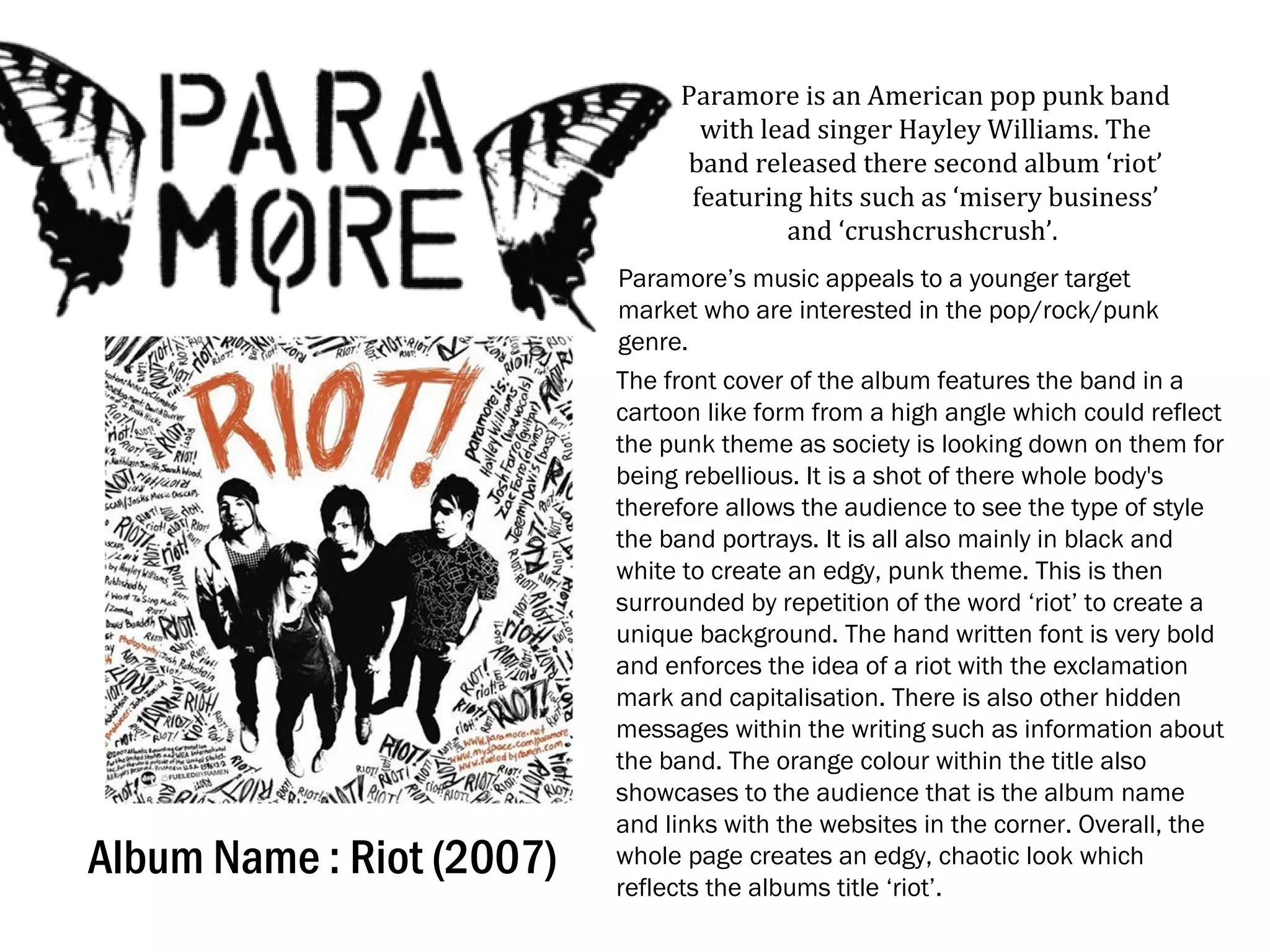
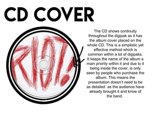
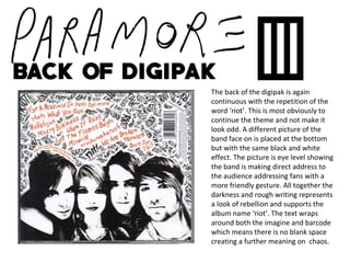
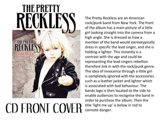
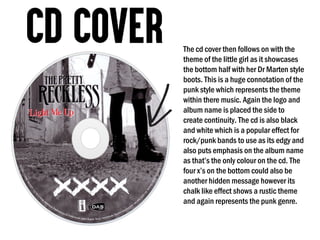
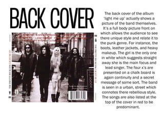
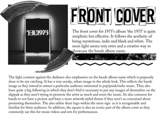
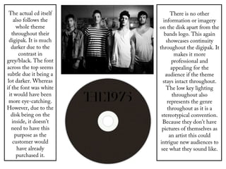
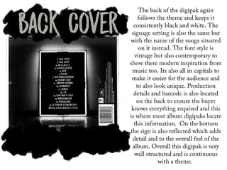
Album Name : Riot (2007)
Paramore is an American pop punk band
with lead singer Hayley Williams. The
band released there second album ‘riot’
featuring hits such as ‘misery business’
and ‘crushcrushcrush’.
Paramore’s music appeals to a younger target
market who are interested in the pop/rock/punk
genre.
The front cover of the album features the band in a
cartoon like form from a high angle which could reflect
the punk theme as society is looking down on them for
being rebellious. It is a shot of there whole body's
therefore allows the audience to see the type of style
the band portrays. It is all also mainly in black and
white to create an edgy, punk theme. This is then
surrounded by repetition of the word ‘riot’ to create a
unique background. The hand written font is very bold
and enforces the idea of a riot with the exclamation
mark and capitalisation. There is also other hidden
messages within the writing such as information about
the band. The orange colour within the title also
showcases to the audience that is the album name
and links with the websites in the corner. Overall, the
whole page creates an edgy, chaotic look which
reflects the albums title ‘riot’.
The CD shows continuity
throughout the digipak as it has
the album cover placed on the
whole CD. This is a simplistic yet
effective method which is
common within a lot of digipaks.
It keeps the name of the album a
main priority within it and due to it
being inside the cover, is only
seen by people who purchase the
album. This means the
presentation doesn’t need to be
as detailed as the audience have
already brought it and know of
the band.
The back of the digipak is again
continuous with the repetition of the
word ‘riot’. This is most obviously to
continue the theme and not make it
look odd. A different picture of the
band face on is placed at the bottom
but with the same black and white
effect. The picture is eye level showing
the band is making direct address to
the audience addressing fans with a
more friendly gesture. All together the
darkness and rough writing represents
a look of rebellion and supports the
album name ‘riot’. The text wraps
around both the imagine and barcode
which means there is no blank space
creating a further meaning on chaos.
The Pretty Reckless are an American
rock/punk band from New York. The front
of the album has a main picture of a little
girl looking straight into the camera from a
high angle. She is dressed as how a
member of the band would stereotypically
dress in specific the lead singer, and she is
holding a lighter. This instantly is a
contrast with the age and could be
representing the lead singers rebellion
therefore link in with the rock/punk genre.
The idea of innocence through a little girl
is completely ignored with the accessories
such as a leather jacket and lighter which
is associated with bad behaviour. The
bands logo is then located to the side to
enable audiences to recognise the band in
order to purchase the album. Then the
title ‘light me up’ is below in red to
connote danger.
The cd cover then follows on with the
theme of the little girl as it showcases
the bottom half with her Dr Marten style
boots. This is a huge connotation of the
punk style which represents the theme
within there music. Again the logo and
album name is placed the side to
create continuity. The cd is also black
and white which is a popular effect for
rock/punk bands to use as its edgy and
also puts emphasis on the album name
as that’s the only colour on the cd. The
four x’s on the bottom could also be
another hidden message however its
chalk like effect shows a rustic theme
and again represents the punk genre.
The back cover of the album
‘light me up’ actually shows a
picture of the band themselves.
It’s a full body picture front on
which allows the audience to see
there unique style and relate it to
the punk genre. For instance, the
boots, leather jackets, and heavy
makeup. The girl is the only one
in white which suggests straight
away she is the main focus and
lead singer. The four x’s are
presented on a chalk board is
again continuity and a secret
message of some sort. The band
is seen in a urban, street which
connotes there rebellious style.
The songs are also listed at the
top of the cover in red to be
predominant.
The front cover for 1975’s album ‘the 1975’ is quite
simplistic but effective. It follows the aesthetic of
being mysterious, indie and black and white. The
neon light seems very retro and a creative way to
showcase the bands album name.
The light contrast against the darkness also emphasises on the bands album name which is purposely
done to be eye catching. It has a very smoky, urban image to the whole look. This reflects the bands
image as they intend to attract a particular audience interested in pop/punk/indie music. They also
have quite a big following in which they don’t find it necessary to put any images of themselves on the
digipak as they aren't trying to promote the artist as much and more the music. Its also common for
bands to not have a picture and have a more artwork styled theme if they aren't as concerned about
promoting themselves. The also utilise there logo within the neon sign as it is recognisable and
familiar for there audience. In addition, the square is also an iconic part of the album cover as they
commonly use this for music videos and sets for performances.
The actual cd itself
also follows the
whole theme
throughout their
digipak. It is much
darker due to the
contrast in
grey/black. The font
across the top seems
subtle due it being a
lot darker. Whereas
if the font was white
it would have been
more eye-catching.
However, due to the
disk being on the
inside, it doesn’t
need to have this
purpose as the
customer would
have already
purchased it.
There is no other
information or imagery
on the disk apart from the
bands logo. This again
showcases continuity
throughout the digipak. It
makes it more
professional and
appealing for the
audience if the theme
stays intact throughout.
The low key lighting
throughout also
represents the genre
throughout as it is a
stereotypical convention.
Because they don’t have
pictures of themselves as
an artist this could
intrigue new audiences to
see what they sound like.
The back of the digipak again
follows the theme and keeps it
consistently black and white. The
signage setting is also the same but
with the name of the songs situated
on it instead. The font style is
vintage but also contemporary to
show there modern inspiration from
music too. Its also all in capitals to
make it easier for the audience and
to also look unique. Production
details and barcode is also located
on the back to ensure the buyer
knows everything required and this
is where most album digipaks locate
this information. On the bottom
the sign is also reflected which adds
detail and to the overall feel of the
album. Overall this digipak is very
well structured and is continuous
with a theme.

Digipak

  • 1.
    Album Name :Riot (2007) Paramore is an American pop punk band with lead singer Hayley Williams. The band released there second album ‘riot’ featuring hits such as ‘misery business’ and ‘crushcrushcrush’. Paramore’s music appeals to a younger target market who are interested in the pop/rock/punk genre. The front cover of the album features the band in a cartoon like form from a high angle which could reflect the punk theme as society is looking down on them for being rebellious. It is a shot of there whole body's therefore allows the audience to see the type of style the band portrays. It is all also mainly in black and white to create an edgy, punk theme. This is then surrounded by repetition of the word ‘riot’ to create a unique background. The hand written font is very bold and enforces the idea of a riot with the exclamation mark and capitalisation. There is also other hidden messages within the writing such as information about the band. The orange colour within the title also showcases to the audience that is the album name and links with the websites in the corner. Overall, the whole page creates an edgy, chaotic look which reflects the albums title ‘riot’.
  • 2.
    The CD showscontinuity throughout the digipak as it has the album cover placed on the whole CD. This is a simplistic yet effective method which is common within a lot of digipaks. It keeps the name of the album a main priority within it and due to it being inside the cover, is only seen by people who purchase the album. This means the presentation doesn’t need to be as detailed as the audience have already brought it and know of the band.
  • 3.
    The back ofthe digipak is again continuous with the repetition of the word ‘riot’. This is most obviously to continue the theme and not make it look odd. A different picture of the band face on is placed at the bottom but with the same black and white effect. The picture is eye level showing the band is making direct address to the audience addressing fans with a more friendly gesture. All together the darkness and rough writing represents a look of rebellion and supports the album name ‘riot’. The text wraps around both the imagine and barcode which means there is no blank space creating a further meaning on chaos.
  • 4.
    The Pretty Recklessare an American rock/punk band from New York. The front of the album has a main picture of a little girl looking straight into the camera from a high angle. She is dressed as how a member of the band would stereotypically dress in specific the lead singer, and she is holding a lighter. This instantly is a contrast with the age and could be representing the lead singers rebellion therefore link in with the rock/punk genre. The idea of innocence through a little girl is completely ignored with the accessories such as a leather jacket and lighter which is associated with bad behaviour. The bands logo is then located to the side to enable audiences to recognise the band in order to purchase the album. Then the title ‘light me up’ is below in red to connote danger.
  • 5.
    The cd coverthen follows on with the theme of the little girl as it showcases the bottom half with her Dr Marten style boots. This is a huge connotation of the punk style which represents the theme within there music. Again the logo and album name is placed the side to create continuity. The cd is also black and white which is a popular effect for rock/punk bands to use as its edgy and also puts emphasis on the album name as that’s the only colour on the cd. The four x’s on the bottom could also be another hidden message however its chalk like effect shows a rustic theme and again represents the punk genre.
  • 6.
    The back coverof the album ‘light me up’ actually shows a picture of the band themselves. It’s a full body picture front on which allows the audience to see there unique style and relate it to the punk genre. For instance, the boots, leather jackets, and heavy makeup. The girl is the only one in white which suggests straight away she is the main focus and lead singer. The four x’s are presented on a chalk board is again continuity and a secret message of some sort. The band is seen in a urban, street which connotes there rebellious style. The songs are also listed at the top of the cover in red to be predominant.
  • 8.
    The front coverfor 1975’s album ‘the 1975’ is quite simplistic but effective. It follows the aesthetic of being mysterious, indie and black and white. The neon light seems very retro and a creative way to showcase the bands album name. The light contrast against the darkness also emphasises on the bands album name which is purposely done to be eye catching. It has a very smoky, urban image to the whole look. This reflects the bands image as they intend to attract a particular audience interested in pop/punk/indie music. They also have quite a big following in which they don’t find it necessary to put any images of themselves on the digipak as they aren't trying to promote the artist as much and more the music. Its also common for bands to not have a picture and have a more artwork styled theme if they aren't as concerned about promoting themselves. The also utilise there logo within the neon sign as it is recognisable and familiar for there audience. In addition, the square is also an iconic part of the album cover as they commonly use this for music videos and sets for performances.
  • 9.
    The actual cditself also follows the whole theme throughout their digipak. It is much darker due to the contrast in grey/black. The font across the top seems subtle due it being a lot darker. Whereas if the font was white it would have been more eye-catching. However, due to the disk being on the inside, it doesn’t need to have this purpose as the customer would have already purchased it. There is no other information or imagery on the disk apart from the bands logo. This again showcases continuity throughout the digipak. It makes it more professional and appealing for the audience if the theme stays intact throughout. The low key lighting throughout also represents the genre throughout as it is a stereotypical convention. Because they don’t have pictures of themselves as an artist this could intrigue new audiences to see what they sound like.
  • 10.
    The back ofthe digipak again follows the theme and keeps it consistently black and white. The signage setting is also the same but with the name of the songs situated on it instead. The font style is vintage but also contemporary to show there modern inspiration from music too. Its also all in capitals to make it easier for the audience and to also look unique. Production details and barcode is also located on the back to ensure the buyer knows everything required and this is where most album digipaks locate this information. On the bottom the sign is also reflected which adds detail and to the overall feel of the album. Overall this digipak is very well structured and is continuous with a theme.