SlideShare a Scribd company logo
1 of 7
Digipak Analysis
By Tom Crane
Digipak Analysis 1
All Over the World: The Very Best of Electric Light Orchestra is a compilation album by the Electric
Light Orchestra, released in 2005. Originally released exclusively in the band's home market (the
UK), the album sold very well, becoming the ELO's first Top Ten entry since Dino Record's
compilation album The Very Best of the Electric Light Orchestra hit number 4 in 1994. All Over the
World sold over 300,000 copies in the UK alone within a year and a half of its release. The songs on
the album include "Mr. Blue Sky“, "Evil Woman“, "Don't Bring Me Down“, "Sweet Talkin' Woman“,
"Shine a Little Love“, "Turn to Stone“, "The Diary of Horace Wimp“, "Confusion“, "Hold on Tight“,
"Livin' Thing“, "Telephone Line“, "All Over the World“, "Wild West Hero“, "Showdown“, "Ma-Ma-
Ma Belle“, "Xanadu“, "Rockaria!“, "Strange Magic“, "Alright“ and "Rock 'n' Roll Is King“.
The colour scheme when picked out from the front cover looks very bright and appealing, this
allows the album cover to look eye catchy and people will be drawn towards the cover. The
colours on the album allow for many representations of the album is and also the songs. Yellow is
associated with joy, happiness, intellect, and energy. This is important for the audience as they
can make this interpretation of the cover just by the image and colours that are used. Blue is the
colour of the sky and sea. It is often associated with depth and stability. The colour blue is the
colour that is used the most throughout the album cover, CD and the back cover. This may be to
represent one of ELOs most popular songs called ‘Mr. Blue Sky’. The music that ELO produces is of
the rock genre and there is heavy use of instruments through their work. This could represent the
yellow on the front cover to represent the energy from the use of instruments.
The back of the digipak is very simple,
although it uses a variety of different
colours, the layout looks very simple but
unique. The back of the digipak also has
the listing of songs, this is important
information that is needed for the
audience who buy the album.
Furthermore the image used of earth will
also draw the attention of the users. The
back cover of the digipak uses a very plain
and simple font, this can be very
beneficial because it allows the audience
to clearly see what songs are listed on the
back cover. The yellow colour of the font
allows it to stand out which makes it
appealing and it makes its very clear to
read. Furthermore the white font is also
required information but it is in a much
smaller font because the audience will not
find it interesting and it wont make a
difference to whether they buy it or not.
Finally the image is very futuristic which
may reflect a positive vibe for the album.
The front cover of ‘All Over The
World’ is very unique and
colourful, this allows the cover
to look appealing and eye
catching. The use of a space ship
allows it to give an unusual look
and that also helps to grab the
attention of the audience. There
is clearly a motif across this
digipak, we as the audience can
see that there is a use of space
ships and also space as we can
see earth on the back cover. The
font that they have used on the
front cover of the digipak is very
clear and can be easily read by
the audience. The name of ELO
is placed in the centre of the
front cover as that is there
abbreviation of Electric Light
Orchestra. The cover gives the
album a positive vibe due to the
bright colours.
Overall this digipak is very successful and meets many
conventions of digipaks. The colour palette is very bright on the
front cover and it gradually gets darker across the CD and the
back cover but this does not effect the clean look of the digipak.
The structure of the digipak looks well organised and everything
looks to be in the right place like the barcode for example. I
personally feel that the list of the songs could be placed in a
better position as I feel they have just been placed in the middle
of the page. Overall the ‘All Over The World’ has a very positive
vibe due to the wide range of bright colours used.
Digipak Analysis 2
The back cover of the digipak for ‘Nevermind’ by Nirvana is very unusual and we can see this
through the unusual use of colours of orange and a light blue which looks like a swimming
pool. I personally feel that the back cover lets the album down as I feel the structure of the
back cover is very poor. I understand that they have used the water effect which continues
throughout the digipak but this is something I will stay away from this when designing my
digipak. Furthermore I feel the orange image on the back cover is very unusual and I
personally feel that it doesn’t look right within the digipak. This is the first introduction of the
bright orange across the digipak and although it stands out and looks very appealing it makes
the back cover look odd. The font is very clear which makes it easier for the users to
understand the songs that are listed. The black font colour allows it to also stand out due to
the light blue back ground. It has all the require information on the back cover which is
required and this is important especially when people come to buying the album. Overall the
cover is very unusual but it works within the digipak to create a successful album.
The colour scheme of this digipak is very
bright and appealing and we can see this
through the use of the colour blue. The
use of the swimming pool is a motif
across the digipak as it features on the
front cover, CD and the back cover. Due to
the bright blue colour it is eye catchy
which grabs the attention of the
audience. The colours on the album allow
for many representations of the album is
and also the songs. Blue is the colour of
the sky and sea. It is often associated
with depth and stability. The colour blue
is the colour that is used the most
throughout the album cover, CD and the
back cover. Although the theme of blue is
used across the digipak, there is an
introduction of orange on the back cover.
I personally feel that the image looks out
of place on the back cover so this is
something I would stay away from this
when designing my digipak and stick to
the same colour theme.
Overall this digipak is very successful and it will grab the attention of the
audience by the use of the unusual image and the colour scheme
throughout the digipak. The digipak looks very structured and the use of
swimming pool effects throughout the digipak makes it looks unique. We
can see the strong structure through the organisation of the digipak, the
band name Nirvana and the Album name is placed in the left hand corner
of the front cover which is essential information and it empowering
enough to catch the attention of the audience. Although I personally feel
the back cover lets down the digipak due to the poor choice of image.
Overall the digipak is successful in many ways and there has been many
copies been sold.
Nevermind is the second studio album by the American rock band Nirvana, released on September 24,
1991 by DGC Records. Produced by Butch Vig, Nevermind was the group's first release on DGC. Lead
singer Kurt Cobain sought to make music outside the restrictive confines of the Seattle grunge scene,
drawing influence from groups such as the Pixies and their use of "loud/quiet" dynamics. The songs on the
album include ‘Smells Like Teen Spirit’, ‘In Bloom’, ‘Come As You Are’, ‘Breed’, ‘Lithium’, ‘Polly’, ‘Territorial
Pissings’, ‘Drain You’, ‘Lounge Act’, ‘Stay Away Lyrics’, ‘On A Plain Lyrics’ and ‘Something In The Way’. Due
to Nirvana being a rock band the songs will most likely meet many conventions of the genre rock. The
digipak also fits the rock genre as it is very unusual and different which allows the digipak to have its own
unique look.
The front cover of the digipak is
very unusual as it is not common
to see a naked child in the
middle of a swimming pool
trying to catch money. This is a
unique way of grabbing the
audiences attention due to the
unusual image. The colour blue
is also very bright and appealing
which will also catch the
attention of the audience. The
black font is very dominating
and it stands out on the front
cover which is important
because the audience can see
what the album is called and
also the name of the band. The
fonts are very clear which makes
it easy to understand also the
font used for ‘Nevermind’ is
wavy which may represent the
swimming pool.
Digipak Analysis 3
The Dark Side of the Moon is the eighth album by the English rock band Pink Floyd. Originally released
on 1 March 1973, on the label Harvest, it built on ideas explored in the band's earlier recordings and
live shows, but departs from instrumental thematic by founding member Syd Barrett. The album
explores themes including conflict, greed, the passage of time, and mental illness, the latter partly
inspired by Barrett's deteriorating mental state. The songs on the album include ‘Speak to Me’,
‘Breathe (In the Air)’, ‘On the Run’, ‘Time’, ‘The Great Gig in the Sky’, ‘Money’, ‘Us and Them’, ‘Any
Colour You Like’, ‘Brain Damage’ and ‘Eclipse’. It is important that the songs are listed on the back cover
as people may buy the album due to a specific song. Due to Pink Floyd being a rock band they need to
meet the conventions of rock. One way they have met the conventions of rock is using a black coloured
theme which is typical within rock.
The colour scheme of this Digipak is
very conflicting as the majority of the
digipak is black but it has a few bright
colours in the from of a rainbow.
Overall the colour scheme is very
dark which is typical of the rock
genre as rock bands wear black
clothing. The colours actually work
really work together well to portray a
clean looking digipak. The use of
colours are used across the digipak
which is important because we can
see the consistency of colour scheme
throughout. The use of the rainbow
is also very appealing as it will catch
the attention of the audience due to
the bright colours. I personally feel
that the colour scheme Pink Floyd
have used defines them as a band as
the black represents their rock genre
and the bright colours may define the
music within the album. Overall the
colour scheme of this digipak is very
successful as it will grab the attention
of users.
The front cover of this digipak is
very different compared to other
digipaks, this plays to advantage
of the album as more people will
most likely look at the album due
to it looking unusual. The reason
the front cover is different is
because it doesn’t have the name
of the album or the name of the
band. The colours used on the
front cover are very eye catchy as
the rainbow will draw the
attention of the audience. The
colour black that has been used
may represent that they are a
rock band as many bands within
the rock genre use the colour
black for their clothing.
Furthermore the image is also
very different and this may also
attract the audience to looking at
the album. Overall the cover
looks very unique but it doesn’t
follow the convention of
including the band name and
album name on the cover which
is a negative.
The back cover of the digipak is very well structured and organised which is important
because the users will want the to see the vital information like the tack list etc. The
songs are list in the top left hand corner which looks really good as it still allows space
for the triangle image and rainbow which is repetitive across the digipak. All the
required information is on the back cover which is essential. For example the barcode
needs to be on the digipak as when people buy it, the album needs to be scanned. The
back cover looks very clean and organised which is good because people are more likely
to buy the album if it looks well organised. Overall the back cover looks well designed
and has all the required information that the user would need.
Magazine Advert Analysis 1
Stereophonics-
Keep Calm and Carry On
During my research of magazine adverts I came across Stereophonics
magazine advert to promote their new album ‘ Keep Calm and Carry On’
which was released on 16 November 2009. The colour scheme of this
magazine advert is very dark and gloomy, the colours used are very dull
which will not help when it comes to attracting the audience to the advert.
The sea water looks very grey along with the sky which portrays the album
as very dark and depressing. Furthermore the advert is very simple, it
includes the information that is needed so that the users understand about
the new album. When people are flicking through a magazine they don’t
want to read lots of information so this advert is successful in this way as
the text is very minimalistic. The image that is used is very unusual as you
wouldn’t ever see 4 men sat around a table in the middle of the see. The
reason that this image works within the magazine is because people will be
drawn towards it because it is so unusual. The fonts used throughout this
advert is very simple but clear, the user will be able to read the text clearly
which is important so that they know the information. The black font for the
band name is clear due to it being black on a grey background, this is the
same with the album name. These two bits of text are the most essential
because it gives an idea to the audience what the advert is about. Overall
the magazine advert is very successful due to the promotion of their new
album, it includes vital information like the release date and also the name
of the album.
Magazine Advert Analysis 2
Kasabian-
The Debut Album
During my research of magazine adverts I came across Kasabian magazine
advert to promote their new album ‘ The Debut Album’ which was released on
6 September 2004. The colour scheme of this magazine advert is mainly very
dark due to the strong use of black throughout the advert. The contrast of
black and white is really effective as the white text stands out on the image
and it will catch the attention of the user. The advert is very simple and
structured well which can be very effective as most people do not want to
read a lot of information, they would prefer it to be short and snappy like this
advert. The image that is used is very dominating on the advert and will catch
the eye of the users, the image is a recurring motif across the album that
Kasabian created. The fonts that is used throughout the advert is very clear
and bold which make it easier for the audience to read the advert when going
through their magazine. The white colour for the font also allows it to stand
out more. When seeing a music magazine advert you would want to see the
key points of the poster like the name of the band and also the name of the
album and this advert successfully meets these conventions. Furthermore by
having the name Kasabian printed in a big font at the top of the page it will
also attract customers. Overall the magazine advert is very successful due to
the promotion of their new album, it includes vital information like the bands
website and also some of the songs that are included.
Magazine Advert Analysis 3
The Killers-
Day & Age
During my research of magazine adverts I came across The Killers
magazine advert to promote their new album ‘ Day & Age’ which was
released on November 18, 2008. The colour scheme of this advert is very
different and unusual, the use of the violet colour makes the advert stand
out. All the colours used have been used in a certain effect as they are
dotted on to create an image which is different and it will draw the
attention of the users. The advert is also very simplistic and there is very
little information provided but I feel this helps the advert to keep a clean
look and I feel people will look at the advert due to there being very little
information as they will most likely not want to read a lot of information.
The image created by the dots looks like a sun setting which creates a very
relaxing mood and this may represent the type of music that The Killers
sing. The fonts that have been sued throughput the advert are very clear
and bold which is important as it will grab the attention of the users. The
colour of the fonts also work with the background as they stand out
clearly. The white colour for the band name is very bold and big which is
essential when trying to grab the attention of the users. Overall the
magazine advert is very successful due to the promotion of their new
album, it includes vital information like the name of the band and also the
name of the album.

More Related Content

What's hot

Conventions of digipak and ad
Conventions of digipak and adConventions of digipak and ad
Conventions of digipak and admeganmalc
 
The 1975 analysis completed
The 1975 analysis completedThe 1975 analysis completed
The 1975 analysis completedAbigail Downes
 
Digipak and contents analysis As Media coursework
Digipak and contents analysis As Media courseworkDigipak and contents analysis As Media coursework
Digipak and contents analysis As Media courseworkelliotballasmedia
 
Digipak Analysis
Digipak AnalysisDigipak Analysis
Digipak AnalysisSteph2000
 
Digipak (Album Cover) Analysis
Digipak (Album Cover) Analysis Digipak (Album Cover) Analysis
Digipak (Album Cover) Analysis hlr1993
 
DIGIPAK ANALYSIS
DIGIPAK ANALYSIS DIGIPAK ANALYSIS
DIGIPAK ANALYSIS rmackrory10
 
Media digipack analysis
Media digipack analysisMedia digipack analysis
Media digipack analysisEdPearce1998
 
Appendix 9 - Digipak analysis
Appendix 9 - Digipak analysis Appendix 9 - Digipak analysis
Appendix 9 - Digipak analysis Hannahhhhh15
 
Digipak and magazine advert
Digipak and magazine advert Digipak and magazine advert
Digipak and magazine advert EDavoile13
 
Analysis albums[1]
Analysis albums[1]Analysis albums[1]
Analysis albums[1]Eddie Guy
 
Album covers and digipaks
Album covers and digipaksAlbum covers and digipaks
Album covers and digipaksjennypinchbeck
 

What's hot (18)

Conventions of digipak and ad
Conventions of digipak and adConventions of digipak and ad
Conventions of digipak and ad
 
DIGIPAK ANALYSIS
DIGIPAK ANALYSISDIGIPAK ANALYSIS
DIGIPAK ANALYSIS
 
The 1975 analysis completed
The 1975 analysis completedThe 1975 analysis completed
The 1975 analysis completed
 
Digipak and contents analysis As Media coursework
Digipak and contents analysis As Media courseworkDigipak and contents analysis As Media coursework
Digipak and contents analysis As Media coursework
 
Digipak Analysis
Digipak AnalysisDigipak Analysis
Digipak Analysis
 
Digipak Analysis
Digipak AnalysisDigipak Analysis
Digipak Analysis
 
Digipak analysis
Digipak analysisDigipak analysis
Digipak analysis
 
Digipak (Album Cover) Analysis
Digipak (Album Cover) Analysis Digipak (Album Cover) Analysis
Digipak (Album Cover) Analysis
 
DIGIPAK ANALYSIS
DIGIPAK ANALYSIS DIGIPAK ANALYSIS
DIGIPAK ANALYSIS
 
digipack desconstuction
digipack desconstuctiondigipack desconstuction
digipack desconstuction
 
Existing digipaks
Existing digipaksExisting digipaks
Existing digipaks
 
Digipak Research
Digipak Research Digipak Research
Digipak Research
 
Media digipack analysis
Media digipack analysisMedia digipack analysis
Media digipack analysis
 
Appendix 9 - Digipak analysis
Appendix 9 - Digipak analysis Appendix 9 - Digipak analysis
Appendix 9 - Digipak analysis
 
Digipak and magazine advert
Digipak and magazine advert Digipak and magazine advert
Digipak and magazine advert
 
Analysis albums[1]
Analysis albums[1]Analysis albums[1]
Analysis albums[1]
 
Digipak
Digipak Digipak
Digipak
 
Album covers and digipaks
Album covers and digipaksAlbum covers and digipaks
Album covers and digipaks
 

Viewers also liked

Formacion de la personalidad y estructura de la personalidad criminal
Formacion de la personalidad y estructura de la personalidad criminalFormacion de la personalidad y estructura de la personalidad criminal
Formacion de la personalidad y estructura de la personalidad criminalNestor1984
 
Music video analysis x3
Music video analysis x3Music video analysis x3
Music video analysis x3craneyboi
 
Prospective video locations
Prospective video locationsProspective video locations
Prospective video locationscraneyboi
 
Over servicing webinar slides with notes
Over servicing webinar slides with notes Over servicing webinar slides with notes
Over servicing webinar slides with notes Frankie Glaister
 
Resume Gajendra Tak
Resume Gajendra TakResume Gajendra Tak
Resume Gajendra TakGajendratak
 
2015_12_PhD_Passoni
2015_12_PhD_Passoni2015_12_PhD_Passoni
2015_12_PhD_PassoniLuca Passoni
 
What's new in Ruby 2.3
What's new in Ruby 2.3What's new in Ruby 2.3
What's new in Ruby 2.3Simon Courtois
 

Viewers also liked (11)

Formacion de la personalidad y estructura de la personalidad criminal
Formacion de la personalidad y estructura de la personalidad criminalFormacion de la personalidad y estructura de la personalidad criminal
Formacion de la personalidad y estructura de la personalidad criminal
 
Music video analysis x3
Music video analysis x3Music video analysis x3
Music video analysis x3
 
Computacion
ComputacionComputacion
Computacion
 
Contabilidad
Contabilidad Contabilidad
Contabilidad
 
Prospective video locations
Prospective video locationsProspective video locations
Prospective video locations
 
Over servicing webinar slides with notes
Over servicing webinar slides with notes Over servicing webinar slides with notes
Over servicing webinar slides with notes
 
Resume Gajendra Tak
Resume Gajendra TakResume Gajendra Tak
Resume Gajendra Tak
 
2015_12_PhD_Passoni
2015_12_PhD_Passoni2015_12_PhD_Passoni
2015_12_PhD_Passoni
 
Manali_Gosar_Job
Manali_Gosar_JobManali_Gosar_Job
Manali_Gosar_Job
 
What is Rack ?
What is Rack ?What is Rack ?
What is Rack ?
 
What's new in Ruby 2.3
What's new in Ruby 2.3What's new in Ruby 2.3
What's new in Ruby 2.3
 

Similar to Digipak analysis

Digipak powerpoint
Digipak powerpointDigipak powerpoint
Digipak powerpointdaisysadeh
 
Digipak Research
Digipak ResearchDigipak Research
Digipak Researchmeghil12
 
Digipack and poster analysis
Digipack and poster analysisDigipack and poster analysis
Digipack and poster analysisdenningb
 
Digipack analysis A2 Media
Digipack analysis A2 MediaDigipack analysis A2 Media
Digipack analysis A2 MediaJacob Gregory
 
A2 Media Coursework - Research - DigiPak Analysis 6X
A2 Media Coursework - Research - DigiPak Analysis 6XA2 Media Coursework - Research - DigiPak Analysis 6X
A2 Media Coursework - Research - DigiPak Analysis 6XTAwojobi
 
Digipack analysis
Digipack analysisDigipack analysis
Digipack analysisjoehall1206
 
Digipak analysis – Toro Y Moi
Digipak analysis – Toro Y MoiDigipak analysis – Toro Y Moi
Digipak analysis – Toro Y MoiJasrolit
 
Digipack and poster analysis
Digipack and poster analysisDigipack and poster analysis
Digipack and poster analysisdenningb
 
The wombats digipack analysis
The wombats digipack analysisThe wombats digipack analysis
The wombats digipack analysisianjamiealexben
 

Similar to Digipak analysis (20)

Digipak powerpoint
Digipak powerpointDigipak powerpoint
Digipak powerpoint
 
Digipak analysis
Digipak analysisDigipak analysis
Digipak analysis
 
Digipak Research
Digipak ResearchDigipak Research
Digipak Research
 
Digipack and poster analysis
Digipack and poster analysisDigipack and poster analysis
Digipack and poster analysis
 
Digipak analysis
Digipak analysisDigipak analysis
Digipak analysis
 
Digipack analysis A2 Media
Digipack analysis A2 MediaDigipack analysis A2 Media
Digipack analysis A2 Media
 
Digipack analysis
Digipack analysisDigipack analysis
Digipack analysis
 
A2 Media Coursework - Research - DigiPak Analysis 6X
A2 Media Coursework - Research - DigiPak Analysis 6XA2 Media Coursework - Research - DigiPak Analysis 6X
A2 Media Coursework - Research - DigiPak Analysis 6X
 
Analysis of Digipaks
Analysis of DigipaksAnalysis of Digipaks
Analysis of Digipaks
 
Analysis of digipaks
Analysis of digipaksAnalysis of digipaks
Analysis of digipaks
 
Digipack analysis
Digipack analysisDigipack analysis
Digipack analysis
 
Digipaks.
Digipaks.Digipaks.
Digipaks.
 
Digipak analysis – Toro Y Moi
Digipak analysis – Toro Y MoiDigipak analysis – Toro Y Moi
Digipak analysis – Toro Y Moi
 
Digipak research
Digipak researchDigipak research
Digipak research
 
Digipack and poster analysis
Digipack and poster analysisDigipack and poster analysis
Digipack and poster analysis
 
The wombats digipack analysis
The wombats digipack analysisThe wombats digipack analysis
The wombats digipack analysis
 
Digipak Analysis X3
Digipak Analysis X3Digipak Analysis X3
Digipak Analysis X3
 
Digipak analysis
Digipak analysisDigipak analysis
Digipak analysis
 
CD Cover Analysis
CD Cover AnalysisCD Cover Analysis
CD Cover Analysis
 
Digipak analysis
Digipak analysisDigipak analysis
Digipak analysis
 

Recently uploaded

SORA AI: Will It Be the Future of Video Creation?
SORA AI: Will It Be the Future of Video Creation?SORA AI: Will It Be the Future of Video Creation?
SORA AI: Will It Be the Future of Video Creation?Searchable Design
 
DGR_Digital Advertising Strategies for a Cookieless World_Presentation.pdf
DGR_Digital Advertising Strategies for a Cookieless World_Presentation.pdfDGR_Digital Advertising Strategies for a Cookieless World_Presentation.pdf
DGR_Digital Advertising Strategies for a Cookieless World_Presentation.pdfDemandbase
 
BrightonSEO - Addressing SEO & CX - CMDL - Apr 24 .pptx
BrightonSEO -  Addressing SEO & CX - CMDL - Apr 24 .pptxBrightonSEO -  Addressing SEO & CX - CMDL - Apr 24 .pptx
BrightonSEO - Addressing SEO & CX - CMDL - Apr 24 .pptxcollette15
 
What are the 4 characteristics of CTAs that convert?
What are the 4 characteristics of CTAs that convert?What are the 4 characteristics of CTAs that convert?
What are the 4 characteristics of CTAs that convert?Juan Pineda
 
The Pitfalls of Keyword Stuffing in SEO Copywriting
The Pitfalls of Keyword Stuffing in SEO CopywritingThe Pitfalls of Keyword Stuffing in SEO Copywriting
The Pitfalls of Keyword Stuffing in SEO CopywritingJuan Pineda
 
DIGITAL MARKETING COURSE IN BTM -Influencer Marketing Strategy
DIGITAL MARKETING COURSE IN BTM -Influencer Marketing StrategyDIGITAL MARKETING COURSE IN BTM -Influencer Marketing Strategy
DIGITAL MARKETING COURSE IN BTM -Influencer Marketing StrategySouvikRay24
 
From Chance to Choice - Tactical Link Building for International SEO
From Chance to Choice - Tactical Link Building for International SEOFrom Chance to Choice - Tactical Link Building for International SEO
From Chance to Choice - Tactical Link Building for International SEOSzymon Słowik
 
Word Count for Writers: Examples of Word Counts for Sample Genres
Word Count for Writers: Examples of Word Counts for Sample GenresWord Count for Writers: Examples of Word Counts for Sample Genres
Word Count for Writers: Examples of Word Counts for Sample GenresLisa M. Masiello
 
Master the Art of Digital Recruitment in Asia.pdf
Master the Art of Digital Recruitment in Asia.pdfMaster the Art of Digital Recruitment in Asia.pdf
Master the Art of Digital Recruitment in Asia.pdfHigher Education Marketing
 
Research and Discovery Tools for Experimentation - 17 Apr 2024 - v 2.3 (1).pdf
Research and Discovery Tools for Experimentation - 17 Apr 2024 - v 2.3 (1).pdfResearch and Discovery Tools for Experimentation - 17 Apr 2024 - v 2.3 (1).pdf
Research and Discovery Tools for Experimentation - 17 Apr 2024 - v 2.3 (1).pdfVWO
 
(Generative) AI & Marketing: - Out of the Hype - Empowering the Marketing M...
(Generative) AI & Marketing: - Out of the Hype - Empowering the Marketing M...(Generative) AI & Marketing: - Out of the Hype - Empowering the Marketing M...
(Generative) AI & Marketing: - Out of the Hype - Empowering the Marketing M...Hugues Rey
 
TAM AdEx 2023 Cross Media Advertising Recap - Auto Sector
TAM AdEx 2023 Cross Media Advertising Recap - Auto SectorTAM AdEx 2023 Cross Media Advertising Recap - Auto Sector
TAM AdEx 2023 Cross Media Advertising Recap - Auto SectorSocial Samosa
 
Fueling A_B experiments with behavioral insights (1).pdf
Fueling A_B experiments with behavioral insights (1).pdfFueling A_B experiments with behavioral insights (1).pdf
Fueling A_B experiments with behavioral insights (1).pdfVWO
 
定制(ULV毕业证书)拉文大学毕业证成绩单原版一比一
定制(ULV毕业证书)拉文大学毕业证成绩单原版一比一定制(ULV毕业证书)拉文大学毕业证成绩单原版一比一
定制(ULV毕业证书)拉文大学毕业证成绩单原版一比一s SS
 
Call Girls In Aerocity Delhi ❤️8860477959 Good Looking Escorts In 24/7 Delhi NCR
Call Girls In Aerocity Delhi ❤️8860477959 Good Looking Escorts In 24/7 Delhi NCRCall Girls In Aerocity Delhi ❤️8860477959 Good Looking Escorts In 24/7 Delhi NCR
Call Girls In Aerocity Delhi ❤️8860477959 Good Looking Escorts In 24/7 Delhi NCRlizamodels9
 
Forecast of Content Marketing through AI
Forecast of Content Marketing through AIForecast of Content Marketing through AI
Forecast of Content Marketing through AIRinky
 
The Impact of Digital Technologies
The Impact of Digital Technologies The Impact of Digital Technologies
The Impact of Digital Technologies bruguardarib
 
Exploring The World Of Adult Ad Networks.pdf
Exploring The World Of Adult Ad Networks.pdfExploring The World Of Adult Ad Networks.pdf
Exploring The World Of Adult Ad Networks.pdfmarcuslary231
 
Influencer Marketing Power point presentation
Influencer Marketing  Power point presentationInfluencer Marketing  Power point presentation
Influencer Marketing Power point presentationdgtivemarketingagenc
 
Mastering SEO in the Evolving AI-driven World
Mastering SEO in the Evolving AI-driven WorldMastering SEO in the Evolving AI-driven World
Mastering SEO in the Evolving AI-driven WorldScalenut
 

Recently uploaded (20)
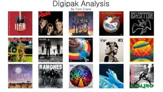
SORA AI: Will It Be the Future of Video Creation?
SORA AI: Will It Be the Future of Video Creation?SORA AI: Will It Be the Future of Video Creation?
SORA AI: Will It Be the Future of Video Creation?
 
DGR_Digital Advertising Strategies for a Cookieless World_Presentation.pdf
DGR_Digital Advertising Strategies for a Cookieless World_Presentation.pdfDGR_Digital Advertising Strategies for a Cookieless World_Presentation.pdf
DGR_Digital Advertising Strategies for a Cookieless World_Presentation.pdf
 
BrightonSEO - Addressing SEO & CX - CMDL - Apr 24 .pptx
BrightonSEO -  Addressing SEO & CX - CMDL - Apr 24 .pptxBrightonSEO -  Addressing SEO & CX - CMDL - Apr 24 .pptx
BrightonSEO - Addressing SEO & CX - CMDL - Apr 24 .pptx
 
What are the 4 characteristics of CTAs that convert?
What are the 4 characteristics of CTAs that convert?What are the 4 characteristics of CTAs that convert?
What are the 4 characteristics of CTAs that convert?
 
The Pitfalls of Keyword Stuffing in SEO Copywriting
The Pitfalls of Keyword Stuffing in SEO CopywritingThe Pitfalls of Keyword Stuffing in SEO Copywriting
The Pitfalls of Keyword Stuffing in SEO Copywriting
 
DIGITAL MARKETING COURSE IN BTM -Influencer Marketing Strategy
DIGITAL MARKETING COURSE IN BTM -Influencer Marketing StrategyDIGITAL MARKETING COURSE IN BTM -Influencer Marketing Strategy
DIGITAL MARKETING COURSE IN BTM -Influencer Marketing Strategy
 
From Chance to Choice - Tactical Link Building for International SEO
From Chance to Choice - Tactical Link Building for International SEOFrom Chance to Choice - Tactical Link Building for International SEO
From Chance to Choice - Tactical Link Building for International SEO
 
Word Count for Writers: Examples of Word Counts for Sample Genres
Word Count for Writers: Examples of Word Counts for Sample GenresWord Count for Writers: Examples of Word Counts for Sample Genres
Word Count for Writers: Examples of Word Counts for Sample Genres
 
Master the Art of Digital Recruitment in Asia.pdf
Master the Art of Digital Recruitment in Asia.pdfMaster the Art of Digital Recruitment in Asia.pdf
Master the Art of Digital Recruitment in Asia.pdf
 
Research and Discovery Tools for Experimentation - 17 Apr 2024 - v 2.3 (1).pdf
Research and Discovery Tools for Experimentation - 17 Apr 2024 - v 2.3 (1).pdfResearch and Discovery Tools for Experimentation - 17 Apr 2024 - v 2.3 (1).pdf
Research and Discovery Tools for Experimentation - 17 Apr 2024 - v 2.3 (1).pdf
 
(Generative) AI & Marketing: - Out of the Hype - Empowering the Marketing M...
(Generative) AI & Marketing: - Out of the Hype - Empowering the Marketing M...(Generative) AI & Marketing: - Out of the Hype - Empowering the Marketing M...
(Generative) AI & Marketing: - Out of the Hype - Empowering the Marketing M...
 
TAM AdEx 2023 Cross Media Advertising Recap - Auto Sector
TAM AdEx 2023 Cross Media Advertising Recap - Auto SectorTAM AdEx 2023 Cross Media Advertising Recap - Auto Sector
TAM AdEx 2023 Cross Media Advertising Recap - Auto Sector
 
Fueling A_B experiments with behavioral insights (1).pdf
Fueling A_B experiments with behavioral insights (1).pdfFueling A_B experiments with behavioral insights (1).pdf
Fueling A_B experiments with behavioral insights (1).pdf
 
定制(ULV毕业证书)拉文大学毕业证成绩单原版一比一
定制(ULV毕业证书)拉文大学毕业证成绩单原版一比一定制(ULV毕业证书)拉文大学毕业证成绩单原版一比一
定制(ULV毕业证书)拉文大学毕业证成绩单原版一比一
 
Call Girls In Aerocity Delhi ❤️8860477959 Good Looking Escorts In 24/7 Delhi NCR
Call Girls In Aerocity Delhi ❤️8860477959 Good Looking Escorts In 24/7 Delhi NCRCall Girls In Aerocity Delhi ❤️8860477959 Good Looking Escorts In 24/7 Delhi NCR
Call Girls In Aerocity Delhi ❤️8860477959 Good Looking Escorts In 24/7 Delhi NCR
 
Forecast of Content Marketing through AI
Forecast of Content Marketing through AIForecast of Content Marketing through AI
Forecast of Content Marketing through AI
 
The Impact of Digital Technologies
The Impact of Digital Technologies The Impact of Digital Technologies
The Impact of Digital Technologies
 
Exploring The World Of Adult Ad Networks.pdf
Exploring The World Of Adult Ad Networks.pdfExploring The World Of Adult Ad Networks.pdf
Exploring The World Of Adult Ad Networks.pdf
 
Influencer Marketing Power point presentation
Influencer Marketing  Power point presentationInfluencer Marketing  Power point presentation
Influencer Marketing Power point presentation
 
Mastering SEO in the Evolving AI-driven World
Mastering SEO in the Evolving AI-driven WorldMastering SEO in the Evolving AI-driven World
Mastering SEO in the Evolving AI-driven World
 

Digipak analysis

  • 2. Digipak Analysis 1 All Over the World: The Very Best of Electric Light Orchestra is a compilation album by the Electric Light Orchestra, released in 2005. Originally released exclusively in the band's home market (the UK), the album sold very well, becoming the ELO's first Top Ten entry since Dino Record's compilation album The Very Best of the Electric Light Orchestra hit number 4 in 1994. All Over the World sold over 300,000 copies in the UK alone within a year and a half of its release. The songs on the album include "Mr. Blue Sky“, "Evil Woman“, "Don't Bring Me Down“, "Sweet Talkin' Woman“, "Shine a Little Love“, "Turn to Stone“, "The Diary of Horace Wimp“, "Confusion“, "Hold on Tight“, "Livin' Thing“, "Telephone Line“, "All Over the World“, "Wild West Hero“, "Showdown“, "Ma-Ma- Ma Belle“, "Xanadu“, "Rockaria!“, "Strange Magic“, "Alright“ and "Rock 'n' Roll Is King“. The colour scheme when picked out from the front cover looks very bright and appealing, this allows the album cover to look eye catchy and people will be drawn towards the cover. The colours on the album allow for many representations of the album is and also the songs. Yellow is associated with joy, happiness, intellect, and energy. This is important for the audience as they can make this interpretation of the cover just by the image and colours that are used. Blue is the colour of the sky and sea. It is often associated with depth and stability. The colour blue is the colour that is used the most throughout the album cover, CD and the back cover. This may be to represent one of ELOs most popular songs called ‘Mr. Blue Sky’. The music that ELO produces is of the rock genre and there is heavy use of instruments through their work. This could represent the yellow on the front cover to represent the energy from the use of instruments. The back of the digipak is very simple, although it uses a variety of different colours, the layout looks very simple but unique. The back of the digipak also has the listing of songs, this is important information that is needed for the audience who buy the album. Furthermore the image used of earth will also draw the attention of the users. The back cover of the digipak uses a very plain and simple font, this can be very beneficial because it allows the audience to clearly see what songs are listed on the back cover. The yellow colour of the font allows it to stand out which makes it appealing and it makes its very clear to read. Furthermore the white font is also required information but it is in a much smaller font because the audience will not find it interesting and it wont make a difference to whether they buy it or not. Finally the image is very futuristic which may reflect a positive vibe for the album. The front cover of ‘All Over The World’ is very unique and colourful, this allows the cover to look appealing and eye catching. The use of a space ship allows it to give an unusual look and that also helps to grab the attention of the audience. There is clearly a motif across this digipak, we as the audience can see that there is a use of space ships and also space as we can see earth on the back cover. The font that they have used on the front cover of the digipak is very clear and can be easily read by the audience. The name of ELO is placed in the centre of the front cover as that is there abbreviation of Electric Light Orchestra. The cover gives the album a positive vibe due to the bright colours. Overall this digipak is very successful and meets many conventions of digipaks. The colour palette is very bright on the front cover and it gradually gets darker across the CD and the back cover but this does not effect the clean look of the digipak. The structure of the digipak looks well organised and everything looks to be in the right place like the barcode for example. I personally feel that the list of the songs could be placed in a better position as I feel they have just been placed in the middle of the page. Overall the ‘All Over The World’ has a very positive vibe due to the wide range of bright colours used.
  • 3. Digipak Analysis 2 The back cover of the digipak for ‘Nevermind’ by Nirvana is very unusual and we can see this through the unusual use of colours of orange and a light blue which looks like a swimming pool. I personally feel that the back cover lets the album down as I feel the structure of the back cover is very poor. I understand that they have used the water effect which continues throughout the digipak but this is something I will stay away from this when designing my digipak. Furthermore I feel the orange image on the back cover is very unusual and I personally feel that it doesn’t look right within the digipak. This is the first introduction of the bright orange across the digipak and although it stands out and looks very appealing it makes the back cover look odd. The font is very clear which makes it easier for the users to understand the songs that are listed. The black font colour allows it to also stand out due to the light blue back ground. It has all the require information on the back cover which is required and this is important especially when people come to buying the album. Overall the cover is very unusual but it works within the digipak to create a successful album. The colour scheme of this digipak is very bright and appealing and we can see this through the use of the colour blue. The use of the swimming pool is a motif across the digipak as it features on the front cover, CD and the back cover. Due to the bright blue colour it is eye catchy which grabs the attention of the audience. The colours on the album allow for many representations of the album is and also the songs. Blue is the colour of the sky and sea. It is often associated with depth and stability. The colour blue is the colour that is used the most throughout the album cover, CD and the back cover. Although the theme of blue is used across the digipak, there is an introduction of orange on the back cover. I personally feel that the image looks out of place on the back cover so this is something I would stay away from this when designing my digipak and stick to the same colour theme. Overall this digipak is very successful and it will grab the attention of the audience by the use of the unusual image and the colour scheme throughout the digipak. The digipak looks very structured and the use of swimming pool effects throughout the digipak makes it looks unique. We can see the strong structure through the organisation of the digipak, the band name Nirvana and the Album name is placed in the left hand corner of the front cover which is essential information and it empowering enough to catch the attention of the audience. Although I personally feel the back cover lets down the digipak due to the poor choice of image. Overall the digipak is successful in many ways and there has been many copies been sold. Nevermind is the second studio album by the American rock band Nirvana, released on September 24, 1991 by DGC Records. Produced by Butch Vig, Nevermind was the group's first release on DGC. Lead singer Kurt Cobain sought to make music outside the restrictive confines of the Seattle grunge scene, drawing influence from groups such as the Pixies and their use of "loud/quiet" dynamics. The songs on the album include ‘Smells Like Teen Spirit’, ‘In Bloom’, ‘Come As You Are’, ‘Breed’, ‘Lithium’, ‘Polly’, ‘Territorial Pissings’, ‘Drain You’, ‘Lounge Act’, ‘Stay Away Lyrics’, ‘On A Plain Lyrics’ and ‘Something In The Way’. Due to Nirvana being a rock band the songs will most likely meet many conventions of the genre rock. The digipak also fits the rock genre as it is very unusual and different which allows the digipak to have its own unique look. The front cover of the digipak is very unusual as it is not common to see a naked child in the middle of a swimming pool trying to catch money. This is a unique way of grabbing the audiences attention due to the unusual image. The colour blue is also very bright and appealing which will also catch the attention of the audience. The black font is very dominating and it stands out on the front cover which is important because the audience can see what the album is called and also the name of the band. The fonts are very clear which makes it easy to understand also the font used for ‘Nevermind’ is wavy which may represent the swimming pool.
  • 4. Digipak Analysis 3 The Dark Side of the Moon is the eighth album by the English rock band Pink Floyd. Originally released on 1 March 1973, on the label Harvest, it built on ideas explored in the band's earlier recordings and live shows, but departs from instrumental thematic by founding member Syd Barrett. The album explores themes including conflict, greed, the passage of time, and mental illness, the latter partly inspired by Barrett's deteriorating mental state. The songs on the album include ‘Speak to Me’, ‘Breathe (In the Air)’, ‘On the Run’, ‘Time’, ‘The Great Gig in the Sky’, ‘Money’, ‘Us and Them’, ‘Any Colour You Like’, ‘Brain Damage’ and ‘Eclipse’. It is important that the songs are listed on the back cover as people may buy the album due to a specific song. Due to Pink Floyd being a rock band they need to meet the conventions of rock. One way they have met the conventions of rock is using a black coloured theme which is typical within rock. The colour scheme of this Digipak is very conflicting as the majority of the digipak is black but it has a few bright colours in the from of a rainbow. Overall the colour scheme is very dark which is typical of the rock genre as rock bands wear black clothing. The colours actually work really work together well to portray a clean looking digipak. The use of colours are used across the digipak which is important because we can see the consistency of colour scheme throughout. The use of the rainbow is also very appealing as it will catch the attention of the audience due to the bright colours. I personally feel that the colour scheme Pink Floyd have used defines them as a band as the black represents their rock genre and the bright colours may define the music within the album. Overall the colour scheme of this digipak is very successful as it will grab the attention of users. The front cover of this digipak is very different compared to other digipaks, this plays to advantage of the album as more people will most likely look at the album due to it looking unusual. The reason the front cover is different is because it doesn’t have the name of the album or the name of the band. The colours used on the front cover are very eye catchy as the rainbow will draw the attention of the audience. The colour black that has been used may represent that they are a rock band as many bands within the rock genre use the colour black for their clothing. Furthermore the image is also very different and this may also attract the audience to looking at the album. Overall the cover looks very unique but it doesn’t follow the convention of including the band name and album name on the cover which is a negative. The back cover of the digipak is very well structured and organised which is important because the users will want the to see the vital information like the tack list etc. The songs are list in the top left hand corner which looks really good as it still allows space for the triangle image and rainbow which is repetitive across the digipak. All the required information is on the back cover which is essential. For example the barcode needs to be on the digipak as when people buy it, the album needs to be scanned. The back cover looks very clean and organised which is good because people are more likely to buy the album if it looks well organised. Overall the back cover looks well designed and has all the required information that the user would need.
  • 5. Magazine Advert Analysis 1 Stereophonics- Keep Calm and Carry On During my research of magazine adverts I came across Stereophonics magazine advert to promote their new album ‘ Keep Calm and Carry On’ which was released on 16 November 2009. The colour scheme of this magazine advert is very dark and gloomy, the colours used are very dull which will not help when it comes to attracting the audience to the advert. The sea water looks very grey along with the sky which portrays the album as very dark and depressing. Furthermore the advert is very simple, it includes the information that is needed so that the users understand about the new album. When people are flicking through a magazine they don’t want to read lots of information so this advert is successful in this way as the text is very minimalistic. The image that is used is very unusual as you wouldn’t ever see 4 men sat around a table in the middle of the see. The reason that this image works within the magazine is because people will be drawn towards it because it is so unusual. The fonts used throughout this advert is very simple but clear, the user will be able to read the text clearly which is important so that they know the information. The black font for the band name is clear due to it being black on a grey background, this is the same with the album name. These two bits of text are the most essential because it gives an idea to the audience what the advert is about. Overall the magazine advert is very successful due to the promotion of their new album, it includes vital information like the release date and also the name of the album.
  • 6. Magazine Advert Analysis 2 Kasabian- The Debut Album During my research of magazine adverts I came across Kasabian magazine advert to promote their new album ‘ The Debut Album’ which was released on 6 September 2004. The colour scheme of this magazine advert is mainly very dark due to the strong use of black throughout the advert. The contrast of black and white is really effective as the white text stands out on the image and it will catch the attention of the user. The advert is very simple and structured well which can be very effective as most people do not want to read a lot of information, they would prefer it to be short and snappy like this advert. The image that is used is very dominating on the advert and will catch the eye of the users, the image is a recurring motif across the album that Kasabian created. The fonts that is used throughout the advert is very clear and bold which make it easier for the audience to read the advert when going through their magazine. The white colour for the font also allows it to stand out more. When seeing a music magazine advert you would want to see the key points of the poster like the name of the band and also the name of the album and this advert successfully meets these conventions. Furthermore by having the name Kasabian printed in a big font at the top of the page it will also attract customers. Overall the magazine advert is very successful due to the promotion of their new album, it includes vital information like the bands website and also some of the songs that are included.
  • 7. Magazine Advert Analysis 3 The Killers- Day & Age During my research of magazine adverts I came across The Killers magazine advert to promote their new album ‘ Day & Age’ which was released on November 18, 2008. The colour scheme of this advert is very different and unusual, the use of the violet colour makes the advert stand out. All the colours used have been used in a certain effect as they are dotted on to create an image which is different and it will draw the attention of the users. The advert is also very simplistic and there is very little information provided but I feel this helps the advert to keep a clean look and I feel people will look at the advert due to there being very little information as they will most likely not want to read a lot of information. The image created by the dots looks like a sun setting which creates a very relaxing mood and this may represent the type of music that The Killers sing. The fonts that have been sued throughput the advert are very clear and bold which is important as it will grab the attention of the users. The colour of the fonts also work with the background as they stand out clearly. The white colour for the band name is very bold and big which is essential when trying to grab the attention of the users. Overall the magazine advert is very successful due to the promotion of their new album, it includes vital information like the name of the band and also the name of the album.