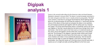
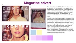
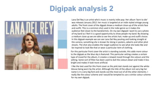
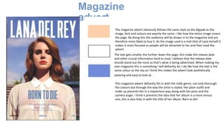
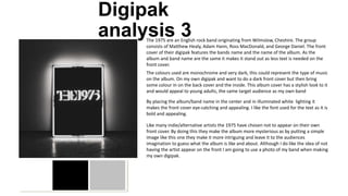
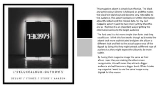
The document provides an analysis of several album digipaks and magazine advertisements. It summarizes key aspects of the designs that the author likes and wants to incorporate into their own digipak and advertisements. These include using colorful designs on the front with simpler designs on the back, including photos of the band, and ensuring track listings and release dates are prominently displayed. The author also notes preferences around font styles, color schemes, and inclusion of additional materials like posters or photos.