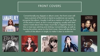
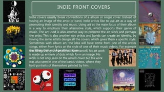
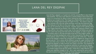
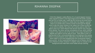
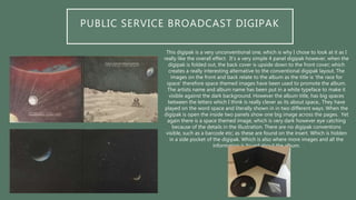
DIGIPAK ANALYSIS
WHAT IS A DIGIPAK?
A Digipak is a style of packaging, typically used
for CD singles or special editions albums.
Digipaks are normally in a book form layout,
with 4 or more fold out panels; with the CD or
CD’s encased inside. Digipaks are used to
promote the album or single, by using eye
catching images of the artists. They will usually
include some aspect of brand identity, for
example having the artist on the cover seen in
an iconic way, or through the use of colour seen
in videos of theirs etc. They are also used to tell
the audience more information about the artist
or band, sometimes digipaks will include a
sleeve, which will have additional images and
information for the audience to read, to learn
more about the artist and the story behind their
music.
Digipak’s were created by MeadWestvaco, and around the
2000’s is when they became a lot more popular by artists,
labels and also audiences. They massively benefit artists
and their music, because it’s a promotional process; which
brings awareness to them. They are advertised a lot more
than a regular CD, because they are seen as ‘special’ and
‘professional.’ Digipak’s are often associated with being
bought by ‘fans’, as they would need the special edition
copy of their favourite artists album, with more aspects;
from images to extras and personal information about the
chosen artist.
FRONT COVERS
Conventionally any digipak or album cover, the front cover will
have a picture of the artist or band so audiences can quickly
recognise the album. Usually it will be a medium or close up shot
of the artist or band, as this is most engaging; usually with their
name in bold above their head, much like a magazine layout; as
this is most eye catching and striking. Conventionally, as well as
having the artists name on the front cover, there will also be the
name of the album or single, to make it clear to audiences.
INDIE FRONT COVERS
Indie covers usually break conventions of a album or single cover. Instead of
having an image of the artist or band, indie artists like to use art as a way of
promoting their identity and music. Using art as the main focus of their album
is a way to emphasis their alternative style, which supports their genre of
music. The art used is also another way to promote the art work and perhaps
the artist. This is also another way artists and bands can create an identity, by
having the same artists design all the covers, which gives them a specific style.
Sometimes with album art, the idea will have come from one of the artists
songs, either from lyrics or the style of one of their music videos. For example
the Killers Day and Age album coverwas designed by the artist Paul Normansell, his art work
is made up entirely of dots which form an image. His
work is not only seen on the album cover but his work
was also seen in one of the bands videos, where they
hold portraits of themselves painted by him.
LANA DEL REY DIGIPAK
Lana Del Rey’s digipak is a 4 panel one and the overall effect is very minimal
and simplistic. The front cover features a central medium shot of the artist,
which is a convention for album covers; having the artist central draws the
audience eye straight to her. The image has a faded effect to it, which links
well to her vintage style and also her style of music. The colours used are
very minimal, with only red, white and blue; much like the American flag,
which features in her Born to Die music video. Lana has created an identity
by the use of continuity in her products . Another aspect of her identity which
is also hugely featured are flowers, she is often seen wearing a flower crown
or they will be in her videos in some way. In this case the flowers are seen on
the CD, which also brings the bold red into the digipak, to make it stand out.
The artists name is very big and bold at the top of the image in white, to
contrast to the blue background, which is then reversed for the album name
at the bottom; which is in blue to contrast against her white shirt. The back
panel of the digipak is where the conventions of a digipak are, things such as
the barcode etc. This is where all the different songs are, again sticking to the
blue and white colour scheme. The same typeface has been used all the way
through the digipak to make it all link and create a nice flow. The simplicity of
the overall digipak draws the audiences attention to Lana and her beauty,
which is the whole idea of a digipak to promote the artist. Inside the digipak
is a simple image across the two panels. I think this is really effective as it
draws your attention straight to her. She is seen wearing the same outfit in
the same location however through her body language and pose gives more
RIHANNA DIGIPAK
I think this digipak is really effective. It’s a 6 panel digipak, however
when opened up there is one large image across the inside 3 panels,
with the CD’s on either side. I really like this format as the artists face is
in the central panel, therefore is visible when the digipak is opened.
There is an overall colour scheme carried out through the digipak
which is also the colour scheme in her videos; this is done to give her
as an artist an identity. The colour red is mainly used as when this
album came out in 2010, Rhianna had red hair and this was a big part
of her identity. The colour red has connotations of love, which could be
a reason it was used, as a lot of her music is love songs, therefore the
digipak was made to suit her style of music. There album cover is a
close up shot of her, unconventionally she is not looking at the camera,
which is unusual however works really well; as she fills the whole frame
which makes it a lot more engaging than the conventional medium
close up shot. As the 3 panel picture features a lot of flowers, the CD’s
have a flowers on them, however in a lighter colour to contrast to the
background and make them more visible and eye catching.
PUBLIC SERVICE BROADCAST DIGIPAK
This digipak is a very unconventional one, which is why I chose to look at it as I
really like the overall effect. It’s a very simple 4 panel digipak however, when the
digipak is folded out, the back cover is upside down to the front cover; which
creates a really interesting alternative to the conventional digipak layout. The
images on the front and back relate to the album as the title is ‘the race for
space’ therefore space themed images have been used to promote the album.
The artists name and album name has been put in a white typeface to make it
visible against the dark background. However the album title, has big spaces
between the letters which I think is really clever as its about space,. They have
played on the word space and literally shown in in two different ways. When the
digipak is open the inside two panels show one big image across the pages. Yet
again there is a space themed image, which is very dark however eye catching
because of the details in the illustration. There are no digipak conventions
visible, such as a barcode etc; as these are found on the insert. Which is hidden
in a side pocket of the digipak. Which is also where more images and all the
information is found about the album.

Digipak Analysis

  • 1.
  • 2.
    WHAT IS ADIGIPAK? A Digipak is a style of packaging, typically used for CD singles or special editions albums. Digipaks are normally in a book form layout, with 4 or more fold out panels; with the CD or CD’s encased inside. Digipaks are used to promote the album or single, by using eye catching images of the artists. They will usually include some aspect of brand identity, for example having the artist on the cover seen in an iconic way, or through the use of colour seen in videos of theirs etc. They are also used to tell the audience more information about the artist or band, sometimes digipaks will include a sleeve, which will have additional images and information for the audience to read, to learn more about the artist and the story behind their music. Digipak’s were created by MeadWestvaco, and around the 2000’s is when they became a lot more popular by artists, labels and also audiences. They massively benefit artists and their music, because it’s a promotional process; which brings awareness to them. They are advertised a lot more than a regular CD, because they are seen as ‘special’ and ‘professional.’ Digipak’s are often associated with being bought by ‘fans’, as they would need the special edition copy of their favourite artists album, with more aspects; from images to extras and personal information about the chosen artist.
  • 3.
    FRONT COVERS Conventionally anydigipak or album cover, the front cover will have a picture of the artist or band so audiences can quickly recognise the album. Usually it will be a medium or close up shot of the artist or band, as this is most engaging; usually with their name in bold above their head, much like a magazine layout; as this is most eye catching and striking. Conventionally, as well as having the artists name on the front cover, there will also be the name of the album or single, to make it clear to audiences.
  • 4.
    INDIE FRONT COVERS Indiecovers usually break conventions of a album or single cover. Instead of having an image of the artist or band, indie artists like to use art as a way of promoting their identity and music. Using art as the main focus of their album is a way to emphasis their alternative style, which supports their genre of music. The art used is also another way to promote the art work and perhaps the artist. This is also another way artists and bands can create an identity, by having the same artists design all the covers, which gives them a specific style. Sometimes with album art, the idea will have come from one of the artists songs, either from lyrics or the style of one of their music videos. For example the Killers Day and Age album coverwas designed by the artist Paul Normansell, his art work is made up entirely of dots which form an image. His work is not only seen on the album cover but his work was also seen in one of the bands videos, where they hold portraits of themselves painted by him.
  • 5.
    LANA DEL REYDIGIPAK Lana Del Rey’s digipak is a 4 panel one and the overall effect is very minimal and simplistic. The front cover features a central medium shot of the artist, which is a convention for album covers; having the artist central draws the audience eye straight to her. The image has a faded effect to it, which links well to her vintage style and also her style of music. The colours used are very minimal, with only red, white and blue; much like the American flag, which features in her Born to Die music video. Lana has created an identity by the use of continuity in her products . Another aspect of her identity which is also hugely featured are flowers, she is often seen wearing a flower crown or they will be in her videos in some way. In this case the flowers are seen on the CD, which also brings the bold red into the digipak, to make it stand out. The artists name is very big and bold at the top of the image in white, to contrast to the blue background, which is then reversed for the album name at the bottom; which is in blue to contrast against her white shirt. The back panel of the digipak is where the conventions of a digipak are, things such as the barcode etc. This is where all the different songs are, again sticking to the blue and white colour scheme. The same typeface has been used all the way through the digipak to make it all link and create a nice flow. The simplicity of the overall digipak draws the audiences attention to Lana and her beauty, which is the whole idea of a digipak to promote the artist. Inside the digipak is a simple image across the two panels. I think this is really effective as it draws your attention straight to her. She is seen wearing the same outfit in the same location however through her body language and pose gives more
  • 6.
    RIHANNA DIGIPAK I thinkthis digipak is really effective. It’s a 6 panel digipak, however when opened up there is one large image across the inside 3 panels, with the CD’s on either side. I really like this format as the artists face is in the central panel, therefore is visible when the digipak is opened. There is an overall colour scheme carried out through the digipak which is also the colour scheme in her videos; this is done to give her as an artist an identity. The colour red is mainly used as when this album came out in 2010, Rhianna had red hair and this was a big part of her identity. The colour red has connotations of love, which could be a reason it was used, as a lot of her music is love songs, therefore the digipak was made to suit her style of music. There album cover is a close up shot of her, unconventionally she is not looking at the camera, which is unusual however works really well; as she fills the whole frame which makes it a lot more engaging than the conventional medium close up shot. As the 3 panel picture features a lot of flowers, the CD’s have a flowers on them, however in a lighter colour to contrast to the background and make them more visible and eye catching.
  • 7.
    PUBLIC SERVICE BROADCASTDIGIPAK This digipak is a very unconventional one, which is why I chose to look at it as I really like the overall effect. It’s a very simple 4 panel digipak however, when the digipak is folded out, the back cover is upside down to the front cover; which creates a really interesting alternative to the conventional digipak layout. The images on the front and back relate to the album as the title is ‘the race for space’ therefore space themed images have been used to promote the album. The artists name and album name has been put in a white typeface to make it visible against the dark background. However the album title, has big spaces between the letters which I think is really clever as its about space,. They have played on the word space and literally shown in in two different ways. When the digipak is open the inside two panels show one big image across the pages. Yet again there is a space themed image, which is very dark however eye catching because of the details in the illustration. There are no digipak conventions visible, such as a barcode etc; as these are found on the insert. Which is hidden in a side pocket of the digipak. Which is also where more images and all the information is found about the album.