The document summarizes and analyzes the album covers, layouts, colors, genres, and branding of four different albums:
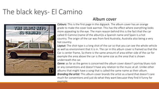
1. The Black Keys - El Camino uses an orange-tinted photo of a car to represent the album's Spanish name and origins. It features the car centered in the frame with equal space above and below. The cover subverts genre conventions to brand the artist as unconventional.
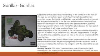
2. Gorillaz - Gorillaz features a camouflaged car on a white background to catch attention. It is positioned as driving toward the viewer. The cover follows alternative hip hop conventions while subverting bright electronica styles. This brands the artists as curious and unseen.