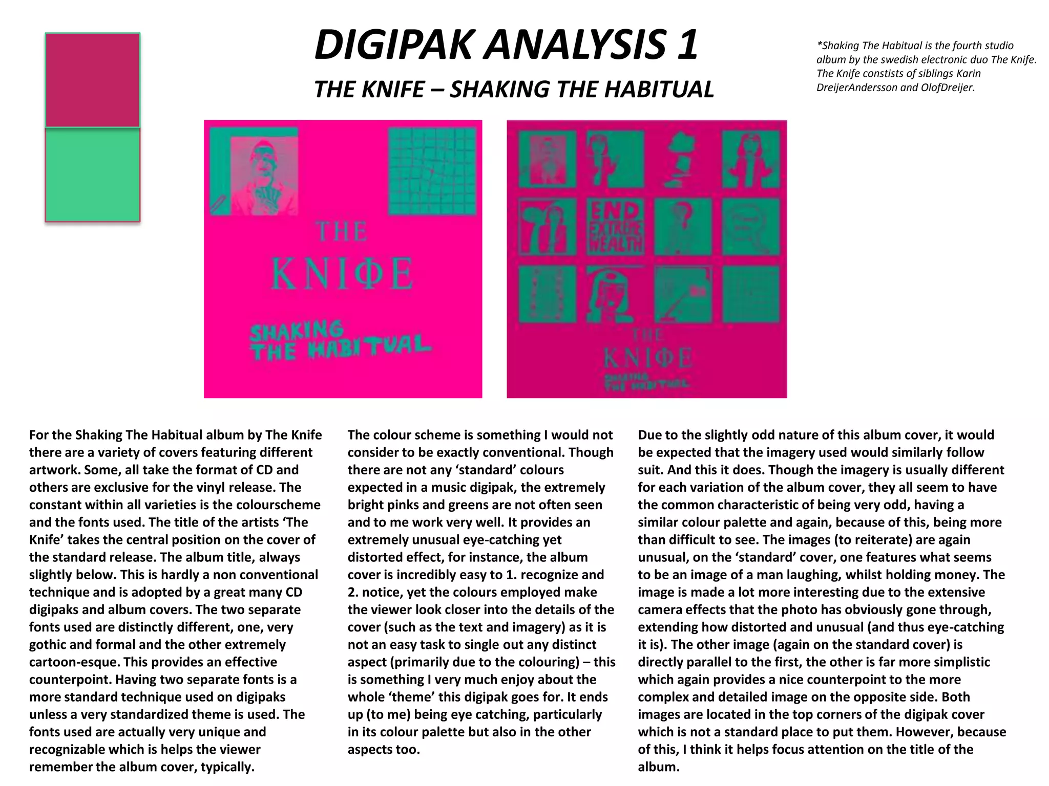
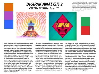
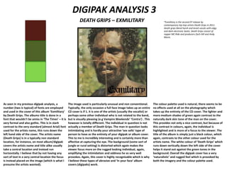
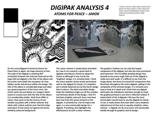
DIGIPAK ANALYSIS 1
THE KNIFE – SHAKING THE HABITUAL
For the Shaking The Habitual album by The Knife
there are a variety of covers featuring different
artwork. Some, all take the format of CD and
others are exclusive for the vinyl release. The
constant within all varieties is the colourscheme
and the fonts used. The title of the artists ‘The
Knife’ takes the central position on the cover of
the standard release. The album title, always
slightly below. This is hardly a non conventional
technique and is adopted by a great many CD
digipaks and album covers. The two separate
fonts used are distinctly different, one, very
gothic and formal and the other extremely
cartoon-esque. This provides an effective
counterpoint. Having two separate fonts is a
more standard technique used on digipaks
unless a very standardized theme is used. The
fonts used are actually very unique and
recognizable which is helps the viewer
remember the album cover, typically.
The colour scheme is something I would not
consider to be exactly conventional. Though
there are not any ‘standard’ colours
expected in a music digipak, the extremely
bright pinks and greens are not often seen
and to me work very well. It provides an
extremely unusual eye-catching yet
distorted effect, for instance, the album
cover is incredibly easy to 1. recognize and
2. notice, yet the colours employed make
the viewer look closer into the details of the
cover (such as the text and imagery) as it is
not an easy task to single out any distinct
aspect (primarily due to the colouring) – this
is something I very much enjoy about the
whole ‘theme’ this digipak goes for. It ends
up (to me) being eye catching, particularly
in its colour palette but also in the other
aspects too.
Due to the slightly odd nature of this album cover, it would
be expected that the imagery used would similarly follow
suit. And this it does. Though the imagery is usually different
for each variation of the album cover, they all seem to have
the common characteristic of being very odd, having a
similar colour palette and again, because of this, being more
than difficult to see. The images (to reiterate) are again
unusual, on the ‘standard’ cover, one features what seems
to be an image of a man laughing, whilst holding money. The
image is made a lot more interesting due to the extensive
camera effects that the photo has obviously gone through,
extending how distorted and unusual (and thus eye-catching
it is). The other image (again on the standard cover) is
directly parallel to the first, the other is far more simplistic
which again provides a nice counterpoint to the more
complex and detailed image on the opposite side. Both
images are located in the top corners of the digipak cover
which is not a standard place to put them. However, because
of this, I think it helps focus attention on the title of the
album.
*Shaking The Habitual is the fourth studio
album by the swedish electronic duo The Knife.
The Knife constists of siblings Karin
DreijerAndersson and OlofDreijer.
DIGIPAK ANALYSIS 2
CAPTAIN MURPHY - DUALITY
There is actually very little text on the cover of this
album (digipak). There are many more variations
for the album artwork than there are for ‘Shaking
The Habitual’ by ‘The Knife’ (around 20 different
pieces of artwork I believe) yet all of them have
very little text. On the original cover (the one on
the left) the only text featured is simply the artists
name ‘Captain Murphy’. It is done in a very
simplistic and standardised font, and to be honest
at first glance is hardly noticeable due to its
colouring. This again is a massive contrast to the
very complex background that creates the majority
of the album cover. Due to the graphics on the
cover, there isn't really any room for a ‘huge’
amount of text, so personally, I believe this works
well. On the other cover (as an example) there is
no text at all, meaning again the focus is solely
retained on the imagery.
The colour scheme employed is obviously, again,
very vivid, bright and unusual. There is not really
a set colour palette for the album artwork
however on the original cover it mostly consists
of orange shades combined with some purpled
and darker blues. This is very abstract, not only
is it intriguing to look at, but the colours used
are very harmonious and generally gives the
album cover a very ‘soft’ feel in terms of cover.
This of course contrasts hugely with the graphics
which are not in the slightest bit ‘soft’ (e.g ‘The
Captain’ standing on a mound of skulls) I think
again, this is a great counterpoint and definitely
gives the entirety of the cover an abstract feel,
one that is again, very intriguing to the viewer.
This unusual and contrasting colour scheme in
used on every variation of the album artwork.
The imagery, or rather, graphics used on the album
artwork for ‘Duality’ are obviously varied (as stated
before) – they are often very dark and abstract, they
have a very ‘pop art’ sort of feel combined with some
sort of villainous comic strip. It is definitely detailed
and because of this, interesting. The variations of the
imagery are also ‘nice’ to look at, though not perhaps
your standard sort of graphic you would expect on an
album/digipak cover, I think it works incredibly well,
not only is it something I believe the viewer will be
inclined to study in detail, it is something I believe
they will be inclined to remember. This is something
that not every album cover achieves. If anything, I
feel that the graphics are certainly iconic, particularly
Captain Murphy. This, combined with the lack of text
and bright colouring means that the attention is
always retained on the various graphics.
*Captain Murphy is the ‘alter ego’ of renowned producer
Flying Lotus, Captain Murphy rose to fame in 2013 after
releasing his first album/mixtape Duality which features
incredibly experimental and dark rap and production.
Captain Murphy’s identity was unknown until months
after its release. Flying Lotus’s alter ego is named after
the character from Sealab.
DIGIPAK ANALYSIS 3
DEATH GRIPS – EXMILITARY
As seen in my previous digipak analysis, a
number (two is typical) of fonts are employed
and used in the cover of this album ‘Exmilitary’
by Death Grips. The albums title is done in a
font that wouldn’t be amiss in ‘The Times’ – it is
very formal and also gothic. This is in stark
contrast to the very standard (almost Arial) font
used for the artists name, this runs down the
left hand side of the cover. The artists name
(Death Grips) is in a typically non standard
location, for instance, on most album/digipak
covers the artists name and title alike usually
take a central location and instead run
horizontally. I believe that by not having any
sort of text in a very central location the focus
is instead placed on the image (which is what I
presume the artists wanted).
The image used is particularly unusual and non conventional.
Typically, the only occasion a full face image takes up an entire
CD cover is if 1. it is one of the artists (usually the vocalist) or
perhaps some other individual who is not related to the band,
but is visually pleasing (e.g Vampire Weekends’ ‘Contra’) . This
however is totally different. The individual in question is not
actually a member of Death Grips. The man in question looks
intimidating and is hardly your attractive ‘sex sells’ type of
person to have as the entirety of your digipak or album cover.
This to me is incredibly interesting and is certainly more than
affective at capturing the eye. The background (some sort of
jungle or rural setting) is distorted which again makes the
viewer focus more on the rugged looking individual, again,
amplifying the intimidation and oddness he so very well
provokes. Again, this cover is highly recognizable which is why
I believe these types of abrasive and ‘in your face’ album
covers (digipaks) work.
The colour palette used is natural, there seems to be
no effects used at all on the photography which
takes up the entirety of the CD cover. The lighter and
more medium shades of green again contrast to the
naturally dark skin tone of the man on the cover.
This provides not only a nice contrast, but because of
this contrast in colours, again, the individual is
highlighted and is more of a focus to the viewer. The
title of the album is simply just a black colour, which
again, contrasts to the other colour used for the
artists name. The white colour of ‘Death Grips’ which
runs down vertically down the left side of the cover
helps it stand out against the green tones in the
background. Overall the digipak cover has a very
‘naturalistic’ and rugged feel which is provoked by
both the imagery and the colour palette used.
*Exmilitary is the second EP release by
contemporary hip-hop artists Death Grips in 2011.
Death grips blend harsh and brash vocals with edgy
and dark electronic beats. Death Grips consist of
rapper MC Ride and producers Zach Hill and Andy
Morin.
DIGIPAK ANALYSIS 4
ATOMS FOR PEACE – AMOK
On the cover/digipak of Amok by Atoms For
Peace there is again, not huge amounts of text.
The style of the digipak is anything BUT
minimalist however the only text featured on the
huge fold out digipak is the title of the album and
the artists name (with the exception of a few
hidden words and phrases within the design. The
title of the album is considerably large and takes
up a good proportion of the front cover, the
artists name sits just below at a tangent which
means it crosses over with the title of the album.
It is considerably smaller. Both fonts differ in
colour, they seem to be the reverse of one
another (e.g black with a white outluner and
white with a black outline) and I feel this helps
each piece of text stand out against the hectic
similarly-coloured background.
The colour scheme is simply black and white.
As I saw in my research, a great deal of
digipaks and albums choose to adopt this
theme as although it may not be the
‘brightest’ design, it is certainly bold. I think
the colour palette chosen works particularly
well on the digipak for Amok, it is simplistic,
yet is totally balanced out by the hectic design
that it colours. The black and white design
helps the individual single out all the complex
and intricate details of the design. I feel if it
had been brightly coloured, focus may have
been lost from the actual artwork on the
digipak. It certainly has a lot of impact and
again, is a very memorable design for a
digipak. If anything, this highlights the
effectiveness of such a colour scheme.
The graphics I believe are not only the largest
component of the digipak, but also the most prominent
and important. The incredibly detailed design that
spreads across every single fold out of the digipak is
really very well made. It is difficult to see from the
image above, but there are actual foil components that
illuminate throughout the entire digipak, adding to the
complexity of the intricate design. It is certainly very
easy to look at in detail and I think that any digipak
which gets the individuals attention enough to study
the graphics/artwork is one that is effective indeed. If
asked which of the 4 digipaks I felt was the most
memorable I would have to say the digipak for Amok.
To me, it really shows that even with a very simplistic
style/amount of text and an equally simplistic colour
scheme – a digipak can be very iconic and memorable
wholly through its graphics and its design.
*Amok is the first studio album release from
Atoms For Peace earlier in 2013. Atoms For
Peace consists of Radiohead vocalist Thom
Yorke and acclaimed producer Nigel
Godrich.

DIGIPAK ANALYSIS

  • 1.
    DIGIPAK ANALYSIS 1 THEKNIFE – SHAKING THE HABITUAL For the Shaking The Habitual album by The Knife there are a variety of covers featuring different artwork. Some, all take the format of CD and others are exclusive for the vinyl release. The constant within all varieties is the colourscheme and the fonts used. The title of the artists ‘The Knife’ takes the central position on the cover of the standard release. The album title, always slightly below. This is hardly a non conventional technique and is adopted by a great many CD digipaks and album covers. The two separate fonts used are distinctly different, one, very gothic and formal and the other extremely cartoon-esque. This provides an effective counterpoint. Having two separate fonts is a more standard technique used on digipaks unless a very standardized theme is used. The fonts used are actually very unique and recognizable which is helps the viewer remember the album cover, typically. The colour scheme is something I would not consider to be exactly conventional. Though there are not any ‘standard’ colours expected in a music digipak, the extremely bright pinks and greens are not often seen and to me work very well. It provides an extremely unusual eye-catching yet distorted effect, for instance, the album cover is incredibly easy to 1. recognize and 2. notice, yet the colours employed make the viewer look closer into the details of the cover (such as the text and imagery) as it is not an easy task to single out any distinct aspect (primarily due to the colouring) – this is something I very much enjoy about the whole ‘theme’ this digipak goes for. It ends up (to me) being eye catching, particularly in its colour palette but also in the other aspects too. Due to the slightly odd nature of this album cover, it would be expected that the imagery used would similarly follow suit. And this it does. Though the imagery is usually different for each variation of the album cover, they all seem to have the common characteristic of being very odd, having a similar colour palette and again, because of this, being more than difficult to see. The images (to reiterate) are again unusual, on the ‘standard’ cover, one features what seems to be an image of a man laughing, whilst holding money. The image is made a lot more interesting due to the extensive camera effects that the photo has obviously gone through, extending how distorted and unusual (and thus eye-catching it is). The other image (again on the standard cover) is directly parallel to the first, the other is far more simplistic which again provides a nice counterpoint to the more complex and detailed image on the opposite side. Both images are located in the top corners of the digipak cover which is not a standard place to put them. However, because of this, I think it helps focus attention on the title of the album. *Shaking The Habitual is the fourth studio album by the swedish electronic duo The Knife. The Knife constists of siblings Karin DreijerAndersson and OlofDreijer.
  • 2.
    DIGIPAK ANALYSIS 2 CAPTAINMURPHY - DUALITY There is actually very little text on the cover of this album (digipak). There are many more variations for the album artwork than there are for ‘Shaking The Habitual’ by ‘The Knife’ (around 20 different pieces of artwork I believe) yet all of them have very little text. On the original cover (the one on the left) the only text featured is simply the artists name ‘Captain Murphy’. It is done in a very simplistic and standardised font, and to be honest at first glance is hardly noticeable due to its colouring. This again is a massive contrast to the very complex background that creates the majority of the album cover. Due to the graphics on the cover, there isn't really any room for a ‘huge’ amount of text, so personally, I believe this works well. On the other cover (as an example) there is no text at all, meaning again the focus is solely retained on the imagery. The colour scheme employed is obviously, again, very vivid, bright and unusual. There is not really a set colour palette for the album artwork however on the original cover it mostly consists of orange shades combined with some purpled and darker blues. This is very abstract, not only is it intriguing to look at, but the colours used are very harmonious and generally gives the album cover a very ‘soft’ feel in terms of cover. This of course contrasts hugely with the graphics which are not in the slightest bit ‘soft’ (e.g ‘The Captain’ standing on a mound of skulls) I think again, this is a great counterpoint and definitely gives the entirety of the cover an abstract feel, one that is again, very intriguing to the viewer. This unusual and contrasting colour scheme in used on every variation of the album artwork. The imagery, or rather, graphics used on the album artwork for ‘Duality’ are obviously varied (as stated before) – they are often very dark and abstract, they have a very ‘pop art’ sort of feel combined with some sort of villainous comic strip. It is definitely detailed and because of this, interesting. The variations of the imagery are also ‘nice’ to look at, though not perhaps your standard sort of graphic you would expect on an album/digipak cover, I think it works incredibly well, not only is it something I believe the viewer will be inclined to study in detail, it is something I believe they will be inclined to remember. This is something that not every album cover achieves. If anything, I feel that the graphics are certainly iconic, particularly Captain Murphy. This, combined with the lack of text and bright colouring means that the attention is always retained on the various graphics. *Captain Murphy is the ‘alter ego’ of renowned producer Flying Lotus, Captain Murphy rose to fame in 2013 after releasing his first album/mixtape Duality which features incredibly experimental and dark rap and production. Captain Murphy’s identity was unknown until months after its release. Flying Lotus’s alter ego is named after the character from Sealab.
  • 3.
    DIGIPAK ANALYSIS 3 DEATHGRIPS – EXMILITARY As seen in my previous digipak analysis, a number (two is typical) of fonts are employed and used in the cover of this album ‘Exmilitary’ by Death Grips. The albums title is done in a font that wouldn’t be amiss in ‘The Times’ – it is very formal and also gothic. This is in stark contrast to the very standard (almost Arial) font used for the artists name, this runs down the left hand side of the cover. The artists name (Death Grips) is in a typically non standard location, for instance, on most album/digipak covers the artists name and title alike usually take a central location and instead run horizontally. I believe that by not having any sort of text in a very central location the focus is instead placed on the image (which is what I presume the artists wanted). The image used is particularly unusual and non conventional. Typically, the only occasion a full face image takes up an entire CD cover is if 1. it is one of the artists (usually the vocalist) or perhaps some other individual who is not related to the band, but is visually pleasing (e.g Vampire Weekends’ ‘Contra’) . This however is totally different. The individual in question is not actually a member of Death Grips. The man in question looks intimidating and is hardly your attractive ‘sex sells’ type of person to have as the entirety of your digipak or album cover. This to me is incredibly interesting and is certainly more than affective at capturing the eye. The background (some sort of jungle or rural setting) is distorted which again makes the viewer focus more on the rugged looking individual, again, amplifying the intimidation and oddness he so very well provokes. Again, this cover is highly recognizable which is why I believe these types of abrasive and ‘in your face’ album covers (digipaks) work. The colour palette used is natural, there seems to be no effects used at all on the photography which takes up the entirety of the CD cover. The lighter and more medium shades of green again contrast to the naturally dark skin tone of the man on the cover. This provides not only a nice contrast, but because of this contrast in colours, again, the individual is highlighted and is more of a focus to the viewer. The title of the album is simply just a black colour, which again, contrasts to the other colour used for the artists name. The white colour of ‘Death Grips’ which runs down vertically down the left side of the cover helps it stand out against the green tones in the background. Overall the digipak cover has a very ‘naturalistic’ and rugged feel which is provoked by both the imagery and the colour palette used. *Exmilitary is the second EP release by contemporary hip-hop artists Death Grips in 2011. Death grips blend harsh and brash vocals with edgy and dark electronic beats. Death Grips consist of rapper MC Ride and producers Zach Hill and Andy Morin.
  • 4.
    DIGIPAK ANALYSIS 4 ATOMSFOR PEACE – AMOK On the cover/digipak of Amok by Atoms For Peace there is again, not huge amounts of text. The style of the digipak is anything BUT minimalist however the only text featured on the huge fold out digipak is the title of the album and the artists name (with the exception of a few hidden words and phrases within the design. The title of the album is considerably large and takes up a good proportion of the front cover, the artists name sits just below at a tangent which means it crosses over with the title of the album. It is considerably smaller. Both fonts differ in colour, they seem to be the reverse of one another (e.g black with a white outluner and white with a black outline) and I feel this helps each piece of text stand out against the hectic similarly-coloured background. The colour scheme is simply black and white. As I saw in my research, a great deal of digipaks and albums choose to adopt this theme as although it may not be the ‘brightest’ design, it is certainly bold. I think the colour palette chosen works particularly well on the digipak for Amok, it is simplistic, yet is totally balanced out by the hectic design that it colours. The black and white design helps the individual single out all the complex and intricate details of the design. I feel if it had been brightly coloured, focus may have been lost from the actual artwork on the digipak. It certainly has a lot of impact and again, is a very memorable design for a digipak. If anything, this highlights the effectiveness of such a colour scheme. The graphics I believe are not only the largest component of the digipak, but also the most prominent and important. The incredibly detailed design that spreads across every single fold out of the digipak is really very well made. It is difficult to see from the image above, but there are actual foil components that illuminate throughout the entire digipak, adding to the complexity of the intricate design. It is certainly very easy to look at in detail and I think that any digipak which gets the individuals attention enough to study the graphics/artwork is one that is effective indeed. If asked which of the 4 digipaks I felt was the most memorable I would have to say the digipak for Amok. To me, it really shows that even with a very simplistic style/amount of text and an equally simplistic colour scheme – a digipak can be very iconic and memorable wholly through its graphics and its design. *Amok is the first studio album release from Atoms For Peace earlier in 2013. Atoms For Peace consists of Radiohead vocalist Thom Yorke and acclaimed producer Nigel Godrich.