"LLMs for Python Engineers: Advanced Data Analysis and Semantic Kernel",Oleks...
Magazine front cover and contents page layouts, fonts and colours
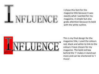
1. I chose this font for the
magazine title because it was
exactly what I wanted for my
magazine, it simple but also
grabs attention because its bold
with the white outline.
This is my final design for the
magazine title, I used the colours
red, black and white to link to the
colours I have chosen for my
magazine. The bold red box
behind the ‘I’ makes it stand out
more and can be shortened to ‘I
music’.
2. On the left is my first layout, all the cover lines are on the left
because that’s the first things the will see. I thought that this
would be important to attract attention. Although this is
important I don’t like how close together they are. The attention
will be taken of the main image more as the cover lines would
look separated
from the image
as there sectioned
to one side.
Because I didn’t
like how the cover lines were all on the one side I spread them
out on the page more keeping the lead article on the left so that
it still gains attention from the audience on the first glance. I’m
still not happy about how it is set out because the cover lines
look like their dotted in random positions. I moved the flash to
the top because it’s an important thing for the readers to
see, but I preferred it at the bottom.
3. This is my final layout for my front cover that
I chose, I have added the cover lines to it.
Again the writing is red, black and white. This
creates a simple look but links it to the kind
of music that it contains. Adding an edgy rock
look, which is what I want for my magazine.
The cover lines are to the one side whilst the
lead article is to the other, separating them
and making the lead article more important.
They are spread to either side because this
will keep the attention on the main image
because it will be placed in the centre. The
two cover lines are in the left 3rd because this
is the first thing seen on the cover.
The lead article is bigger and bolder than the
rest because it’s the most important and the
one that needs to catch the readers eye.
These will attract the attention. The logo of ‘I
music’ will also be seen first and hopefully be
recognised by regular readers.
I found this layout would be most
aesthetically pleasing to the audience.
4. I want the heading of the
contents page on a side so
18
These are the
different font that there is more room on
options for the page the page and I like the look
numbers on the of it. I've also added the ‘I
contents page. They music’ logo onto the
18 need to be bold and contents page so that it is
stand out so that the linked to the front page and
readers know what so that the readers can
pages are important. recognise it more because
they have seen it more.
18
My favourite is the
bottom one-
Georgia. I am comparing both the black
18
background and the white
background. The white one seems to
be more simple and soft whilst the
back make its more bold and add an
edge to it. I ask a few people who
were likely to read this type of
magazine and 85% said they preferred
the black background.
5. This link to the front cover
because of the font I have used
on the contents headline and
the ‘I music’ logo. There are
plenty of images placed on the
page so that the attention is
brought to each cover line, with
the number placed next to them
so its easy to see what page it
will be on.