
Recommended
More Related Content
What's hot
What's hot (19)
Similar to Contents page analysis
Similar to Contents page analysis (20)
Recently uploaded
Recently uploaded (20)
Contents page analysis
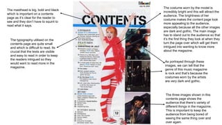
- 1. The costume worn by the model is incredibly bright and this will attract the audience. The brightness of her costume makes the content page look more appealing to the audience, especially because all the other images are dark and gothic. The main image has to stand out to the audience so that it’s the first thing they look at when they turn the page over which will get them intrigued into wanting to know more about the magazine. The masthead is big, bold and black which is important on a contents page as it’s clear for the reader to see and they don’t have to squint to read what it says. The typography utilised on the contents page are quite small and which is difficult to read. Its crucial that the texts are visible and easy to read in order to keep the readers intrigued so they would want to read more in the magazine. As portrayed through these images, we can tell that the genre of this music magazine is rock and that’s because the costumes worn by the artists are very dark and gothic. The three images shown in this contents page shows the audience that there’s variety of different things in the magazine. This is important to keep the audience from being bored of seeing the same thing over and over again.
- 2. The costume worn by this artist illustrates that this magazine is hip hop or rap magazine. It is really important that the reader can distinguish a genre of the magazine jus by looking at the costume because they don’t have to read much and this keeps them intrigued because the reader wants to be able to see a picture and know what its portraying rather than having to always read which can get boring for the reader. The font of the texts are small but bold which is important because it stands out and it differentiates the sub-headings to the added texts. The fact that the sub- headings are bold helps the readers because its easy to read as it’s visible. The artist’s facial expressions can push the reader away as he looks quite angry and this may show the audience that the magazine is not a welcoming one which can stop the reader from enjoying the magazine. There’s only one image on this contents page, this is not a good thing because the readers like to look at different images so they don’t get bored of reading. It is also important to have different images so the magazine look appealing to the audience in order to keep them intrigued. Having the featured artist's name on the contents page is important because it gives the reader a bit of insight on what the magazine is about and who’s in the magazine. It is also important that its clear fro the audience to see as soon as they turn the page so they don’t have to look for it.