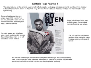
Contents Page Analysis 1
The colour scheme for the contents page is really effective as the whole page is in black and white and the only bit of colour
is the red heart which is placed on the artists body. The red stands out due to the colour contrast and this makes the page
eye catching.
Contents has been written in a
unique style which even isn’t on
one line, also as the black font it is
easier to catch the readers eye on
such a plain background
The main reason why Vibe have
used a basic background is to make
the artist stand out more as he will
also attract certain readers.
Not only has Vibe thought about music but they have also thought about fashion as they
have a fashion section in the magazine, they have got the artist in the main image to wear
something that in fashion at the moment and what targets the audience.
There is a variety of fonts used
and this makes the page look
more professional and unique.
The font used for the different
sections of the magazine make
the page look more fancy and
formal.
Contents Page Analysis 2
The colour scheme gives a
professional feel and the black and
silver colours give a metallic feel,
which is stylish and attractive to look
at. The shadow from the image also
contributes to the colour scheme, as
the top part of the comments page
has a shade effect behind the text.
I don’t like the large image as I feel the
provocative nature of the image
distracts from the purpose of the
contents page, however on the image
the woman shapes a V – which is also
their logo, so it might be a necessity.
The font fits the tone and the ‘stylish’
outlook of the layout, although its not the
easiest to read, it does have the
professional look and the black bold titles
stand out on the silver background.
The contents page itself is rather bland
and without detail, there isn’t enough
writing in my opinion and the single
image may provide a logo but it doesn’t
give the impression that the designer put
much effort into it.
I don’t particularly like the layout of this as the word
‘contents’ is broken down into 3 short words which
looks quite ugly, despite it almost being a ‘Vibe’ logo
in itself. Also the contents in 3 pages long, which
ordinarily would not be an issue, however the take
up most of the page with the image but only provide
a small amount of detail for the contents.
Contents Page Analysis 3The masthead inst visible on
this page at all, the main
visible piece of text is the big
cover line that shows the
reader that this is the
contents page. This makes
the aim of the page clear so
readers know exactly what
will be included on this page.
The nice thing about this
contents page which I haven't
seen may times before is the
large amounts of photos. This is
good because it will be music
fans that are reading this genre
of magazines so they are going
to want to see pictures of their
favourite artists and bands.
The pictures are
accompanies with a
countdown number
which is good
because it gets
readers aware of
what is in the charts
at the moment and
what isn’t.
This contents page colour scheme wise is
very bland. It sticks to greys, light blues and
blacks which is done for simplicity, the
designer obviously didn’t want to make it too
colourful as it may distract attention. However
they have added some colours like yellow in
some titles as it includes some fun into the
page.
The right hand column shows the
readers that this magazine is up to
date and a good one to read
because it says ‘This Week’ and
shows them what each page will
include so what they want to read
is easily accessible.
The bottom section is
promoting an offer of
subscription which is a
good way to gain
regular audiences,
young music fans
always like a bargain
so this is effective.

Contents page analysis

  • 1.
    Contents Page Analysis1 The colour scheme for the contents page is really effective as the whole page is in black and white and the only bit of colour is the red heart which is placed on the artists body. The red stands out due to the colour contrast and this makes the page eye catching. Contents has been written in a unique style which even isn’t on one line, also as the black font it is easier to catch the readers eye on such a plain background The main reason why Vibe have used a basic background is to make the artist stand out more as he will also attract certain readers. Not only has Vibe thought about music but they have also thought about fashion as they have a fashion section in the magazine, they have got the artist in the main image to wear something that in fashion at the moment and what targets the audience. There is a variety of fonts used and this makes the page look more professional and unique. The font used for the different sections of the magazine make the page look more fancy and formal.
  • 2.
    Contents Page Analysis2 The colour scheme gives a professional feel and the black and silver colours give a metallic feel, which is stylish and attractive to look at. The shadow from the image also contributes to the colour scheme, as the top part of the comments page has a shade effect behind the text. I don’t like the large image as I feel the provocative nature of the image distracts from the purpose of the contents page, however on the image the woman shapes a V – which is also their logo, so it might be a necessity. The font fits the tone and the ‘stylish’ outlook of the layout, although its not the easiest to read, it does have the professional look and the black bold titles stand out on the silver background. The contents page itself is rather bland and without detail, there isn’t enough writing in my opinion and the single image may provide a logo but it doesn’t give the impression that the designer put much effort into it. I don’t particularly like the layout of this as the word ‘contents’ is broken down into 3 short words which looks quite ugly, despite it almost being a ‘Vibe’ logo in itself. Also the contents in 3 pages long, which ordinarily would not be an issue, however the take up most of the page with the image but only provide a small amount of detail for the contents.
  • 3.
    Contents Page Analysis3The masthead inst visible on this page at all, the main visible piece of text is the big cover line that shows the reader that this is the contents page. This makes the aim of the page clear so readers know exactly what will be included on this page. The nice thing about this contents page which I haven't seen may times before is the large amounts of photos. This is good because it will be music fans that are reading this genre of magazines so they are going to want to see pictures of their favourite artists and bands. The pictures are accompanies with a countdown number which is good because it gets readers aware of what is in the charts at the moment and what isn’t. This contents page colour scheme wise is very bland. It sticks to greys, light blues and blacks which is done for simplicity, the designer obviously didn’t want to make it too colourful as it may distract attention. However they have added some colours like yellow in some titles as it includes some fun into the page. The right hand column shows the readers that this magazine is up to date and a good one to read because it says ‘This Week’ and shows them what each page will include so what they want to read is easily accessible. The bottom section is promoting an offer of subscription which is a good way to gain regular audiences, young music fans always like a bargain so this is effective.