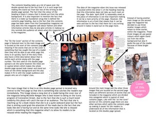
1. The main image that is that is on this double page spread is located very
central to the first page so that this is something that catches the readers eye
immediately. This image shows a long shot of a model being the cover star of
the magazine being Michelle Keegan who is best known to being on the iconic
program of Coronation Street, due to the fact that she is such a much loved
celebrity this photo will catch the eye of an audience. The fact that she is
reaching up for a book means that she is at a quite awkward pose but the fact
that is smiling could grab the attention of the reads due to the fact that she
looks like she is having fun and at the same time looks like she is relaxed
which is something that this magazine what’s to allow its readers to be
relaxed while reading the magazine.
The contents heading takes up a lot of space over the
double spread due to the fact that it is in such large font
making this stand out from the rest of the writing on the
double page spread. The fact that the colour of the
heading is black it means that it stands out from the white
background. It is also important to mention the fact that
there is a make up foundation smug that is behind the
contents page heading, due to the fact that this contents
page has been taken from the Cosmopolitan magazine not
only does this this magazine talk about fashion and other
information articles they do also give articles in makeup so
this reminds the audience all about what this magazine has
in the magazine.
The ‘On the Cover’ section of the contents
page is featured next to the main image and
is located at the start of the contents page
meaning if the stores that are on the cover is
something that has caught the eye of a reader
then they will be able to see what page this
story is on quickly. Each of the story titles
also have a little description about that is
within each article along with the page
number. The text used on this double page
spread is all the same however the titles are
in capital letters which makes the whole
double page spread look classer and stand out
more on the white background and this also
makes it fit in with the target audience and
people who are of a higher class.
Instead of having another
main image on the second
page the magazine has
decided to use three
smaller images which
relate to three stories
within the magazine. These
three images all use pastel
colours which again stand
out from the white
background but also it
grabs the eye of the reader
because of these bright
colours.
Around the main image and the other three
images that are located on the second page
there are different sections of stories that are
included in the magazine which are divided
into categories which is typical of most
contents pages. Like with the ‘on the cover’
section on this contents page there are also
other sections which splits the contents page
up making it easier for the readers to
understand all of the information that is
located on this double page spread.
The date of the magazine when this issue was released
is located within the letter C of the heading meaning
that this information does not take up much room on
the page. The date ‘April 2018’ is reasonably small as
this piece of information is not that important making
it not be a main priority of the page. However, this
information is un a front that means that it can be
seen and due to the fact that there isn’t any writing
around it makes it stand out on the page more.
Cover
of this
contents
page.
2. I believe that this contents page is
different to the one that I have previously
analysed purely because this cover has a
larger focus on pictures used than writing.
The title of the contents page is not the
main focus, although it does stand out on
the page due to the fact that it is printed
in black block capitals means that it is
seen. However, it is surrounded by images
making the reader to be drawn to the
images before the title of the page.
The masthead of the magazine ‘Red’ is
also included on the contents page which
helps emphasises the brand identity of
the magazine. It could be said that the
masthead or the magazine company
‘Red’s logo is one of the main features of
this contents page due to the fact that it
stands out on the page due to the red
background.
The date of the magazine issue is also
featured on the contents page and is
actually located beneath the title of this
page. The date ‘February 2017’ is smaller
than the title but larger than the
information about what page which story
is on. This date is easily visual due to the
fact that it is in a different font than any
other writing on this page, and it being in
italics males it easy to spot.
It can be said that this contents page doesn’t have a main image due to the fact that at the top of this page and
along the right-hand side of this page there are many photos. However, each of these photos have context about
a story that is within the magazine, an example of this is the denim jacket and pair of jeans that are located on
the left-hand side whereas when looking at the sections I can see that on page 16 there is a story on Forever in
blue jeans. It can also be said that the main image is the photo of the model that is located in the middle of the
page. This photo is of the same model that is on the front page which shows a sense of consistency. This photo
shows a long shot of a model wearing clothes that are edgy and because that this image is in the centre of the
contents page it means that the readers eyes are draw to this immediately. The body position of the model is
slightly sexual but also very confident which helps to show of the clothes that she is wearing.
The on the cover stories are
located on this contents page and
described with help of the images,
this makes the stories more
memorable and stand out from
the rest which could mean that
people are drawn to these stories
more so they may be read in more
death and before other stories.
Underneath the main images there are different sections of stories that are included in the magazine which are divided into categories which is typical of
most contents pages. Like with the ‘on the cover’ section on this contents page there are also other sections which splits the contents page up making it easier
for the readers to understand all of the information that is located on this page. The tiles of each section are in the same black font in capital letters, there
are also a few stories that are in red that stand out from the crowd and these stories are the main focus of this magazine. The use of the colour red and
black creates a sense of brand consistency. Each of the story titles also have a little description about that is within each article along with the page number
and this allows the readers to get a little more information about each story which could make the reader want to read the magazine even more.
Cover
of this
contents
page.