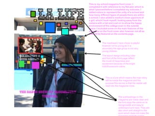
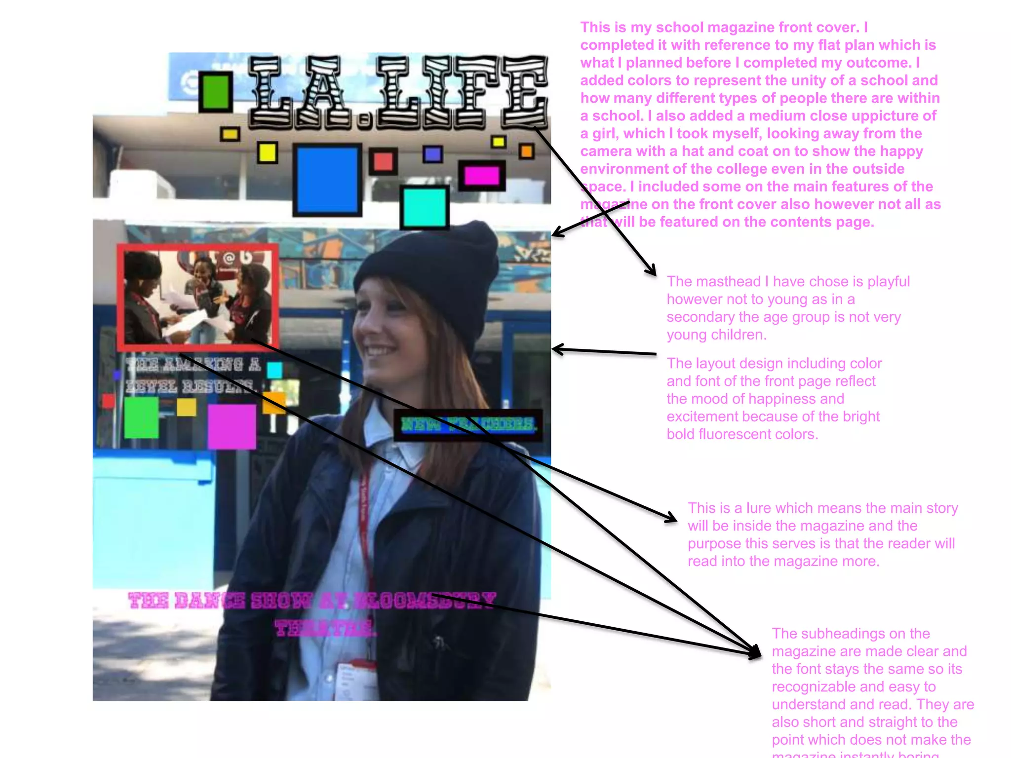
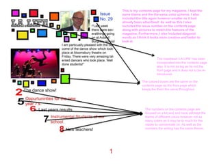
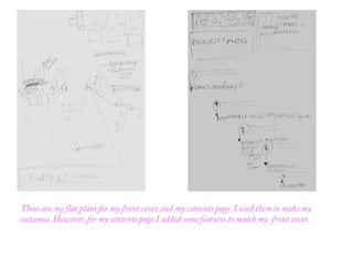
This is my school magazine front cover. I
completed it with reference to my flat plan which is
what I planned before I completed my outcome. I
added colors to represent the unity of a school and
how many different types of people there are within
a school. I also added a medium close uppicture of
a girl, which I took myself, looking away from the
camera with a hat and coat on to show the happy
environment of the college even in the outside
space. I included some on the main features of the
magazine on the front cover also however not all as
that will be featured on the contents page.


            The masthead I have chose is playful
            however not to young as in a
            secondary the age group is not very
            young children.
            The layout design including color
            and font of the front page reflect
            the mood of happiness and
            excitement because of the bright
            bold fluorescent colors.


               This is a lure which means the main story
               will be inside the magazine and the
               purpose this serves is that the reader will
               read into the magazine more.


                            The subheadings on the
                            magazine are made clear and
                            the font stays the same so its
                            recognizable and easy to
                            understand and read. They are
                            also short and straight to the
                            point which does not make the
This is my contents page for my magazine. I kept the
same theme and the the same color scheme. I also
included the title again however smaller as it had
already been advertised. As well as this I also
included the issue number on the contents page
along with pictures to match the features of the
magazine. Furthermore, I also included diagonal
words as I think it looks more creative and better to
look at.


                       The masthead ‘LA.LIFE’ has been
                       incorporated into the contents page
                       also. It is not as big as its not the
                       front page and it does not to be re-
                       introduced.

             The colored boxes are the same on the
             contents page as the front page which
             keeps the them the same throughout.


               The numbers on the contents page are
               focused on a lot and and have still kept the
               theme of different colors however not as
               many colors as it may be to much for the
               reader to concentrate on. As well as the
               numbers the writing has the same theme.
Presentation2

Presentation2

  • 1.
    This is myschool magazine front cover. I completed it with reference to my flat plan which is what I planned before I completed my outcome. I added colors to represent the unity of a school and how many different types of people there are within a school. I also added a medium close uppicture of a girl, which I took myself, looking away from the camera with a hat and coat on to show the happy environment of the college even in the outside space. I included some on the main features of the magazine on the front cover also however not all as that will be featured on the contents page. The masthead I have chose is playful however not to young as in a secondary the age group is not very young children. The layout design including color and font of the front page reflect the mood of happiness and excitement because of the bright bold fluorescent colors. This is a lure which means the main story will be inside the magazine and the purpose this serves is that the reader will read into the magazine more. The subheadings on the magazine are made clear and the font stays the same so its recognizable and easy to understand and read. They are also short and straight to the point which does not make the
  • 2.
    This is mycontents page for my magazine. I kept the same theme and the the same color scheme. I also included the title again however smaller as it had already been advertised. As well as this I also included the issue number on the contents page along with pictures to match the features of the magazine. Furthermore, I also included diagonal words as I think it looks more creative and better to look at. The masthead ‘LA.LIFE’ has been incorporated into the contents page also. It is not as big as its not the front page and it does not to be re- introduced. The colored boxes are the same on the contents page as the front page which keeps the them the same throughout. The numbers on the contents page are focused on a lot and and have still kept the theme of different colors however not as many colors as it may be to much for the reader to concentrate on. As well as the numbers the writing has the same theme.