
Recommended
More Related Content
What's hot
What's hot (20)
Viewers also liked
Similar to AS Media Transition Project
Similar to AS Media Transition Project (20)
AS Media Transition Project
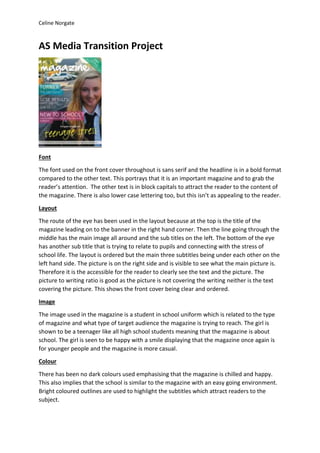
- 1. Celine Norgate AS Media Transition Project Font The font used on the front cover throughout is sans serif and the headline is in a bold format compared to the other text. This portrays that it is an important magazine and to grab the reader’s attention. The other text is in block capitals to attract the reader to the content of the magazine. There is also lower case lettering too, but this isn’t as appealing to the reader. Layout The route of the eye has been used in the layout because at the top is the title of the magazine leading on to the banner in the right hand corner. Then the line going through the middle has the main image all around and the sub titles on the left. The bottom of the eye has another sub title that is trying to relate to pupils and connecting with the stress of school life. The layout is ordered but the main three subtitles being under each other on the left hand side. The picture is on the right side and is visible to see what the main picture is. Therefore it is the accessible for the reader to clearly see the text and the picture. The picture to writing ratio is good as the picture is not covering the writing neither is the text covering the picture. This shows the front cover being clear and ordered. Image The image used in the magazine is a student in school uniform which is related to the type of magazine and what type of target audience the magazine is trying to reach. The girl is shown to be a teenager like all high school students meaning that the magazine is about school. The girl is seen to be happy with a smile displaying that the magazine once again is for younger people and the magazine is more casual. Colour There has been no dark colours used emphasising that the magazine is chilled and happy. This also implies that the school is similar to the magazine with an easy going environment. Bright coloured outlines are used to highlight the subtitles which attract readers to the subject.
- 2. Celine Norgate Mode of address The mode of address is informal by the use of bright colours and the differently styled font across the bottom. The text is very simple and blunt giving it the informal effect. The use of the image also makes it informal as it is a young girl and is very basic. Conventions The layout is conventional because it follows the route of the eye and is ordered like a typical magazine. The content is also conventional as it uses the typical title, sub titles and picture. Plan of magazine:
- 4. Celine Norgate My Magazine Design Evaluation Font The font I have used on the front cover throughout my magazine is sans serif. The headline is in block capitals compared to the other text to attract the reader to the magazine’s genre and the name of it. For the other text I have used lower case lettering, but used a capital letter at the start of each word. This emphasises the content of the magazine, however isn’t as appealing as the headline. One similarity between my design magazine and the real magazine was we used different style fonts in different areas. It is also similar to the original magazine cover I was observing as that included sans serif font and a bold headline. Although, my headline was in block capitals whereas the real school magazine was in lower case lettering. Another difference between my magazine design and the real magazine was my other text was in lower case lettering, but the other was block capital. Layout For my magazine cover I have used the route of the eye with the headline being at the top, the line across the middle having the subtitles on the left with the main picture on the right and the line across the bottom the banner and other subtitles. The layout of my magazine is ordered with the subtitles being one under each other and directly to the side at the bottom. I have ordered my text to be around the image so that it is clearly visible to viewers; by doing this is easy for the reader to read the text and see the image clearly. I have used a good picture to writing ratio as the writing is not cover the main part of the image nor the image covering the writing. The layout I have used for my magazine cover is similar to the real magazine as we have both used the same route of the eye. I have also arranged my text slightly similar to the real one with it surrounding the main part of the image. However, a difference between my magazine and the real one is that I have most of my subtitles across the bottom of the page. I have done this so that it surround’s the Neale- Wade logo on the logbook so the reader is attracted to the subtitles and the picture. Image The image I have used for my magazine cover is of a student in school uniform. This clearly indicates to readers what the genre is for this magazine. The student in the image is smiling suggesting that the magazine is casual and the school is a happy/friendly environment. The student I have used is obviously a teenager which connects to other student readers. I have also included in the image a piece of the schools equipment (a diary). This shows the schools logo which attracts the reader to the magazine. In the top left hand corner beside the headline I have used an image of the school’s logo, this grabs the reader’s attention to the headline of the magazine. A similarity between my magazine and the real magazine is we have both included an image of a teenage student smiling which connects to readers of that age category.
- 5. Celine Norgate Colour The colours I have used in my magazine are the same as the ones the school use for its logo and the uniform (the tie). The colours are bright implying that the school is a happy place and so is the magazine. These bright colours stand out, attracting the reader to the text. I have used no dark colours which also suggest the school is happy/friendly. The colours I have used are similar to the real magazine with the bright colours and no use of dark colours. The only difference with the colours use for my magazine and the real magazine is I have put my colours in a theme that link to the school. Mode of address The mode of address that I have used for my magazine is informal. This is because I have used bright colours and different styled font. The image I have used also gives it an informal effect as it shows the boy happy and smiling. The reason I have made the mode of address informal is because the target audience for my magazine is aimed at students. The mode of address is similar to my magazine and the real one as they are both informal by the use of bright colours, font and imagery. Conventions The layout that I have used for my magazine is conventional because it follows the route of the eye and is ordered like a typical magazine. The content is also conventional as it uses the typical title, sub titles and pictures. This is similar to the real magazine as that is conventional too as well as its content.