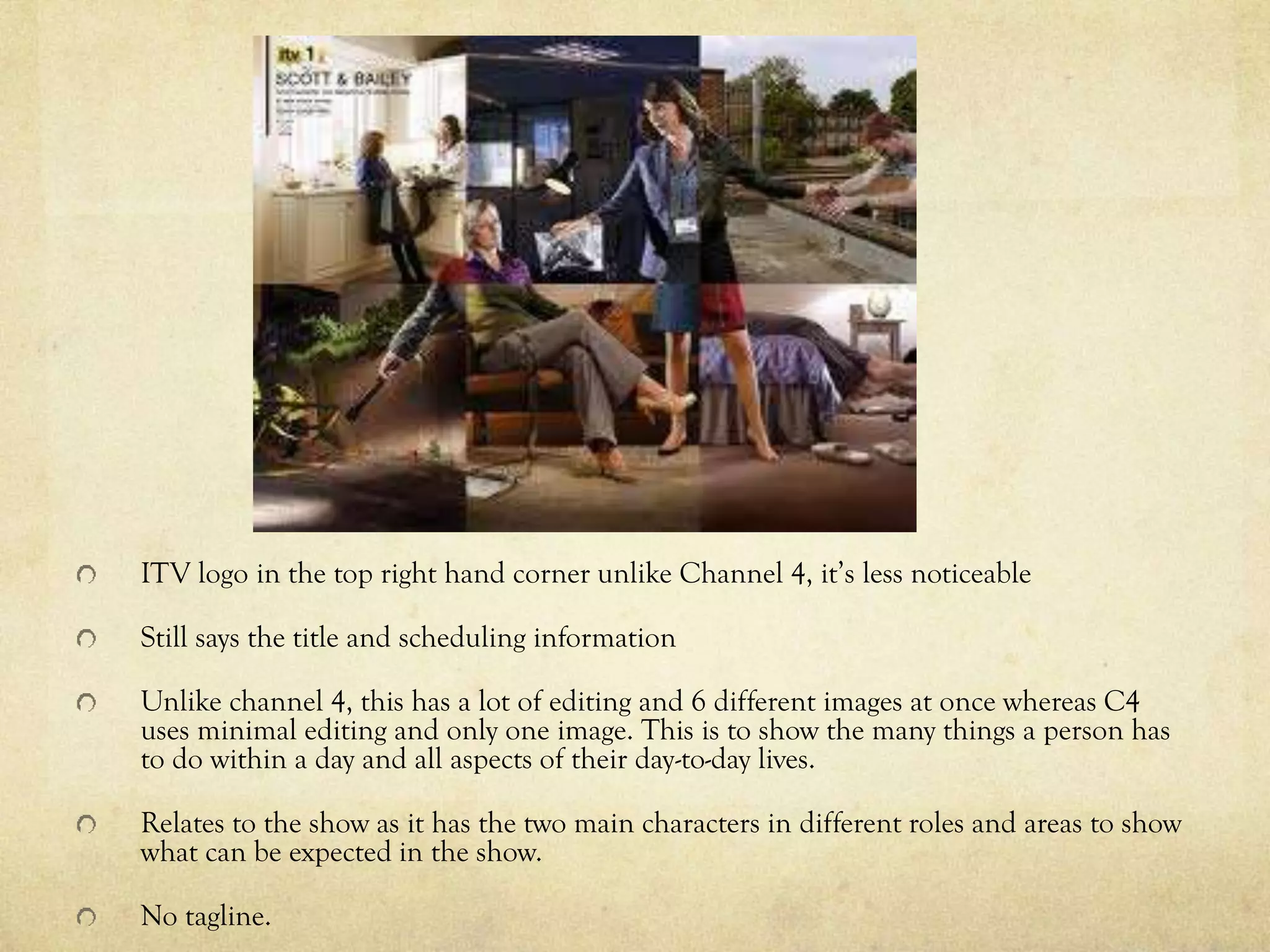
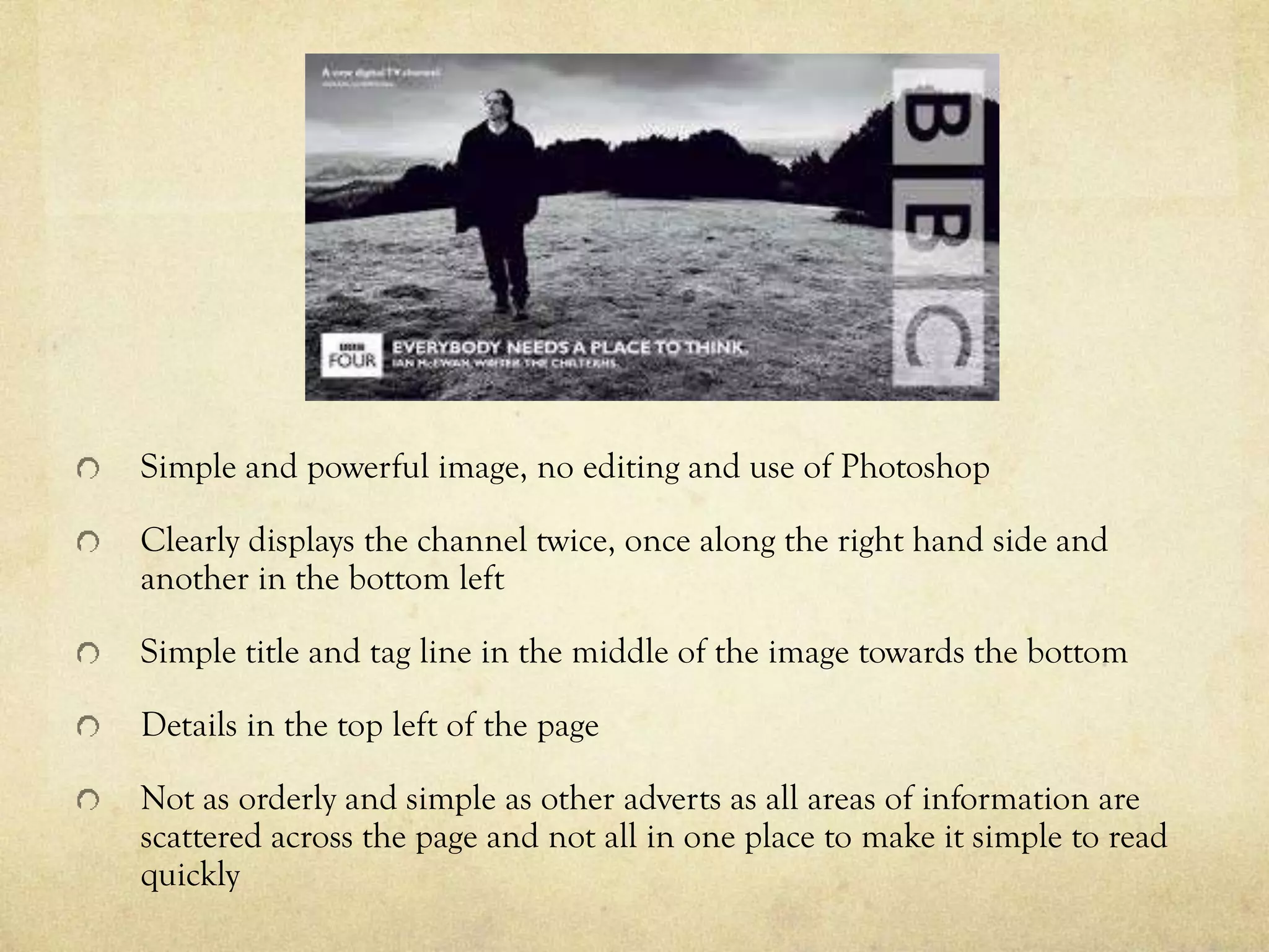
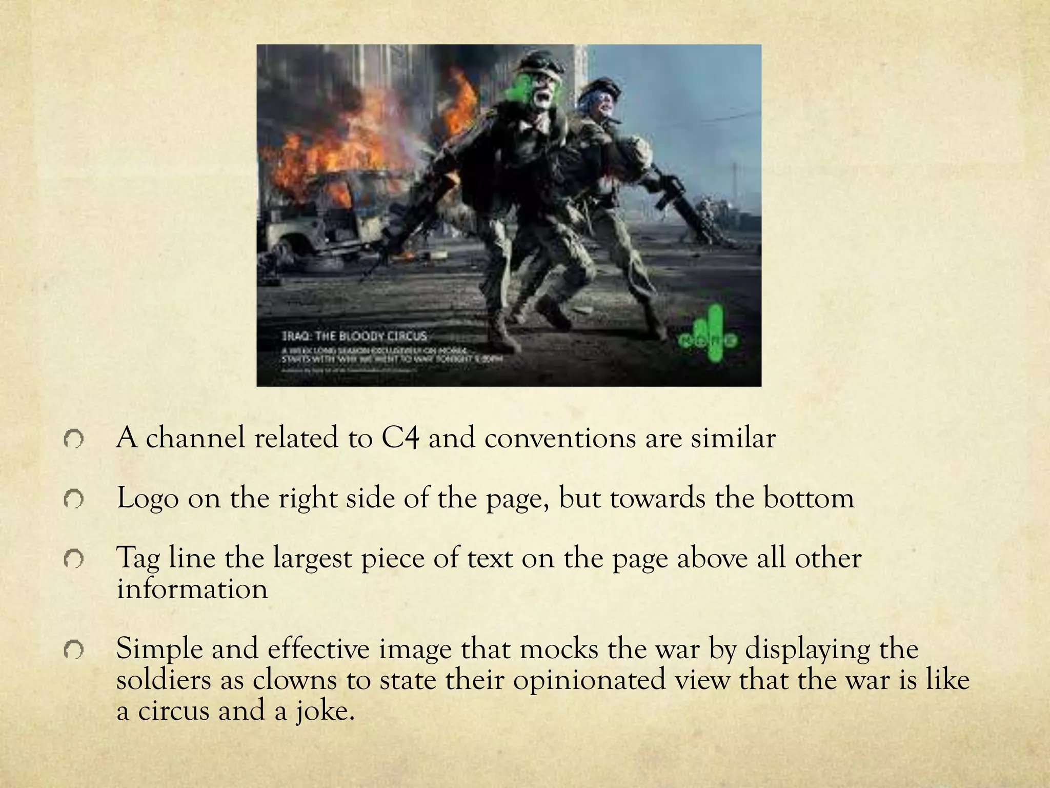
Codes and conventions of
documentary adverts
By Jacob Chisnall
Codes and Conventions
The Channel 4 logo is always on the right side of the advertisement
and mostly in the centre of the right side but sometimes at the top.
There is a banner on the left side at the bottom with the
documentary title and the time/date it will be shown.
The tagline can also be written here but can also be placed
separately at the top left.
The title, tagline and time/date are always shown.
The advertisement is landscape. It consists of one dominant image
which anchors meaning to the documentary.
There is a limited amount of text.
Often placed at the bottom of newspapers.
Channel 4 font featured in all of their advertisements. Channel 4
logo featured in all advertisements and can vary in colour.
Simple Photoshop, not over complicated.
Channel 4 logo in the middle of the right hand side
Very little editing or Photoshop used to alter the image of the two young boys to
keep the image simple and to not distract from the message that they’re trying to put
across
Powerful image to emphasise the effect of gun crime on children
Simple title with information scheduling in a box and not disrupting the images
impact.
Channel 4 logo on the right hand side in the middle
Simple yet powerful photo to emphasise how easily children go missing right in front of our
eyes and we pay no real attention, with the image inferring that them disappearing is similar to
them being swallowed up
Text in a white box including scheduling information
Some photo shop used to make it look as if the child is being pulled into the ground and the
blur of the people to make it look like they’re just walking by quickly, but nothing to make it
look as if it’s not real.
ITV logo in the top right hand corner unlike Channel 4, it’s less noticeable
Still says the title and scheduling information
Unlike channel 4, this has a lot of editing and 6 different images at once whereas C4
uses minimal editing and only one image. This is to show the many things a person has
to do within a day and all aspects of their day-to-day lives.
Relates to the show as it has the two main characters in different roles and areas to show
what can be expected in the show.
No tagline.
Simple and powerful image, no editing and use of Photoshop
Clearly displays the channel twice, once along the right hand side and
another in the bottom left
Simple title and tag line in the middle of the image towards the bottom
Details in the top left of the page
Not as orderly and simple as other adverts as all areas of information are
scattered across the page and not all in one place to make it simple to read
quickly
A channel related to C4 and conventions are similar
Logo on the right side of the page, but towards the bottom
Tag line the largest piece of text on the page above all other
information
Simple and effective image that mocks the war by displaying the
soldiers as clowns to state their opinionated view that the war is like
a circus and a joke.

Codes and Conventions of Print Advertisements With Examples

  • 1.
    Codes and conventionsof documentary adverts By Jacob Chisnall
  • 2.
    Codes and Conventions TheChannel 4 logo is always on the right side of the advertisement and mostly in the centre of the right side but sometimes at the top. There is a banner on the left side at the bottom with the documentary title and the time/date it will be shown. The tagline can also be written here but can also be placed separately at the top left. The title, tagline and time/date are always shown. The advertisement is landscape. It consists of one dominant image which anchors meaning to the documentary. There is a limited amount of text. Often placed at the bottom of newspapers. Channel 4 font featured in all of their advertisements. Channel 4 logo featured in all advertisements and can vary in colour. Simple Photoshop, not over complicated.
  • 3.
    Channel 4 logoin the middle of the right hand side Very little editing or Photoshop used to alter the image of the two young boys to keep the image simple and to not distract from the message that they’re trying to put across Powerful image to emphasise the effect of gun crime on children Simple title with information scheduling in a box and not disrupting the images impact.
  • 4.
    Channel 4 logoon the right hand side in the middle Simple yet powerful photo to emphasise how easily children go missing right in front of our eyes and we pay no real attention, with the image inferring that them disappearing is similar to them being swallowed up Text in a white box including scheduling information Some photo shop used to make it look as if the child is being pulled into the ground and the blur of the people to make it look like they’re just walking by quickly, but nothing to make it look as if it’s not real.
  • 5.
    ITV logo inthe top right hand corner unlike Channel 4, it’s less noticeable Still says the title and scheduling information Unlike channel 4, this has a lot of editing and 6 different images at once whereas C4 uses minimal editing and only one image. This is to show the many things a person has to do within a day and all aspects of their day-to-day lives. Relates to the show as it has the two main characters in different roles and areas to show what can be expected in the show. No tagline.
  • 6.
    Simple and powerfulimage, no editing and use of Photoshop Clearly displays the channel twice, once along the right hand side and another in the bottom left Simple title and tag line in the middle of the image towards the bottom Details in the top left of the page Not as orderly and simple as other adverts as all areas of information are scattered across the page and not all in one place to make it simple to read quickly
  • 7.
    A channel relatedto C4 and conventions are similar Logo on the right side of the page, but towards the bottom Tag line the largest piece of text on the page above all other information Simple and effective image that mocks the war by displaying the soldiers as clowns to state their opinionated view that the war is like a circus and a joke.