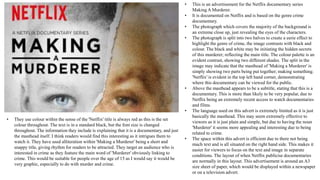
Advertisements
and DPS
• The target audience for this documentary would be more towards people who are
interested in this type of programme, and is probably more suitable towards adults as it
starts on a Monday.
• This is an advertisement for a documentary called Britain’s
Forgotten Children found in a TV guide or newspaper advert.
• The layout of this ad is dominated by a photograph, making
the active audience think more in depth about the meaning of
the documentary and to give them a deeper understanding of
what the documentary is.
• The language used is very short and simple in the left hand
corner with the title and the website in small print in the
bottom right hand corner. The logo for channel 4 is placed to
the right side, this is because the designers wanted to focus on
the child in the middle, which is what the documentary is
based about.
• This advertisements headline may attract audience alongside
help with the photograph, as the photograph literally depicts
the headline.
• The spacing around the advert is used in a way for the
audience just to focus on the child more so than anything else,
with the movement and blur of people around him. The large
space around the child represents the isolated, neglect he
feels.
• The style is quite an unconventional design and uncommon as
usually you would expect a lot more textual information
around an image whereas this advert has minimal information
to emphasis the isolation of the child, keeping the audience
intrigued.
• The colours that are used are white, greys and dark colours,
suggesting the type of programme that this is set to be. The
lack of bright colours could represent not only the isolated
child but the British atmosphere and weather. The white logo
stands out as it has been placed on a dark background, giving
the contextual factors the audience about what Channel it was
produced by.
• This is an advertisement for a
documentary called Seven Days
which can be found in a TV guide
or newspaper advert.
• The layout of this advert is very
abstract and different to your
typical advertisement as they have
inco-operated different characters
from the programme and placed
them together.
• The language used is very short
and simple in the left hand corner
with the title and the website in
small print in the bottom right
hand corner. The logo for channel
4 is placed to the right side, this is
because the designers wanted to
focus on the main photograph, to
use their own interpretation about
the programme.
• The advertisement is dominated
again by a photograph to create am
active audience.
• The spacing around the advert is
used in a way for the audience just
to focus on the character created
more so than anything else. They
have used shallow focus to really
highlight the facial features.
• The target audience for this documentary would most likely the older generation as it is post watershed and plays after
10 therefore is more suitable for adults as they will show possible violence, explicit language and images.
• The colours that are used are quite bright colours, oranges, white and then the facial and hair colours. The colour of the
channels logo is orange which highlights to the audience what channel produced the programme as it stands out.
• This is an advertisement for the Netflix documentary series
Making A Murderer.
• It is documented on Netflix and is based on the genre crime
documentary.
• The photograph which covers the majority of the background is
an extreme close up, just revealing the eyes of the characters.
• The photograph is split into two halves to create a eerie effect to
highlight the genre of crime, the image contrasts with black and
colour. The black and white may be initiating the hidden secrets
of this murderer; reflecting the main title. The colour palette is an
evident contrast, showing two different shades. The split in the
image may indicate that the masthead of 'Making a Murderer' is
simply showing two parts being put together; making something.
'Netflix' is evident in the top left hand corner, demonstrating
where this documentary can be viewed for the public.
• Above the masthead appears to be a subtitle, stating that this is a
documentary. This is more than likely to be very popular, due to
Netflix being an extremely recent access to watch documentaries
and films.
• The language used on this advert is extremely limited as it is just
basically the masthead. This may seem extremely effective to
viewers as it is just plain and simple, but due to having the noun
'Murderer' it seems more appealing and interesting due to being
related to crime.
• The space within this advert is efficient due to there not being
much text and is all situated on the right hand side. This makes it
easier for viewers to focus on the text and image in separate
conditions. The layout of when Netflix publicise documentaries
are normally in this layout. This advertisement is around an A3
size sheet of paper, which would be displayed within a newspaper
or on a television advert.
• They use colour within the sense of the 'Netflix' title is always red as this is the set
colour throughout. The text is in a standard black, but the font size is changed
throughout. The information they include is explaining that it is a documentary, and just
the masthead itself. I think readers would find this interesting as it intrigues them to
watch it. They have used alliteration within 'Making a Murderer' being a short and
snappy title, giving rhythm for readers to be attracted. They target an audience who is
interested in crime as they feature the main word of 'Murderer' obviously linking to
crime. This would be suitable for people over the age of 15 as I would say it would be
very graphic, especially to do with murder and crime.
• This is an advertisement for a documentary called Under The
Gun, it has been advertised on a large billboard.
• The layout is of the American Flag which covers the left hand
side, with the headline of the title and other contextual
information on the right.
• The language used is very descriptive telling the audience
exactly what the documentary is about.
• This advertisement is in America and the headline may attract
audiences as gun laws in America is a hot topic.
• The spacing around the advert is used very well, with not
much space left, the large American flag will help reduce the
amount of information that the audience will have to absorb.
• The headline itself is idiomatic, “under the gun” which is
used to describe who is being held at gunpoint, however in
this term, it used as a way to describe the fact that American
citizens are under gun laws.
• The style that this advert is designed for is a very common
design for billboards with one image on one side and text on
the other, this is because it is a very good way of attracting the
audience attention and maintaining it.
• The colours that are used are red, white and blue, these
colours represent the national colours of America. These
specific colours have been used as a basis for representing
America’s controversial laws which involve guns simply
allowing the audience to have a better understanding about
the documentary.
• The information included on this billboard is the title of the
documentary, the director, the date, channel and time it is
being shown. This is necessary information that the audience
need to know.
• The target audience for this documentary would most likely be families in America as it is
shown at 8pm and gun laws is such a hot topic that effect almost everyone, no matter
what age, race or gender in America.
• This is an advertisement for a
documentary called Sinatra based on
Franck Sinatra, it is displayed on a
billboard.
• The layout of it is a full sized image
which covers the whole display with the
text overlapping it. This makes it and
effective advert because the image is of a
large scale of a singer which people will
recognize drawing their attention towards
it.
• The language used is written in third
person , this highlights the fact that the
documentary is about Frank and his
lifestyle.
• The spacing around has been used very
well as the whole billboard is dominated
by one image , this gives the best way to
attract the audience.
• The headline itself is just “Sinatra” which
is an effective headline as this has a
worldwide renown name and is
recognised by people as being the
surname of a famous singer- Frank.
• The colours that are used on this
billboard are very plain giving a retro
feel to it. Its almost with the use of these
plain colours that its like an old fashioned
bit of film.
• The information included in this advert is the title of the documentary, date, time it is showing and the channel
which it screened on.
• The target audience for this film would be people whom grew up around the late 60s, people who took interest in his
music and possibly people who are just interested in finding out a bit about his lifestyle and how he became famous.
• This DPS is about wildlife as you
can tell from the colours being
associated with nature and David
Attenborough on the front as the
narrator of these style of
documentaries.
• The image on this DPS takes up
the majority of the page, we also
can tell what channel this
documentary is on due to the BBC
logo. The logo BBC is easily
recognisable due to its colours and
popularity and success of the
company.
• The headline of this DPS is bold
to ensure that it stands out over
everything else and also to aware
the readers when the programme
is showing.
• On the right hand side, there is a
column about wildlife experts and
their opinions. This is very useful
to the readers as they can see an
insight into a wildlife
documentary.
• This DPS layout has a main image of an actress
who participates in the programme Call The
Midwife, the image is directly in the middle of the
page. With regards to her costume it is the same one
that she wears in the TV programme along with her
facial expressions, this easily attracts the audience
as she is a well known character.
• The page is ironic as it talks about the life of a
fictional midwife giving birth in real life, a pull
quote has been used which is the biggest text on the
page “Giving birth is a freak thing.” the page is
about the actress Helen George giving birth, it is
important for the pull quote to be about the initial
topic of the DPS so that the readers then know
straight away about the topic.
• The language used includes quotes from Helen as a
personal interview which has been put onto a DPS.
High frequency lexis ahs been used in the main title
as the programmes target audience is more for the
working class/middle class.
• The space around has been used to wrap the text
alongside the image of Helen George, it looks full
but not too busy. The text has been put in different
fonts and sizes for a different topic or quote, the
importance of this is to create something less
tedious and repetitive.
• A colour scheme has been used of pink and blues,
blue representing the nurses uniform and the pink
informing the readers she gave birth to a girl, and
the fact that her role in Call The Midwife is
stereotypically feminine.
• The style of text which has been used represents a feminine style to the magazine, for example the title is in
a neat and curly way associated with feminine handwriting..
• This DPS focuses upon Dame Edna Everage. The
layout of this page has been designed with one
picture on each side and the textual information on
the other. All the text has been laid out in vertical
columned lines, additional information has been
placed in different coloured boxes.
• This page has done various things to attract their
intended target audience. “The truth” has been
placed in capital letters just under the main title,
making the readers feel like they are reading
something exclusive about Edna.
• The language used is easy so it doesn't discriminate
any audience. They tend to use language of which
an audience from a working class/middle class can
read and enjoy. The demographics for his page
would interest the category's of E, D, C2 and C as
most of these are manual workers who would have
more social time to read magazines, rather than
those of groups B and A.
• The colours used within the page, match the
costumes she's is wearing on the page next to it,
making the DPS more appealing and organised.
• The DPS initially targets a younger audience. The
title reveals this “Kids and Films”.
• As this DPS target audience is for children, the
language used has to be simplistic yet interesting
for children to read. The use of an exclamatory
sentence “Magic at the Farm!” highlights the child
like theme.
• There are masses of colour and images of popular
kids shows. Kids usually look at the images first
rather than the text so having lots of images ensures
it will grab the attention of the young target
audience . A Christmas theme pattern has been
included in the background of both pages.
• The language used have been used thoughtfully to
gain a audience from their initial target audience.
• The colour scheme includes a range of colours
enhancing the page and initially making it more
attention grabbing.
• The overall theme of the DPS is Christmas films,
detail such as a film reel at the bottom inform the
readers what films will be showing during the
Christmas holidays, engaging a potentially older
audience as well as the kids.

Adverts and DPS

  • 1.
  • 2.
    • The targetaudience for this documentary would be more towards people who are interested in this type of programme, and is probably more suitable towards adults as it starts on a Monday. • This is an advertisement for a documentary called Britain’s Forgotten Children found in a TV guide or newspaper advert. • The layout of this ad is dominated by a photograph, making the active audience think more in depth about the meaning of the documentary and to give them a deeper understanding of what the documentary is. • The language used is very short and simple in the left hand corner with the title and the website in small print in the bottom right hand corner. The logo for channel 4 is placed to the right side, this is because the designers wanted to focus on the child in the middle, which is what the documentary is based about. • This advertisements headline may attract audience alongside help with the photograph, as the photograph literally depicts the headline. • The spacing around the advert is used in a way for the audience just to focus on the child more so than anything else, with the movement and blur of people around him. The large space around the child represents the isolated, neglect he feels. • The style is quite an unconventional design and uncommon as usually you would expect a lot more textual information around an image whereas this advert has minimal information to emphasis the isolation of the child, keeping the audience intrigued. • The colours that are used are white, greys and dark colours, suggesting the type of programme that this is set to be. The lack of bright colours could represent not only the isolated child but the British atmosphere and weather. The white logo stands out as it has been placed on a dark background, giving the contextual factors the audience about what Channel it was produced by.
  • 3.
    • This isan advertisement for a documentary called Seven Days which can be found in a TV guide or newspaper advert. • The layout of this advert is very abstract and different to your typical advertisement as they have inco-operated different characters from the programme and placed them together. • The language used is very short and simple in the left hand corner with the title and the website in small print in the bottom right hand corner. The logo for channel 4 is placed to the right side, this is because the designers wanted to focus on the main photograph, to use their own interpretation about the programme. • The advertisement is dominated again by a photograph to create am active audience. • The spacing around the advert is used in a way for the audience just to focus on the character created more so than anything else. They have used shallow focus to really highlight the facial features. • The target audience for this documentary would most likely the older generation as it is post watershed and plays after 10 therefore is more suitable for adults as they will show possible violence, explicit language and images. • The colours that are used are quite bright colours, oranges, white and then the facial and hair colours. The colour of the channels logo is orange which highlights to the audience what channel produced the programme as it stands out.
  • 4.
    • This isan advertisement for the Netflix documentary series Making A Murderer. • It is documented on Netflix and is based on the genre crime documentary. • The photograph which covers the majority of the background is an extreme close up, just revealing the eyes of the characters. • The photograph is split into two halves to create a eerie effect to highlight the genre of crime, the image contrasts with black and colour. The black and white may be initiating the hidden secrets of this murderer; reflecting the main title. The colour palette is an evident contrast, showing two different shades. The split in the image may indicate that the masthead of 'Making a Murderer' is simply showing two parts being put together; making something. 'Netflix' is evident in the top left hand corner, demonstrating where this documentary can be viewed for the public. • Above the masthead appears to be a subtitle, stating that this is a documentary. This is more than likely to be very popular, due to Netflix being an extremely recent access to watch documentaries and films. • The language used on this advert is extremely limited as it is just basically the masthead. This may seem extremely effective to viewers as it is just plain and simple, but due to having the noun 'Murderer' it seems more appealing and interesting due to being related to crime. • The space within this advert is efficient due to there not being much text and is all situated on the right hand side. This makes it easier for viewers to focus on the text and image in separate conditions. The layout of when Netflix publicise documentaries are normally in this layout. This advertisement is around an A3 size sheet of paper, which would be displayed within a newspaper or on a television advert. • They use colour within the sense of the 'Netflix' title is always red as this is the set colour throughout. The text is in a standard black, but the font size is changed throughout. The information they include is explaining that it is a documentary, and just the masthead itself. I think readers would find this interesting as it intrigues them to watch it. They have used alliteration within 'Making a Murderer' being a short and snappy title, giving rhythm for readers to be attracted. They target an audience who is interested in crime as they feature the main word of 'Murderer' obviously linking to crime. This would be suitable for people over the age of 15 as I would say it would be very graphic, especially to do with murder and crime.
  • 5.
    • This isan advertisement for a documentary called Under The Gun, it has been advertised on a large billboard. • The layout is of the American Flag which covers the left hand side, with the headline of the title and other contextual information on the right. • The language used is very descriptive telling the audience exactly what the documentary is about. • This advertisement is in America and the headline may attract audiences as gun laws in America is a hot topic. • The spacing around the advert is used very well, with not much space left, the large American flag will help reduce the amount of information that the audience will have to absorb. • The headline itself is idiomatic, “under the gun” which is used to describe who is being held at gunpoint, however in this term, it used as a way to describe the fact that American citizens are under gun laws. • The style that this advert is designed for is a very common design for billboards with one image on one side and text on the other, this is because it is a very good way of attracting the audience attention and maintaining it. • The colours that are used are red, white and blue, these colours represent the national colours of America. These specific colours have been used as a basis for representing America’s controversial laws which involve guns simply allowing the audience to have a better understanding about the documentary. • The information included on this billboard is the title of the documentary, the director, the date, channel and time it is being shown. This is necessary information that the audience need to know. • The target audience for this documentary would most likely be families in America as it is shown at 8pm and gun laws is such a hot topic that effect almost everyone, no matter what age, race or gender in America.
  • 6.
    • This isan advertisement for a documentary called Sinatra based on Franck Sinatra, it is displayed on a billboard. • The layout of it is a full sized image which covers the whole display with the text overlapping it. This makes it and effective advert because the image is of a large scale of a singer which people will recognize drawing their attention towards it. • The language used is written in third person , this highlights the fact that the documentary is about Frank and his lifestyle. • The spacing around has been used very well as the whole billboard is dominated by one image , this gives the best way to attract the audience. • The headline itself is just “Sinatra” which is an effective headline as this has a worldwide renown name and is recognised by people as being the surname of a famous singer- Frank. • The colours that are used on this billboard are very plain giving a retro feel to it. Its almost with the use of these plain colours that its like an old fashioned bit of film. • The information included in this advert is the title of the documentary, date, time it is showing and the channel which it screened on. • The target audience for this film would be people whom grew up around the late 60s, people who took interest in his music and possibly people who are just interested in finding out a bit about his lifestyle and how he became famous.
  • 7.
    • This DPSis about wildlife as you can tell from the colours being associated with nature and David Attenborough on the front as the narrator of these style of documentaries. • The image on this DPS takes up the majority of the page, we also can tell what channel this documentary is on due to the BBC logo. The logo BBC is easily recognisable due to its colours and popularity and success of the company. • The headline of this DPS is bold to ensure that it stands out over everything else and also to aware the readers when the programme is showing. • On the right hand side, there is a column about wildlife experts and their opinions. This is very useful to the readers as they can see an insight into a wildlife documentary.
  • 8.
    • This DPSlayout has a main image of an actress who participates in the programme Call The Midwife, the image is directly in the middle of the page. With regards to her costume it is the same one that she wears in the TV programme along with her facial expressions, this easily attracts the audience as she is a well known character. • The page is ironic as it talks about the life of a fictional midwife giving birth in real life, a pull quote has been used which is the biggest text on the page “Giving birth is a freak thing.” the page is about the actress Helen George giving birth, it is important for the pull quote to be about the initial topic of the DPS so that the readers then know straight away about the topic. • The language used includes quotes from Helen as a personal interview which has been put onto a DPS. High frequency lexis ahs been used in the main title as the programmes target audience is more for the working class/middle class. • The space around has been used to wrap the text alongside the image of Helen George, it looks full but not too busy. The text has been put in different fonts and sizes for a different topic or quote, the importance of this is to create something less tedious and repetitive. • A colour scheme has been used of pink and blues, blue representing the nurses uniform and the pink informing the readers she gave birth to a girl, and the fact that her role in Call The Midwife is stereotypically feminine. • The style of text which has been used represents a feminine style to the magazine, for example the title is in a neat and curly way associated with feminine handwriting..
  • 9.
    • This DPSfocuses upon Dame Edna Everage. The layout of this page has been designed with one picture on each side and the textual information on the other. All the text has been laid out in vertical columned lines, additional information has been placed in different coloured boxes. • This page has done various things to attract their intended target audience. “The truth” has been placed in capital letters just under the main title, making the readers feel like they are reading something exclusive about Edna. • The language used is easy so it doesn't discriminate any audience. They tend to use language of which an audience from a working class/middle class can read and enjoy. The demographics for his page would interest the category's of E, D, C2 and C as most of these are manual workers who would have more social time to read magazines, rather than those of groups B and A. • The colours used within the page, match the costumes she's is wearing on the page next to it, making the DPS more appealing and organised.
  • 10.
    • The DPSinitially targets a younger audience. The title reveals this “Kids and Films”. • As this DPS target audience is for children, the language used has to be simplistic yet interesting for children to read. The use of an exclamatory sentence “Magic at the Farm!” highlights the child like theme. • There are masses of colour and images of popular kids shows. Kids usually look at the images first rather than the text so having lots of images ensures it will grab the attention of the young target audience . A Christmas theme pattern has been included in the background of both pages. • The language used have been used thoughtfully to gain a audience from their initial target audience. • The colour scheme includes a range of colours enhancing the page and initially making it more attention grabbing. • The overall theme of the DPS is Christmas films, detail such as a film reel at the bottom inform the readers what films will be showing during the Christmas holidays, engaging a potentially older audience as well as the kids.