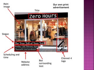
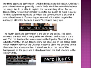
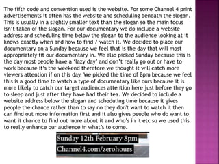
Channel 4
logo
Slogan
Scheduling and
time
Main
image
Title
Box
surrounding
text
Website
address
Our own print
advertisement
Main image
Channel 4 logo
Time
Slogan
Title
Box
surrounding
text
Women’s lib
advertisement
As you can see both print advertisements are very much alike. They
both follow the same codes and conventions to make it look
professional and high quality. To help make our print advertisement
follow the codes and conventions of a channel 4 advertisement we took
close reference to the women’s lib advertisement.
In order for the print advert to look professional, it must include the
logo of the channel it will be shown on. For our documentary it will be
shown on Channel 4 because that was the most suitable channel for our
documentary and was the most popular answer in the questionnaire we
did. The most common place for the Channel 4 logo to be located is on
the right hand side of the print advertisement , either in the middle or
in one of the corners. For our print advertising we located ours in the
bottom right hand corner because we felt this is where it would be
look due to the background colours. We kept the colour of the logo to
match the rest of the colour on the print advert so it all fits in well
with each other and also if the logo was a different colour it would
stand out more than other things on the page therefore the main focus
would be on the logo rather than the slogan for example.
The next code and convention I will be talking about is the main image.
The main image on Channel 4 advertisements either takes up the entire
frame or just shows a single image. By them just focusing on one image
means they can focus on the main subject of the documentary. The
point of including a main image is to give the audience an insight into
what to expect from the rest of the documentary. For my documentary,
we included just one main image because we wanted the audience to
not have to look around at various things, we wanted to keep it simple
by choosing one image that is bright to catch the audience's attention.
We picked the main image to be of a shop window because we wanted
it to link well to the documentary and the main theme behind it being
jobs. We thought the shop links well to the theme of jobs because it's
something people highly associate with it.
The third code and convention I will be discussing is the slogan. Channel 4
print advertisements generally contain little words because they believe
the image should be able to explain the documentary alone. For our
documentary we use short simple words for our slogan to make it easier
for the audience to read and to follow the conventions of a channel 4
print advertisement. For our slogan we used alliteration to gain the
audience's attention because it doesn’t get used every day.
The fourth code and convention is the use of the boxes. The boxes
surround the text which really enhances the text and makes it stand
out. The box is often the same colour as the logo for Channel 4 print
advertisements. For our documentary the boxes are in the colour black
which matches up with the Channel 4 logo we used. We decided to use
the colour black because then it stands out from the rest of the
background on the page and it stands out from the text which is in the
colour white.
The fifth code and convention used is the website. For some Channel 4 print
advertisements it often has the website and scheduling beneath the slogan.
This is usually in a slightly smaller text than the slogan so the main focus
isn’t taken of the slogan. For our documentary we do include a website
address and scheduling time below the slogan to the audience looking at it
knows exactly when and how to find / watch it. We decided to place our
documentary on a Sunday because we feel that is the day that will most
appropriately fit our documentary in. We also picked Sunday because this is
the day most people have a ‘lazy day’ and don’t really go out or have to
work because it’s the weekend therefore we thought it will catch more
viewers attention if on this day. We picked the time of 8pm because we feel
this is a good time to watch a type of documentary like ours because it is
more likely to catch our target audiences attention here just before they go
to sleep and just after they have had their tea. We decided to include a
website address below the slogan and scheduling time because it gives
people the chance rather than to say no they don't want to watch it then
can find out more information first and it also gives people who do want to
want it chance to find out more about it and who’s in it etc so we used this
to really enhance our audience in what’s to come.

Print advertisement

  • 2.
  • 3.
    Main image Channel 4logo Time Slogan Title Box surrounding text Women’s lib advertisement
  • 4.
    As you cansee both print advertisements are very much alike. They both follow the same codes and conventions to make it look professional and high quality. To help make our print advertisement follow the codes and conventions of a channel 4 advertisement we took close reference to the women’s lib advertisement. In order for the print advert to look professional, it must include the logo of the channel it will be shown on. For our documentary it will be shown on Channel 4 because that was the most suitable channel for our documentary and was the most popular answer in the questionnaire we did. The most common place for the Channel 4 logo to be located is on the right hand side of the print advertisement , either in the middle or in one of the corners. For our print advertising we located ours in the bottom right hand corner because we felt this is where it would be look due to the background colours. We kept the colour of the logo to match the rest of the colour on the print advert so it all fits in well with each other and also if the logo was a different colour it would stand out more than other things on the page therefore the main focus would be on the logo rather than the slogan for example.
  • 5.
    The next codeand convention I will be talking about is the main image. The main image on Channel 4 advertisements either takes up the entire frame or just shows a single image. By them just focusing on one image means they can focus on the main subject of the documentary. The point of including a main image is to give the audience an insight into what to expect from the rest of the documentary. For my documentary, we included just one main image because we wanted the audience to not have to look around at various things, we wanted to keep it simple by choosing one image that is bright to catch the audience's attention. We picked the main image to be of a shop window because we wanted it to link well to the documentary and the main theme behind it being jobs. We thought the shop links well to the theme of jobs because it's something people highly associate with it.
  • 6.
    The third codeand convention I will be discussing is the slogan. Channel 4 print advertisements generally contain little words because they believe the image should be able to explain the documentary alone. For our documentary we use short simple words for our slogan to make it easier for the audience to read and to follow the conventions of a channel 4 print advertisement. For our slogan we used alliteration to gain the audience's attention because it doesn’t get used every day. The fourth code and convention is the use of the boxes. The boxes surround the text which really enhances the text and makes it stand out. The box is often the same colour as the logo for Channel 4 print advertisements. For our documentary the boxes are in the colour black which matches up with the Channel 4 logo we used. We decided to use the colour black because then it stands out from the rest of the background on the page and it stands out from the text which is in the colour white.
  • 7.
    The fifth codeand convention used is the website. For some Channel 4 print advertisements it often has the website and scheduling beneath the slogan. This is usually in a slightly smaller text than the slogan so the main focus isn’t taken of the slogan. For our documentary we do include a website address and scheduling time below the slogan to the audience looking at it knows exactly when and how to find / watch it. We decided to place our documentary on a Sunday because we feel that is the day that will most appropriately fit our documentary in. We also picked Sunday because this is the day most people have a ‘lazy day’ and don’t really go out or have to work because it’s the weekend therefore we thought it will catch more viewers attention if on this day. We picked the time of 8pm because we feel this is a good time to watch a type of documentary like ours because it is more likely to catch our target audiences attention here just before they go to sleep and just after they have had their tea. We decided to include a website address below the slogan and scheduling time because it gives people the chance rather than to say no they don't want to watch it then can find out more information first and it also gives people who do want to want it chance to find out more about it and who’s in it etc so we used this to really enhance our audience in what’s to come.