This advertisement is for a Netflix documentary series called "Making a Murderer". The photograph takes up most of the background and shows an extreme close-up of eyes. The photograph is split in two halves to create an eerie effect highlighting the crime genre. Minimal text is used to focus attention on the photograph and intrigue viewers about the documentary series. The target audience seems to be those interested in crime documentaries as the title references murder.
2024.06.01 Introducing a competency framework for languag learning materials ...Sandy Millin
http://sandymillin.wordpress.com/iateflwebinar2024
Published classroom materials form the basis of syllabuses, drive teacher professional development, and have a potentially huge influence on learners, teachers and education systems. All teachers also create their own materials, whether a few sentences on a blackboard, a highly-structured fully-realised online course, or anything in between. Despite this, the knowledge and skills needed to create effective language learning materials are rarely part of teacher training, and are mostly learnt by trial and error.
Knowledge and skills frameworks, generally called competency frameworks, for ELT teachers, trainers and managers have existed for a few years now. However, until I created one for my MA dissertation, there wasn’t one drawing together what we need to know and do to be able to effectively produce language learning materials.
This webinar will introduce you to my framework, highlighting the key competencies I identified from my research. It will also show how anybody involved in language teaching (any language, not just English!), teacher training, managing schools or developing language learning materials can benefit from using the framework.
How to Make a Field invisible in Odoo 17Celine George
It is possible to hide or invisible some fields in odoo. Commonly using “invisible” attribute in the field definition to invisible the fields. This slide will show how to make a field invisible in odoo 17.
Ethnobotany and Ethnopharmacology:
Ethnobotany in herbal drug evaluation,
Impact of Ethnobotany in traditional medicine,
New development in herbals,
Bio-prospecting tools for drug discovery,
Role of Ethnopharmacology in drug evaluation,
Reverse Pharmacology.
Unit 8 - Information and Communication Technology (Paper I).pdfThiyagu K
This slides describes the basic concepts of ICT, basics of Email, Emerging Technology and Digital Initiatives in Education. This presentations aligns with the UGC Paper I syllabus.
The Roman Empire A Historical Colossus.pdfkaushalkr1407
The Roman Empire, a vast and enduring power, stands as one of history's most remarkable civilizations, leaving an indelible imprint on the world. It emerged from the Roman Republic, transitioning into an imperial powerhouse under the leadership of Augustus Caesar in 27 BCE. This transformation marked the beginning of an era defined by unprecedented territorial expansion, architectural marvels, and profound cultural influence.
The empire's roots lie in the city of Rome, founded, according to legend, by Romulus in 753 BCE. Over centuries, Rome evolved from a small settlement to a formidable republic, characterized by a complex political system with elected officials and checks on power. However, internal strife, class conflicts, and military ambitions paved the way for the end of the Republic. Julius Caesar’s dictatorship and subsequent assassination in 44 BCE created a power vacuum, leading to a civil war. Octavian, later Augustus, emerged victorious, heralding the Roman Empire’s birth.
Under Augustus, the empire experienced the Pax Romana, a 200-year period of relative peace and stability. Augustus reformed the military, established efficient administrative systems, and initiated grand construction projects. The empire's borders expanded, encompassing territories from Britain to Egypt and from Spain to the Euphrates. Roman legions, renowned for their discipline and engineering prowess, secured and maintained these vast territories, building roads, fortifications, and cities that facilitated control and integration.
The Roman Empire’s society was hierarchical, with a rigid class system. At the top were the patricians, wealthy elites who held significant political power. Below them were the plebeians, free citizens with limited political influence, and the vast numbers of slaves who formed the backbone of the economy. The family unit was central, governed by the paterfamilias, the male head who held absolute authority.
Culturally, the Romans were eclectic, absorbing and adapting elements from the civilizations they encountered, particularly the Greeks. Roman art, literature, and philosophy reflected this synthesis, creating a rich cultural tapestry. Latin, the Roman language, became the lingua franca of the Western world, influencing numerous modern languages.
Roman architecture and engineering achievements were monumental. They perfected the arch, vault, and dome, constructing enduring structures like the Colosseum, Pantheon, and aqueducts. These engineering marvels not only showcased Roman ingenuity but also served practical purposes, from public entertainment to water supply.
Welcome to TechSoup New Member Orientation and Q&A (May 2024).pdfTechSoup
In this webinar you will learn how your organization can access TechSoup's wide variety of product discount and donation programs. From hardware to software, we'll give you a tour of the tools available to help your nonprofit with productivity, collaboration, financial management, donor tracking, security, and more.
Model Attribute Check Company Auto PropertyCeline George
In Odoo, the multi-company feature allows you to manage multiple companies within a single Odoo database instance. Each company can have its own configurations while still sharing common resources such as products, customers, and suppliers.
Students, digital devices and success - Andreas Schleicher - 27 May 2024..pptxEduSkills OECD
Andreas Schleicher presents at the OECD webinar ‘Digital devices in schools: detrimental distraction or secret to success?’ on 27 May 2024. The presentation was based on findings from PISA 2022 results and the webinar helped launch the PISA in Focus ‘Managing screen time: How to protect and equip students against distraction’ https://www.oecd-ilibrary.org/education/managing-screen-time_7c225af4-en and the OECD Education Policy Perspective ‘Students, digital devices and success’ can be found here - https://oe.cd/il/5yV
2. • The target audience for this documentary would be more towards people who are
interested in this type of programme, and is probably more suitable towards adults as it
starts on a Monday.
• This is an advertisement for a documentary called Britain’s
Forgotten Children found in a TV guide or newspaper advert.
• The layout of this ad is dominated by a photograph, making
the active audience think more in depth about the meaning of
the documentary and to give them a deeper understanding of
what the documentary is.
• The language used is very short and simple in the left hand
corner with the title and the website in small print in the
bottom right hand corner. The logo for channel 4 is placed to
the right side, this is because the designers wanted to focus on
the child in the middle, which is what the documentary is
based about.
• This advertisements headline may attract audience alongside
help with the photograph, as the photograph literally depicts
the headline.
• The spacing around the advert is used in a way for the
audience just to focus on the child more so than anything else,
with the movement and blur of people around him. The large
space around the child represents the isolated, neglect he
feels.
• The style is quite an unconventional design and uncommon as
usually you would expect a lot more textual information
around an image whereas this advert has minimal information
to emphasis the isolation of the child, keeping the audience
intrigued.
• The colours that are used are white, greys and dark colours,
suggesting the type of programme that this is set to be. The
lack of bright colours could represent not only the isolated
child but the British atmosphere and weather. The white logo
stands out as it has been placed on a dark background, giving
the contextual factors the audience about what Channel it was
produced by.
3. • This is an advertisement for a
documentary called Seven Days
which can be found in a TV guide
or newspaper advert.
• The layout of this advert is very
abstract and different to your
typical advertisement as they have
inco-operated different characters
from the programme and placed
them together.
• The language used is very short
and simple in the left hand corner
with the title and the website in
small print in the bottom right
hand corner. The logo for channel
4 is placed to the right side, this is
because the designers wanted to
focus on the main photograph, to
use their own interpretation about
the programme.
• The advertisement is dominated
again by a photograph to create am
active audience.
• The spacing around the advert is
used in a way for the audience just
to focus on the character created
more so than anything else. They
have used shallow focus to really
highlight the facial features.
• The target audience for this documentary would most likely the older generation as it is post watershed and plays after
10 therefore is more suitable for adults as they will show possible violence, explicit language and images.
• The colours that are used are quite bright colours, oranges, white and then the facial and hair colours. The colour of the
channels logo is orange which highlights to the audience what channel produced the programme as it stands out.
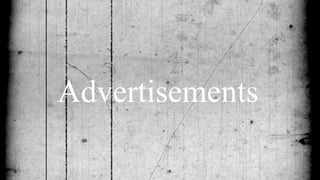
4. • This is an advertisement for the Netflix documentary series
Making A Murderer.
• It is documented on Netflix and is based on the genre crime
documentary.
• The photograph which covers the majority of the background is
an extreme close up, just revealing the eyes of the characters.
• The photograph is split into two halves to create a eerie effect to
highlight the genre of crime, the image contrasts with black and
colour. The black and white may be initiating the hidden secrets
of this murderer; reflecting the main title. The colour palette is an
evident contrast, showing two different shades. The split in the
image may indicate that the masthead of 'Making a Murderer' is
simply showing two parts being put together; making something.
'Netflix' is evident in the top left hand corner, demonstrating
where this documentary can be viewed for the public.
• Above the masthead appears to be a subtitle, stating that this is a
documentary. This is more than likely to be very popular, due to
Netflix being an extremely recent access to watch documentaries
and films.
• The language used on this advert is extremely limited as it is just
basically the masthead. This may seem extremely effective to
viewers as it is just plain and simple, but due to having the noun
'Murderer' it seems more appealing and interesting due to being
related to crime.
• The space within this advert is efficient due to there not being
much text and is all situated on the right hand side. This makes it
easier for viewers to focus on the text and image in separate
conditions. The layout of when Netflix publicise documentaries
are normally in this layout. This advertisement is around an A3
size sheet of paper, which would be displayed within a newspaper
or on a television advert.
• They use colour within the sense of the 'Netflix' title is always red as this is the set
colour throughout. The text is in a standard black, but the font size is changed
throughout. The information they include is explaining that it is a documentary, and just
the masthead itself. I think readers would find this interesting as it intrigues them to
watch it. They have used alliteration within 'Making a Murderer' being a short and
snappy title, giving rhythm for readers to be attracted. They target an audience who is
interested in crime as they feature the main word of 'Murderer' obviously linking to
crime. This would be suitable for people over the age of 15 as I would say it would be
very graphic, especially to do with murder and crime.
5. • This is an advertisement for a documentary called Under The
Gun, it has been advertised on a large billboard.
• The layout is of the American Flag which covers the left hand
side, with the headline of the title and other contextual
information on the right.
• The language used is very descriptive telling the audience
exactly what the documentary is about.
• This advertisement is in America and the headline may attract
audiences as gun laws in America is a hot topic.
• The spacing around the advert is used very well, with not
much space left, the large American flag will help reduce the
amount of information that the audience will have to absorb.
• The headline itself is idiomatic, “under the gun” which is
used to describe who is being held at gunpoint, however in
this term, it used as a way to describe the fact that American
citizens are under gun laws.
• The style that this advert is designed for is a very common
design for billboards with one image on one side and text on
the other, this is because it is a very good way of attracting the
audience attention and maintaining it.
• The colours that are used are red, white and blue, these
colours represent the national colours of America. These
specific colours have been used as a basis for representing
America’s controversial laws which involve guns simply
allowing the audience to have a better understanding about
the documentary.
• The information included on this billboard is the title of the
documentary, the director, the date, channel and time it is
being shown. This is necessary information that the audience
need to know.
• The target audience for this documentary would most likely be families in America as it is
shown at 8pm and gun laws is such a hot topic that effect almost everyone, no matter
what age, race or gender in America.
6. • This is an advertisement for a
documentary called Sinatra based on
Franck Sinatra, it is displayed on a
billboard.
• The layout of it is a full sized image
which covers the whole display with the
text overlapping it. This makes it and
effective advert because the image is of a
large scale of a singer which people will
recognize drawing their attention towards
it.
• The language used is written in third
person , this highlights the fact that the
documentary is about Frank and his
lifestyle.
• The spacing around has been used very
well as the whole billboard is dominated
by one image , this gives the best way to
attract the audience.
• The headline itself is just “Sinatra” which
is an effective headline as this has a
worldwide renown name and is
recognised by people as being the
surname of a famous singer- Frank.
• The colours that are used on this
billboard are very plain giving a retro
feel to it. Its almost with the use of these
plain colours that its like an old fashioned
bit of film.
• The information included in this advert is the title of the documentary, date, time it is showing and the channel
which it screened on.
• The target audience for this film would be people whom grew up around the late 60s, people who took interest in his
music and possibly people who are just interested in finding out a bit about his lifestyle and how he became famous.