Describing Data withTables
and Graphs
Name : Kanimozhi
Dept : CSE Cybersecurity
College : ACE
2.
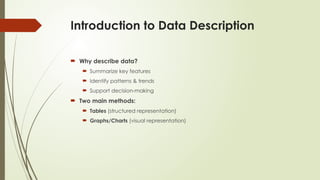
Introduction to DataDescription
Why describe data?
Summarize key features
Identify patterns & trends
Support decision-making
Two main methods:
Tables (structured representation)
Graphs/Charts (visual representation)
3.
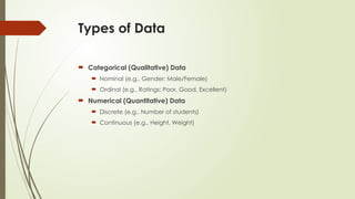
Types of Data
Categorical (Qualitative) Data
Nominal (e.g., Gender: Male/Female)
Ordinal (e.g., Ratings: Poor, Good, Excellent)
Numerical (Quantitative) Data
Discrete (e.g., Number of students)
Continuous (e.g., Height, Weight)
4.
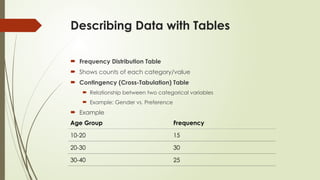
Describing Data withTables
Frequency Distribution Table
Shows counts of each category/value
Contingency (Cross-Tabulation) Table
Relationship between two categorical variables
Example: Gender vs. Preference
Example
Age Group Frequency
10-20 15
20-30 30
30-40 25
5.
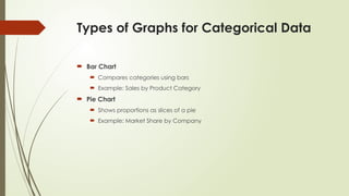
Types of Graphsfor Categorical Data
Bar Chart
Compares categories using bars
Example: Sales by Product Category
Pie Chart
Shows proportions as slices of a pie
Example: Market Share by Company
6.
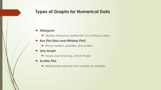
Types of Graphsfor Numerical Data
Histogram
Displays frequency distribution of continuous data
Box Plot (Box-and-Whisker Plot)
Shows median, quartiles, and outliers
Line Graph
Trends over time (e.g., Stock Prices)
Scatter Plot
Relationship between two numerical variables
7.
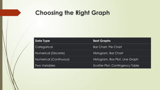
Choosing the RightGraph
Data Type Best Graphs
Categorical Bar Chart, Pie Chart
Numerical (Discrete) Histogram, Bar Chart
Numerical (Continuous) Histogram, Box Plot, Line Graph
Two Variables Scatter Plot, Contingency Table
8.
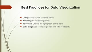
Best Practices forData Visualization
Clarity: Avoid clutter, use clear labels
Accuracy: No misleading scales
Relevance: Choose the right graph for the data
Color Usage: Use contrasting colors for better readability
Summary & KeyTakeaways
Tables provide structured summaries (frequency, contingency tables)
Graphs help visualize patterns (bar, pie, histogram, scatter plot)
Choose the right graph based on data type
Follow best practices for effective data presentation