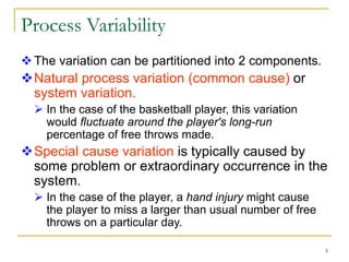
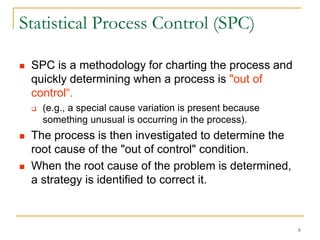
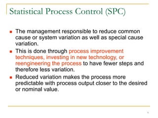
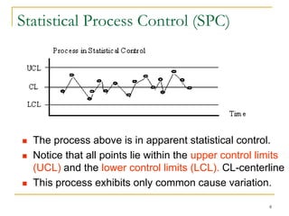
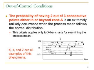
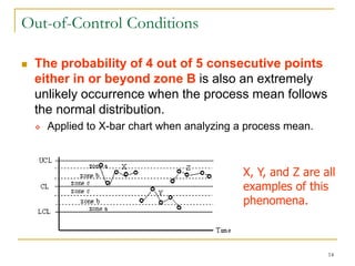
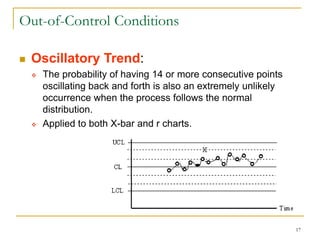
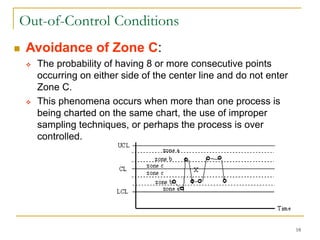
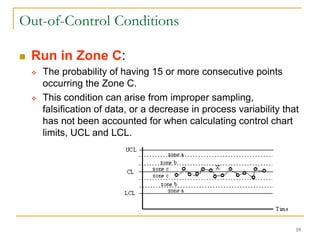
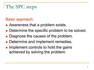
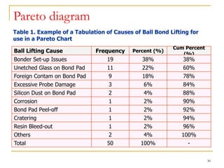
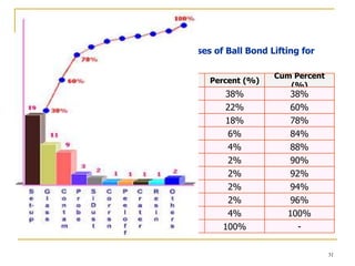
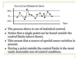
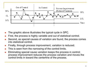
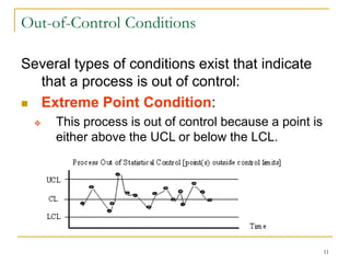
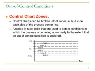
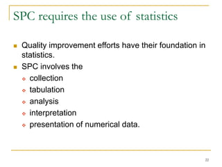
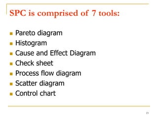
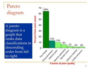
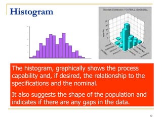
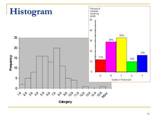
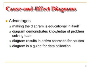
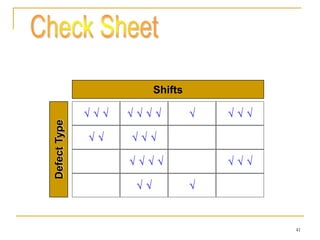
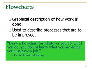
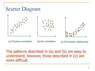
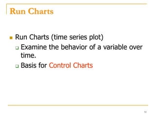
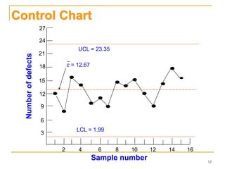
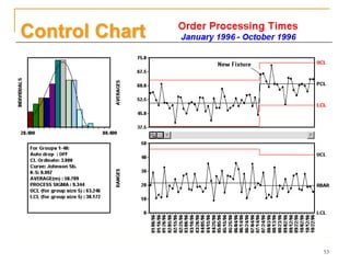
1
Statistical Process Contol
(SPC)
Lec-1
2
Quality and SPC
 The concept of quality has been
with us since the beginning of time.
 Typically the quality of products
was described by some attribute
such as strength, beauty or
finish.
 However, the mass production of
products that the reproducibility of
the size or shape of a product
became a quality issue.
3
Quality and SPC
 Quality was obtained by inspecting each
part and passing only those that met
specifications.
 With SPC, the process is monitored
through sampling.
 Considering the results of the sample,
adjustments are made to the process
before the process is able to produce
defective parts.
4
Process Variability
 The concept of process variability forms the heart of
SPC.
 For example, if a basketball player shot free throws
in practice, and the player shot 100 free throws
every day, the player would not get exactly the same
number of baskets each day.
 Some days the player would get 84 of 100, some
days 67 of 100, and so on.
 All processes have this kind of variation or
variability.
5
Process Variability
The variation can be partitioned into 2 components.
Natural process variation (common cause) or
system variation.
 In the case of the basketball player, this variation
would fluctuate around the player's long-run
percentage of free throws made.
Special cause variation is typically caused by
some problem or extraordinary occurrence in the
system.
 In the case of the player, a hand injury might cause
the player to miss a larger than usual number of free
throws on a particular day.
6
Statistical Process Control (SPC)
 SPC is a methodology for charting the process and
quickly determining when a process is "out of
control“.
 (e.g., a special cause variation is present because
something unusual is occurring in the process).
 The process is then investigated to determine the
root cause of the "out of control" condition.
 When the root cause of the problem is determined,
a strategy is identified to correct it.
7
Statistical Process Control (SPC)
 The management responsible to reduce common
cause or system variation as well as special cause
variation.
 This is done through process improvement
techniques, investing in new technology, or
reengineering the process to have fewer steps and
therefore less variation.
 Reduced variation makes the process more
predictable with process output closer to the desired
or nominal value.
8
Statistical Process Control (SPC)
 The process above is in apparent statistical control.
 Notice that all points lie within the upper control limits
(UCL) and the lower control limits (LCL). CL-centerline
 This process exhibits only common cause variation.
9
 The process above is out of statistical control.
 Notice that a single point can be found outside the
control limits (above them).
 This means that a source of special cause variation is
present.
 Having a point outside the control limits is the most
easily detectable out-of-control condition.
10
 The graphic above illustrates the typical cycle in SPC.
 First, the process is highly variable and out of statistical control.
 Second, as special causes of variation are found, the process comes
into statistical control.
 Finally, through process improvement, variation is reduced.
 This is seen from the narrowing of the control limits.
 Eliminating special cause variation keeps the process in control;
process improvement reduces the process variation and moves the
control limits in toward the centerline of the process.
11
Out-of-Control Conditions
Several types of conditions exist that indicate
that a process is out of control:
 Extreme Point Condition:
 This process is out of control because a point is
either above the UCL or below the LCL.
12
Out-of-Control Conditions
 Control Chart Zones:
 Control charts can be broken into 3 zones, a, b, & c on
each side of the process center line.
 A series of rules exist that are used to detect conditions in
which the process is behaving abnormally to the extent that
an out of control condition is declared.
13
Out-of-Control Conditions
 The probability of having 2 out of 3 consecutive
points either in or beyond zone A is an extremely
unlikely occurrence when the process mean follows
the normal distribution.
 This criteria applies only to X-bar charts for examining the
process mean.
X, Y, and Z are all
examples of this
phenomena.
14
Out-of-Control Conditions
 The probability of 4 out of 5 consecutive points
either in or beyond zone B is also an extremely
unlikely occurrence when the process mean follows
the normal distribution.
 Applied to X-bar chart when analyzing a process mean.
X, Y, and Z are all
examples of this
phenomena.
15
Out-of-Control Conditions
 Runs Above or Below the Centerline:
 The probability of having long runs (8 or more consecutive
points) either above or below the centerline is also an
extremely unlikely occurrence when the process follows the
normal distribution.
 Applied to both X-bar and r charts.
16
Out-of-Control Conditions
 Linear Trends:
 The probability of 6 or more consecutive points showing a
continuous increase or decrease is also an extremely
unlikely occurrence when the process follows the normal
distribution.
 Applied to both X-bar and r charts.
17
Out-of-Control Conditions
 Oscillatory Trend:
 The probability of having 14 or more consecutive points
oscillating back and forth is also an extremely unlikely
occurrence when the process follows the normal
distribution.
 Applied to both X-bar and r charts.
18
Out-of-Control Conditions
 Avoidance of Zone C:
 The probability of having 8 or more consecutive points
occurring on either side of the center line and do not enter
Zone C.
 This phenomena occurs when more than one process is
being charted on the same chart, the use of improper
sampling techniques, or perhaps the process is over
controlled.
19
Out-of-Control Conditions
 Run in Zone C:
 The probability of having 15 or more consecutive points
occurring the Zone C.
 This condition can arise from improper sampling,
falsification of data, or a decrease in process variability that
has not been accounted for when calculating control chart
limits, UCL and LCL.
20
The basics
 Don’t inspect the product, inspect the
process.
 You can’t inspect it in, you’ve got to
build it in.
 If you can’t measure it, you can’t
manage it.
21
The SPC steps
Basic approach:
 Awareness that a problem exists.
 Determine the specific problem to be solved.
 Diagnose the causes of the problem.
 Determine and implement remedies.
 Implement controls to hold the gains
achieved by solving the problem.
22
SPC requires the use of statistics
 Quality improvement efforts have their foundation in
statistics.
 SPC involves the
 collection
 tabulation
 analysis
 interpretation
 presentation of numerical data.
23
SPC is comprised of 7 tools:
 Pareto diagram
 Histogram
 Cause and Effect Diagram
 Check sheet
 Process flow diagram
 Scatter diagram
 Control chart
24
Pareto Principle
 Alfredo Pareto (1848-1923) Italian
Economist:
 Conducted studies of the distribution of wealth in
Europe.
 20% of the population has 80% of the wealth
 Joseph Juran used the term “vital few & trivial
many or useful many”. He noted that 20% of
the quality problems caused 80% of the dollar
loss.
25
Pareto
diagram
Percentfromeachcause
Causes of poor quality
0
10
20
30
40
50
60
70
(64)
(13)
(10)
(6)
(3) (2) (2)
A pareto
diagram is a
graph that
ranks data
classifications in
descending
order from left
to right.
26
Pareto diagram%Complaints
27
Pareto diagram
 Sometimes a pareto diagram has a
cumulative line.
 This line represents the sum of the data
as they are added together from left to
right.
28
Pareto diagram
 Sometimes a pareto diagram has a
cumulative line.
 This line represents the sum of the data
as they are added together from left to
right.
Above the bars, using the 2nd Y-axis representing the
cumulative data, plot the cumulative percentage values in
the form of a line.
29
Pareto diagram
 The cumulative
percentage can
be computed
(dotted line).
 On the right, add
a vertical percent
scale equal in
length to the
scale on the left.
 Label this from
0% to 100% .
30
Pareto diagram
Table 1. Example of a Tabulation of Causes of Ball Bond Lifting for
use in a Pareto Chart
Ball Lifting Cause Frequency Percent (%)
Cum Percent
(%)
Bonder Set-up Issues 19 38% 38%
Unetched Glass on Bond Pad 11 22% 60%
Foreign Contam on Bond Pad 9 18% 78%
Excessive Probe Damage 3 6% 84%
Silicon Dust on Bond Pad 2 4% 88%
Corrosion 1 2% 90%
Bond Pad Peel-off 1 2% 92%
Cratering 1 2% 94%
Resin Bleed-out 1 2% 96%
Others 2 4% 100%
Total 50 100% -
31
Pareto diagram
Table 1. Example of a Tabulation of Causes of Ball Bond Lifting for
use in a Pareto Chart
Ball Lifting Cause Frequency Percent (%)
Cum Percent
(%)
Bonder Set-up Issues 19 38% 38%
Unetched Glass on Bond Pad 11 22% 60%
Foreign Contam on Bond Pad 9 18% 78%
Excessive Probe Damage 3 6% 84%
Silicon Dust on Bond Pad 2 4% 88%
Corrosion 1 2% 90%
Bond Pad Peel-off 1 2% 92%
Cratering 1 2% 94%
Resin Bleed-out 1 2% 96%
Others 2 4% 100%
Total 50 100% -
32
Histogram
The histogram, graphically shows the process
capability and, if desired, the relationship to the
specifications and the nominal.
It also suggests the shape of the population and
indicates if there are any gaps in the data.
33
Histogram
34
Histogram
Data Range Frequency
0-10 1
10-20 3
20-30 6
30-40 4
40-50 2
35
Cause-and-Effect Diagrams
 Show the relationships between a problem
and its possible causes.
 Developed by Kaoru Ishikawa (1953)
 Also known as …
 Fishbone diagrams
 Ishikawa diagrams
36
Cause and Effect “Skeleton”
Quality
Problem
Materials
EquipmentPeople
Procedures
37
38
Quality
Problem
MachinesMeasurement Human
ProcessEnvironment Materials
Faulty testing equipment
Incorrect specifications
Improper methods
Poor supervision
Lack of concentration
Inadequate training
Out of adjustment
Tooling problems
Old / worn
Defective from vendor
Not to specifications
Material-
handling problems
Deficiencies
in product
design
Ineffective quality
management
Poor process
design
Inaccurate
temperature
control
Dust and
Dirt
39
Cause-and-Effect Diagrams
 Advantages
 making the diagram is educational in itself
 diagram demonstrates knowledge of problem
solving team
 diagram results in active searches for causes
 diagram is a guide for data collection
40
Cause-and-Effect Diagrams
To construct the skeleton, remember:
 For manufacturing - the 4 M’s
 man, method, machine, material
 For service applications
 equipment, policies, procedures, people
41
          
    
  
  
Shifts
DefectType
   
42
COMPONENTS REPLACED BY LAB
TIME PERIOD: 22 Feb to 27 Feb 1998
REPAIR TECHNICIAN: Bob
TV SET MODEL 1013
Integrated Circuits ||||
Capacitors |||| |||| |||| |||| |||| ||
Resistors ||
Transformers ||||
Commands
CRT |
43
Flowcharts
 Graphical description of how work is
done.
 Used to describe processes that are to
be improved.
"Draw a flowchart for whatever you do. Until
you do, you do not know what you are doing,
you just have a job.”
 Dr. W. Edwards Deming.
44
Activity
Decision
Yes
No
Flowcharts
45
Flowcharts
46
Flow Diagrams
47
Process Chart Symbols
Operations
Inspection
Transportation
Delay
Storage
48
Flow Diagrams
49
50
Scatter Diagram
.
(a) Positive correlation (b) No correlation (c) Curvilinear relationship
The patterns described in (a) and (b) are easy to
understand; however, those described in (c) are
more difficult.
51
Run Charts
 Run Charts (time series plot)
 Examine the behavior of a variable over
time.
 Basis for Control Charts
52
18
12
6
3
9
15
21
24
27
2 4 6 8 10 12 14 16
Sample number
Numberofdefects
UCL = 23.35
LCL = 1.99
c = 12.67
Control Chart
53
Control Chart
54
SUMMARY
 SPC using statistical techniques to
 measure and analyze the variation in processes
 to monitor product quality and
 maintain processes to fixed targets.
 Statistical quality control using statistical techniques
for
 measuring and improving the quality of processes,
 sampling plans,
 experimental design,
 variation reduction,
 process capability analysis,
 process improvement plans.
55
SUMMARY
 A primary tool used for SPC is
 the control chart,
 a graphical representation of certain descriptive statistics
for specific quantitative measurements of the process.
 These descriptive statistics are displayed in the
control chart in comparison to their "in-control"
sampling distributions.
 The comparison detects any unusual variation in the
process, which could indicate a problem with the
process.
56
SUMMARY - benefits
 Provides surveillance and feedback for keeping
processes in control
 Signals when a problem with the process has
occurred
 Detects assignable causes of variation
 Reduces need for inspection
 Monitors process quality
 Provides mechanism to make process changes and
track effects of those changes
 Once a process is stable, provides process
capability analysis with comparison to the product
tolerance

Chapter 1 spc

  • 1.
  • 2.
    2 Quality and SPC The concept of quality has been with us since the beginning of time.  Typically the quality of products was described by some attribute such as strength, beauty or finish.  However, the mass production of products that the reproducibility of the size or shape of a product became a quality issue.
  • 3.
    3 Quality and SPC Quality was obtained by inspecting each part and passing only those that met specifications.  With SPC, the process is monitored through sampling.  Considering the results of the sample, adjustments are made to the process before the process is able to produce defective parts.
  • 4.
    4 Process Variability  Theconcept of process variability forms the heart of SPC.  For example, if a basketball player shot free throws in practice, and the player shot 100 free throws every day, the player would not get exactly the same number of baskets each day.  Some days the player would get 84 of 100, some days 67 of 100, and so on.  All processes have this kind of variation or variability.
  • 5.
    5 Process Variability The variationcan be partitioned into 2 components. Natural process variation (common cause) or system variation.  In the case of the basketball player, this variation would fluctuate around the player's long-run percentage of free throws made. Special cause variation is typically caused by some problem or extraordinary occurrence in the system.  In the case of the player, a hand injury might cause the player to miss a larger than usual number of free throws on a particular day.
  • 6.
    6 Statistical Process Control(SPC)  SPC is a methodology for charting the process and quickly determining when a process is "out of control“.  (e.g., a special cause variation is present because something unusual is occurring in the process).  The process is then investigated to determine the root cause of the "out of control" condition.  When the root cause of the problem is determined, a strategy is identified to correct it.
  • 7.
    7 Statistical Process Control(SPC)  The management responsible to reduce common cause or system variation as well as special cause variation.  This is done through process improvement techniques, investing in new technology, or reengineering the process to have fewer steps and therefore less variation.  Reduced variation makes the process more predictable with process output closer to the desired or nominal value.
  • 8.
    8 Statistical Process Control(SPC)  The process above is in apparent statistical control.  Notice that all points lie within the upper control limits (UCL) and the lower control limits (LCL). CL-centerline  This process exhibits only common cause variation.
  • 9.
    9  The processabove is out of statistical control.  Notice that a single point can be found outside the control limits (above them).  This means that a source of special cause variation is present.  Having a point outside the control limits is the most easily detectable out-of-control condition.
  • 10.
    10  The graphicabove illustrates the typical cycle in SPC.  First, the process is highly variable and out of statistical control.  Second, as special causes of variation are found, the process comes into statistical control.  Finally, through process improvement, variation is reduced.  This is seen from the narrowing of the control limits.  Eliminating special cause variation keeps the process in control; process improvement reduces the process variation and moves the control limits in toward the centerline of the process.
  • 11.
    11 Out-of-Control Conditions Several typesof conditions exist that indicate that a process is out of control:  Extreme Point Condition:  This process is out of control because a point is either above the UCL or below the LCL.
  • 12.
    12 Out-of-Control Conditions  ControlChart Zones:  Control charts can be broken into 3 zones, a, b, & c on each side of the process center line.  A series of rules exist that are used to detect conditions in which the process is behaving abnormally to the extent that an out of control condition is declared.
  • 13.
    13 Out-of-Control Conditions  Theprobability of having 2 out of 3 consecutive points either in or beyond zone A is an extremely unlikely occurrence when the process mean follows the normal distribution.  This criteria applies only to X-bar charts for examining the process mean. X, Y, and Z are all examples of this phenomena.
  • 14.
    14 Out-of-Control Conditions  Theprobability of 4 out of 5 consecutive points either in or beyond zone B is also an extremely unlikely occurrence when the process mean follows the normal distribution.  Applied to X-bar chart when analyzing a process mean. X, Y, and Z are all examples of this phenomena.
  • 15.
    15 Out-of-Control Conditions  RunsAbove or Below the Centerline:  The probability of having long runs (8 or more consecutive points) either above or below the centerline is also an extremely unlikely occurrence when the process follows the normal distribution.  Applied to both X-bar and r charts.
  • 16.
    16 Out-of-Control Conditions  LinearTrends:  The probability of 6 or more consecutive points showing a continuous increase or decrease is also an extremely unlikely occurrence when the process follows the normal distribution.  Applied to both X-bar and r charts.
  • 17.
    17 Out-of-Control Conditions  OscillatoryTrend:  The probability of having 14 or more consecutive points oscillating back and forth is also an extremely unlikely occurrence when the process follows the normal distribution.  Applied to both X-bar and r charts.
  • 18.
    18 Out-of-Control Conditions  Avoidanceof Zone C:  The probability of having 8 or more consecutive points occurring on either side of the center line and do not enter Zone C.  This phenomena occurs when more than one process is being charted on the same chart, the use of improper sampling techniques, or perhaps the process is over controlled.
  • 19.
    19 Out-of-Control Conditions  Runin Zone C:  The probability of having 15 or more consecutive points occurring the Zone C.  This condition can arise from improper sampling, falsification of data, or a decrease in process variability that has not been accounted for when calculating control chart limits, UCL and LCL.
  • 20.
    20 The basics  Don’tinspect the product, inspect the process.  You can’t inspect it in, you’ve got to build it in.  If you can’t measure it, you can’t manage it.
  • 21.
    21 The SPC steps Basicapproach:  Awareness that a problem exists.  Determine the specific problem to be solved.  Diagnose the causes of the problem.  Determine and implement remedies.  Implement controls to hold the gains achieved by solving the problem.
  • 22.
    22 SPC requires theuse of statistics  Quality improvement efforts have their foundation in statistics.  SPC involves the  collection  tabulation  analysis  interpretation  presentation of numerical data.
  • 23.
    23 SPC is comprisedof 7 tools:  Pareto diagram  Histogram  Cause and Effect Diagram  Check sheet  Process flow diagram  Scatter diagram  Control chart
  • 24.
    24 Pareto Principle  AlfredoPareto (1848-1923) Italian Economist:  Conducted studies of the distribution of wealth in Europe.  20% of the population has 80% of the wealth  Joseph Juran used the term “vital few & trivial many or useful many”. He noted that 20% of the quality problems caused 80% of the dollar loss.
  • 25.
    25 Pareto diagram Percentfromeachcause Causes of poorquality 0 10 20 30 40 50 60 70 (64) (13) (10) (6) (3) (2) (2) A pareto diagram is a graph that ranks data classifications in descending order from left to right.
  • 26.
  • 27.
    27 Pareto diagram  Sometimesa pareto diagram has a cumulative line.  This line represents the sum of the data as they are added together from left to right.
  • 28.
    28 Pareto diagram  Sometimesa pareto diagram has a cumulative line.  This line represents the sum of the data as they are added together from left to right. Above the bars, using the 2nd Y-axis representing the cumulative data, plot the cumulative percentage values in the form of a line.
  • 29.
    29 Pareto diagram  Thecumulative percentage can be computed (dotted line).  On the right, add a vertical percent scale equal in length to the scale on the left.  Label this from 0% to 100% .
  • 30.
    30 Pareto diagram Table 1.Example of a Tabulation of Causes of Ball Bond Lifting for use in a Pareto Chart Ball Lifting Cause Frequency Percent (%) Cum Percent (%) Bonder Set-up Issues 19 38% 38% Unetched Glass on Bond Pad 11 22% 60% Foreign Contam on Bond Pad 9 18% 78% Excessive Probe Damage 3 6% 84% Silicon Dust on Bond Pad 2 4% 88% Corrosion 1 2% 90% Bond Pad Peel-off 1 2% 92% Cratering 1 2% 94% Resin Bleed-out 1 2% 96% Others 2 4% 100% Total 50 100% -
  • 31.
    31 Pareto diagram Table 1.Example of a Tabulation of Causes of Ball Bond Lifting for use in a Pareto Chart Ball Lifting Cause Frequency Percent (%) Cum Percent (%) Bonder Set-up Issues 19 38% 38% Unetched Glass on Bond Pad 11 22% 60% Foreign Contam on Bond Pad 9 18% 78% Excessive Probe Damage 3 6% 84% Silicon Dust on Bond Pad 2 4% 88% Corrosion 1 2% 90% Bond Pad Peel-off 1 2% 92% Cratering 1 2% 94% Resin Bleed-out 1 2% 96% Others 2 4% 100% Total 50 100% -
  • 32.
    32 Histogram The histogram, graphicallyshows the process capability and, if desired, the relationship to the specifications and the nominal. It also suggests the shape of the population and indicates if there are any gaps in the data.
  • 33.
  • 34.
    34 Histogram Data Range Frequency 0-101 10-20 3 20-30 6 30-40 4 40-50 2
  • 35.
    35 Cause-and-Effect Diagrams  Showthe relationships between a problem and its possible causes.  Developed by Kaoru Ishikawa (1953)  Also known as …  Fishbone diagrams  Ishikawa diagrams
  • 36.
    36 Cause and Effect“Skeleton” Quality Problem Materials EquipmentPeople Procedures
  • 37.
  • 38.
    38 Quality Problem MachinesMeasurement Human ProcessEnvironment Materials Faultytesting equipment Incorrect specifications Improper methods Poor supervision Lack of concentration Inadequate training Out of adjustment Tooling problems Old / worn Defective from vendor Not to specifications Material- handling problems Deficiencies in product design Ineffective quality management Poor process design Inaccurate temperature control Dust and Dirt
  • 39.
    39 Cause-and-Effect Diagrams  Advantages making the diagram is educational in itself  diagram demonstrates knowledge of problem solving team  diagram results in active searches for causes  diagram is a guide for data collection
  • 40.
    40 Cause-and-Effect Diagrams To constructthe skeleton, remember:  For manufacturing - the 4 M’s  man, method, machine, material  For service applications  equipment, policies, procedures, people
  • 41.
    41                      Shifts DefectType    
  • 42.
    42 COMPONENTS REPLACED BYLAB TIME PERIOD: 22 Feb to 27 Feb 1998 REPAIR TECHNICIAN: Bob TV SET MODEL 1013 Integrated Circuits |||| Capacitors |||| |||| |||| |||| |||| || Resistors || Transformers |||| Commands CRT |
  • 43.
    43 Flowcharts  Graphical descriptionof how work is done.  Used to describe processes that are to be improved. "Draw a flowchart for whatever you do. Until you do, you do not know what you are doing, you just have a job.”  Dr. W. Edwards Deming.
  • 44.
  • 45.
  • 46.
  • 47.
  • 48.
  • 49.
  • 50.
    50 Scatter Diagram . (a) Positivecorrelation (b) No correlation (c) Curvilinear relationship The patterns described in (a) and (b) are easy to understand; however, those described in (c) are more difficult.
  • 51.
    51 Run Charts  RunCharts (time series plot)  Examine the behavior of a variable over time.  Basis for Control Charts
  • 52.
    52 18 12 6 3 9 15 21 24 27 2 4 68 10 12 14 16 Sample number Numberofdefects UCL = 23.35 LCL = 1.99 c = 12.67 Control Chart
  • 53.
  • 54.
    54 SUMMARY  SPC usingstatistical techniques to  measure and analyze the variation in processes  to monitor product quality and  maintain processes to fixed targets.  Statistical quality control using statistical techniques for  measuring and improving the quality of processes,  sampling plans,  experimental design,  variation reduction,  process capability analysis,  process improvement plans.
  • 55.
    55 SUMMARY  A primarytool used for SPC is  the control chart,  a graphical representation of certain descriptive statistics for specific quantitative measurements of the process.  These descriptive statistics are displayed in the control chart in comparison to their "in-control" sampling distributions.  The comparison detects any unusual variation in the process, which could indicate a problem with the process.
  • 56.
    56 SUMMARY - benefits Provides surveillance and feedback for keeping processes in control  Signals when a problem with the process has occurred  Detects assignable causes of variation  Reduces need for inspection  Monitors process quality  Provides mechanism to make process changes and track effects of those changes  Once a process is stable, provides process capability analysis with comparison to the product tolerance

Editor's Notes