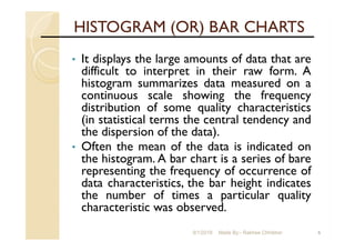
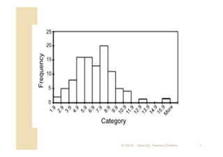
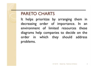
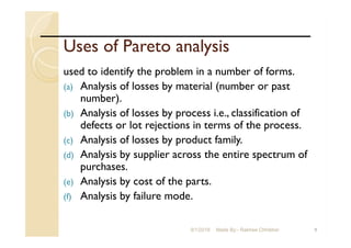
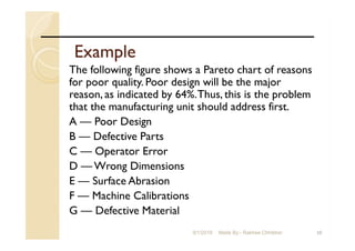
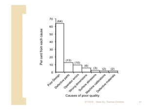
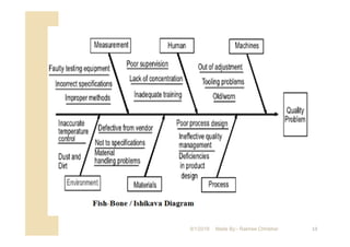
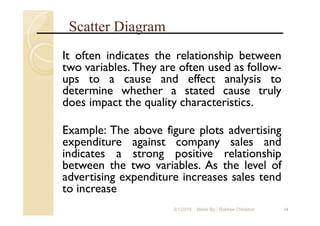
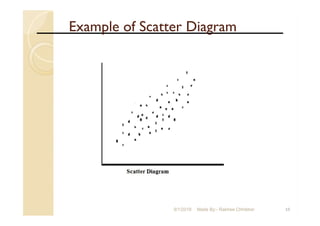
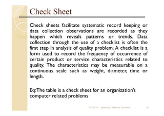
1
Statistical Quality Control
9/1/2018 Made By:- Rakhee Chhibber
Quality Improvement and Statistics
2
• Definitions of Quality
Quality means fitness for use
- quality of design
- quality of conformance
Quality is inversely proportional to
variability.
9/1/2018 Made By:- Rakhee Chhibber
Quality Improvement and Statistics
3
• Quality Improvement
Quality improvement is the reduction of
variability in processes and products.
Alternatively, quality improvement is also
seen as “waste reduction”.
9/1/2018 Made By:- Rakhee Chhibber
Statistical Process Control
4
• Statistical process control is a
collection of tools that when used
together can result in process stability
and variance reduction
9/1/2018 Made By:- Rakhee Chhibber
Statistical Process Control
5
The seven major tools are
1) Histogram
2) Pareto Chart
3) Cause and Effect Diagram
4) Defect Concentration Diagram
5) Control Chart
6) Scatter Diagram
7) Check Sheet
9/1/2018 Made By:- Rakhee Chhibber
HISTOGRAM (OR) BAR CHARTS
• It displays the large amounts of data that are
difficult to interpret in their raw form. A
histogram summarizes data measured on a
continuous scale showing the frequency
distribution of some quality characteristics
(in statistical terms the central tendency and
the dispersion of the data).
• Often the mean of the data is indicated on
the histogram. A bar chart is a series of bare
representing the frequency of occurrence of
data characteristics, the bar height indicates
the number of times a particular quality
characteristic was observed.
69/1/2018 Made By:- Rakhee Chhibber
79/1/2018 Made By:- Rakhee Chhibber
PARETO CHARTS
It helps prioritize by arranging them in
decreasing order of importance. In an
environment of limited resources these
diagrams help companies to decide on the
order in which they should address
problems.
89/1/2018 Made By:- Rakhee Chhibber
Uses of Pareto analysis
used to identify the problem in a number of forms.
(a) Analysis of losses by material (number or past
number).
(b) Analysis of losses by process i.e., classification of
defects or lot rejections in terms of the process.
(c) Analysis of losses by product family.
(d) Analysis by supplier across the entire spectrum of
purchases.
(e) Analysis by cost of the parts.
(f) Analysis by failure mode.
99/1/2018 Made By:- Rakhee Chhibber
Example
The following figure shows a Pareto chart of reasons
for poor quality. Poor design will be the major
reason, as indicated by 64%.Thus, this is the problem
that the manufacturing unit should address first.
A — Poor Design
B — Defective Parts
C — Operator Error
D — Wrong Dimensions
E — Surface Abrasion
F — Machine Calibrations
G — Defective Material
109/1/2018 Made By:- Rakhee Chhibber
119/1/2018 Made By:- Rakhee Chhibber
CAUSE AND EFFECT DIAGRAM
It is sometimes called as Fish-bone diagram. It is
first developed by Kaorv Ishikawa in 1943 and is
sometimes called as Ishikawa diagram. The
diameter helps the management trace customer
complaints directly to the operations involved.
The main quality problem is referred to Fish-
head; the major categories of potential cause
structural bones and the likely specific causes to
ribs. It explores possible causes of problems,
with the intention being to discover the root
causes. This diagram helps identify possible
reasons for a process to go out of control as
well as possible effects on the process.
129/1/2018 Made By:- Rakhee Chhibber
139/1/2018 Made By:- Rakhee Chhibber
Scatter Diagram
It often indicates the relationship between
two variables. They are often used as follow-
ups to a cause and effect analysis to
determine whether a stated cause truly
does impact the quality characteristics.
Example: The above figure plots advertising
expenditure against company sales and
indicates a strong positive relationship
between the two variables. As the level of
advertising expenditure increases sales tend
to increase
149/1/2018 Made By:- Rakhee Chhibber
Example of Scatter Diagram
159/1/2018 Made By:- Rakhee Chhibber
Check Sheet
Check sheets facilitate systematic record keeping or
data collection observations are recorded as they
happen which reveals patterns or trends. Data
collection through the use of a checklist is often the
first step in analysis of quality problem. A checklist is a
form used to record the frequency of occurrence of
certain product or service characteristics related to
quality. The characteristics may be measurable on a
continuous scale such as weight, diameter, time or
length.
Eq:The table is a check sheet for an organization’s
computer related problems
169/1/2018 Made By:- Rakhee Chhibber
Example : - Lab Check List
179/1/2018 Made By:- Rakhee Chhibber
FLOW CHARTS (OR) GRAPHS
It shows the sequence of events in a process.
They are used for manufacturing and service
operations. Flow charts are often used to
diagram operational procedures to simplify
the system. They can identify bottlenecks,
redundant steps and non-value added
activities. A realistic flow chart can be
constructed by using the knowledge of the
person who are directly involved in the
particular process. The flow chart can be
identifies where delays can occur.
189/1/2018 Made By:- Rakhee Chhibber
Example of Flow Chart/graph
199/1/2018 Made By:- Rakhee Chhibber
Control Charts
Statistical Process Chart is implemented
through control charts that are used to
monitor the output of the process and
indicate the presence of problems requiring
further action. Control charts can be used
to monitor processes where output is
measured as either variables or attributes.
This topic will be discussed in another
powerpoint presentation
209/1/2018 Made By:- Rakhee Chhibber

Tools used for statistical quality control

  • 1.
    1 Statistical Quality Control 9/1/2018Made By:- Rakhee Chhibber
  • 2.
    Quality Improvement andStatistics 2 • Definitions of Quality Quality means fitness for use - quality of design - quality of conformance Quality is inversely proportional to variability. 9/1/2018 Made By:- Rakhee Chhibber
  • 3.
    Quality Improvement andStatistics 3 • Quality Improvement Quality improvement is the reduction of variability in processes and products. Alternatively, quality improvement is also seen as “waste reduction”. 9/1/2018 Made By:- Rakhee Chhibber
  • 4.
    Statistical Process Control 4 •Statistical process control is a collection of tools that when used together can result in process stability and variance reduction 9/1/2018 Made By:- Rakhee Chhibber
  • 5.
    Statistical Process Control 5 Theseven major tools are 1) Histogram 2) Pareto Chart 3) Cause and Effect Diagram 4) Defect Concentration Diagram 5) Control Chart 6) Scatter Diagram 7) Check Sheet 9/1/2018 Made By:- Rakhee Chhibber
  • 6.
    HISTOGRAM (OR) BARCHARTS • It displays the large amounts of data that are difficult to interpret in their raw form. A histogram summarizes data measured on a continuous scale showing the frequency distribution of some quality characteristics (in statistical terms the central tendency and the dispersion of the data). • Often the mean of the data is indicated on the histogram. A bar chart is a series of bare representing the frequency of occurrence of data characteristics, the bar height indicates the number of times a particular quality characteristic was observed. 69/1/2018 Made By:- Rakhee Chhibber
  • 7.
    79/1/2018 Made By:-Rakhee Chhibber
  • 8.
    PARETO CHARTS It helpsprioritize by arranging them in decreasing order of importance. In an environment of limited resources these diagrams help companies to decide on the order in which they should address problems. 89/1/2018 Made By:- Rakhee Chhibber
  • 9.
    Uses of Paretoanalysis used to identify the problem in a number of forms. (a) Analysis of losses by material (number or past number). (b) Analysis of losses by process i.e., classification of defects or lot rejections in terms of the process. (c) Analysis of losses by product family. (d) Analysis by supplier across the entire spectrum of purchases. (e) Analysis by cost of the parts. (f) Analysis by failure mode. 99/1/2018 Made By:- Rakhee Chhibber
  • 10.
    Example The following figureshows a Pareto chart of reasons for poor quality. Poor design will be the major reason, as indicated by 64%.Thus, this is the problem that the manufacturing unit should address first. A — Poor Design B — Defective Parts C — Operator Error D — Wrong Dimensions E — Surface Abrasion F — Machine Calibrations G — Defective Material 109/1/2018 Made By:- Rakhee Chhibber
  • 11.
    119/1/2018 Made By:-Rakhee Chhibber
  • 12.
    CAUSE AND EFFECTDIAGRAM It is sometimes called as Fish-bone diagram. It is first developed by Kaorv Ishikawa in 1943 and is sometimes called as Ishikawa diagram. The diameter helps the management trace customer complaints directly to the operations involved. The main quality problem is referred to Fish- head; the major categories of potential cause structural bones and the likely specific causes to ribs. It explores possible causes of problems, with the intention being to discover the root causes. This diagram helps identify possible reasons for a process to go out of control as well as possible effects on the process. 129/1/2018 Made By:- Rakhee Chhibber
  • 13.
    139/1/2018 Made By:-Rakhee Chhibber
  • 14.
    Scatter Diagram It oftenindicates the relationship between two variables. They are often used as follow- ups to a cause and effect analysis to determine whether a stated cause truly does impact the quality characteristics. Example: The above figure plots advertising expenditure against company sales and indicates a strong positive relationship between the two variables. As the level of advertising expenditure increases sales tend to increase 149/1/2018 Made By:- Rakhee Chhibber
  • 15.
    Example of ScatterDiagram 159/1/2018 Made By:- Rakhee Chhibber
  • 16.
    Check Sheet Check sheetsfacilitate systematic record keeping or data collection observations are recorded as they happen which reveals patterns or trends. Data collection through the use of a checklist is often the first step in analysis of quality problem. A checklist is a form used to record the frequency of occurrence of certain product or service characteristics related to quality. The characteristics may be measurable on a continuous scale such as weight, diameter, time or length. Eq:The table is a check sheet for an organization’s computer related problems 169/1/2018 Made By:- Rakhee Chhibber
  • 17.
    Example : -Lab Check List 179/1/2018 Made By:- Rakhee Chhibber
  • 18.
    FLOW CHARTS (OR)GRAPHS It shows the sequence of events in a process. They are used for manufacturing and service operations. Flow charts are often used to diagram operational procedures to simplify the system. They can identify bottlenecks, redundant steps and non-value added activities. A realistic flow chart can be constructed by using the knowledge of the person who are directly involved in the particular process. The flow chart can be identifies where delays can occur. 189/1/2018 Made By:- Rakhee Chhibber
  • 19.
    Example of FlowChart/graph 199/1/2018 Made By:- Rakhee Chhibber
  • 20.
    Control Charts Statistical ProcessChart is implemented through control charts that are used to monitor the output of the process and indicate the presence of problems requiring further action. Control charts can be used to monitor processes where output is measured as either variables or attributes. This topic will be discussed in another powerpoint presentation 209/1/2018 Made By:- Rakhee Chhibber