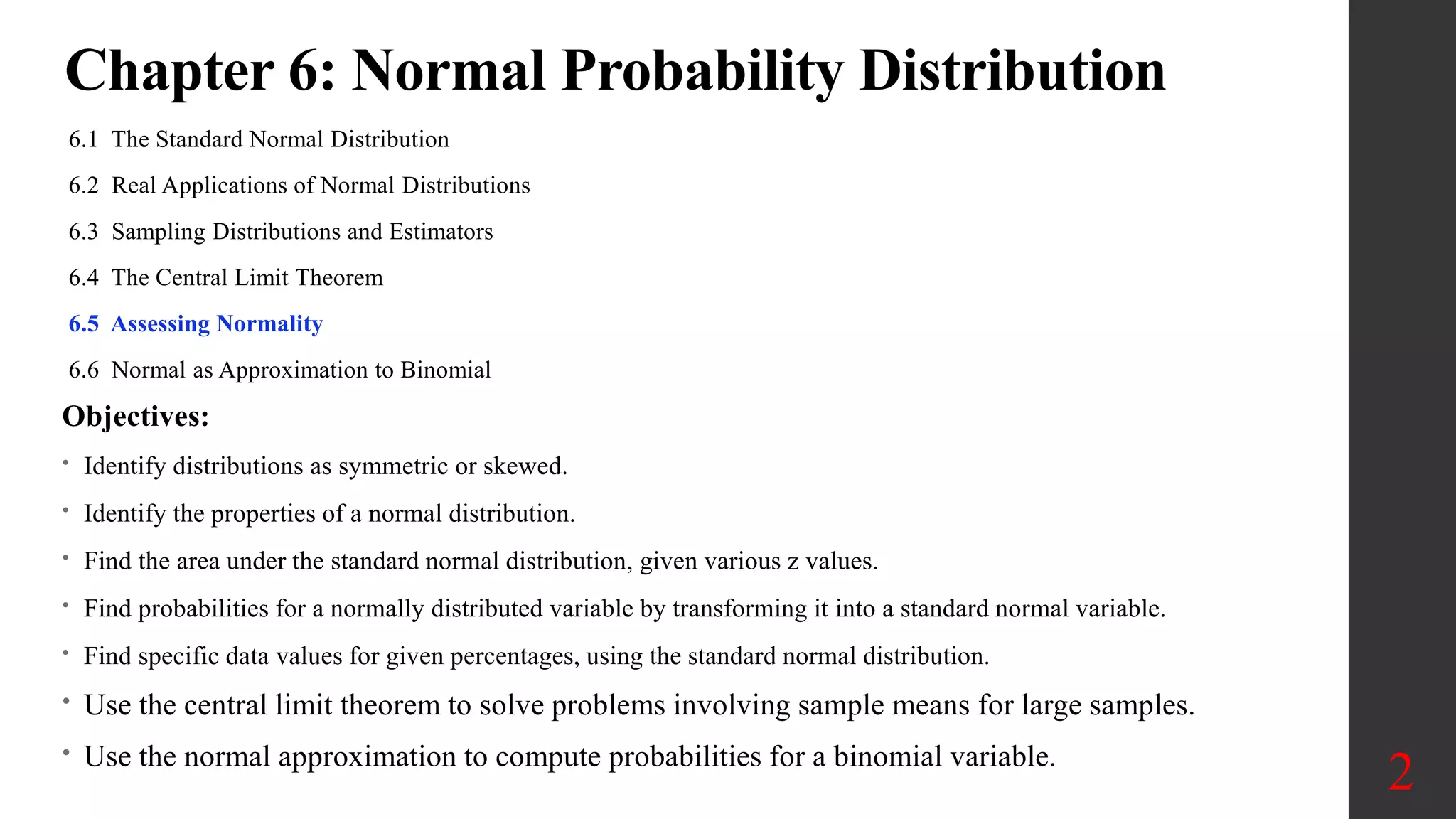
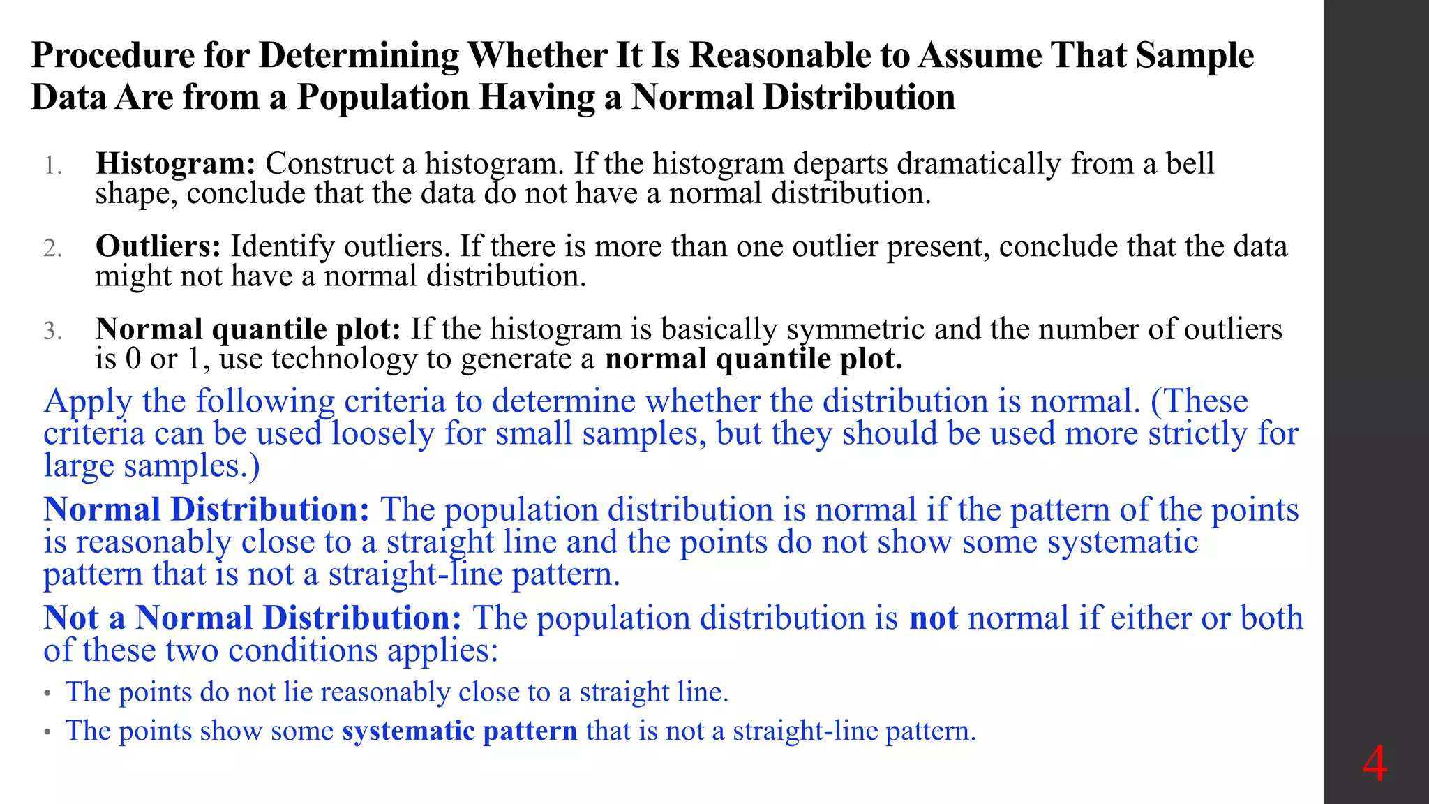
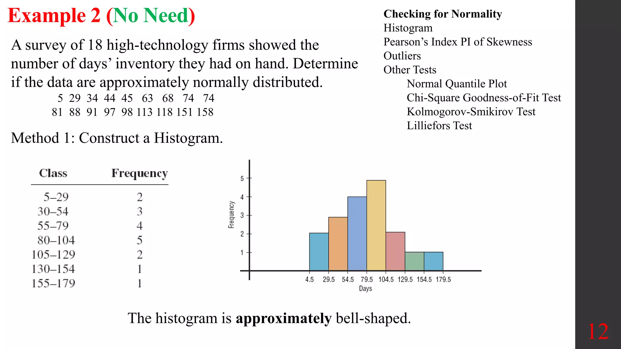
Elementary Statistics
Chapter 6:
Normal Probability
Distribution
6.5 Assessing Normality
1
Chapter 6: Normal Probability Distribution
6.1 The Standard Normal Distribution
6.2 Real Applications of Normal Distributions
6.3 Sampling Distributions and Estimators
6.4 The Central Limit Theorem
6.5 Assessing Normality
6.6 Normal as Approximation to Binomial
2
Objectives:
• Identify distributions as symmetric or skewed.
• Identify the properties of a normal distribution.
• Find the area under the standard normal distribution, given various z values.
• Find probabilities for a normally distributed variable by transforming it into a standard normal variable.
• Find specific data values for given percentages, using the standard normal distribution.
• Use the central limit theorem to solve problems involving sample means for large samples.
• Use the normal approximation to compute probabilities for a binomial variable.
Key Concept:
Determine whether the requirement of a normal distribution is
satisfied:
(1) visual inspection of a histogram to see if it is roughly bell-
shaped
(2) identifying any outliers; and
(3) constructing a normal quantile plot.
Normal Quantile Plot
A normal quantile plot (or normal probability plot) is a graph
of points (x, y) where each x value is from the original set of
sample data, and each y value is the corresponding z score that is
expected from the standard normal distribution.
6.5 Assessing Normality
3
(x, y = Z-score)
TI Calculator:
How to enter data & Normal
Quantile Plot :
1. Stat
2. Edit
3. ClrList 𝑳𝟏
4. Or Highlight & Clear
5. Type in your data in L1, ..
6. Press 2nd y (for stat Plot)
7. Enter
8. Select ON
9. Select Type item (Last one in
the 2nd row option)
10. Enter 𝑳𝟏for the data List
11. Press Zoom
12. Press 9 (ZoomStat)
Procedure for Determining Whether It Is Reasonable to Assume That Sample
DataAre from a Population Having a Normal Distribution
1. Histogram: Construct a histogram. If the histogram departs dramatically from a bell
shape, conclude that the data do not have a normal distribution.
2. Outliers: Identify outliers. If there is more than one outlier present, conclude that the data
might not have a normal distribution.
3. Normal quantile plot: If the histogram is basically symmetric and the number of outliers
is 0 or 1, use technology to generate a normal quantile plot.
Apply the following criteria to determine whether the distribution is normal. (These
criteria can be used loosely for small samples, but they should be used more strictly for
large samples.)
Normal Distribution: The population distribution is normal if the pattern of the points
is reasonably close to a straight line and the points do not show some systematic
pattern that is not a straight-line pattern.
Not a Normal Distribution: The population distribution is not normal if either or both
of these two conditions applies:
• The points do not lie reasonably close to a straight line.
• The points show some systematic pattern that is not a straight-line pattern.
4
Normal Example
Normal: The first case shows a histogram of IQ scores that is close to being bell-
shaped suggesting a normal distribution. The corresponding normal quantile plot
shows points that are reasonably close to a straight-line pattern, and the points do
not show any other systematic pattern that is not a straight line. It is safe to assume
that these IQ scores are from a population that has a normal distribution.
(x, y = Z-score)
5
Uniform Example
Uniform: The second case shows a histogram of data having a uniform (flat)
distribution. The corresponding normal quantile plot suggests that the points are
not normally distributed. Although the pattern of points is reasonably close to a
straight-line pattern, there is another systematic pattern that is not a straight-
line pattern. We conclude that these sample values are from a population having
a distribution that is not normal.
(x, y = Z-score)
6
Skewed Example
Skewed: The third case shows a histogram of the amounts of rainfall (in inches) in
Boston for every Monday during one year. The shape of the histogram is skewed to
the right, not bell-shaped. The corresponding normal quantile plot shows points that
are not at all close to a straight-line pattern. These rainfall amounts are from a
population having a distribution that is not normal.
(x, y = Z-score)
7
Tools for Determining Normality
Histogram / Outliers: If the requirement of a normal
distribution is not too strict, simply look at a histogram and
find the number of outliers. If the histogram is roughly bell-
shaped and the number of outliers is 0 or 1, treat the
population as if it has a normal distribution.
Normal Quantile Plot: Normal quantile plots can be difficult
to construct on your own, but they can be generated with a TI-
83/84 Plus calculator or suitable software, such as Statdisk,
Minitab, Excel, or StatCrunch.
Advanced Methods: In addition to the procedures discussed
in this section, there are other more advanced procedures for
assessing normality, such as the chi-square goodness-of-fit
test, the Kolmogorov-Smirnov test, the Lilliefors test, the
Anderson-Darling test, the Jarque-Bera test, and the Ryan-
Joiner test (discussed briefly in Part 2).
8
TI Calculator:
How to enter data & Normal
Quantile Plot :
1. Stat
2. Edit
3. ClrList 𝑳𝟏
4. Or Highlight & Clear
5. Type in your data in L1, ..
6. Press 2nd y (for stat Plot)
7. Enter
8. Select ON
9. Select Type item (Last one in
the 2nd row option)
10. Enter 𝑳𝟏for the data List
11. Press Zoom
12. Press 9 (ZoomStat)
Manual Construction of Normal Quantile Plot
Step 1: First sort the data by arranging the values in order from lowest to highest.
Step 2. With a sample of size n, each value represents a proportion of 1/n of the
sample. Using the known sample size n, identify the areas of 1/2n, 3/2n, and so
on. These are the cumulative areas to the left of the corresponding sample values.
These values are the cumulative areas to the left of the corresponding sample
values.
Step 3: Use the standard normal distribution (software or a calculator or Table A-
2) to find the z scores corresponding to the cumulative left areas found in Step 2.
(These are the z scores that are expected from a normally distributed sample.)
Step 4: Match the original sorted data values with their corresponding z scores
found in Step 3, then plot the points (x, y), where each x is an original sample
value and y is the corresponding z score.
Step 5: Examine the normal quantile plot and use the criteria given in Part 1.
Conclude that the population has a normal distribution if the pattern of the points
is reasonably close to a straight line and the points do not show some systematic
pattern that is not a straight-line pattern.
9
Old Faithful Eruption Times
We can use the
Normality
Assessment
feature of
Statdisk with all
250 eruption
times listed in
the “Old
Faithful” data set
to get the
accompanying
display.
10
Let’s use the display with the three criteria for assessing normality.
1. Histogram: We can see that the histogram is skewed to the left and is far from being bell-shaped.
2. Outliers: The display shows that there are 20 possible outliers. If we examine a sorted list of the 250 eruption times, the 20 lowest
times do appear to be outliers.
3. Normal quantile plot: Whoa! The points in the normal quantile plot are very far from a straight-line pattern. We conclude that the
250 eruption times do not appear to be from a population with a normal distribution.
Example 1
(x, y = Z-score)
11
Construct a Normal
Quantile plot for a
sample of breaking
distance in feet
measured under
standard condition for a
sample of large cars are
as follows:
131, 134, 139, 143, 145
Normal. The points have coordinates:
(131, –1.28), (134, –0.52), (139, 0), (143, 0.52), (145, 1.28)
12
Checking for Normality
Histogram
Pearson’s Index PI of Skewness
Outliers
Other Tests
Normal Quantile Plot
Chi-Square Goodness-of-Fit Test
Kolmogorov-Smikirov Test
Lilliefors Test
A survey of 18 high-technology firms showed the
number of days’ inventory they had on hand. Determine
if the data are approximately normally distributed.
5 29 34 44 45 63 68 74 74
81 88 91 97 98 113 118 151 158
Method 1: Construct a Histogram.
Example 2 (No Need)
The histogram is approximately bell-shaped.
13
Checking for Normality
Histogram
Pearson’s Index PI of Skewness
Outliers
Other Tests
Normal Quantile Plot
Chi-Square Goodness-of-Fit Test
Kolmogorov-Smikirov Test
Lilliefors Test
Example 2 (No Need)
Method 2: Check for Skewness.
The PI is not greater than 1 or less than –1, so it can be
concluded that the distribution is not significantly
skewed.
Method 3: Check for Outliers.
Five-Number Summary: 5 - 45 - 77.5 - 98 - 158
Q1 – 1.5(IQR) = 45 – 1.5(53) = –34.5
Q3 + 1.5(IQR) = 98 + 1.5(53) = 177.5
No data below –34.5 or above 177.5, so no outliers.
 
3 79.5 77.5
3( )
PI 0.148
40.5


  
X MD
s
79.5, 77.5, 40.5
  
X MD s
Conclusion:
The histogram is approximately
bell-shaped.
The data are not significantly
skewed.
There are no outliers.
Thus, it can be concluded that the
distribution is approximately
normally distributed.

Assessing Normality

  • 1.
    Elementary Statistics Chapter 6: NormalProbability Distribution 6.5 Assessing Normality 1
  • 2.
    Chapter 6: NormalProbability Distribution 6.1 The Standard Normal Distribution 6.2 Real Applications of Normal Distributions 6.3 Sampling Distributions and Estimators 6.4 The Central Limit Theorem 6.5 Assessing Normality 6.6 Normal as Approximation to Binomial 2 Objectives: • Identify distributions as symmetric or skewed. • Identify the properties of a normal distribution. • Find the area under the standard normal distribution, given various z values. • Find probabilities for a normally distributed variable by transforming it into a standard normal variable. • Find specific data values for given percentages, using the standard normal distribution. • Use the central limit theorem to solve problems involving sample means for large samples. • Use the normal approximation to compute probabilities for a binomial variable.
  • 3.
    Key Concept: Determine whetherthe requirement of a normal distribution is satisfied: (1) visual inspection of a histogram to see if it is roughly bell- shaped (2) identifying any outliers; and (3) constructing a normal quantile plot. Normal Quantile Plot A normal quantile plot (or normal probability plot) is a graph of points (x, y) where each x value is from the original set of sample data, and each y value is the corresponding z score that is expected from the standard normal distribution. 6.5 Assessing Normality 3 (x, y = Z-score) TI Calculator: How to enter data & Normal Quantile Plot : 1. Stat 2. Edit 3. ClrList 𝑳𝟏 4. Or Highlight & Clear 5. Type in your data in L1, .. 6. Press 2nd y (for stat Plot) 7. Enter 8. Select ON 9. Select Type item (Last one in the 2nd row option) 10. Enter 𝑳𝟏for the data List 11. Press Zoom 12. Press 9 (ZoomStat)
  • 4.
    Procedure for DeterminingWhether It Is Reasonable to Assume That Sample DataAre from a Population Having a Normal Distribution 1. Histogram: Construct a histogram. If the histogram departs dramatically from a bell shape, conclude that the data do not have a normal distribution. 2. Outliers: Identify outliers. If there is more than one outlier present, conclude that the data might not have a normal distribution. 3. Normal quantile plot: If the histogram is basically symmetric and the number of outliers is 0 or 1, use technology to generate a normal quantile plot. Apply the following criteria to determine whether the distribution is normal. (These criteria can be used loosely for small samples, but they should be used more strictly for large samples.) Normal Distribution: The population distribution is normal if the pattern of the points is reasonably close to a straight line and the points do not show some systematic pattern that is not a straight-line pattern. Not a Normal Distribution: The population distribution is not normal if either or both of these two conditions applies: • The points do not lie reasonably close to a straight line. • The points show some systematic pattern that is not a straight-line pattern. 4
  • 5.
    Normal Example Normal: Thefirst case shows a histogram of IQ scores that is close to being bell- shaped suggesting a normal distribution. The corresponding normal quantile plot shows points that are reasonably close to a straight-line pattern, and the points do not show any other systematic pattern that is not a straight line. It is safe to assume that these IQ scores are from a population that has a normal distribution. (x, y = Z-score) 5
  • 6.
    Uniform Example Uniform: Thesecond case shows a histogram of data having a uniform (flat) distribution. The corresponding normal quantile plot suggests that the points are not normally distributed. Although the pattern of points is reasonably close to a straight-line pattern, there is another systematic pattern that is not a straight- line pattern. We conclude that these sample values are from a population having a distribution that is not normal. (x, y = Z-score) 6
  • 7.
    Skewed Example Skewed: Thethird case shows a histogram of the amounts of rainfall (in inches) in Boston for every Monday during one year. The shape of the histogram is skewed to the right, not bell-shaped. The corresponding normal quantile plot shows points that are not at all close to a straight-line pattern. These rainfall amounts are from a population having a distribution that is not normal. (x, y = Z-score) 7
  • 8.
    Tools for DeterminingNormality Histogram / Outliers: If the requirement of a normal distribution is not too strict, simply look at a histogram and find the number of outliers. If the histogram is roughly bell- shaped and the number of outliers is 0 or 1, treat the population as if it has a normal distribution. Normal Quantile Plot: Normal quantile plots can be difficult to construct on your own, but they can be generated with a TI- 83/84 Plus calculator or suitable software, such as Statdisk, Minitab, Excel, or StatCrunch. Advanced Methods: In addition to the procedures discussed in this section, there are other more advanced procedures for assessing normality, such as the chi-square goodness-of-fit test, the Kolmogorov-Smirnov test, the Lilliefors test, the Anderson-Darling test, the Jarque-Bera test, and the Ryan- Joiner test (discussed briefly in Part 2). 8 TI Calculator: How to enter data & Normal Quantile Plot : 1. Stat 2. Edit 3. ClrList 𝑳𝟏 4. Or Highlight & Clear 5. Type in your data in L1, .. 6. Press 2nd y (for stat Plot) 7. Enter 8. Select ON 9. Select Type item (Last one in the 2nd row option) 10. Enter 𝑳𝟏for the data List 11. Press Zoom 12. Press 9 (ZoomStat)
  • 9.
    Manual Construction ofNormal Quantile Plot Step 1: First sort the data by arranging the values in order from lowest to highest. Step 2. With a sample of size n, each value represents a proportion of 1/n of the sample. Using the known sample size n, identify the areas of 1/2n, 3/2n, and so on. These are the cumulative areas to the left of the corresponding sample values. These values are the cumulative areas to the left of the corresponding sample values. Step 3: Use the standard normal distribution (software or a calculator or Table A- 2) to find the z scores corresponding to the cumulative left areas found in Step 2. (These are the z scores that are expected from a normally distributed sample.) Step 4: Match the original sorted data values with their corresponding z scores found in Step 3, then plot the points (x, y), where each x is an original sample value and y is the corresponding z score. Step 5: Examine the normal quantile plot and use the criteria given in Part 1. Conclude that the population has a normal distribution if the pattern of the points is reasonably close to a straight line and the points do not show some systematic pattern that is not a straight-line pattern. 9
  • 10.
    Old Faithful EruptionTimes We can use the Normality Assessment feature of Statdisk with all 250 eruption times listed in the “Old Faithful” data set to get the accompanying display. 10 Let’s use the display with the three criteria for assessing normality. 1. Histogram: We can see that the histogram is skewed to the left and is far from being bell-shaped. 2. Outliers: The display shows that there are 20 possible outliers. If we examine a sorted list of the 250 eruption times, the 20 lowest times do appear to be outliers. 3. Normal quantile plot: Whoa! The points in the normal quantile plot are very far from a straight-line pattern. We conclude that the 250 eruption times do not appear to be from a population with a normal distribution.
  • 11.
    Example 1 (x, y= Z-score) 11 Construct a Normal Quantile plot for a sample of breaking distance in feet measured under standard condition for a sample of large cars are as follows: 131, 134, 139, 143, 145 Normal. The points have coordinates: (131, –1.28), (134, –0.52), (139, 0), (143, 0.52), (145, 1.28)
  • 12.
    12 Checking for Normality Histogram Pearson’sIndex PI of Skewness Outliers Other Tests Normal Quantile Plot Chi-Square Goodness-of-Fit Test Kolmogorov-Smikirov Test Lilliefors Test A survey of 18 high-technology firms showed the number of days’ inventory they had on hand. Determine if the data are approximately normally distributed. 5 29 34 44 45 63 68 74 74 81 88 91 97 98 113 118 151 158 Method 1: Construct a Histogram. Example 2 (No Need) The histogram is approximately bell-shaped.
  • 13.
    13 Checking for Normality Histogram Pearson’sIndex PI of Skewness Outliers Other Tests Normal Quantile Plot Chi-Square Goodness-of-Fit Test Kolmogorov-Smikirov Test Lilliefors Test Example 2 (No Need) Method 2: Check for Skewness. The PI is not greater than 1 or less than –1, so it can be concluded that the distribution is not significantly skewed. Method 3: Check for Outliers. Five-Number Summary: 5 - 45 - 77.5 - 98 - 158 Q1 – 1.5(IQR) = 45 – 1.5(53) = –34.5 Q3 + 1.5(IQR) = 98 + 1.5(53) = 177.5 No data below –34.5 or above 177.5, so no outliers.   3 79.5 77.5 3( ) PI 0.148 40.5      X MD s 79.5, 77.5, 40.5    X MD s Conclusion: The histogram is approximately bell-shaped. The data are not significantly skewed. There are no outliers. Thus, it can be concluded that the distribution is approximately normally distributed.