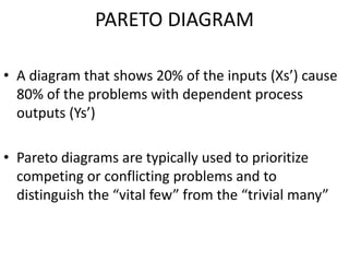
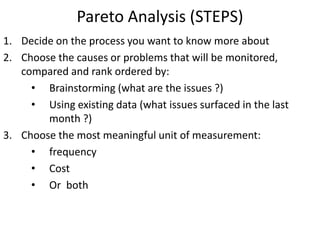
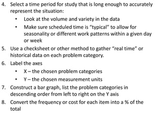
SQC TOOLS
By: Aniket Joshi
GROUP 1 : Histogram, Pareto Chart, Flow
Chart, Checksheet & Scatter Diagram
HISTOGRAM
• A frequency polygon in which data is grouped into
classes
• Height of each bar shows frequency in each class
• Data must be properly grouped in order to
understand the shape of the data distribution
• VARIATIONS :
(a) Simple Histogram
(b)Histogram with Fit
(c) Histogram with Groups
(d)Histogram with Fit & Groups
Example
Customer Waiting Time in Seconds (n=32)
10.4 12 18.7 15.9 11.8 12 17.5 11.3
10.9 12.4 11.4 10.7 10.2 13.9 13 12.7
12.5 14.3 10.4 16.4 11.4 10.6 13.9 11.2
17.3 11.4 11.2 20.3 19.9 20 14.2 11.6
SIMPLE HISTOGRAM : MINITAB OUTPUT
HISTOGRAM WITH FIT: MINITAB OUTPUT
PARETO DIAGRAM
• A diagram that shows 20% of the inputs (Xs’) cause
80% of the problems with dependent process
outputs (Ys’)
• Pareto diagrams are typically used to prioritize
competing or conflicting problems and to
distinguish the “vital few” from the “trivial many”
Pareto Analysis (STEPS)
1. Decide on the process you want to know more about
2. Choose the causes or problems that will be monitored,
compared and rank ordered by:
• Brainstorming (what are the issues ?)
• Using existing data (what issues surfaced in the last
month ?)
3. Choose the most meaningful unit of measurement:
• frequency
• Cost
• Or both
4. Select a time period for study that is long enough to accurately
represent the situation:
• Look at the volume and variety in the data
• Make sure scheduled time is “typical” to allow for
seasonality or different work patterns within a given day
or week
5. Use a checksheet or other method to gather “real time” or
historical data on each problem category.
6. Label the axes
• X – the chosen problem categories
• Y – the chosen measurement units
7. Construct a bar graph, list the problem categories in
descending order from left to right on the Y axis
8. Convert the frequency or cost for each item into a % of the
total
9. Calculate the percentages for the items from left to right and
cumulate from left to right
10. Plot cumulative percentages
11. The cumulative percentages show how much of the total
problem will be fixed by addressing a vital few
FLOW CHART
• a graphical representation of a process, depicting inputs, outputs
and units of activity. It represents the entire process at a high or
detailed (depending on your use) level of observation, allowing
analysis and optimization of workflow.
When to Use ?
• To develop understanding of how a process is done
• To study a process for improvement
• To communicate to others how a process is done
• When better communication is needed between people
involved with the same process
• To document a process
• When planning a project
Commonly Used Symbols in a Flowchart
• - One step in the process; the step is written inside the box.
Usually, only one arrow goes out of the box
• - Direction of flow from one step or decision to another
• - Decision based on a question. The question is written in the
diamond. More than one arrow goes out of the diamond, each one
showing the direction the process takes for a given answer to the
question. (Often the answers are “ yes” and “ no.”)
• - Delay or Wait
• - Link to another page or another flowchart. The same symbol on
the other page indicates that the flow continues there.
• - Input/Output
• - Document
• - Alternate symbols for start and end points
Example – Payment Processing Flowchart
CHECKSHEET
• A check sheet is a structured, prepared form for
collecting and analyzing data.
• This is a generic tool that can be adapted for a wide
variety of purposes.
When to Use ?
• When data can be observed and collected repeatedly
by the same person or at the same location.
• When collecting data on the frequency or patterns of
events, problems, defects, defect location, defect
causes, etc.
• When collecting data from a production process.
Checksheet Example
SCATTER DIAGRAM
• A scatter diagram is the graphical representation of paired (x,y)
data.
• This type of graph is appropriate when the values in one data
set correspond to values in another data set, and one wishes to
understand the relationship between the two
• Scatterplots provide a visual representation of the correlation,
or relationship between the two variables.
• X Axis :Independent Variable
• Y Axis:Dependent Variable
Scatter Diagram : Examples
Hours Spent Sleeping vs. Hours Spent AwakeRunning vs. Calories Burnt
Thank You

Statistical Quality Control Tools - Total Quality Management

  • 1.
    SQC TOOLS By: AniketJoshi GROUP 1 : Histogram, Pareto Chart, Flow Chart, Checksheet & Scatter Diagram
  • 2.
    HISTOGRAM • A frequencypolygon in which data is grouped into classes • Height of each bar shows frequency in each class • Data must be properly grouped in order to understand the shape of the data distribution • VARIATIONS : (a) Simple Histogram (b)Histogram with Fit (c) Histogram with Groups (d)Histogram with Fit & Groups
  • 3.
    Example Customer Waiting Timein Seconds (n=32) 10.4 12 18.7 15.9 11.8 12 17.5 11.3 10.9 12.4 11.4 10.7 10.2 13.9 13 12.7 12.5 14.3 10.4 16.4 11.4 10.6 13.9 11.2 17.3 11.4 11.2 20.3 19.9 20 14.2 11.6
  • 4.
    SIMPLE HISTOGRAM :MINITAB OUTPUT
  • 5.
    HISTOGRAM WITH FIT:MINITAB OUTPUT
  • 6.
    PARETO DIAGRAM • Adiagram that shows 20% of the inputs (Xs’) cause 80% of the problems with dependent process outputs (Ys’) • Pareto diagrams are typically used to prioritize competing or conflicting problems and to distinguish the “vital few” from the “trivial many”
  • 7.
    Pareto Analysis (STEPS) 1.Decide on the process you want to know more about 2. Choose the causes or problems that will be monitored, compared and rank ordered by: • Brainstorming (what are the issues ?) • Using existing data (what issues surfaced in the last month ?) 3. Choose the most meaningful unit of measurement: • frequency • Cost • Or both
  • 8.
    4. Select atime period for study that is long enough to accurately represent the situation: • Look at the volume and variety in the data • Make sure scheduled time is “typical” to allow for seasonality or different work patterns within a given day or week 5. Use a checksheet or other method to gather “real time” or historical data on each problem category. 6. Label the axes • X – the chosen problem categories • Y – the chosen measurement units 7. Construct a bar graph, list the problem categories in descending order from left to right on the Y axis 8. Convert the frequency or cost for each item into a % of the total
  • 9.
    9. Calculate thepercentages for the items from left to right and cumulate from left to right 10. Plot cumulative percentages 11. The cumulative percentages show how much of the total problem will be fixed by addressing a vital few
  • 10.
    FLOW CHART • agraphical representation of a process, depicting inputs, outputs and units of activity. It represents the entire process at a high or detailed (depending on your use) level of observation, allowing analysis and optimization of workflow. When to Use ? • To develop understanding of how a process is done • To study a process for improvement • To communicate to others how a process is done • When better communication is needed between people involved with the same process • To document a process • When planning a project
  • 11.
    Commonly Used Symbolsin a Flowchart • - One step in the process; the step is written inside the box. Usually, only one arrow goes out of the box • - Direction of flow from one step or decision to another • - Decision based on a question. The question is written in the diamond. More than one arrow goes out of the diamond, each one showing the direction the process takes for a given answer to the question. (Often the answers are “ yes” and “ no.”) • - Delay or Wait • - Link to another page or another flowchart. The same symbol on the other page indicates that the flow continues there. • - Input/Output • - Document • - Alternate symbols for start and end points
  • 12.
    Example – PaymentProcessing Flowchart
  • 13.
    CHECKSHEET • A checksheet is a structured, prepared form for collecting and analyzing data. • This is a generic tool that can be adapted for a wide variety of purposes. When to Use ? • When data can be observed and collected repeatedly by the same person or at the same location. • When collecting data on the frequency or patterns of events, problems, defects, defect location, defect causes, etc. • When collecting data from a production process.
  • 14.
  • 15.
    SCATTER DIAGRAM • Ascatter diagram is the graphical representation of paired (x,y) data. • This type of graph is appropriate when the values in one data set correspond to values in another data set, and one wishes to understand the relationship between the two • Scatterplots provide a visual representation of the correlation, or relationship between the two variables. • X Axis :Independent Variable • Y Axis:Dependent Variable
  • 16.
    Scatter Diagram :Examples Hours Spent Sleeping vs. Hours Spent AwakeRunning vs. Calories Burnt
  • 17.

Editor's Notes

  • #16 X- independent Y- dependent