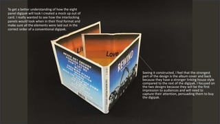
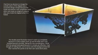
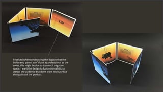
The document discusses the creation of a mock-up of an 8 panel digipak using card to understand how the interlocking panels would look. The author feels the strongest parts of the design are the album cover and back because they have a stronger linking house style compared to the rest of the digipak. They also changed the outside color successfully so the inside and exterior now complement each other. The double panel illustration doesn't match up perfectly due to it being a paper mock-up. The author noticed the inside end panels don't look as professional as the cover possibly due to too much negative space and wants a minimalistic yet high quality design.