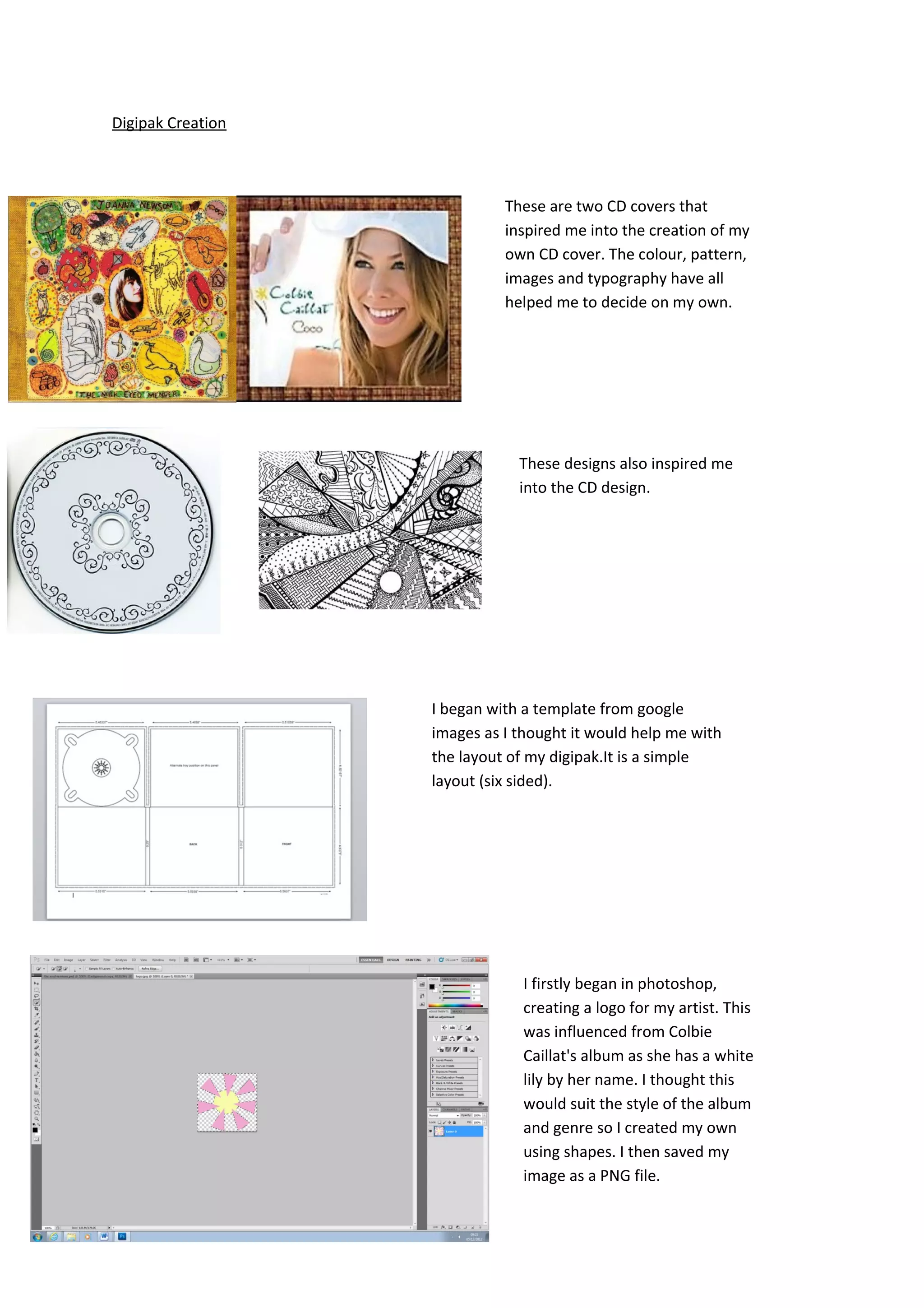
Digipak Creation


                             These are two CD covers that
                             inspired me into the creation of my
                             own CD cover. The colour, pattern,
                             images and typography have all
                             helped me to decide on my own.


                               These designs also inspired me
                               into the CD design.


                   I began with a template from google
                   images as I thought it would help me with
                   the layout of my digipak.It is a simple
                   layout (six sided).


                               I firstly began in photoshop,
                               creating a logo for my artist. This
                               was influenced from Colbie
                               Caillat's album as she has a white
                               lily by her name. I thought this
                               would suit the style of the album
                               and genre so I created my own
                               using shapes. I then saved my
                               image as a PNG file.
It was important to save the files as PNG as they
               would then go into word as typography with no
               background.


I began with the front cover of the album. I
took inspiration from an album cover I ooked
at in the planning stage- Ellie Goulding's
“Lights” as the image used is similar to the
one I have taken. I think the image worked
well on the front and was a powerful image
to represent the artist on thr front cover. It is
also a typical convention to have a close up
on the artists face on the front of a CD
album.


I then placed in the text I earlier created in
photoshop and also the logo. I played
around with the layout on the front but I
decided that this worked the most
effectively.


   I then began to create the back of the
   album. I used the same image from the
   magazine advert as they link in.
I began to place in the text
     on the back- the song titles. I
     wasn't happy with the layout.


So I tried it with the numbers down the right
hand side and it works much better.


               I now placed in some of my own
               photogrpahy as it is conventional
               to have some more images in the
               digipak to relresent the artist.


                                                   I then created the background
                                                   design for my CD print. I created
                                                   the design myself using felt tip
                                                   pens and paper and scanned the
                                                   image in. I then created a lower
                                                   brightness to fit onto the CD.
Overall I am pleased
with my digipak- the
photogrpahy,
typography and
design have all
worked well.

Digipak prints

  • 1.
    Digipak Creation These are two CD covers that inspired me into the creation of my own CD cover. The colour, pattern, images and typography have all helped me to decide on my own. These designs also inspired me into the CD design. I began with a template from google images as I thought it would help me with the layout of my digipak.It is a simple layout (six sided). I firstly began in photoshop, creating a logo for my artist. This was influenced from Colbie Caillat's album as she has a white lily by her name. I thought this would suit the style of the album and genre so I created my own using shapes. I then saved my image as a PNG file.
  • 2.
    It was importantto save the files as PNG as they would then go into word as typography with no background. I began with the front cover of the album. I took inspiration from an album cover I ooked at in the planning stage- Ellie Goulding's “Lights” as the image used is similar to the one I have taken. I think the image worked well on the front and was a powerful image to represent the artist on thr front cover. It is also a typical convention to have a close up on the artists face on the front of a CD album. I then placed in the text I earlier created in photoshop and also the logo. I played around with the layout on the front but I decided that this worked the most effectively. I then began to create the back of the album. I used the same image from the magazine advert as they link in.
  • 3.
    I began toplace in the text on the back- the song titles. I wasn't happy with the layout. So I tried it with the numbers down the right hand side and it works much better. I now placed in some of my own photogrpahy as it is conventional to have some more images in the digipak to relresent the artist. I then created the background design for my CD print. I created the design myself using felt tip pens and paper and scanned the image in. I then created a lower brightness to fit onto the CD.
  • 4.
    Overall I ampleased with my digipak- the photogrpahy, typography and design have all worked well.