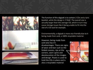
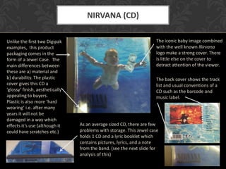
DIGIPAK
ANALYSIS
‘a Digipak is a patented style of
compact disc or DVD packaging’


        Jessica Hyde
NINE INCH NAILS (CD)

Aesthetically, the                              •   The genre of Nine Inch
 choice of colours                                  Nails is considered ‘Heavy
purple, white, red,                                 Metal’. The cover of this
yellow and orange                                   digipak appeals to the
                                                    target audience by
can be considered                                   supporting a discrete and
 ‘Autumn shades’.                                   simplistic design. Half of
   This is further                                  the logo is visible, possibly
  supported with                                    in an attempt to remain an
   flowers on the                                   ‘underground’ band,
 back of the pack.                                  presumably the audience
The colour theme                                    would recognise the logo
      remains                                       instantly
  throughout the
 whole digipak to
keep continuity.


                                   • Ergonomics- Able to open up the
                                     whole case to see both CDs and the list
                                     of songs
The function of this digipak is to contain 2 CDs and a lyric
booklet, while the design is ‘2 fold’. The overall size is
actually larger than the average CD, which in turn may
cause storage issues like it being unable to fit into the
slot of a CD rack for example.

Environmentally, a digipak is more eco-friendly due to it
being made from card, a 100% recyclable material.

However, being made from
card also has it’s
disadvantages. There are signs
of wear and tear such as the
folded creases, rips at the
corners, worn spine and
decolouration of the images
and design. Plastic is used to
hold the CDs in place and is
also a recyclable material.
THE OFFICE (DVD)

One of the most                          • For the DVD digipak, there
noticeable                                 is an outer cover which
aesthetic                                  advertises the product.
features of this                           This is done with pictures,
design is the very                         a write up/ summary plus
simplistic, layout.                        the usual DVD conventions
This could almost                          which are present, like the
act to represent                           age restriction and
the formal ‘office                         duration. There is also a
feel’. Colours                             cut away for ease of
related with                               separating the digipak
office and desk                            from it’s card case. Inside
work such as                               there are 3 DVD holders
grey –pencil lead                          made from plastic, with
and white used-                            ‘cut aways’ in the four
paper, forms etc.                          corners and a ‘push’
are used,                                  button in the centre of
combined with a                            each for ease of DVD
simple typeface                            removal.
to tie the look
together.
Similarly to the CD Digipak, this is
made of card and plastic, both of
which can be recycled. Despite it
being slightly larger than the
normal DVD (plastic case) size, it
carries 3 DVDs which makes it
overall very convenient for the
buyer, and also seller who can cut
down manufacturing and
material costs. Furthermore, the
space that is available is utilised,
with the episode names placed
on the back of the card under the
transparent plastic DVD holder.
The thick, smooth white card
gives a feeling of quality to the
product. In general there are a        The packaging appeals to the target audience by showing the popular
few creases but no major               characters of the show. Actor Ricky Gervais features on all three DVD
damage.                                designs as well as the back and middle panels adding humour, which
                                       the audience of this programme will appreciate.
NIRVANA (CD)

Unlike the first two Digipak                                         The iconic baby image combined
examples, this product                                               with the well known Nirvana
packaging comes in the                                               logo make a strong cover. There
form of a Jewel Case. The                                            is little else on the cover to
main differences between                                             detract attention of the viewer.
these are a) material and
b) durability. The plastic                                           The back cover shows the track
cover gives this CD a                                                list and usual conventions of a
‘glossy’ finish, aesthetically                                       CD such as the barcode and
appealing to buyers.                                                 music label.
Plastic is also more ‘hard
wearing’ i.e. after many
years it will not be
damaged in a way which
effects it’s use (although it    As an average sized CD, there are few
could have scratches etc.)       problems with storage. This Jewel case
                                 holds 1 CD and a lyric booklet which
                                 contains pictures, lyrics, and a note
                                 from the band. (see the next slide for
                                 analysis of this)
The water theme is kept on the cover, CD
                                                        design and lyric booklet throughout, possibly
                                                        for continuity. Inside the booklet are lyrics
                                                        and pictures of the band, which could give
                                                        the target audience an insight into the band,
                                                        thus making them feel ‘closer’ and more
                                                        attached to their music.

                                                        Ergonomically the CD holder is similar to the
                                                        card digipak as both are made from plastic,
                                                        contain ‘cut aways’, and a section in the
                                                        middle to push which will release the CD.
                                                        Plastic as a material is less environmentally
                                                        friendly than card but is considered to be
                                                        more durable.

The font and alignment of the text in the booklet, as
seen here, further follows the water theme with the
imagery of waves, suggesting again that continuity is
key
DISADVANTAGES OF A DIGIPAK


• Not as durable as a Jewel case, prone to ‘wear and tear’, like rips folds,
  creases and image discolouring.

• Can be difficult to store as the size generally tends to be larger than the
  average CD, thus unable to fit into CD racks, for example

• Can be found too ‘fiddly’ i.e. difficult to access the CDs or booklet

• Can inflate the price of the CD for the buyers as the Digipak is generally
  more expensive to make
ADVANTAGES OF A DIGIPAK


• The digipak is generally made from thick, good quality card which gives a
  professional finish and the impression of high quality goods.

• The fold design is more efficient in storing numerous CD’s, compared to a
  Jewel case which can hold 2 CDs maximum.

• More environmentally-friendly materials are used, the card can also be
  made from previously recycled material.

• There is more space and opportunity for the artist to represent
  themselves and their brand. It is also more continuous to have the design
  which can be spread across the folds, unlike the disjointed Jewel case
  layout.

D

  • 1.
    DIGIPAK ANALYSIS ‘a Digipak isa patented style of compact disc or DVD packaging’ Jessica Hyde
  • 2.
    NINE INCH NAILS(CD) Aesthetically, the • The genre of Nine Inch choice of colours Nails is considered ‘Heavy purple, white, red, Metal’. The cover of this yellow and orange digipak appeals to the target audience by can be considered supporting a discrete and ‘Autumn shades’. simplistic design. Half of This is further the logo is visible, possibly supported with in an attempt to remain an flowers on the ‘underground’ band, back of the pack. presumably the audience The colour theme would recognise the logo remains instantly throughout the whole digipak to keep continuity. • Ergonomics- Able to open up the whole case to see both CDs and the list of songs
  • 3.
    The function ofthis digipak is to contain 2 CDs and a lyric booklet, while the design is ‘2 fold’. The overall size is actually larger than the average CD, which in turn may cause storage issues like it being unable to fit into the slot of a CD rack for example. Environmentally, a digipak is more eco-friendly due to it being made from card, a 100% recyclable material. However, being made from card also has it’s disadvantages. There are signs of wear and tear such as the folded creases, rips at the corners, worn spine and decolouration of the images and design. Plastic is used to hold the CDs in place and is also a recyclable material.
  • 4.
    THE OFFICE (DVD) Oneof the most • For the DVD digipak, there noticeable is an outer cover which aesthetic advertises the product. features of this This is done with pictures, design is the very a write up/ summary plus simplistic, layout. the usual DVD conventions This could almost which are present, like the act to represent age restriction and the formal ‘office duration. There is also a feel’. Colours cut away for ease of related with separating the digipak office and desk from it’s card case. Inside work such as there are 3 DVD holders grey –pencil lead made from plastic, with and white used- ‘cut aways’ in the four paper, forms etc. corners and a ‘push’ are used, button in the centre of combined with a each for ease of DVD simple typeface removal. to tie the look together.
  • 5.
    Similarly to theCD Digipak, this is made of card and plastic, both of which can be recycled. Despite it being slightly larger than the normal DVD (plastic case) size, it carries 3 DVDs which makes it overall very convenient for the buyer, and also seller who can cut down manufacturing and material costs. Furthermore, the space that is available is utilised, with the episode names placed on the back of the card under the transparent plastic DVD holder. The thick, smooth white card gives a feeling of quality to the product. In general there are a The packaging appeals to the target audience by showing the popular few creases but no major characters of the show. Actor Ricky Gervais features on all three DVD damage. designs as well as the back and middle panels adding humour, which the audience of this programme will appreciate.
  • 6.
    NIRVANA (CD) Unlike thefirst two Digipak The iconic baby image combined examples, this product with the well known Nirvana packaging comes in the logo make a strong cover. There form of a Jewel Case. The is little else on the cover to main differences between detract attention of the viewer. these are a) material and b) durability. The plastic The back cover shows the track cover gives this CD a list and usual conventions of a ‘glossy’ finish, aesthetically CD such as the barcode and appealing to buyers. music label. Plastic is also more ‘hard wearing’ i.e. after many years it will not be damaged in a way which effects it’s use (although it As an average sized CD, there are few could have scratches etc.) problems with storage. This Jewel case holds 1 CD and a lyric booklet which contains pictures, lyrics, and a note from the band. (see the next slide for analysis of this)
  • 7.
    The water themeis kept on the cover, CD design and lyric booklet throughout, possibly for continuity. Inside the booklet are lyrics and pictures of the band, which could give the target audience an insight into the band, thus making them feel ‘closer’ and more attached to their music. Ergonomically the CD holder is similar to the card digipak as both are made from plastic, contain ‘cut aways’, and a section in the middle to push which will release the CD. Plastic as a material is less environmentally friendly than card but is considered to be more durable. The font and alignment of the text in the booklet, as seen here, further follows the water theme with the imagery of waves, suggesting again that continuity is key
  • 8.
    DISADVANTAGES OF ADIGIPAK • Not as durable as a Jewel case, prone to ‘wear and tear’, like rips folds, creases and image discolouring. • Can be difficult to store as the size generally tends to be larger than the average CD, thus unable to fit into CD racks, for example • Can be found too ‘fiddly’ i.e. difficult to access the CDs or booklet • Can inflate the price of the CD for the buyers as the Digipak is generally more expensive to make
  • 9.
    ADVANTAGES OF ADIGIPAK • The digipak is generally made from thick, good quality card which gives a professional finish and the impression of high quality goods. • The fold design is more efficient in storing numerous CD’s, compared to a Jewel case which can hold 2 CDs maximum. • More environmentally-friendly materials are used, the card can also be made from previously recycled material. • There is more space and opportunity for the artist to represent themselves and their brand. It is also more continuous to have the design which can be spread across the folds, unlike the disjointed Jewel case layout.