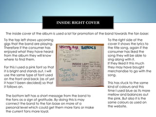
Shelby Edmunds
DIGIPAK DESIGN 1
Using the initial designs I created for the digipak cover, I took my favorite idea
and started to play around with what it could look like as an actual digipak
cover. It was a design which I could potentially use for my final digipak design
and so I moderated the design and put it onto a template to see what it would
look like before I started to create the product online. I wanted to see if it was
the type of digipak that would reach our target audience and that would match
the genre of the song.
I stuck with the design of the website for the
background of the Digipak, therefore fans of
the band will immediately recognize that link.
As well as the same design I used the same
colours - pink, blue and orange which are
used at the background for the website.
The band name is written in front of this
pattern in bold black lettering therefore it is
clear - also when stacked on a shelf as the title
is bold at the top it will stick out when other
objects are in front of it which would make it
easier for the consumer to see.
The title of the album is written down the right
side of the album cover, which makes it
different to normal album titles which are just
written across the bottom, its in plain bold
lettering so that it stands out against the
colours of the background.
FRONT COVER
The image on the front of the digipak is a picture of the band with their instruments
• By showing their instruments it plays to the convention of a rock band as it is
immediately telling the audience what kind of band they are by the instruments they
use; similarly The stage is in the background of the image therefore it immediately tells
the audience that the band does play live shows
• By showing the instruments It also plays to the convention that rock bands can always
play their own instruments which is was separates them from the pop genre.
• Also by showing the band on the front cover it shows to people, who may not know,
what the band looks like.
• However some rock covers don’t show the band on them i.e. Nirvana. But some of the
popular rock bands do have the band on the front cover i.e. Paramore therefore it is
also similar in that respect.
FRONT COVER
To the top left there is a small picture of the
band and to the right of this there is the
band logo, as they are at the top they will
stand out if they are on a shelf on the
wrong way, but also it is a means of
marketing - its promoting the band on their
album.
BACK COVER
The back cover again stuck with the
design of the website for the background
of the Digipak, however it covers almost
the entire back cover, where as the front
cover uses an image of the band for the
majority of the space.
The tracks on the digipak are written
across the center of the cover, again in
black bold lettering so that they stand out.
As of yet I’m not sure where it is just a
single or an entire album which will be
track listed on the back cover.
To the bottom right there is a barcode
that will be used for purchase. Directly
below this is the band title and social
networking links so that potential fans of
the band will know where to find them if
they are interested in finding out more.
INSIDE RIGHT COVER
To the top left shows upcoming
gigs that the band are playing.
Therefore if the consumer has
enjoyed what they have heard
from the album they will know
where to find them.
For this I used a pink font so that
it is bright and stands out. I will
use the same type of font used
on the front and back (as of yet
it hasn’t been decided) so that
it follows on.
The inside cover of the album is used a lot for promotion of the band towards the fan base:
To the right side of the
cover it shows the lyrics to
the title song, again if the
consumer has liked the
song they will be able to
sing along with it.
If they liked it this much
they may have bought
merchandise to go with the
song.
This has stuck to the same
kind of colours and this
time I used blue as its more
mellow and balances out
the pink. But also it is the
same colours as used on
the website.
The bottom left has a short message from the band to
the fans as a sign of gratitude. By doing this is may
connect the band to the fan base on more of a
personal level which could get them more fans or make
the current fans more loyal.
This is where the CD would go, I have
designed what the slot would look
like underneath the disc, the disc will
be plain. The background is sticking
to the rest of the album so that it is
coherent – the same background so
that it matches. The title of the
album is written across the centre in
big black lettering so that it stands
out against the background. When
the CD is taken out it then leaves the
title of the album underneath so that
the audience know what they are
listening to – it could also be said
that it is a marketing tool.
INSIDE RIGHT COVER
Digipak design 1

Digipak design 1

  • 1.
    Shelby Edmunds DIGIPAK DESIGN1 Using the initial designs I created for the digipak cover, I took my favorite idea and started to play around with what it could look like as an actual digipak cover. It was a design which I could potentially use for my final digipak design and so I moderated the design and put it onto a template to see what it would look like before I started to create the product online. I wanted to see if it was the type of digipak that would reach our target audience and that would match the genre of the song.
  • 2.
    I stuck withthe design of the website for the background of the Digipak, therefore fans of the band will immediately recognize that link. As well as the same design I used the same colours - pink, blue and orange which are used at the background for the website. The band name is written in front of this pattern in bold black lettering therefore it is clear - also when stacked on a shelf as the title is bold at the top it will stick out when other objects are in front of it which would make it easier for the consumer to see. The title of the album is written down the right side of the album cover, which makes it different to normal album titles which are just written across the bottom, its in plain bold lettering so that it stands out against the colours of the background. FRONT COVER
  • 3.
    The image onthe front of the digipak is a picture of the band with their instruments • By showing their instruments it plays to the convention of a rock band as it is immediately telling the audience what kind of band they are by the instruments they use; similarly The stage is in the background of the image therefore it immediately tells the audience that the band does play live shows • By showing the instruments It also plays to the convention that rock bands can always play their own instruments which is was separates them from the pop genre. • Also by showing the band on the front cover it shows to people, who may not know, what the band looks like. • However some rock covers don’t show the band on them i.e. Nirvana. But some of the popular rock bands do have the band on the front cover i.e. Paramore therefore it is also similar in that respect. FRONT COVER
  • 4.
    To the topleft there is a small picture of the band and to the right of this there is the band logo, as they are at the top they will stand out if they are on a shelf on the wrong way, but also it is a means of marketing - its promoting the band on their album. BACK COVER The back cover again stuck with the design of the website for the background of the Digipak, however it covers almost the entire back cover, where as the front cover uses an image of the band for the majority of the space. The tracks on the digipak are written across the center of the cover, again in black bold lettering so that they stand out. As of yet I’m not sure where it is just a single or an entire album which will be track listed on the back cover. To the bottom right there is a barcode that will be used for purchase. Directly below this is the band title and social networking links so that potential fans of the band will know where to find them if they are interested in finding out more.
  • 5.
    INSIDE RIGHT COVER Tothe top left shows upcoming gigs that the band are playing. Therefore if the consumer has enjoyed what they have heard from the album they will know where to find them. For this I used a pink font so that it is bright and stands out. I will use the same type of font used on the front and back (as of yet it hasn’t been decided) so that it follows on. The inside cover of the album is used a lot for promotion of the band towards the fan base: To the right side of the cover it shows the lyrics to the title song, again if the consumer has liked the song they will be able to sing along with it. If they liked it this much they may have bought merchandise to go with the song. This has stuck to the same kind of colours and this time I used blue as its more mellow and balances out the pink. But also it is the same colours as used on the website. The bottom left has a short message from the band to the fans as a sign of gratitude. By doing this is may connect the band to the fan base on more of a personal level which could get them more fans or make the current fans more loyal.
  • 6.
    This is wherethe CD would go, I have designed what the slot would look like underneath the disc, the disc will be plain. The background is sticking to the rest of the album so that it is coherent – the same background so that it matches. The title of the album is written across the centre in big black lettering so that it stands out against the background. When the CD is taken out it then leaves the title of the album underneath so that the audience know what they are listening to – it could also be said that it is a marketing tool. INSIDE RIGHT COVER