DIGIPAK PLAN
AND DESIGN
I began with a simple net such as this to begin
sketching out my idea. This, plus a backing piece
of card would push the CD up through the middle
of the pack highlighted to the left. However, my
idea was not this straightforward. I wanted the
two pieces of card that held up the CD to
resemble a city skyline. I also had to take into
account the various limitations of the project
digipak:
• Must use only original pictures
• Must have four folds
•Elements of corporate identity present
This was my initial plan for my idea:
DIGIPAK PLAN AND DESIGN
I printed a small paper version of the net to better understand what I was working with so that I could
proceed to make further changes to the net.
I first discovered that the two flaps on the
side of the net seemed unnecessary for my
design. I decided to discard these.
I also decided to change the so they were overall
slightly larger than the average size of a normal CD
case.
The average CD is 12 cm in diameter, and a CD case
is often like this:
I decided my closed digi-
pak should be square,
and decided to opt for a
20 cm x 20 cm layout.
DIGIPAK PLAN AND DESIGN
I had wanted a rough skyline like this one:
on either side of the fold where the CD was to
appear. I decided that this should be around 6
cm (i.e. half the size of the CD) to provide the
desired effect. This would mean that the two
buildings on the far right and far left would have
to both be 6 cm so that they would connect and
keep the CD in place.
Then, because of the four folds, I had to
incorporate another fold onto each side of the
net. This would have to be smaller than the
front and back page so that it would fit in next
to the popup. With 6 cm out from each side of
the popup, the pages must be smaller than 20
cm.
This was my first net. I found that when testing this, having the outer pages, marked ‘1’ the same size
as the inner pages, marked ‘2’ this made the digipak difficult to close because they did not fit together
properly. This has to be taken into account because rather than paper, card would be used, which is
thicker than paper and thus would be even more difficult to close. The makeshift disk I used also does
not fall back into the digipak so the CD does not always ‘popup’ unless it’s pushed back further in
manually. This may be due to snags in the paper though, so the difference in material may improve this.
This effectively demonstrates what the pack will eventually look like nonetheless.
DIGIPAK PLAN AND DESIGN
1 12 2
DIGIPAK PLAN AND DESIGN
I could then focus on the design of each page. Below I have labelled each page the inner pages 1 -4 and
the outer pages 1A, 2A, 3A and 4A respectively, where 2A is the front of the album and 3A is the back. I
could then plan what I wanted for each page.
1
Lyrics
2
Lyrics
3
Lyrics
4
Lyrics
1A
Thanks
3A
Front
2A
Back
4A
Band info
DIGIPAK PLAN AND DESIGN
3A
Front
CITY LIGHTS
A very simple design,
to draw people in
both with the artistic
style and the lack of
information –
characteristic of the
Indie Rock genre. The glass theme is
apparent in the
digipak, website and
music video for
consistency and
corporate identity
DIGIPAK PLAN AND DESIGN
2A Back
THE HEALING  TIME 
HOPING  SHOW ME
THE WAY  VOWS 
FORGOTTEN  SILENT
ALARM  CRYSTALS 
WAKE UP DREAMER 
PLANS  IN THE
MORNING  BLOOD
DANCEFLOORS
Changed order of last
two songs to make a
more aesthetically
pleasing design
Background image:
33% Colour
Saturation so that
colour is visible but
not too bright to keep
in line with colour
scheme
Recurring theme of
wine glass and swirls
1A
Thanks
DIGIPAK PLAN AND DESIGN
BAND NOTES:
Only image of band
on the digipak – often
bands will not feature
on their CD at all, as
the focus is the music
for indie rock music.
4A
Band info
DIGIPAK PLAN AND DESIGN
BWE ARE BLOC PARTY
Corporate Identity in the logo,
also found on the website
Use of a graphical image in line
with common indie rock theme
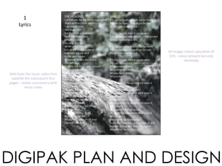
1
Lyrics
DIGIPAK PLAN AND DESIGN
THE HEALING TIME
Stills from the music video then
used for the subsequent four
pages – shows consistency with
music video
All images colour saturation of
33% - colour present but only
minimally
2
Lyrics
DIGIPAK PLAN AND DESIGN
HOPING
White text did not work well
with this background so black
will be used for the inner lyric
pages and white for the outer
lyric pages.
3
Lyrics
DIGIPAK PLAN AND DESIGN
SHOW ME THE WAY
VOWS
WAKE UP DREAMER
I used the nicest forest shots to
make up the band pictures as
these were most artistic, as
indie rock digipaks often are.
Some were not artistic enough
or looked out of place so I
compensated by going out and
taking more forest shots.
4
Lyrics
DIGIPAK PLAN AND DESIGN
IN THE MORNING
DIGIPAK PLAN AND DESIGN
CD
Layout
CITYLIGHTS
The background colour will
then show through the cut out
of the windows of the buildings
Simple design as usual for an
Indie Rock band
Century Gothic font consistent
with the band’s image as are
the colours
Two colours provide simple
interaction for the audience
(i.e. changing the colours of the
building lights) something for
them to engage with, makes
the digipak more interesting
DIGIPAK PLAN AND DESIGN
1
Lyrics
2
Lyrics
3
Lyrics
4
Lyrics
1A
Thanks
2A
Front
3A
Back
4A
Band info
This is the final template. The outer section (above) that the user will first see is deliberately black and white with only the
slightest hint of colour, and then the more colourful images (below) are inside. This makes the digipak appear more stylised.
DIGIPAK PLAN AND DESIGN
I conducted a final test using card
to illustrate functionality.

Digipak Plan and Design

  • 1.
  • 2.
    I began witha simple net such as this to begin sketching out my idea. This, plus a backing piece of card would push the CD up through the middle of the pack highlighted to the left. However, my idea was not this straightforward. I wanted the two pieces of card that held up the CD to resemble a city skyline. I also had to take into account the various limitations of the project digipak: • Must use only original pictures • Must have four folds •Elements of corporate identity present This was my initial plan for my idea: DIGIPAK PLAN AND DESIGN
  • 3.
    DIGIPAK PLAN ANDDESIGN I printed a small paper version of the net to better understand what I was working with so that I could proceed to make further changes to the net. I first discovered that the two flaps on the side of the net seemed unnecessary for my design. I decided to discard these. I also decided to change the so they were overall slightly larger than the average size of a normal CD case. The average CD is 12 cm in diameter, and a CD case is often like this: I decided my closed digi- pak should be square, and decided to opt for a 20 cm x 20 cm layout.
  • 4.
    DIGIPAK PLAN ANDDESIGN I had wanted a rough skyline like this one: on either side of the fold where the CD was to appear. I decided that this should be around 6 cm (i.e. half the size of the CD) to provide the desired effect. This would mean that the two buildings on the far right and far left would have to both be 6 cm so that they would connect and keep the CD in place. Then, because of the four folds, I had to incorporate another fold onto each side of the net. This would have to be smaller than the front and back page so that it would fit in next to the popup. With 6 cm out from each side of the popup, the pages must be smaller than 20 cm.
  • 5.
    This was myfirst net. I found that when testing this, having the outer pages, marked ‘1’ the same size as the inner pages, marked ‘2’ this made the digipak difficult to close because they did not fit together properly. This has to be taken into account because rather than paper, card would be used, which is thicker than paper and thus would be even more difficult to close. The makeshift disk I used also does not fall back into the digipak so the CD does not always ‘popup’ unless it’s pushed back further in manually. This may be due to snags in the paper though, so the difference in material may improve this. This effectively demonstrates what the pack will eventually look like nonetheless. DIGIPAK PLAN AND DESIGN 1 12 2
  • 6.
    DIGIPAK PLAN ANDDESIGN I could then focus on the design of each page. Below I have labelled each page the inner pages 1 -4 and the outer pages 1A, 2A, 3A and 4A respectively, where 2A is the front of the album and 3A is the back. I could then plan what I wanted for each page. 1 Lyrics 2 Lyrics 3 Lyrics 4 Lyrics 1A Thanks 3A Front 2A Back 4A Band info
  • 7.
    DIGIPAK PLAN ANDDESIGN 3A Front CITY LIGHTS A very simple design, to draw people in both with the artistic style and the lack of information – characteristic of the Indie Rock genre. The glass theme is apparent in the digipak, website and music video for consistency and corporate identity
  • 8.
    DIGIPAK PLAN ANDDESIGN 2A Back THE HEALING  TIME  HOPING  SHOW ME THE WAY  VOWS  FORGOTTEN  SILENT ALARM  CRYSTALS  WAKE UP DREAMER  PLANS  IN THE MORNING  BLOOD DANCEFLOORS Changed order of last two songs to make a more aesthetically pleasing design Background image: 33% Colour Saturation so that colour is visible but not too bright to keep in line with colour scheme Recurring theme of wine glass and swirls
  • 9.
    1A Thanks DIGIPAK PLAN ANDDESIGN BAND NOTES: Only image of band on the digipak – often bands will not feature on their CD at all, as the focus is the music for indie rock music.
  • 10.
    4A Band info DIGIPAK PLANAND DESIGN BWE ARE BLOC PARTY Corporate Identity in the logo, also found on the website Use of a graphical image in line with common indie rock theme
  • 11.
    1 Lyrics DIGIPAK PLAN ANDDESIGN THE HEALING TIME Stills from the music video then used for the subsequent four pages – shows consistency with music video All images colour saturation of 33% - colour present but only minimally
  • 12.
    2 Lyrics DIGIPAK PLAN ANDDESIGN HOPING White text did not work well with this background so black will be used for the inner lyric pages and white for the outer lyric pages.
  • 13.
    3 Lyrics DIGIPAK PLAN ANDDESIGN SHOW ME THE WAY VOWS WAKE UP DREAMER I used the nicest forest shots to make up the band pictures as these were most artistic, as indie rock digipaks often are. Some were not artistic enough or looked out of place so I compensated by going out and taking more forest shots.
  • 14.
    4 Lyrics DIGIPAK PLAN ANDDESIGN IN THE MORNING
  • 15.
    DIGIPAK PLAN ANDDESIGN CD Layout CITYLIGHTS The background colour will then show through the cut out of the windows of the buildings Simple design as usual for an Indie Rock band Century Gothic font consistent with the band’s image as are the colours Two colours provide simple interaction for the audience (i.e. changing the colours of the building lights) something for them to engage with, makes the digipak more interesting
  • 16.
    DIGIPAK PLAN ANDDESIGN 1 Lyrics 2 Lyrics 3 Lyrics 4 Lyrics 1A Thanks 2A Front 3A Back 4A Band info This is the final template. The outer section (above) that the user will first see is deliberately black and white with only the slightest hint of colour, and then the more colourful images (below) are inside. This makes the digipak appear more stylised.
  • 17.
    DIGIPAK PLAN ANDDESIGN I conducted a final test using card to illustrate functionality.

Editor's Notes