Download to read offline
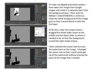
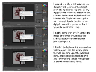
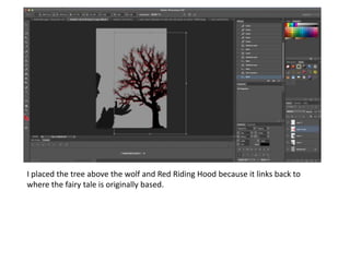
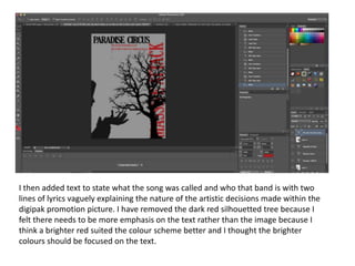
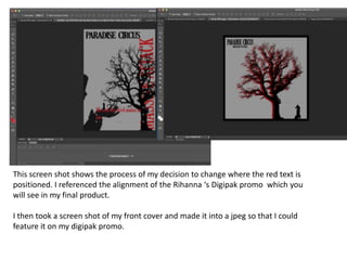
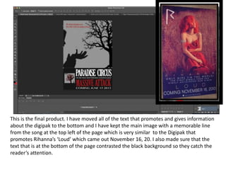

The document describes the process of creating a digipak promotion poster in Photoshop. Key steps include: 1) Importing an image from Google and adjusting its levels to blend with the background layer. 2) Using the eraser tool to remove a watermark from the image. 3) Duplicating layers from a digipak front cover file to maintain consistency. 4) Adding text with the song and band details, repositioning elements for emphasis. 5) Taking a screenshot of the front cover to feature on the promotion poster.