Digipak Flatplans
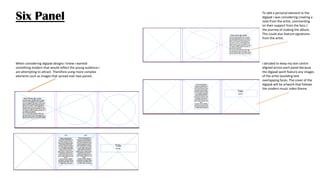
When considering digipak designs I knew I wanted
something modern that would reflect the young audience I
am attempting to attract. Therefore using more complex
elements such as images that spread over two panels.
I decided to keep my text centre
aligned across each panel because
the digipak wont feature any images
of the artist (avoiding text
overlapping faces. The cover of the
digipak will be artwork that follows
the modern music video theme.
To add a personal element to the
digipak I was considering creating a
note from the artist, commenting
on their support from the fans /
the journey of making the album,
This could also feature signatures
from the artist.
Six Panel
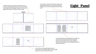
Eight PanelI really like the idea of having an image spread across
the two connecting panels because it can be used to add
more stylisation to the digipak, being the fist part of the
digipak when folded it introduces the house style
Folded
I considered having a two disk digipak but thought that
having a note from the artist was more important
because it would add the extra content needed to
attract listeners to pay extra for the digipak rather than
download the album.
For the spines I wanted to have them a single colour
(depending on the colour of the artwork) having a
simplistic sans serif font showing the title and artists
name.
I think I will use this digipak design because it
incorporates the connecting panels and has enough
substance to attract the fans of the artist.

Digipak flatplans

  • 1.
  • 2.
    When considering digipakdesigns I knew I wanted something modern that would reflect the young audience I am attempting to attract. Therefore using more complex elements such as images that spread over two panels. I decided to keep my text centre aligned across each panel because the digipak wont feature any images of the artist (avoiding text overlapping faces. The cover of the digipak will be artwork that follows the modern music video theme. To add a personal element to the digipak I was considering creating a note from the artist, commenting on their support from the fans / the journey of making the album, This could also feature signatures from the artist. Six Panel
  • 3.
    Eight PanelI reallylike the idea of having an image spread across the two connecting panels because it can be used to add more stylisation to the digipak, being the fist part of the digipak when folded it introduces the house style Folded I considered having a two disk digipak but thought that having a note from the artist was more important because it would add the extra content needed to attract listeners to pay extra for the digipak rather than download the album. For the spines I wanted to have them a single colour (depending on the colour of the artwork) having a simplistic sans serif font showing the title and artists name. I think I will use this digipak design because it incorporates the connecting panels and has enough substance to attract the fans of the artist.