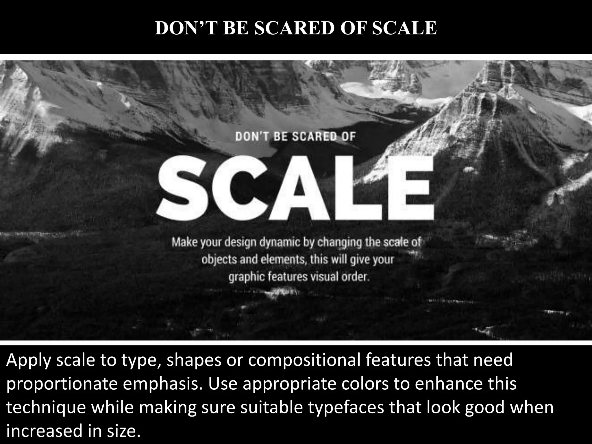
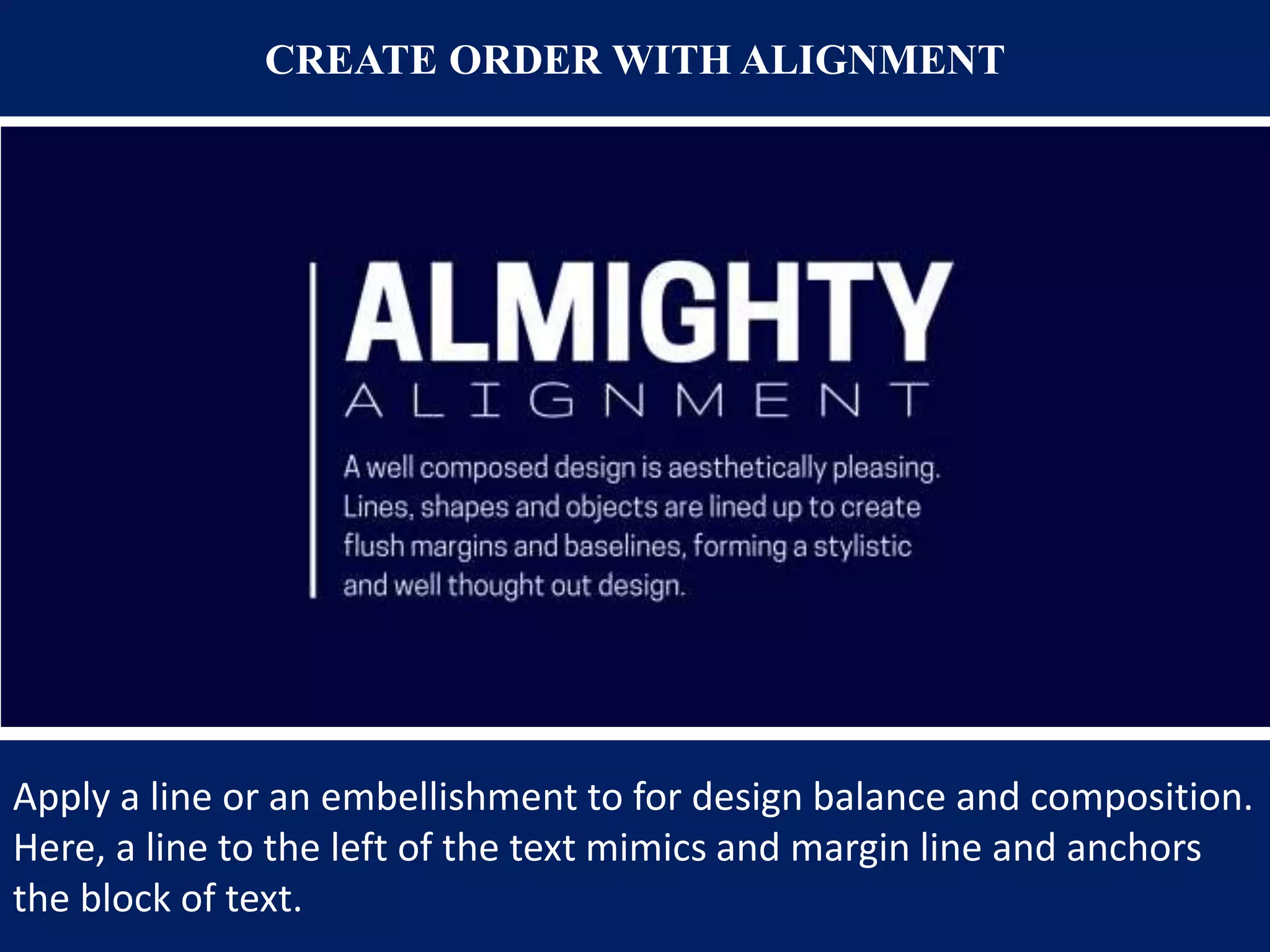
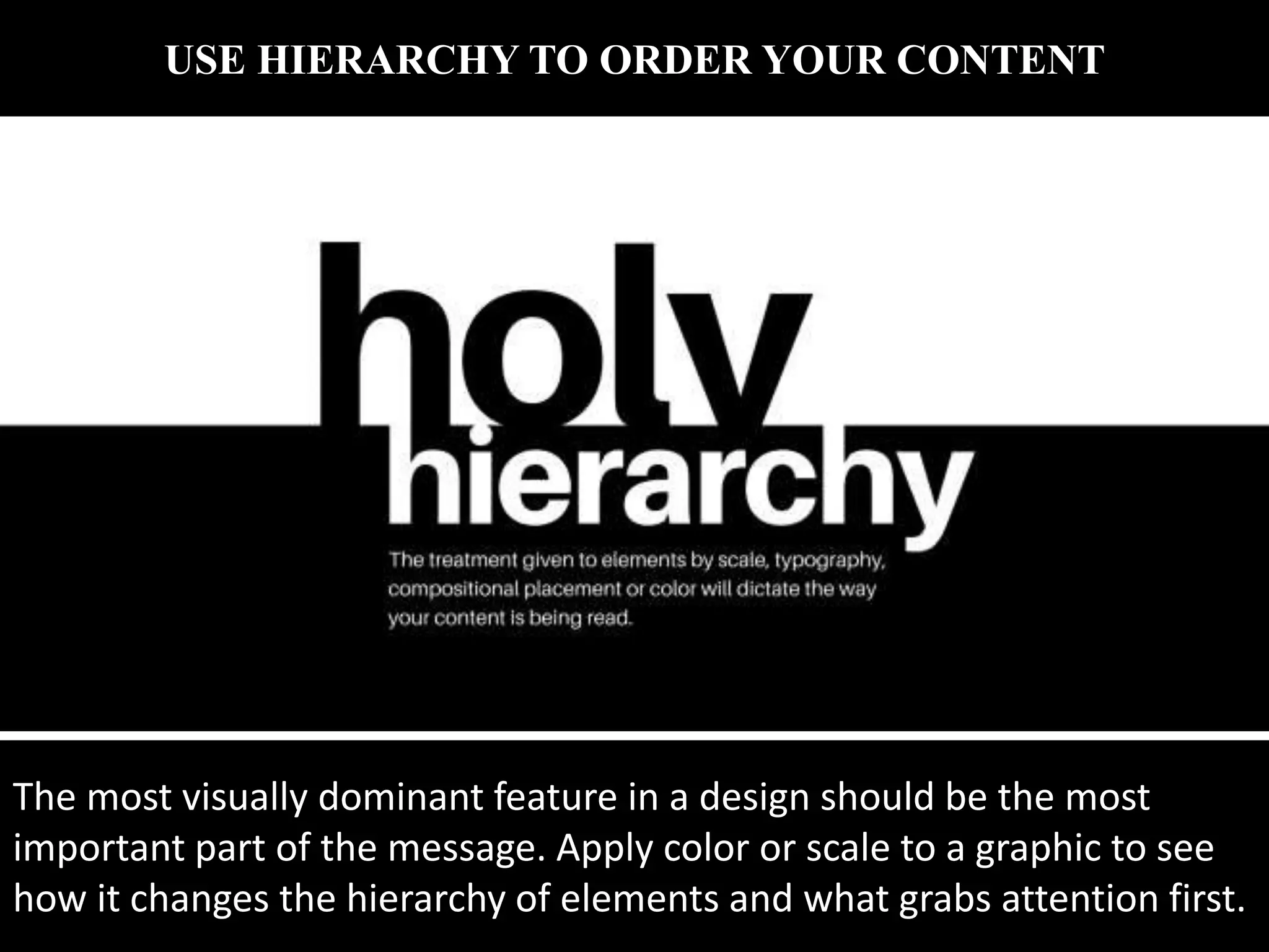
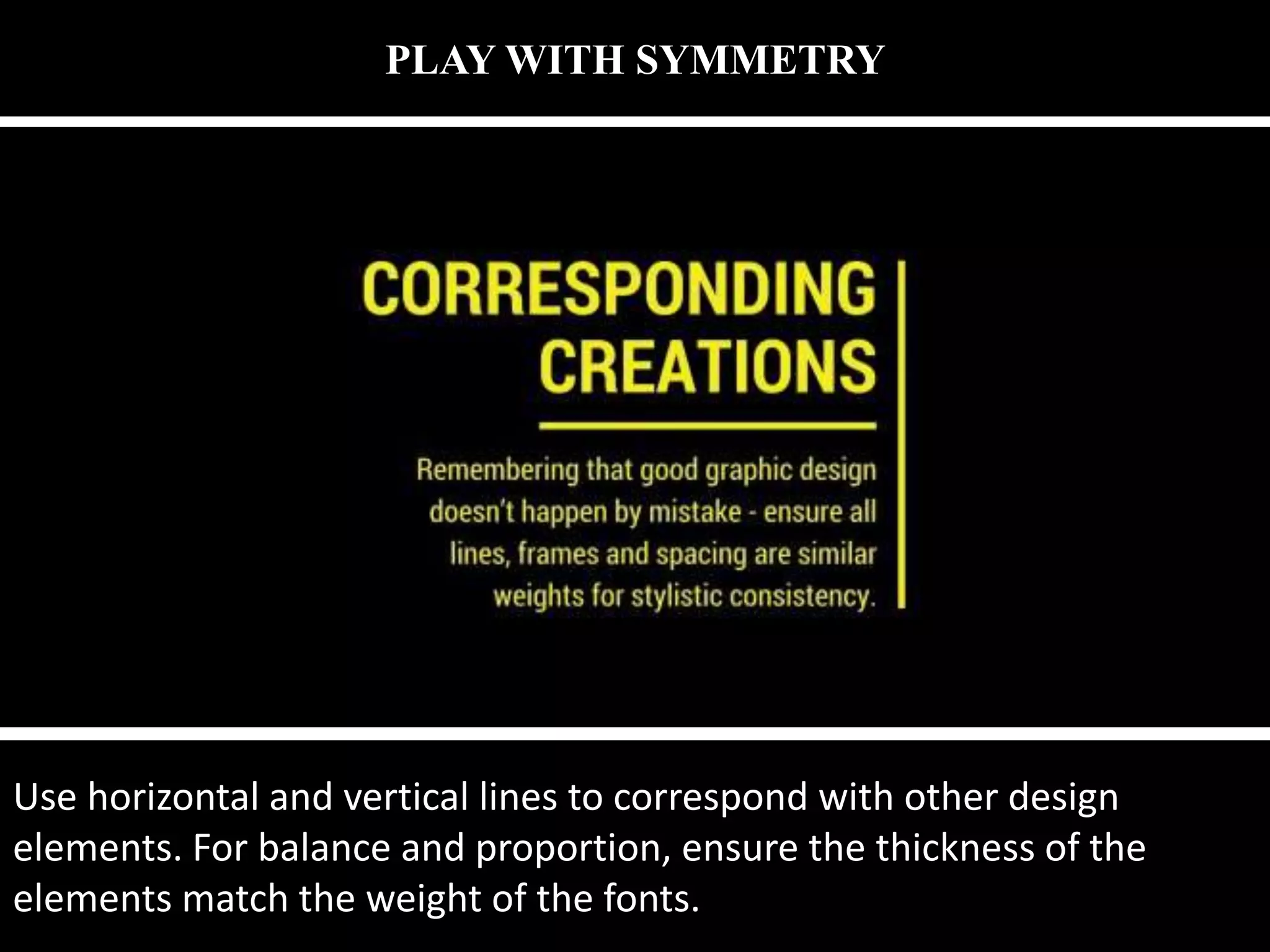
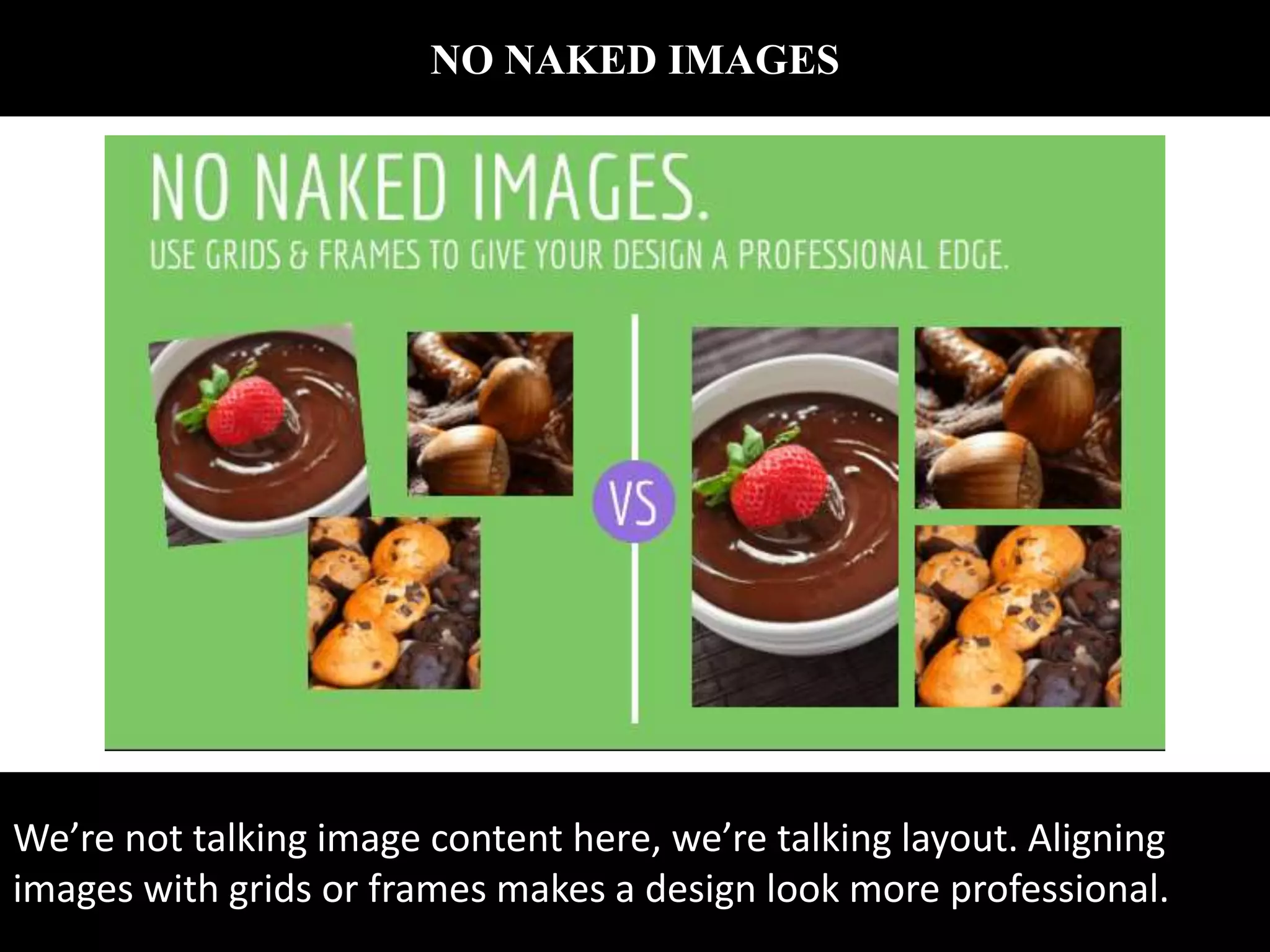
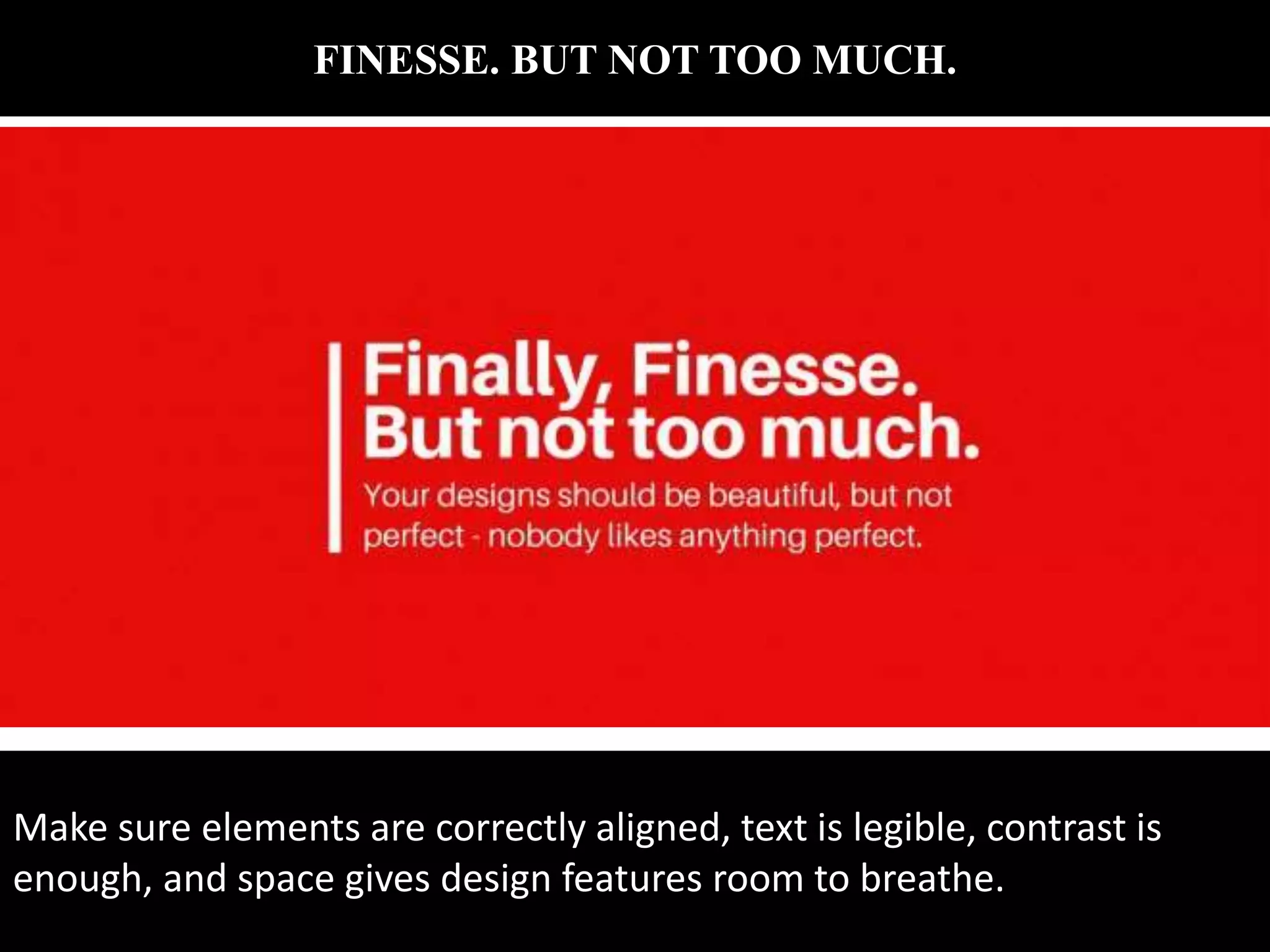
1. Epic Graphic Design
Tips for Non-
Designers Source: https://designschool.canva.com
And google.com
2. FOR FONT’S SAKE, LIMIT YOUR TYPEFACES
When selecting a typeface or font for headings, subtitles and body text,
use easy to read fonts for simple and effective graphic design. The eye
finds it hard to scan multiple typefaces, so stick to a simple collection of
fonts.
3. DON’T BE SCARED OF SCALE
Apply scale to type, shapes or compositional features that need
proportionate emphasis. Use appropriate colors to enhance this
technique while making sure suitable typefaces that look good when
increased in size.
4. RESPECT THE SPACE OF OTHER ELEMENTS
Use letter spacing to fill dead space, aligning text, or condense words
that take up too much space. However, be careful not to reduce letter
spacing so much it can’t be read, or increase it so much the letters
become detached from one another.
5. BE CLEVER WITH YOUR COLORS
Choose a color scheme that has 1-3 primary colors and an additional 1-3
secondary colors that contrast and complement each other. Use
different tones of the same color for consistency by adjusting brightness
for contrast.
6. CLEAN, CRISP, CLEAR
Pump up contrast by adjusting the brightness of the background image
so that it offsets the text color, making the design clear and easy to
read. This is a great way to apply white or black text over an image to
create a strong ‘cut-out’ effect.
7. FONTS HAVE FEELINGS TOO
Chose a typeface that sings the song of your content. Typefaces with
rounded edges are usually friendlier note, Quicksand is used here);
hard-edged geometric fonts (sans serifs) are solid and strong
8. CREATE ORDER WITH ALIGNMENT
Apply a line or an embellishment to for design balance and composition.
Here, a line to the left of the text mimics and margin line and anchors
the block of text.
9. KEEP IT SIMPLE
Keep it simple, but don’t forget your basics. Make sure every element
has a reason to be in the design and keep the number of fonts, colors,
shapes and frames to a minimum.
10. MULTI-PAGE MAGIC
The easiest way to ensure aesthetic unity across a document or
presentation is by duplicating pages then editing text
and replacing images.
11. CREATIVITY AND ORIGINALITY
Push your creative abilities and graphic design skills to achieve original
graphics. Be inventive and experimental and choose and combine
different typefaces and filters. Avoid trends and create designs that
correspond with your own unique style, leaving a personal stamp on
12. USE HIERARCHY TO ORDER YOUR CONTENT
The most visually dominant feature in a design should be the most
important part of the message. Apply color or scale to a graphic to see
how it changes the hierarchy of elements and what grabs attention first.
13. PLAY WITH SYMMETRY
Use horizontal and vertical lines to correspond with other design
elements. For balance and proportion, ensure the thickness of the
elements match the weight of the fonts.
14. RELAX YOUR EYES EVERY NOW AND THEN
Recharge your creative batteries by taking a break. Relaxation boosts
energy and productivity so take a walk, grab a bit to eat, sit in the park
to refresh the brain and revitalize the vision.
15. KEEP IT IN THE FAMILY
Create visual uniformity by applying one typeface or font family to text.
Use a typeface or font family that has a selection of variants, such as
italic, bold, condensed, to keep options open.
16. WONDERFUL WHITE SPACE
Create a fluid design by surrounding words with white space to let
elements breathe. The application of space around text boxes, images
and other graphic elements makes a design easier to read. It’s also
more likely to attract attention than a cluttered composition.
17. RESEARCH BEFORE YOU DIVE IN
Have all the details needed before you begin to write or create. Study,
read, research, resource. Whether it’s materials and objects or
information and facts, the research process will guarantee a more
thought-out result.
18. CREATE A MOOD BOARD
Use a grid for a simple and easy mood boards to contain a collection of
images, color swatches and other visual pieces. This practice will help
you to find a common color palette or theme that can then be applied
to a project
19. IMITATE AND CREATE
Use your Canva social stream or inspiration websites to find designs you
love. Replicate the type treatment, the photo filters or the general
layout in your own content.
20. BE CURRENT EVENT CONSCIOUS
Keep your mind fresh with current events to inspire and influence both
your work and the way you work. Follow relevant news pages on social
networks get vital and relevant information and keep general knowledge
up to date.
21. THINK OUTSIDE THE BOX
The most creative people think outside the box. Don’t use the typical
icons and symbols you see everywhere to represent your
topic. Research, sketch and print to find new and original icons to
visually communicate with your audience.
22. CONTRAST IS KEY
Contrast is one of the most imperative parts of design for mood,
legibility and to make it stand out. Use a contrasting color palette
background, fonts and graphics.
23. BRIGHTEN UP YOUR GRAPHICS
Create drama and impact with attention grabbing graphics. Ensure your
colors don’t bleed together by choosing hues that contrast against one
another.
24. KEEPA NOTEBOOK
Whether on the train, at work or about to fall asleep, inspiration can
come at any time so it’s important to be prepared. Keep a notebook to
draw or scribble down notes and ideas and refer back to them when it
comes time to create.
25. TRIAL & ERROR
Everyone makes mistakes and sometimes they are the most important
part of the learning experience. Design is all about trial and error so
push your designs to the limit because the creative process is often
never complete.
26. NO NAKED IMAGES
We’re not talking image content here, we’re talking layout. Aligning
images with grids or frames makes a design look more professional.
27. FINESSE. BUT NOT TOO MUCH.
Make sure elements are correctly aligned, text is legible, contrast is
enough, and space gives design features room to breathe.