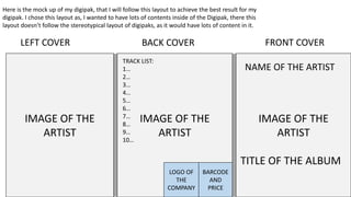
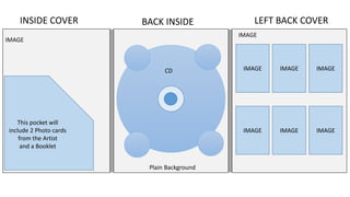
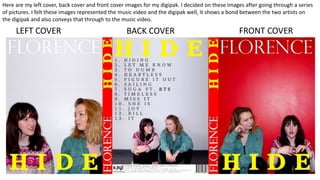
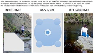
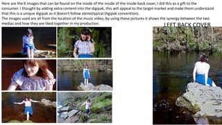
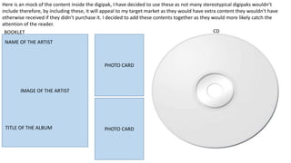
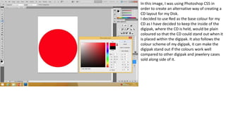
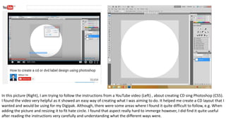
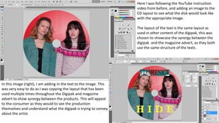
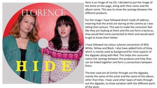
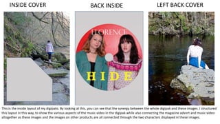
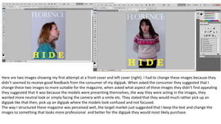
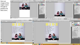
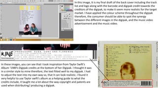
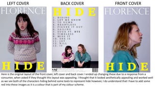
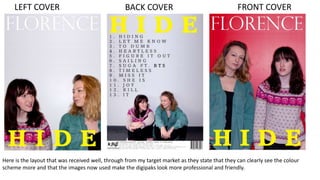
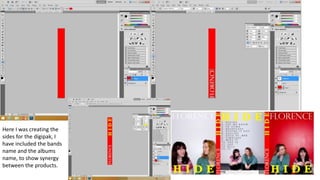
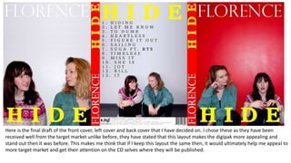
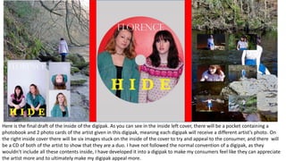
My digipak
By Kabita nepali
IMAGE OF THE
ARTIST
IMAGE OF THE
ARTIST
IMAGE OF THE
ARTIST
BACK COVERLEFT COVER FRONT COVER
TRACK LIST:
1…
2…
3…
4…
5…
6…
7…
8…
9…
10…
BARCODE
AND
PRICE
LOGO OF
THE
COMPANY
TITLE OF THE ALBUM
NAME OF THE ARTIST
Here is the mock up of my digipak, that I will follow this layout to achieve the best result for my
digipak. I chose this layout as, I wanted to have lots of contents inside of the Digipak, there this
layout doesn’t follow the stereotypical layout of digipaks, as it would have lots of content in it.
BACK INSIDEINSIDE COVER LEFT BACK COVER
This pocket will
include 2 Photo cards
from the Artist
and a Booklet
IMAGE IMAGE IMAGE
IMAGE IMAGE IMAGE
CD
Plain Background
IMAGE
IMAGE
BACK COVERLEFT COVER FRONT COVER
Here are my left cover, back cover and front cover images for my digipak. I decided on these images after going through a series
of pictures. I felt these images represented the music video and the digipak well, it shows a bond between the two artists on
the digipak and also conveys that through to the music video.
BACK INSIDEINSIDE COVER LEFT BACK COVER
Here are the pictures for the inside cover, the back inside, and the left back cover. The images used are from the location of the
music video therefore, the consumer can see the synergy between the two medias. The structure of this layout was chosen
this way because I wanted to fit all the content inside of the digipak well, while it still being aesthetically pleasing.
LEFT BACK COVER
Here are the 6 images that can be found on the inside of the inside of the inside back cover, I did this as a gift to the
consumer. I thought by adding extra content into the digipak, this will appeal to the target market and make them understand
that this is a unique digipak as it doesn't follow stereotypical Digipak conventions.
The images used are all from the location of the music video, by using these pictures it shows the synergy between the two
medias and how they are liked together in my production.
Here is an mock of the content inside the digipak, I have decided to use these as not many stereotypical digipaks wouldn’t
include therefore, by including these, it will appeal to my target market as they would have extra content they wouldn't have
otherwise received if they didn’t purchase it. I decided to add these contents together as they would more likely catch the
attention of the reader.
ALBUM TITLE
ARTIST NAME
IMAGE OF THE ARTIST
BOOKLET CD
PHOTO CARD
PHOTO CARDTITLE OF THE ALBUM
NAME OF THE ARTIST
Here is the photo book along with the two
photo cards that will be available inside the
digipak. This would appeal to my target
audience as they would receive more
content along with the CD and since they
are not usually available in an stereotypical
digipak.
The images used are of different shots to
another therefore, it would appeal to the
target market as they would get to receive
various different types of content.
The images are edited to look more
professional through Photoshop CS5, while
opened through ‘Camera Raw’.
The models used for the pictures are also in
the age group of my Target market, this is
because I wanted to use the people from
my target market, of 16-19 year olds so,
that they can feel more connected to these
models portraying artists. I have also made
them wear casual clothing as so the
consumer would feel comfortable looking at
them, as if they were looking at a friend or
someone they know.
In this image, I was using Photoshop CS5 in
order to create an alternative way of creating a
CD layout for my Disk.
I decided to use Red as the base colour for my
CD as I have decided to keep the inside of the
digipak, where the CD is held, would be plain
coloured so that the CD could stand out when it
is placed within the digipak. It also follows the
colour scheme of my digipak, it can make the
digipak stand out if the colours work well
compared to other digipak and jewelery cases
sold along side of it.
In this picture (Right), I am trying to follow the instructions from a YouTube video (Left) , about creating CD sing Photoshop (CS5).
I found the video very helpful as it showed an easy way of creating what I was aiming to do. It helped me create a CD layout that I
wanted and would be using for my Digipak. Although, there were some areas where I found it quite difficult to follow, e.g. When
adding the picture and resizing it to fit hate circle. I found that aspect really hard to immerge however, I did find it quite useful
after reading the instructions very carefully and understanding what the different ways were.
Here I was following the YouTube instruction
video from before, and adding an image to the
CD layout to see what the disk would look like
with the appropriate image.
The layout of the text is the same layout as
used in other content of the digipak, this was
chosen to showcase the synergy between the
digipak and the magazine advert, as they both
use the same structure of the texts .
In this image (right), I am adding in the text to the image. This
was very easy to do as I was copying the layout that has been
used multiple times throughout the Digipak and magazine
advert to show synergy between the products. This will appeal
to the consumer as they would to see the production
themselves and understand what the digipak is trying to convey
about the artist.
Here is an image of my CD, I decided to put the image of
the Artist on the page, along with their name and the
album name. This was to show the synergy between the
different products.
For the image I have followed direct mode of address,
meaning that the artist are staring at the camera as I was
taking their picture. This was to make the consumer feel
like they are looking at them and this can form a bond as,
they would feel more connected to them and would want
to get to know them better.
I have followed my colour scheme convention of RED,
White, Yellow and Black. I also have added hints of Grey,
which is mainly used as background for most aspects of
the digipaks along with Red. This helps the consumer
notice the synergy between the products and how they
can be linked together and form a connections between
them.
The text used are all similar through out the digipaks,
mainly the name of the artist and the name of the album,
other than that, I have used other types of texts through
out the digipaks, to show variation with the different parts
of the alum.
BACK INSIDEINSIDE COVER LEFT BACK COVER
This is the inside layout of my digipaks. By looking at this, you can see that the synergy between the whole digipak and these images. I structured
this layout in this way, to show the various aspects of the music video in the digipak while also connecting the magazine advert and music video
altogether as these images and the images on other products are all connected through the two characters displayed in these images.
Here are two images showing my first attempt at a front cover and left cover (right). I had to change these images because they
didn’t seemed to receive good feedback from the consumer of my digipak. When asked the consumer they suggested that I
change these two images to more suitable for the magazine, when asked what aspect of these images they didn’t find appealing
they suggested that it was because the models were presenting themselves, the way they were acting in the images, they
wanted more neutral look or simply facing the camera with a smile etc. They stated that they would much rather pick up an
digipak like that then, pick up an digipak where the models look confused and not focused.
The way I structured these magazine was perceived well, the target market just suggested that I keep the text and change the
images to something that looks more professional and better for the digipak they would most likely purchase.
Here are
images of the
stages I went
through to
produce my
Back cover;
In these images, you can see that I took inspiration from Taylor Swift’s
Album ‘1989’s Digipak credits at the bottom of her Digipak. I thought it was
in a similar style to mine therefore, the text fitted well to my digipak. I had
to adjust the text into my own way so, that it can look realistic. I found it
very helpful to use Taylor swift’s album as a helping guide to what the
credits include, it taught me a lot about the way copyright and patents are
used when distributing/ producing a digipak.
In this image, It is my final draft of the back cover including the track
list and logo along with the barcode and digipak credit towards the
creditors of the digipak, to make it seem more realistic for the target
market. I have applied the colour scheme throughout the digipak
therefore, the consumer should be able to spot the synergy
between the different images in the digipak, and the music video
advertisement and the music video.
Here I was, picking between the two images for the
inside as the background to the 6 images that I will
put over it. I decided to choose the image (below) as I
found it more appropriate as I didn’t have many shots
of her sitting down when filming the music video
therefore, I decided to have images of her doing that
to indicate to the consumer that there are more
images/scenes of her in that location.
Here is the picture, I went with for the left inside, where I will place a pocket over it that
would hold a photobook and two photo cards of one of the artists.
I decided on this image, because In the music video there is a scene where this
character is wondering around the area, therefore, by having this image that is taken in
the scene of the music video, it allows the consumer to understand the link between
the two products.
The lighting in this scene is all natural but I have used a bit of exposure to brighten up
the dark areas of the scene and to make the character stand out.
I have chosen to enhance the colours in the music video as, I have enhanced the colours
in my music video and it shows synergy between the two products well.
In this image, I was editing my photobook, selecting the images that
fitted well with my digipaks and my magazine advertisement. I
wanted the photobook to be a bit like the front covers of the
digipaks so, that the consumer will look at it and know the synergy
between the products available inside of the digipak and the
products linked to it.
I decided to not put the text highlighting it was a photobook, as I
thought it would be clearly evident when they look inside of the
photobook. Also, by not adding the text, it means that I have
decided to challenge the form and tried to develop it my way.
Here are the two image that I
will be using as a photo cards. I
have decided to use these
images as I have found them to
describe this character well,
and makes the consumer feel
more comfortable with the
artist, as they don’t look very
professional-like, they look like
they are having fun therefore,
making them seem like a
normal teenager which can
relate to my target market.
Here are some more pictures I Was
considering for my front Cover and left
cover. I ended up choosing the one in the
middle, because I found that to be more
appealing then the other images I edited.
Here are more
images I edited to
see what would work
well with my digipaks
and would work well
as a magazine
advertisement.
BACK COVERLEFT COVER FRONT COVER
Here is the original layout of the front cover, left cover and back cover. I ended up changing these due to a response from a
consumer, when asked if they thought this layout was appealing. I thought that it looked aesthetically appealing and worked well
as we see both of the characters hiding behind some texts to represent hide however, I do understand that I have to add some
red into these images as it is a colour that is part of my colour scheme.
BACK COVERLEFT COVER FRONT COVER
Here is the layout that was received well, through from my target market as they state that they can clearly see the colour
scheme more and that the images now used make the digipaks look more professional and friendly.
Here I was creating the
sides for the digipak, I
have included the bands
name and the albums
name, to show synergy
between the products.
Here is the final draft of the front cover, left cover and back cover that I have decided on. I chose these as they have been
received well from the target market unlike before, they have stated that this layout makes the digipak more appealing and
stand out then it was before. This makes me think that if I keep this layout the same then, it would ultimately help me appeal to
more target market and get their attention on the CD selves where they will be published.
Here is the final draft of the inside of the digipak. As you can see in the inside left cover, there will be a pocket containing a
photobook and 2 photo cards of the artist given in this digipak, meaning each digipak will receive a different artist’s photo. On
the right inside cover there will be six images stuck on the inside of the cover to try and appeal to the consumer, and there will
be a CD of both of the artist to show that they are a duo. I have not followed the normal convention of a digipak, as they
wouldn’t include all these contents inside, I have developed it into a digipak to make my consumers feel like they can appreciate
the artist more and to ultimately make my digipak appeal more.

My digipak

  • 1.
  • 2.
    IMAGE OF THE ARTIST IMAGEOF THE ARTIST IMAGE OF THE ARTIST BACK COVERLEFT COVER FRONT COVER TRACK LIST: 1… 2… 3… 4… 5… 6… 7… 8… 9… 10… BARCODE AND PRICE LOGO OF THE COMPANY TITLE OF THE ALBUM NAME OF THE ARTIST Here is the mock up of my digipak, that I will follow this layout to achieve the best result for my digipak. I chose this layout as, I wanted to have lots of contents inside of the Digipak, there this layout doesn’t follow the stereotypical layout of digipaks, as it would have lots of content in it.
  • 3.
    BACK INSIDEINSIDE COVERLEFT BACK COVER This pocket will include 2 Photo cards from the Artist and a Booklet IMAGE IMAGE IMAGE IMAGE IMAGE IMAGE CD Plain Background IMAGE IMAGE
  • 4.
    BACK COVERLEFT COVERFRONT COVER Here are my left cover, back cover and front cover images for my digipak. I decided on these images after going through a series of pictures. I felt these images represented the music video and the digipak well, it shows a bond between the two artists on the digipak and also conveys that through to the music video.
  • 5.
    BACK INSIDEINSIDE COVERLEFT BACK COVER Here are the pictures for the inside cover, the back inside, and the left back cover. The images used are from the location of the music video therefore, the consumer can see the synergy between the two medias. The structure of this layout was chosen this way because I wanted to fit all the content inside of the digipak well, while it still being aesthetically pleasing.
  • 6.
    LEFT BACK COVER Hereare the 6 images that can be found on the inside of the inside of the inside back cover, I did this as a gift to the consumer. I thought by adding extra content into the digipak, this will appeal to the target market and make them understand that this is a unique digipak as it doesn't follow stereotypical Digipak conventions. The images used are all from the location of the music video, by using these pictures it shows the synergy between the two medias and how they are liked together in my production.
  • 7.
    Here is anmock of the content inside the digipak, I have decided to use these as not many stereotypical digipaks wouldn’t include therefore, by including these, it will appeal to my target market as they would have extra content they wouldn't have otherwise received if they didn’t purchase it. I decided to add these contents together as they would more likely catch the attention of the reader. ALBUM TITLE ARTIST NAME IMAGE OF THE ARTIST BOOKLET CD PHOTO CARD PHOTO CARDTITLE OF THE ALBUM NAME OF THE ARTIST
  • 8.
    Here is thephoto book along with the two photo cards that will be available inside the digipak. This would appeal to my target audience as they would receive more content along with the CD and since they are not usually available in an stereotypical digipak. The images used are of different shots to another therefore, it would appeal to the target market as they would get to receive various different types of content. The images are edited to look more professional through Photoshop CS5, while opened through ‘Camera Raw’. The models used for the pictures are also in the age group of my Target market, this is because I wanted to use the people from my target market, of 16-19 year olds so, that they can feel more connected to these models portraying artists. I have also made them wear casual clothing as so the consumer would feel comfortable looking at them, as if they were looking at a friend or someone they know.
  • 9.
    In this image,I was using Photoshop CS5 in order to create an alternative way of creating a CD layout for my Disk. I decided to use Red as the base colour for my CD as I have decided to keep the inside of the digipak, where the CD is held, would be plain coloured so that the CD could stand out when it is placed within the digipak. It also follows the colour scheme of my digipak, it can make the digipak stand out if the colours work well compared to other digipak and jewelery cases sold along side of it.
  • 10.
    In this picture(Right), I am trying to follow the instructions from a YouTube video (Left) , about creating CD sing Photoshop (CS5). I found the video very helpful as it showed an easy way of creating what I was aiming to do. It helped me create a CD layout that I wanted and would be using for my Digipak. Although, there were some areas where I found it quite difficult to follow, e.g. When adding the picture and resizing it to fit hate circle. I found that aspect really hard to immerge however, I did find it quite useful after reading the instructions very carefully and understanding what the different ways were.
  • 11.
    Here I wasfollowing the YouTube instruction video from before, and adding an image to the CD layout to see what the disk would look like with the appropriate image. The layout of the text is the same layout as used in other content of the digipak, this was chosen to showcase the synergy between the digipak and the magazine advert, as they both use the same structure of the texts . In this image (right), I am adding in the text to the image. This was very easy to do as I was copying the layout that has been used multiple times throughout the Digipak and magazine advert to show synergy between the products. This will appeal to the consumer as they would to see the production themselves and understand what the digipak is trying to convey about the artist.
  • 12.
    Here is animage of my CD, I decided to put the image of the Artist on the page, along with their name and the album name. This was to show the synergy between the different products. For the image I have followed direct mode of address, meaning that the artist are staring at the camera as I was taking their picture. This was to make the consumer feel like they are looking at them and this can form a bond as, they would feel more connected to them and would want to get to know them better. I have followed my colour scheme convention of RED, White, Yellow and Black. I also have added hints of Grey, which is mainly used as background for most aspects of the digipaks along with Red. This helps the consumer notice the synergy between the products and how they can be linked together and form a connections between them. The text used are all similar through out the digipaks, mainly the name of the artist and the name of the album, other than that, I have used other types of texts through out the digipaks, to show variation with the different parts of the alum.
  • 13.
    BACK INSIDEINSIDE COVERLEFT BACK COVER This is the inside layout of my digipaks. By looking at this, you can see that the synergy between the whole digipak and these images. I structured this layout in this way, to show the various aspects of the music video in the digipak while also connecting the magazine advert and music video altogether as these images and the images on other products are all connected through the two characters displayed in these images.
  • 14.
    Here are twoimages showing my first attempt at a front cover and left cover (right). I had to change these images because they didn’t seemed to receive good feedback from the consumer of my digipak. When asked the consumer they suggested that I change these two images to more suitable for the magazine, when asked what aspect of these images they didn’t find appealing they suggested that it was because the models were presenting themselves, the way they were acting in the images, they wanted more neutral look or simply facing the camera with a smile etc. They stated that they would much rather pick up an digipak like that then, pick up an digipak where the models look confused and not focused. The way I structured these magazine was perceived well, the target market just suggested that I keep the text and change the images to something that looks more professional and better for the digipak they would most likely purchase.
  • 15.
    Here are images ofthe stages I went through to produce my Back cover;
  • 16.
    In these images,you can see that I took inspiration from Taylor Swift’s Album ‘1989’s Digipak credits at the bottom of her Digipak. I thought it was in a similar style to mine therefore, the text fitted well to my digipak. I had to adjust the text into my own way so, that it can look realistic. I found it very helpful to use Taylor swift’s album as a helping guide to what the credits include, it taught me a lot about the way copyright and patents are used when distributing/ producing a digipak. In this image, It is my final draft of the back cover including the track list and logo along with the barcode and digipak credit towards the creditors of the digipak, to make it seem more realistic for the target market. I have applied the colour scheme throughout the digipak therefore, the consumer should be able to spot the synergy between the different images in the digipak, and the music video advertisement and the music video.
  • 17.
    Here I was,picking between the two images for the inside as the background to the 6 images that I will put over it. I decided to choose the image (below) as I found it more appropriate as I didn’t have many shots of her sitting down when filming the music video therefore, I decided to have images of her doing that to indicate to the consumer that there are more images/scenes of her in that location.
  • 18.
    Here is thepicture, I went with for the left inside, where I will place a pocket over it that would hold a photobook and two photo cards of one of the artists. I decided on this image, because In the music video there is a scene where this character is wondering around the area, therefore, by having this image that is taken in the scene of the music video, it allows the consumer to understand the link between the two products. The lighting in this scene is all natural but I have used a bit of exposure to brighten up the dark areas of the scene and to make the character stand out. I have chosen to enhance the colours in the music video as, I have enhanced the colours in my music video and it shows synergy between the two products well.
  • 19.
    In this image,I was editing my photobook, selecting the images that fitted well with my digipaks and my magazine advertisement. I wanted the photobook to be a bit like the front covers of the digipaks so, that the consumer will look at it and know the synergy between the products available inside of the digipak and the products linked to it. I decided to not put the text highlighting it was a photobook, as I thought it would be clearly evident when they look inside of the photobook. Also, by not adding the text, it means that I have decided to challenge the form and tried to develop it my way. Here are the two image that I will be using as a photo cards. I have decided to use these images as I have found them to describe this character well, and makes the consumer feel more comfortable with the artist, as they don’t look very professional-like, they look like they are having fun therefore, making them seem like a normal teenager which can relate to my target market.
  • 20.
    Here are somemore pictures I Was considering for my front Cover and left cover. I ended up choosing the one in the middle, because I found that to be more appealing then the other images I edited.
  • 21.
    Here are more imagesI edited to see what would work well with my digipaks and would work well as a magazine advertisement.
  • 22.
    BACK COVERLEFT COVERFRONT COVER Here is the original layout of the front cover, left cover and back cover. I ended up changing these due to a response from a consumer, when asked if they thought this layout was appealing. I thought that it looked aesthetically appealing and worked well as we see both of the characters hiding behind some texts to represent hide however, I do understand that I have to add some red into these images as it is a colour that is part of my colour scheme.
  • 23.
    BACK COVERLEFT COVERFRONT COVER Here is the layout that was received well, through from my target market as they state that they can clearly see the colour scheme more and that the images now used make the digipaks look more professional and friendly.
  • 24.
    Here I wascreating the sides for the digipak, I have included the bands name and the albums name, to show synergy between the products.
  • 25.
    Here is thefinal draft of the front cover, left cover and back cover that I have decided on. I chose these as they have been received well from the target market unlike before, they have stated that this layout makes the digipak more appealing and stand out then it was before. This makes me think that if I keep this layout the same then, it would ultimately help me appeal to more target market and get their attention on the CD selves where they will be published.
  • 26.
    Here is thefinal draft of the inside of the digipak. As you can see in the inside left cover, there will be a pocket containing a photobook and 2 photo cards of the artist given in this digipak, meaning each digipak will receive a different artist’s photo. On the right inside cover there will be six images stuck on the inside of the cover to try and appeal to the consumer, and there will be a CD of both of the artist to show that they are a duo. I have not followed the normal convention of a digipak, as they wouldn’t include all these contents inside, I have developed it into a digipak to make my consumers feel like they can appreciate the artist more and to ultimately make my digipak appeal more.