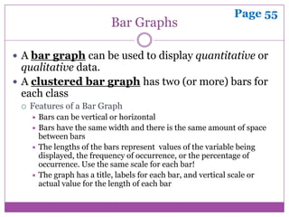
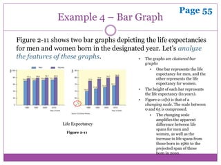
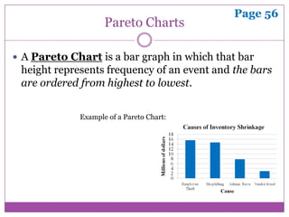
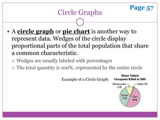
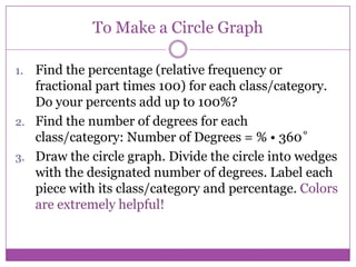
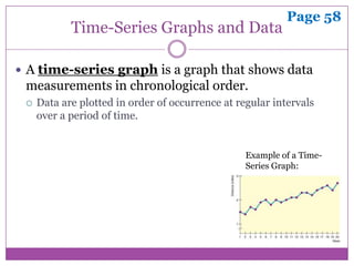
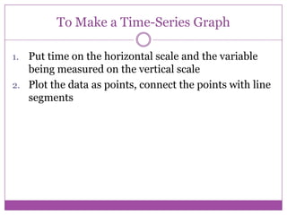
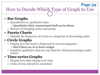
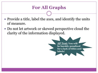
2.2 Bar Graphs, Circle
Graphs, and Time-Series
        Graphs

         CHAPTER 2
      ORGANIZING DATA
Page 55
                           Bar Graphs

 A bar graph can be used to display quantitative or
  qualitative data.
 A clustered bar graph has two (or more) bars for
  each class
    Features of a Bar Graph
      Bars can be vertical or horizontal
      Bars have the same width and there is the same amount of space
       between bars
      The lengths of the bars represent values of the variable being
       displayed, the frequency of occurrence, or the percentage of
       occurrence. Use the same scale for each bar!
      The graph has a title, labels for each bar, and vertical scale or
       actual value for the length of each bar
Page 55
               Example 4 – Bar Graph

Figure 2-11 shows two bar graphs depicting the life expectancies
for men and women born in the designated year. Let’s analyze
the features of these graphs.            The graphs are clustered bar
                                                 graphs
                                                     One bar represents the life
                                                        expectancy for men, and the
                                                        other represents the life
                                                        expectancy for women.
                                                The height of each bar represents
                                                 the life expectancy (in years).
                                                Figure 2-11(b) is that of a
                                                 changing scale. The scale between
                                                 0 and 65 is compressed.
                                                     The changing scale
                                                        amplifies the apparent
                 Life Expectancy                        difference between life
                                                        spans for men and
                   Figure 2-11                          women, as well as the
                                                        increase in life spans from
                                                        those born in 1980 to the
                                                        projected span of those
                                                        born in 2010.
Page 56
                    Pareto Charts

 A Pareto Chart is a bar graph in which that bar
 height represents frequency of an event and the bars
 are ordered from highest to lowest.


             Example of a Pareto Chart:
Page 57
                        Circle Graphs

 A circle graph or pie chart is another way to
 represent data. Wedges of the circle display
 proportional parts of the total population that share
 a common characteristic.
    Wedges are usually labeled with percentages
    The total quantity is 100%, represented by the entire circle

                          Example of a Circle Graph:
To Make a Circle Graph

1. Find the percentage (relative frequency or
   fractional part times 100) for each class/category.
   Do your percents add up to 100%?
2. Find the number of degrees for each
   class/category: Number of Degrees = % • 360˚
3. Draw the circle graph. Divide the circle into wedges
   with the designated number of degrees. Label each
   piece with its class/category and percentage. Colors
   are extremely helpful!
Page 58
            Time-Series Graphs and Data

 A time-series graph is a graph that shows data
 measurements in chronological order.
    Data are plotted in order of occurrence at regular intervals
     over a period of time.


                                                  Example of a Time-
                                                  Series Graph:
Time-Series Graphs and Data

 Time-series data consist of measurements of the
 same variable for the same subject taken at regular
 intervals over a period of time.
To Make a Time-Series Graph

1. Put time on the horizontal scale and the variable
   being measured on the vertical scale
2. Plot the data as points, connect the points with line
   segments
Page 59
How to Decide Which Type of Graph to Use
 Bar Graphs
    Quantitative or qualitative data
        Quantitative Data: measurement itself can be shown
    Beware of changing scales and jumps
 Pareto Charts
    Identify the frequency of events or categories in decreasing order
 Circle Graphs
    Display how the total is dispersed in several categories
        Best if there are 10 or fewer wedges
    Good for qualitative data (or any data for which percentages make
     sense)
 Time-series Graphs
    Display how data change over time
    Units of time should be consistent
For All Graphs

 Provide a title, label the axes, and identify the units
  of measure.
 Do not let artwork or skewed perspective cloud the
  clarity of the information displayed.

                                   AP Test: You will
                                   be harshly penalized
                                   for a lack of titles and
                                   labels!
Homework

 Page 60
   #1 – 6

   #8, 9, 11, 13

2.2 bar graphs, circle graphs, and time series graphs

  • 1.
    2.2 Bar Graphs,Circle Graphs, and Time-Series Graphs CHAPTER 2 ORGANIZING DATA
  • 2.
    Page 55 Bar Graphs  A bar graph can be used to display quantitative or qualitative data.  A clustered bar graph has two (or more) bars for each class  Features of a Bar Graph  Bars can be vertical or horizontal  Bars have the same width and there is the same amount of space between bars  The lengths of the bars represent values of the variable being displayed, the frequency of occurrence, or the percentage of occurrence. Use the same scale for each bar!  The graph has a title, labels for each bar, and vertical scale or actual value for the length of each bar
  • 3.
    Page 55 Example 4 – Bar Graph Figure 2-11 shows two bar graphs depicting the life expectancies for men and women born in the designated year. Let’s analyze the features of these graphs.  The graphs are clustered bar graphs  One bar represents the life expectancy for men, and the other represents the life expectancy for women.  The height of each bar represents the life expectancy (in years).  Figure 2-11(b) is that of a changing scale. The scale between 0 and 65 is compressed.  The changing scale amplifies the apparent Life Expectancy difference between life spans for men and Figure 2-11 women, as well as the increase in life spans from those born in 1980 to the projected span of those born in 2010.
  • 4.
    Page 56 Pareto Charts  A Pareto Chart is a bar graph in which that bar height represents frequency of an event and the bars are ordered from highest to lowest. Example of a Pareto Chart:
  • 5.
    Page 57 Circle Graphs  A circle graph or pie chart is another way to represent data. Wedges of the circle display proportional parts of the total population that share a common characteristic.  Wedges are usually labeled with percentages  The total quantity is 100%, represented by the entire circle Example of a Circle Graph:
  • 6.
    To Make aCircle Graph 1. Find the percentage (relative frequency or fractional part times 100) for each class/category. Do your percents add up to 100%? 2. Find the number of degrees for each class/category: Number of Degrees = % • 360˚ 3. Draw the circle graph. Divide the circle into wedges with the designated number of degrees. Label each piece with its class/category and percentage. Colors are extremely helpful!
  • 7.
    Page 58 Time-Series Graphs and Data  A time-series graph is a graph that shows data measurements in chronological order.  Data are plotted in order of occurrence at regular intervals over a period of time. Example of a Time- Series Graph:
  • 8.
    Time-Series Graphs andData  Time-series data consist of measurements of the same variable for the same subject taken at regular intervals over a period of time.
  • 9.
    To Make aTime-Series Graph 1. Put time on the horizontal scale and the variable being measured on the vertical scale 2. Plot the data as points, connect the points with line segments
  • 10.
    Page 59 How toDecide Which Type of Graph to Use  Bar Graphs  Quantitative or qualitative data  Quantitative Data: measurement itself can be shown  Beware of changing scales and jumps  Pareto Charts  Identify the frequency of events or categories in decreasing order  Circle Graphs  Display how the total is dispersed in several categories  Best if there are 10 or fewer wedges  Good for qualitative data (or any data for which percentages make sense)  Time-series Graphs  Display how data change over time  Units of time should be consistent
  • 11.
    For All Graphs Provide a title, label the axes, and identify the units of measure.  Do not let artwork or skewed perspective cloud the clarity of the information displayed. AP Test: You will be harshly penalized for a lack of titles and labels!
  • 12.
    Homework  Page 60  #1 – 6  #8, 9, 11, 13