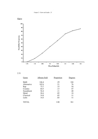
The chapter introduces various techniques for summarizing and depicting data through charts and graphs, including frequency distributions, histograms, frequency polygons, ogives, pie charts, stem-and-leaf plots, Pareto charts, and scatter plots. It emphasizes the importance of choosing graphical representations that clearly communicate trends in the data to intended audiences. Sample problems at the end of the chapter provide examples of constructing and interpreting various charts and graphs.


