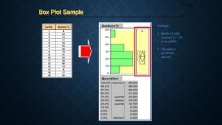
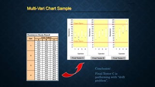
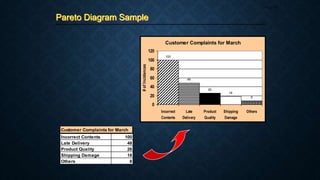
ENGINEERING
DATA ANALYSIS
Profcharlton INAO
Six sigma certified lecturer
Professor, EDA/statistics
4/5/2022
EDA lecture 1 week 1 1
SYLLABUS FROM CHED
4/5/2022
EDA lecture 1 week 1 2
4/5/2022
EDA lecture 1 week 1 3
4/5/2022
EDA lecture 1 week 1 4
4/5/2022
EDA lecture 1 week 1 5
4/5/2022
EDA lecture 1 week 1 6
OBTAINING DATA
7
REVIEW of Basic
Statistics
ProfCharlton Inao
4/5/2022
EDA lecture 1 week 1 8
Basic Statistics
The manufacturing line is host to an ocean of data
which are, to a large extent, left untapped by many
engineers in their search for solutions to day-to-day line
problems.
In answer to such a handicap, this course is designed to
equip participants with in-depth knowledge of basic
statistics, specifically about the appropriate data
manipulation strategies and techniques that one can use
in the endeavor.
Course Objectives
Page 10
Part 1 Introductory Concepts
Part 2 Measures of Central Tendency (Location)
- Mean, Trimmed Mean, Median, Mode
Part 3 Measures of Spread (Variation)
- Range, Variance, Standard Deviation, Inter-quartile Range
Part 4 Graphical Methods of Presentation
- Check Sheet, Histogram, Pareto Diagram,
Cause-and-Effect Diagram, Scatter Diagram,
Graph/Chart, Box Plot, Multi-Vari Chart
Course Outline
Page 11
Introductory
Concepts
Part 1
Page 12
What is Statistics
Page 13
Population
The entire set of
observations that are of
interest in a statistical
investigation.
Sample
Some portion of a
population.
Population
(parameter)
Sample
(statistic)
What is Statistics
Page 14
A branch of applied mathematics concerned
with describing and interpreting a collection
of data and with drawing conclusions about
populations from a knowledge of the
characteristics of a sample.
The science of data handling
4 Phases of Statistical Application
Page 15
Collection of Data
- population or sample
1
Organization of Data
- tables, charts, graphs, etc.
2
Analysis of Data
- involves concise numerical measures
like central tendency and spread
3
Interpretation of Data
- conclusions are based on the
charts, graphs
4
Characteristics of Data Collection
Page 16
1. Data integrity or validity must be high (95% or
higher)
2. Data traceability must be present
3. The right type of data needs to be collected
4. The system must be on line and on time
 Those methods for summarizing
data
 Take the form of either visual
displays of the data or numerical
summaries
 Methods:
Visual Numerical
- Histograms - Means
- Pareto Charts - Medians
- Box Plots - Ranges
- Scatter Plots - SDs
- Variances
Categories of Statistics
Page 17
Descriptive Statistics Inferential Statistics
 Those methods whose results
can be extrapolated beyond the
data to a more general setting
 Used, for example, when one is
estimating an entire day’s
process variation by examining
a small sample from the daily
output of a process
 Methods:
- Hypothesis Testing
- Analysis of Variance
- Experimental Design
Attributes
- Counted or discrete data
- Conformance / nonconformance
- Yield management
- Management tool
- Show there is a problem,
but not why
Types of Data
Page 18
Variables
- Measured or continuous data
- Actual measurement
- Understanding process
- Engineering tool
- Used to identify problem
Example: yield, defect rate, etc. Example: length, weight, etc.
Hierarchy of Variables Data
Page 19
Nominal Data are classified into two or more categories.
Ex.: male/female, with/without, pass/fail
Ordinal Data are grouped according to rank or order
Ex.: 1st/2nd/3rd
Interval Data where ordering or ranking and arithmetic
differences of the observations have meaning
Ex.: test scores, physical measurements
Ratio Data where equality of ratio or proportion has
meaning
Ex.: yield of new is double the yield of old
The Language of Statistics
Page 20
Sum of n Variables










n
1
i
i
x
5
4
3
2
1
5
1
i
i x
x
x
x
x
x 






Example:
Given: xi : 5, 7, 4, 4, 9
= 5 + 7 + 4 + 4 + 9
= 29
The Language of Statistics
Page 21
Sum of Squares of Variables










n
1
i
2
i
x
2
5
2
4
2
3
2
2
2
1
5
1
i
2
i x
x
x
x
x
x 






Example:
Given: xi : 5, 7, 4, 4, 9
= (5)2 + (7)2 + (4)2 + (4)2 + (9)2
= 25 + 49 + 16 + 16 + 81
= 187
The Language of Statistics
Page 22
Square of Sum of Variables
 
2
n
1
i
i
x 









 2
5
4
3
2
1
2
5
1
i
i x
x
x
x
x
x 














Example:
Given: xi : 5, 7, 4, 4, 9
= (5 + 7 + 4 + 4 + 9)2
= (29)2
= 841
The Language of Statistics
Page 23
Summation of a Sum  










n
1
i
i
i y
x
Example:
           
5
5
4
4
3
3
2
2
1
1
5
1
i
i
i y
x
y
x
y
x
y
x
y
x
y
x 












Given: xi : 5, 7, 4, 4, 9
yi : 4, 6, 7, 5, 7
= (5+4) + (7+6) + (4+7) + (4+5) + (9+7)
= 9 + 13 + 11 + 9 + 16
= 58
The Language of Statistics
Page 24
Sum of Product
  









n
1
i
i
i y
x
Example:
                 
5
5
4
4
3
3
2
2
1
1
5
1
i
i
i y
x
y
x
y
x
y
x
y
x
y
x 






Given: xi : 5, 7, 4, 4, 9
yi : 4, 6, 7, 5, 7
= (5x4) + (7x6) + (4x7) + (4x5) + (9x7)
= 20 + 42 + 28 + 20 + 63
= 173
Other Terminologies
Page 25
Qualitative Data
Refers to the attributes or
characteristics of the samples
Quantitative Data
Refers to the numerical
information gathered about the
samples
Outlier
A subset of observations from a
larger data set in which they are
so far separated in value from
the remainder of the
observations that they give rise
to the question of whether they
came from the same
manufacturing process or not or
are simply errors
Measures of
Central Tendency
Part 2
Page 26
Mean
Page 27
the arithmetic center; or the
average of all data
N
x



n
x
x


Population Mean Sample Mean
the most common measure of
central tendency
Example:
Given: xi : 62, 73, 78, 78, 78, 86, 86, 89, 90, 95
Mean = 62 + 73 + 78 + … + 95
10
= 81.5
Trimmed Mean
Page 28
Mean obtained after trimming
off from each side of a data
set a certain percentage of
observations, usually outliers,
Example:
0% 20% 40%
1 62
2 73 73
3 78 78 78
4 78 78 78
5 78 78 78
6 86 86 86
7 86 86 86
8 89 89 89
9 90 90
10 95
T(%) 81.50 82.25 82.50
Obs
Trimming Percentage
Median
Page 29
The center of rank-ordered
data
Example:
Given: xi : 62, 73, 78, 78, 78, 86, 86, 89, 90, 95
Mode = 78
Mode
Page 30
Example:
Given: (Even) xi : 62, 73, 78, 78, 78, 86, 86, 89, 90, 95
(Odd) xi : 62, 73, 78, 78, 78, 86, 86, 89, 90
The number that occurred
most often
Median (even) = (78+86)/2 = 82
Median (odd) = 78
Measures of
Spread
Part 3
Page 31
Range
Page 32
the difference between the
largest and the smallest
measurements
Example:
Given: xi : 62, 73, 78, 78, 78, 86, 86, 89, 90, 95
Range = xmax - xmin
Range = 95 – 62 = 33
Variance
Page 33
The average distance from
the center
The sum of the squared
deviations of the
measurements from their
mean divided by n or n-1
 
N
x
x
2
2  


Population
variance
Sample
Variance
 
1
n
x
x
s
2
2




Example:
Given: xi : 62, 73, 78, 78, 78, 86, 86, 89, 90, 95
 
39
.
93
1
10
)
5
.
81
95
(
...
)
5
.
81
73
(
)
5
.
81
62
(
1
n
x
x
s
2
2
2
2
2













Standard Deviation
Page 34
Defines how the numbers in a
data set vary from the mean;
the average distance from the
center
The positive square root of
variance
 
N
x
x
2
 


Population
SD
Sample
SD
 
1
n
x
x
s
2




Example:
Given: xi : 62, 73, 78, 78, 78, 86, 86, 89, 90, 95
 
66
.
9
1
10
)
5
.
81
95
(
...
)
5
.
81
73
(
)
5
.
81
62
(
1
n
x
x
s
2
2
2
2













Inter-Quartile Range
Page 35
The quartile divides the
population into quarters
The lower quartile (Q1) has
25% of data below it, and
75% above
The middle quartile (Q2) is
the median
The upper quartile (Q3) has
75% of data below it, and
25% above
IQR = Q3 – Q1
Used in the concept of Box
Plots
Example:
1 2 3 4 5 6 7 8
Q1 = 2.5
IQR = 4
Q2 = 6.5
Graphical
Methods of
Presentation
Part 4
Page 36
Check Sheet
Page 37
 Data gathering device that
consists of a list of the different
types of data to be gathered and a
row or column in which to put
tally marks or brief descriptive
remarks
 The heading on the checksheet
contains information such as the
name of the individual gathering
the data, the time frame in which
the data are gathered, and any
other information about the type
and source of data
 Usually used along with Pareto
charts
Functions of Check Sheets:
1. Prod’n process distribution checks
2. Defective item checks
3. Defect location checks
4. Defective cause checks
5. Check-up confirmation checks
6. Others
Check Sheet Samples
Page 38
Product: All Components Inner Date: _________
Dimension Measurement Inspector: _________
Manager: __________
Range: +/-0.05
5 10 15 20 25 30 35 40 45 50 55 60 65
1 -0.07
2 -0.06
3 -0.05
4 -0.04 IIII 4
5 -0.03 IIII II 7
6 -0.02 IIII IIII IIII 15
7 -0.01 IIII IIII IIII IIII IIII IIII IIII II 37
8 0 IIII IIII IIII IIII IIII IIII IIII IIII 45
9 0.01 IIII IIII IIII IIII IIII IIII IIII IIII IIII 49
10 0.02 IIII IIII IIII IIII IIII IIII I 31
11 0.03 IIII IIII I 11
12 0.04 I
13 0.05
14 0.06
15 0.07
200
Production Process Distribution Check Sheet
Meas.
No.
Frquency
Total
January February March
A
1
2
B
3
4
Legend:
Month
Defective Cause Check Sheet
Optr. M/C No.
- Surface Scratch
- Blowhole
- Defective Finishing
- Improper Shape
- Others
X
Histogram
Page 39
 A bar graph with a measurement
scale on one axis and a frequency
or percentage scale on the other
 A picture of a frequency
distribution which is generally
used to show the distribution
pattern of a large sample of data
 The distribution pattern displayed
in a Histogram could be skewed
(to the right or left)
1. Count the number of observations.
2. Find the largest and smallest obs.
3. Find the range.
4. Determine the number of cells using
the formula:
# of Cells = Square Root of n
Generally, use from 4 to 20 cells.
5. Calculate the class interval or width
using the formula:
CW = Range / # of Cells
6. Tally the data for each cell
determined in steps 4 and 5.
7. Get the total for each cell and plot
these in a graph.
Construction of a Histogram:
Histogram Sample
Page 40
Gap Width Rdgs for Magnetic Heads
1.39 1.40 1.60 1.41 1.43
1.46 1.30 1.50 1.34 1.47
1.56 1.35 1.52 1.51 1.25
1.39 1.55 1.59 1.50 1.66
1.61 1.32 1.46 1.30 1.51
1.52 1.48 1.38 1.40 1.55
1.39 1.33 1.46 1.43 1.35
1.57 1.50 1.195 1.48 1.41
1.65 1.51 1.42 1.60 1.29
1.38 1.46 1.39 1.42 1.46
1.70 1.55 1.46 1.52 1.33
1.52 1.25 1.48 1.60 1.43
1.51 1.35 1.40 1.46 1.57
1.62 1.46 1.51 1.24 1.50
1.56 1.30 1.40 1.55 1.50
1.52 1.43 1.39 1.41 1.38
1.40 1.35 1.48 1.42 1.30
1.38 1.55 1.46 1.58 1.34
1.41 1.29 1.41 1.42 1.43
1.38 1.48 1.42 1.60 1.35
1.2 1.3 1.4 1.5 1.6 1.7
Pareto Diagram
Page 41
 A bar graph that rank problems in
decreasing order of frequency
 Allows one to separate the vital
few problems that can lead to the
greatest quality improvement
 Named after Vilfredo Pareto and
introduced as quality control tool
by Juran, the principle is often
stated as “the vital few and the
trivial many” or the “80-20%
Rule”
Construction of a Pareto Diagram:
1. Identify the process characteristics
that will be used in the diagram.
2. Define the manufacturing prod’n
time period for the diagram.
3. Total the number of occurrences for
each defect characteristic for the
time period in step 2.
4. Construct the Pareto diagram as
follows: place the no. of
occurrences in the vertical axis; and
the defect characteristics (arranged
from highest to lowest) in the
horizontal axis.
5. (Optional) Get the cumulative % of
the defect characteristics and plot
these at the right side of the vertical
axis.
Pareto Diagram Sample
Page 42
Customer Complaints for March
Incorrect Contents 100
Late Delivery 48
Product Quality 26
Shipping Damage 18
Others 8
Customer Complaints for March
100
48
26
18
8
0
20
40
60
80
100
120
Incorrect
Contents
Late
Delivery
Product
Quality
Shipping
Damage
Others
#
of
Incidences
Cause-and-Effect Diagram
Page 43
 A useful tool for logically
identifying the possible causes of
quality problems accomplished
through a method of
brainstorming
 Typically uses the 4Ms + 1E as
the main categories: Man, M/C,
Method, Mat’l. and Env’t.
 Can also be based upon the
production processes with which
the problem has direct and
logical connection
 Also called “The Fishbone
Diagram” or “Ishikawa Diagram”
after Dr. Kaoru Ishikawa who
invented it
Cause-and-Effect Diagram
Page 44
Steps in Making a Cause-and-Effect (CE) Diagram:
1. Decide on a problem to be analyzed.
Write the statement (written in a
negative essence) at the rightmost
part of the diagram. Ex. Heavy
Traffic, Insufficient Solder, etc.
2. Depending on the nature of problem,
decide on the appropriate CE
diagram type to use.
3. Agree on what brainstorming rules
to adopt (e.g., structured or
unstructured, etc.).
4. Using the “Why-Why Analysis”
technique, proceed with the
brainstorming activity until all ideas
are exhausted.
5. After the initial brainstorming,
review the entries in the diagram and
assess the validity / logic of each by
asking the questions listed in the
succeeding page.
6. Identify the validated “root cause” or
“most probable cause” by encircling
it.
Cause-and-Effect Diagram
Page 45
1. Are the causes identified really valid? If this cannot
be answered outrightly, perform simulation or
experimentation to verify.
2. Does the team have control over the identified
causes?
3. Is the cause relevant to the problem? Logical?
4. If the identified root cause is addressed, will the
problem be solved, reduced or eliminated?
5. If the answer is “NO” for items 3 and 4, go one step
back in the branch of the diagram. Ask the same
questions once again. Or, look for other causes that
really have an impact to the problem.
Checks to Make During and After Brainstorming:
Cause-and-Effect Diagram Samples
Page 46
1) The Dispersion Analysis Type
high turnover
inexperienced
people
low morale
order forms
hard to read
computer
error
lack of
training process
packing process is
confusing
no “X” check
for accuracy
not enough
correct parts
shipping mat’l
not available
MACHINE MAN
MATERIAL
METHOD
wrong part #
on order form
poor
management
Incorrect
Contents
Shipped To
Customers
Cause-and-Effect Diagram Samples
Page 47
2) The Process Classification Type
Process
Step A
Process
Step B
Process
Step C
Process
Step D Effect
Scatter Diagram
Page 48
 A graph of measurement pairs
that shows the strength of
relationship between two sets of
variables, say x and y
 The relationship is expressed in
terms of correlation
 The correlation between two
variables may be any of the
following:
a) Positive Correlation
b) Zero Correlation
c) Negative Correlation
Y
X
Positive Correlation
Y
X
Negative Correlation
Y
X
No Correlation
Graph / Chart
Page 49
 A simple way of graphically
representing data
 Used to show patterns or trends
quickly without looking at the
actual data
Line Graph
Pie Chart
Customer Complaints
0
25
50
75
100
125
Aug Sep Oct Nov Dec Jan Feb Mar Apr
#
of
Incidences
Customer Complaints
Aug
12%
Sep
12%
Oct
12%
Nov
12%
Dec
12%
Jan
13%
Feb
12%
Mar
13%
Apr
2%
Box Plot
Page 50
 An alternative method to the
Histogram for portraying data
 Provides information on data set
characteristics like location,
spread, skewness, tail length and
outliers
 Frequently used to compare more
than one data set simultaneously
to check if changes have
occurred; done by arranging the
data sets in parallel
 Also called the “box and
whisker” plot
Box Plot
Page 51
Construction of a Box Plot:
1. Determine the lower quartile (Q1)
from the data set. This value
determines the bottom edge of the
rectangle.
2. Determine the upper quartile (Q3)
from the data set. This value
determines the upper edge of the
rectangle.
3. Calculate the IQR (Q3-Q1). This
defines the length of the rectangle or
box.
4. Determine the median M from the
data set. This is represented as a line
within the box plot.
5. Draw a line out of the top edge of
the box. The length of this line is the
minimum value of the maximum
data value or Q3+IQR
 Draw a line out of the bottom of the
box. The length of this is the
maximum value of the minimum
data value or Q1-IQR.
 Values that fall inside the range of
Q1-1.5(IQR) to Q1-IQR or from
Q3+IQR to Q3+1.5(IQR) are
indicated by 0. This occurs about 1
out of 20 times in a normal dist’n.
 Values that are less than Q1-
1.5(IQR) or greater than
Q3+1.5(IQR) are indicated by a dot
or an asterisk (*) on the plot. These
values occur about 1 out of 200
times in a normal dist’n.
Box Plot Sample
Page 52
Lot No. Acetone %
1 6
2 24
3 12
4 11
5 34
6 32
7 28
8 19
9 31
10 22
11 29
12 58
13 15
14 5
15 17
16 25
Acetone%
Quantiles
100.0%
99.5%
97.5%
90.0%
75.0%
50.0%
25.0%
10.0%
2.5%
0.5%
0.0%
maximum
quartile
median
quartile
minimum
58.000
58.000
58.000
41.200
30.500
23.000
12.750
5.700
5.000
5.000
5.000
0
10
20
30
40
50
60
Findings:
1. Batch 12 with
Acetone % = 58
is an outlier
2. The data is
positively
skewed
Multi-Vari Chart
Page 53
 A technique of isolating variation
using graphical methods
 The strategy begins with an
orderly sampling of the products
being produced by the process;
the results are then plotted in
several orders so that a graphical
analysis can be made
 The step-by-step identification of
types of variation is used to
progressively reduce the field of
variables; after the field has been
narrowed further statistical
analysis can be conducted
Construction of a Multi-Vari Chart:
1. Determine which parameters are to
be included in the study. The
parameters should be chosen by
virtue of their significance to the
problem.
2. Collect the data on the parameters
chosen.
3. Construct the multi-vari chart for all
parameter combinations by drawing
a line to connect each combination
of points.
4. Interpret the chart. Look at the
length and position of the lines.
Compare these with specifications.
5. If a variation is found, formulate the
necessary corrective action/s.
Multi-Vari Chart Sample
Page 54
Resistance Study Result
A B C
8.2 8.4 6.5
12.3 6.5 8.3
10.5 10.2 12.4
10.4 12.8 10.8
8.6 12.4 10.6
6.5 10.2 8.5
12.4 8.4 8.6
8.5 8.6 14.8
8.6 14.3 16.2
10.2 12.2 12.2
10.2 12.5 12.2
8.4 10.2 12.3
12.2 14.8 16.9
12.5 14.6 18.4
14.6 12.2 16.5
8.5 16.3 18.2
8.8 14.2 14.3
10.2 8.5 16.8
10.5 12.3 20.2
12.8 12.6 22.5
3
4
Final Testers
Optr.
1
2
Final Tester C
Resistance
0
2
4
6
8
10
12
14
16
18
20
22
24
1 2 3 4
Operator
Final Tester B
Resistance
0
2
4
6
8
10
12
14
16
18
20
22
24
1 2 3 4
Operator
Final Tester A
Resistance
0
2
4
6
8
10
12
14
16
18
20
22
24
1 2 3 4
Operator
Upper Specs
Lower Specs
Conclusion:
Final Tester C is
performing with “drift
problem”.
References
Page 55
1. Elementary Statistics for Basic Education
By Melecio C. Deauna
2. Fundamentals of Statistical Quality Control
By Jerome D. Braverman
3. Guide to Quality Control
By Kaoru Ishikawa
4. Modern Statistical Quality Control and Improvement
By Nicholas R. Farnum
5. Statistical Process Control and Quality Improvement, 3rd Edition
By Gerald M. Smith
6. Statistical Quality Control for Manufacturing Managers
By William S. Messina

Engineering Data Analysis-ProfCharlton

  • 1.
    ENGINEERING DATA ANALYSIS Profcharlton INAO Sixsigma certified lecturer Professor, EDA/statistics 4/5/2022 EDA lecture 1 week 1 1
  • 2.
  • 3.
  • 4.
  • 5.
  • 6.
  • 7.
  • 8.
    REVIEW of Basic Statistics ProfCharltonInao 4/5/2022 EDA lecture 1 week 1 8
  • 9.
  • 10.
    The manufacturing lineis host to an ocean of data which are, to a large extent, left untapped by many engineers in their search for solutions to day-to-day line problems. In answer to such a handicap, this course is designed to equip participants with in-depth knowledge of basic statistics, specifically about the appropriate data manipulation strategies and techniques that one can use in the endeavor. Course Objectives Page 10
  • 11.
    Part 1 IntroductoryConcepts Part 2 Measures of Central Tendency (Location) - Mean, Trimmed Mean, Median, Mode Part 3 Measures of Spread (Variation) - Range, Variance, Standard Deviation, Inter-quartile Range Part 4 Graphical Methods of Presentation - Check Sheet, Histogram, Pareto Diagram, Cause-and-Effect Diagram, Scatter Diagram, Graph/Chart, Box Plot, Multi-Vari Chart Course Outline Page 11
  • 12.
  • 13.
    What is Statistics Page13 Population The entire set of observations that are of interest in a statistical investigation. Sample Some portion of a population. Population (parameter) Sample (statistic)
  • 14.
    What is Statistics Page14 A branch of applied mathematics concerned with describing and interpreting a collection of data and with drawing conclusions about populations from a knowledge of the characteristics of a sample. The science of data handling
  • 15.
    4 Phases ofStatistical Application Page 15 Collection of Data - population or sample 1 Organization of Data - tables, charts, graphs, etc. 2 Analysis of Data - involves concise numerical measures like central tendency and spread 3 Interpretation of Data - conclusions are based on the charts, graphs 4
  • 16.
    Characteristics of DataCollection Page 16 1. Data integrity or validity must be high (95% or higher) 2. Data traceability must be present 3. The right type of data needs to be collected 4. The system must be on line and on time
  • 17.
     Those methodsfor summarizing data  Take the form of either visual displays of the data or numerical summaries  Methods: Visual Numerical - Histograms - Means - Pareto Charts - Medians - Box Plots - Ranges - Scatter Plots - SDs - Variances Categories of Statistics Page 17 Descriptive Statistics Inferential Statistics  Those methods whose results can be extrapolated beyond the data to a more general setting  Used, for example, when one is estimating an entire day’s process variation by examining a small sample from the daily output of a process  Methods: - Hypothesis Testing - Analysis of Variance - Experimental Design
  • 18.
    Attributes - Counted ordiscrete data - Conformance / nonconformance - Yield management - Management tool - Show there is a problem, but not why Types of Data Page 18 Variables - Measured or continuous data - Actual measurement - Understanding process - Engineering tool - Used to identify problem Example: yield, defect rate, etc. Example: length, weight, etc.
  • 19.
    Hierarchy of VariablesData Page 19 Nominal Data are classified into two or more categories. Ex.: male/female, with/without, pass/fail Ordinal Data are grouped according to rank or order Ex.: 1st/2nd/3rd Interval Data where ordering or ranking and arithmetic differences of the observations have meaning Ex.: test scores, physical measurements Ratio Data where equality of ratio or proportion has meaning Ex.: yield of new is double the yield of old
  • 20.
    The Language ofStatistics Page 20 Sum of n Variables           n 1 i i x 5 4 3 2 1 5 1 i i x x x x x x        Example: Given: xi : 5, 7, 4, 4, 9 = 5 + 7 + 4 + 4 + 9 = 29
  • 21.
    The Language ofStatistics Page 21 Sum of Squares of Variables           n 1 i 2 i x 2 5 2 4 2 3 2 2 2 1 5 1 i 2 i x x x x x x        Example: Given: xi : 5, 7, 4, 4, 9 = (5)2 + (7)2 + (4)2 + (4)2 + (9)2 = 25 + 49 + 16 + 16 + 81 = 187
  • 22.
    The Language ofStatistics Page 22 Square of Sum of Variables   2 n 1 i i x            2 5 4 3 2 1 2 5 1 i i x x x x x x                Example: Given: xi : 5, 7, 4, 4, 9 = (5 + 7 + 4 + 4 + 9)2 = (29)2 = 841
  • 23.
    The Language ofStatistics Page 23 Summation of a Sum             n 1 i i i y x Example:             5 5 4 4 3 3 2 2 1 1 5 1 i i i y x y x y x y x y x y x              Given: xi : 5, 7, 4, 4, 9 yi : 4, 6, 7, 5, 7 = (5+4) + (7+6) + (4+7) + (4+5) + (9+7) = 9 + 13 + 11 + 9 + 16 = 58
  • 24.
    The Language ofStatistics Page 24 Sum of Product             n 1 i i i y x Example:                   5 5 4 4 3 3 2 2 1 1 5 1 i i i y x y x y x y x y x y x        Given: xi : 5, 7, 4, 4, 9 yi : 4, 6, 7, 5, 7 = (5x4) + (7x6) + (4x7) + (4x5) + (9x7) = 20 + 42 + 28 + 20 + 63 = 173
  • 25.
    Other Terminologies Page 25 QualitativeData Refers to the attributes or characteristics of the samples Quantitative Data Refers to the numerical information gathered about the samples Outlier A subset of observations from a larger data set in which they are so far separated in value from the remainder of the observations that they give rise to the question of whether they came from the same manufacturing process or not or are simply errors
  • 26.
  • 27.
    Mean Page 27 the arithmeticcenter; or the average of all data N x    n x x   Population Mean Sample Mean the most common measure of central tendency Example: Given: xi : 62, 73, 78, 78, 78, 86, 86, 89, 90, 95 Mean = 62 + 73 + 78 + … + 95 10 = 81.5
  • 28.
    Trimmed Mean Page 28 Meanobtained after trimming off from each side of a data set a certain percentage of observations, usually outliers, Example: 0% 20% 40% 1 62 2 73 73 3 78 78 78 4 78 78 78 5 78 78 78 6 86 86 86 7 86 86 86 8 89 89 89 9 90 90 10 95 T(%) 81.50 82.25 82.50 Obs Trimming Percentage
  • 29.
    Median Page 29 The centerof rank-ordered data Example: Given: xi : 62, 73, 78, 78, 78, 86, 86, 89, 90, 95 Mode = 78
  • 30.
    Mode Page 30 Example: Given: (Even)xi : 62, 73, 78, 78, 78, 86, 86, 89, 90, 95 (Odd) xi : 62, 73, 78, 78, 78, 86, 86, 89, 90 The number that occurred most often Median (even) = (78+86)/2 = 82 Median (odd) = 78
  • 31.
  • 32.
    Range Page 32 the differencebetween the largest and the smallest measurements Example: Given: xi : 62, 73, 78, 78, 78, 86, 86, 89, 90, 95 Range = xmax - xmin Range = 95 – 62 = 33
  • 33.
    Variance Page 33 The averagedistance from the center The sum of the squared deviations of the measurements from their mean divided by n or n-1   N x x 2 2     Population variance Sample Variance   1 n x x s 2 2     Example: Given: xi : 62, 73, 78, 78, 78, 86, 86, 89, 90, 95   39 . 93 1 10 ) 5 . 81 95 ( ... ) 5 . 81 73 ( ) 5 . 81 62 ( 1 n x x s 2 2 2 2 2             
  • 34.
    Standard Deviation Page 34 Defineshow the numbers in a data set vary from the mean; the average distance from the center The positive square root of variance   N x x 2     Population SD Sample SD   1 n x x s 2     Example: Given: xi : 62, 73, 78, 78, 78, 86, 86, 89, 90, 95   66 . 9 1 10 ) 5 . 81 95 ( ... ) 5 . 81 73 ( ) 5 . 81 62 ( 1 n x x s 2 2 2 2             
  • 35.
    Inter-Quartile Range Page 35 Thequartile divides the population into quarters The lower quartile (Q1) has 25% of data below it, and 75% above The middle quartile (Q2) is the median The upper quartile (Q3) has 75% of data below it, and 25% above IQR = Q3 – Q1 Used in the concept of Box Plots Example: 1 2 3 4 5 6 7 8 Q1 = 2.5 IQR = 4 Q2 = 6.5
  • 36.
  • 37.
    Check Sheet Page 37 Data gathering device that consists of a list of the different types of data to be gathered and a row or column in which to put tally marks or brief descriptive remarks  The heading on the checksheet contains information such as the name of the individual gathering the data, the time frame in which the data are gathered, and any other information about the type and source of data  Usually used along with Pareto charts Functions of Check Sheets: 1. Prod’n process distribution checks 2. Defective item checks 3. Defect location checks 4. Defective cause checks 5. Check-up confirmation checks 6. Others
  • 38.
    Check Sheet Samples Page38 Product: All Components Inner Date: _________ Dimension Measurement Inspector: _________ Manager: __________ Range: +/-0.05 5 10 15 20 25 30 35 40 45 50 55 60 65 1 -0.07 2 -0.06 3 -0.05 4 -0.04 IIII 4 5 -0.03 IIII II 7 6 -0.02 IIII IIII IIII 15 7 -0.01 IIII IIII IIII IIII IIII IIII IIII II 37 8 0 IIII IIII IIII IIII IIII IIII IIII IIII 45 9 0.01 IIII IIII IIII IIII IIII IIII IIII IIII IIII 49 10 0.02 IIII IIII IIII IIII IIII IIII I 31 11 0.03 IIII IIII I 11 12 0.04 I 13 0.05 14 0.06 15 0.07 200 Production Process Distribution Check Sheet Meas. No. Frquency Total January February March A 1 2 B 3 4 Legend: Month Defective Cause Check Sheet Optr. M/C No. - Surface Scratch - Blowhole - Defective Finishing - Improper Shape - Others X
  • 39.
    Histogram Page 39  Abar graph with a measurement scale on one axis and a frequency or percentage scale on the other  A picture of a frequency distribution which is generally used to show the distribution pattern of a large sample of data  The distribution pattern displayed in a Histogram could be skewed (to the right or left) 1. Count the number of observations. 2. Find the largest and smallest obs. 3. Find the range. 4. Determine the number of cells using the formula: # of Cells = Square Root of n Generally, use from 4 to 20 cells. 5. Calculate the class interval or width using the formula: CW = Range / # of Cells 6. Tally the data for each cell determined in steps 4 and 5. 7. Get the total for each cell and plot these in a graph. Construction of a Histogram:
  • 40.
    Histogram Sample Page 40 GapWidth Rdgs for Magnetic Heads 1.39 1.40 1.60 1.41 1.43 1.46 1.30 1.50 1.34 1.47 1.56 1.35 1.52 1.51 1.25 1.39 1.55 1.59 1.50 1.66 1.61 1.32 1.46 1.30 1.51 1.52 1.48 1.38 1.40 1.55 1.39 1.33 1.46 1.43 1.35 1.57 1.50 1.195 1.48 1.41 1.65 1.51 1.42 1.60 1.29 1.38 1.46 1.39 1.42 1.46 1.70 1.55 1.46 1.52 1.33 1.52 1.25 1.48 1.60 1.43 1.51 1.35 1.40 1.46 1.57 1.62 1.46 1.51 1.24 1.50 1.56 1.30 1.40 1.55 1.50 1.52 1.43 1.39 1.41 1.38 1.40 1.35 1.48 1.42 1.30 1.38 1.55 1.46 1.58 1.34 1.41 1.29 1.41 1.42 1.43 1.38 1.48 1.42 1.60 1.35 1.2 1.3 1.4 1.5 1.6 1.7
  • 41.
    Pareto Diagram Page 41 A bar graph that rank problems in decreasing order of frequency  Allows one to separate the vital few problems that can lead to the greatest quality improvement  Named after Vilfredo Pareto and introduced as quality control tool by Juran, the principle is often stated as “the vital few and the trivial many” or the “80-20% Rule” Construction of a Pareto Diagram: 1. Identify the process characteristics that will be used in the diagram. 2. Define the manufacturing prod’n time period for the diagram. 3. Total the number of occurrences for each defect characteristic for the time period in step 2. 4. Construct the Pareto diagram as follows: place the no. of occurrences in the vertical axis; and the defect characteristics (arranged from highest to lowest) in the horizontal axis. 5. (Optional) Get the cumulative % of the defect characteristics and plot these at the right side of the vertical axis.
  • 42.
    Pareto Diagram Sample Page42 Customer Complaints for March Incorrect Contents 100 Late Delivery 48 Product Quality 26 Shipping Damage 18 Others 8 Customer Complaints for March 100 48 26 18 8 0 20 40 60 80 100 120 Incorrect Contents Late Delivery Product Quality Shipping Damage Others # of Incidences
  • 43.
    Cause-and-Effect Diagram Page 43 A useful tool for logically identifying the possible causes of quality problems accomplished through a method of brainstorming  Typically uses the 4Ms + 1E as the main categories: Man, M/C, Method, Mat’l. and Env’t.  Can also be based upon the production processes with which the problem has direct and logical connection  Also called “The Fishbone Diagram” or “Ishikawa Diagram” after Dr. Kaoru Ishikawa who invented it
  • 44.
    Cause-and-Effect Diagram Page 44 Stepsin Making a Cause-and-Effect (CE) Diagram: 1. Decide on a problem to be analyzed. Write the statement (written in a negative essence) at the rightmost part of the diagram. Ex. Heavy Traffic, Insufficient Solder, etc. 2. Depending on the nature of problem, decide on the appropriate CE diagram type to use. 3. Agree on what brainstorming rules to adopt (e.g., structured or unstructured, etc.). 4. Using the “Why-Why Analysis” technique, proceed with the brainstorming activity until all ideas are exhausted. 5. After the initial brainstorming, review the entries in the diagram and assess the validity / logic of each by asking the questions listed in the succeeding page. 6. Identify the validated “root cause” or “most probable cause” by encircling it.
  • 45.
    Cause-and-Effect Diagram Page 45 1.Are the causes identified really valid? If this cannot be answered outrightly, perform simulation or experimentation to verify. 2. Does the team have control over the identified causes? 3. Is the cause relevant to the problem? Logical? 4. If the identified root cause is addressed, will the problem be solved, reduced or eliminated? 5. If the answer is “NO” for items 3 and 4, go one step back in the branch of the diagram. Ask the same questions once again. Or, look for other causes that really have an impact to the problem. Checks to Make During and After Brainstorming:
  • 46.
    Cause-and-Effect Diagram Samples Page46 1) The Dispersion Analysis Type high turnover inexperienced people low morale order forms hard to read computer error lack of training process packing process is confusing no “X” check for accuracy not enough correct parts shipping mat’l not available MACHINE MAN MATERIAL METHOD wrong part # on order form poor management Incorrect Contents Shipped To Customers
  • 47.
    Cause-and-Effect Diagram Samples Page47 2) The Process Classification Type Process Step A Process Step B Process Step C Process Step D Effect
  • 48.
    Scatter Diagram Page 48 A graph of measurement pairs that shows the strength of relationship between two sets of variables, say x and y  The relationship is expressed in terms of correlation  The correlation between two variables may be any of the following: a) Positive Correlation b) Zero Correlation c) Negative Correlation Y X Positive Correlation Y X Negative Correlation Y X No Correlation
  • 49.
    Graph / Chart Page49  A simple way of graphically representing data  Used to show patterns or trends quickly without looking at the actual data Line Graph Pie Chart Customer Complaints 0 25 50 75 100 125 Aug Sep Oct Nov Dec Jan Feb Mar Apr # of Incidences Customer Complaints Aug 12% Sep 12% Oct 12% Nov 12% Dec 12% Jan 13% Feb 12% Mar 13% Apr 2%
  • 50.
    Box Plot Page 50 An alternative method to the Histogram for portraying data  Provides information on data set characteristics like location, spread, skewness, tail length and outliers  Frequently used to compare more than one data set simultaneously to check if changes have occurred; done by arranging the data sets in parallel  Also called the “box and whisker” plot
  • 51.
    Box Plot Page 51 Constructionof a Box Plot: 1. Determine the lower quartile (Q1) from the data set. This value determines the bottom edge of the rectangle. 2. Determine the upper quartile (Q3) from the data set. This value determines the upper edge of the rectangle. 3. Calculate the IQR (Q3-Q1). This defines the length of the rectangle or box. 4. Determine the median M from the data set. This is represented as a line within the box plot. 5. Draw a line out of the top edge of the box. The length of this line is the minimum value of the maximum data value or Q3+IQR  Draw a line out of the bottom of the box. The length of this is the maximum value of the minimum data value or Q1-IQR.  Values that fall inside the range of Q1-1.5(IQR) to Q1-IQR or from Q3+IQR to Q3+1.5(IQR) are indicated by 0. This occurs about 1 out of 20 times in a normal dist’n.  Values that are less than Q1- 1.5(IQR) or greater than Q3+1.5(IQR) are indicated by a dot or an asterisk (*) on the plot. These values occur about 1 out of 200 times in a normal dist’n.
  • 52.
    Box Plot Sample Page52 Lot No. Acetone % 1 6 2 24 3 12 4 11 5 34 6 32 7 28 8 19 9 31 10 22 11 29 12 58 13 15 14 5 15 17 16 25 Acetone% Quantiles 100.0% 99.5% 97.5% 90.0% 75.0% 50.0% 25.0% 10.0% 2.5% 0.5% 0.0% maximum quartile median quartile minimum 58.000 58.000 58.000 41.200 30.500 23.000 12.750 5.700 5.000 5.000 5.000 0 10 20 30 40 50 60 Findings: 1. Batch 12 with Acetone % = 58 is an outlier 2. The data is positively skewed
  • 53.
    Multi-Vari Chart Page 53 A technique of isolating variation using graphical methods  The strategy begins with an orderly sampling of the products being produced by the process; the results are then plotted in several orders so that a graphical analysis can be made  The step-by-step identification of types of variation is used to progressively reduce the field of variables; after the field has been narrowed further statistical analysis can be conducted Construction of a Multi-Vari Chart: 1. Determine which parameters are to be included in the study. The parameters should be chosen by virtue of their significance to the problem. 2. Collect the data on the parameters chosen. 3. Construct the multi-vari chart for all parameter combinations by drawing a line to connect each combination of points. 4. Interpret the chart. Look at the length and position of the lines. Compare these with specifications. 5. If a variation is found, formulate the necessary corrective action/s.
  • 54.
    Multi-Vari Chart Sample Page54 Resistance Study Result A B C 8.2 8.4 6.5 12.3 6.5 8.3 10.5 10.2 12.4 10.4 12.8 10.8 8.6 12.4 10.6 6.5 10.2 8.5 12.4 8.4 8.6 8.5 8.6 14.8 8.6 14.3 16.2 10.2 12.2 12.2 10.2 12.5 12.2 8.4 10.2 12.3 12.2 14.8 16.9 12.5 14.6 18.4 14.6 12.2 16.5 8.5 16.3 18.2 8.8 14.2 14.3 10.2 8.5 16.8 10.5 12.3 20.2 12.8 12.6 22.5 3 4 Final Testers Optr. 1 2 Final Tester C Resistance 0 2 4 6 8 10 12 14 16 18 20 22 24 1 2 3 4 Operator Final Tester B Resistance 0 2 4 6 8 10 12 14 16 18 20 22 24 1 2 3 4 Operator Final Tester A Resistance 0 2 4 6 8 10 12 14 16 18 20 22 24 1 2 3 4 Operator Upper Specs Lower Specs Conclusion: Final Tester C is performing with “drift problem”.
  • 55.
    References Page 55 1. ElementaryStatistics for Basic Education By Melecio C. Deauna 2. Fundamentals of Statistical Quality Control By Jerome D. Braverman 3. Guide to Quality Control By Kaoru Ishikawa 4. Modern Statistical Quality Control and Improvement By Nicholas R. Farnum 5. Statistical Process Control and Quality Improvement, 3rd Edition By Gerald M. Smith 6. Statistical Quality Control for Manufacturing Managers By William S. Messina