1. Researching Past Student Examples
How have the pages been laid out?
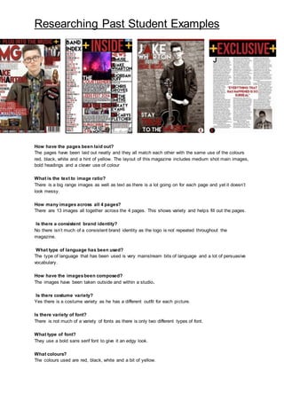
The pages have been laid out neatly and they all match each other with the same use of the colours
red, black, white and a hint of yellow. The layout of this magazine includes medium shot main images,
bold headings and a clever use of colour
What is the text to image ratio?
There is a big range images as well as text as there is a lot going on for each page and yet it doesn’t
look messy.
How many images across all 4 pages?
There are 13 images all together across the 4 pages. This shows variety and helps fill out the pages.
Is there a consistent brand identity?
No there isn’t much of a consistent brand identity as the logo is not repeated throughout the
magazine.
What type of language has been used?
The type of language that has been used is very mainstream bits of language and a lot of persuasive
vocabulary.
How have the imagesbeen composed?
The images have been taken outside and within a studio.
Is there costume variety?
Yes there is a costume variety as he has a different outfit for each picture.
Is there variety of font?
There is not much of a variety of fonts as there is only two different types of font.
What type of font?
They use a bold sans serif font to give it an edgy look.
What colours?
The colours used are red, black, white and a bit of yellow.
2. Researching Past Student Examples
How is the genre evident?
The genre is evident as the use of font, images and costume links in with the genre of the magazine.
Any issues of representation?
No there doesn’t seem to be any issues with representation.